Never Forget an Ingredient Again!
Easy Food Preparing with New Shopping List Feature in Tasty
Background & problem
Tasty is a well-liked app and website that gives users fast and simple recipes with fun cooking video guides.
But there's a problem: it doesn't have a shopping list feature. This means users have to spend more time and effort to organize and prepare for their ingredients. This hassle can discourage users engaging cooking and making the whole experience less enjoyable.
Solution
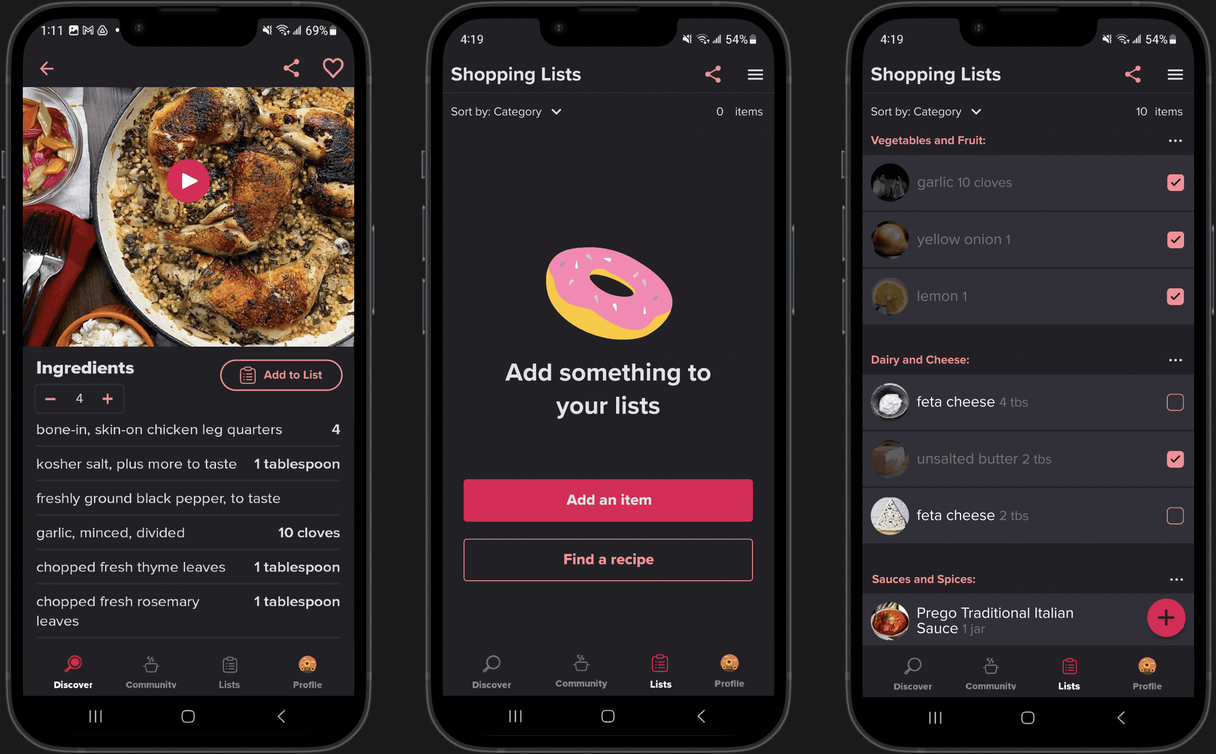
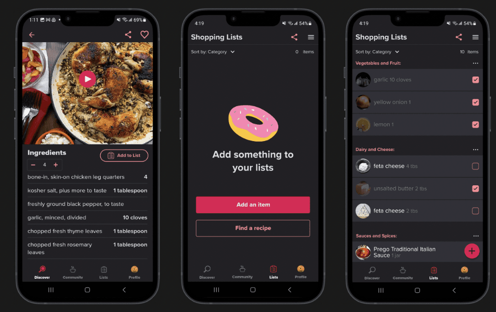
My proposed solution is to integrate a shopping list feature within the Tasty app, which will help users organize their ingredients and streamline the food preparation process. The key functions of this feature include:
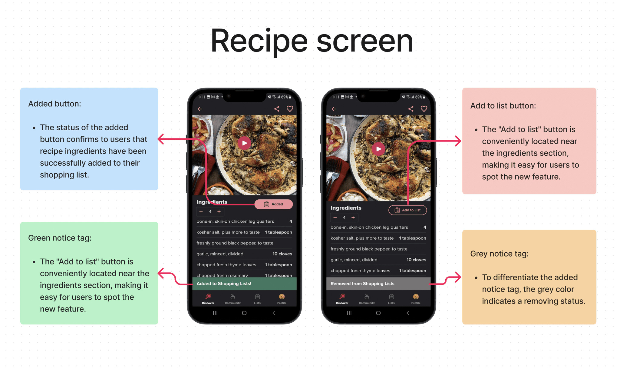
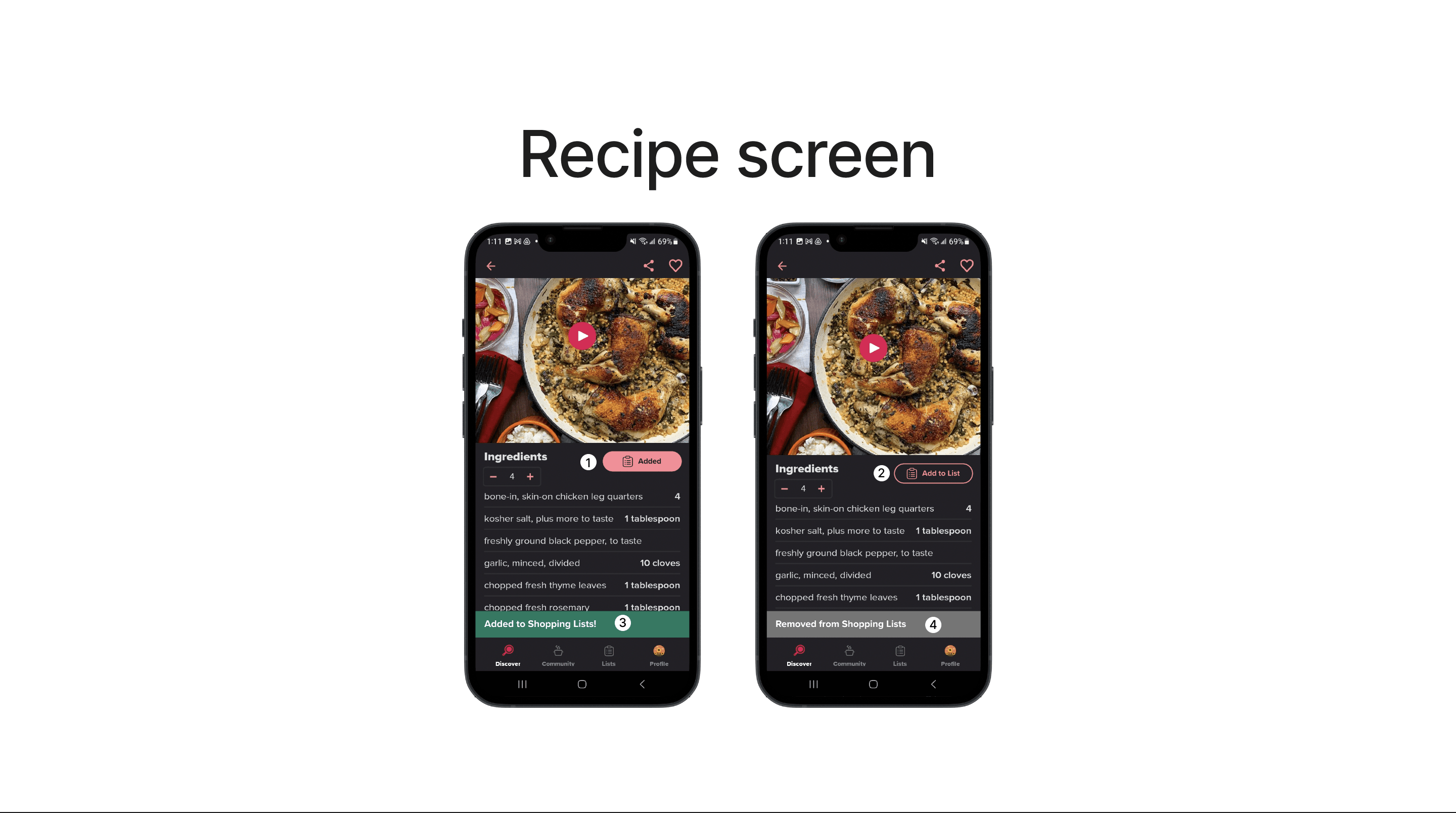
Adding recipe ingredients directly to the shopping list
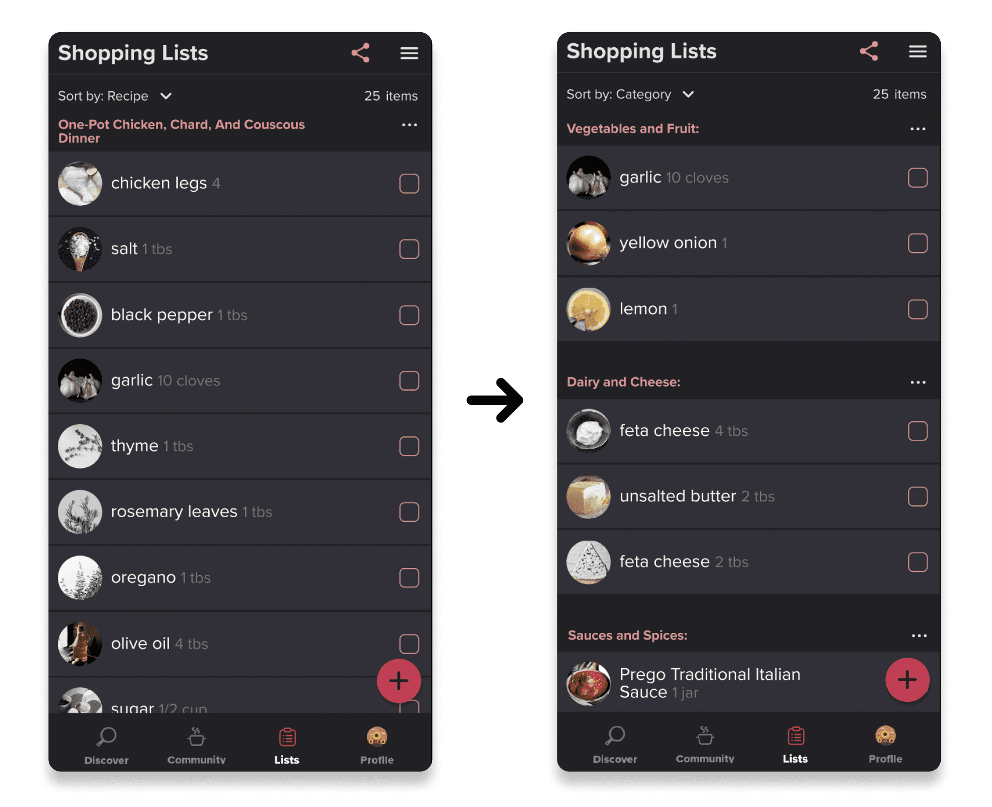
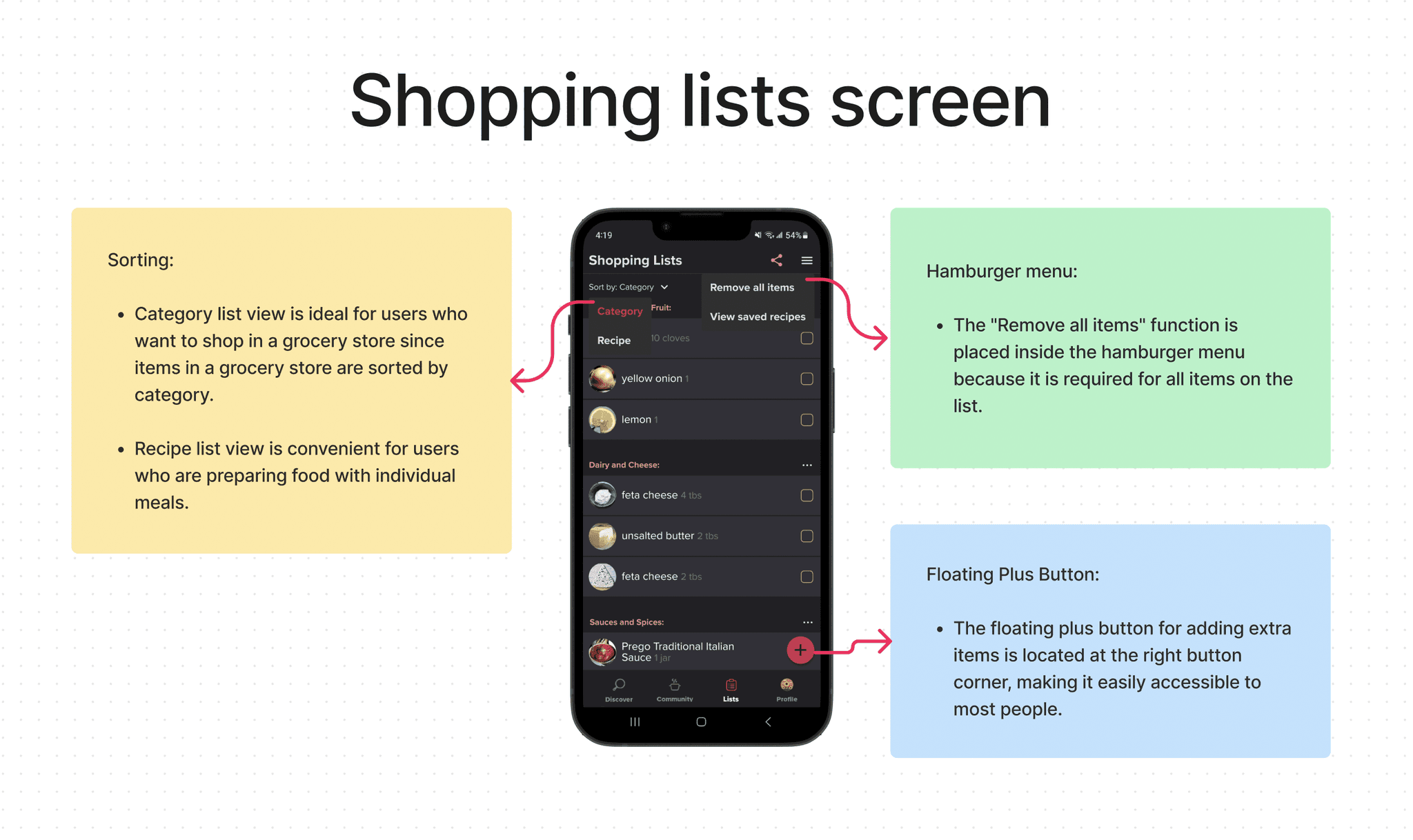
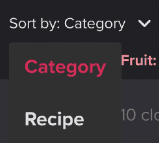
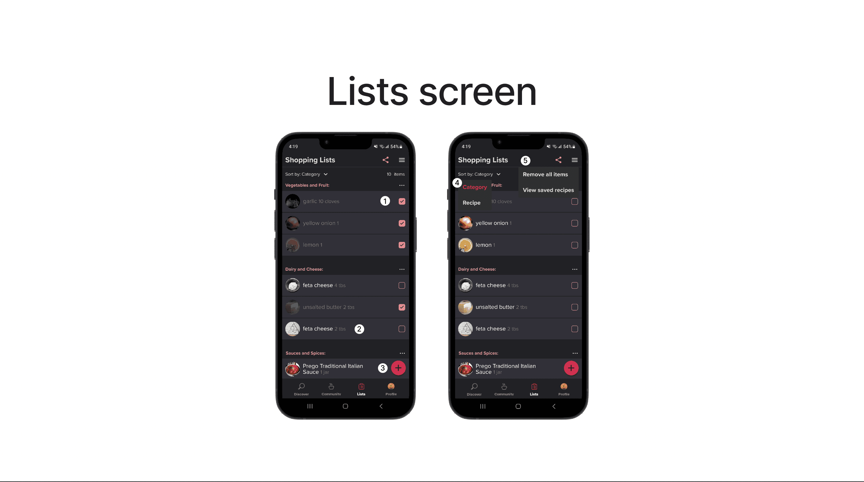
Sorting the list by category or recipe
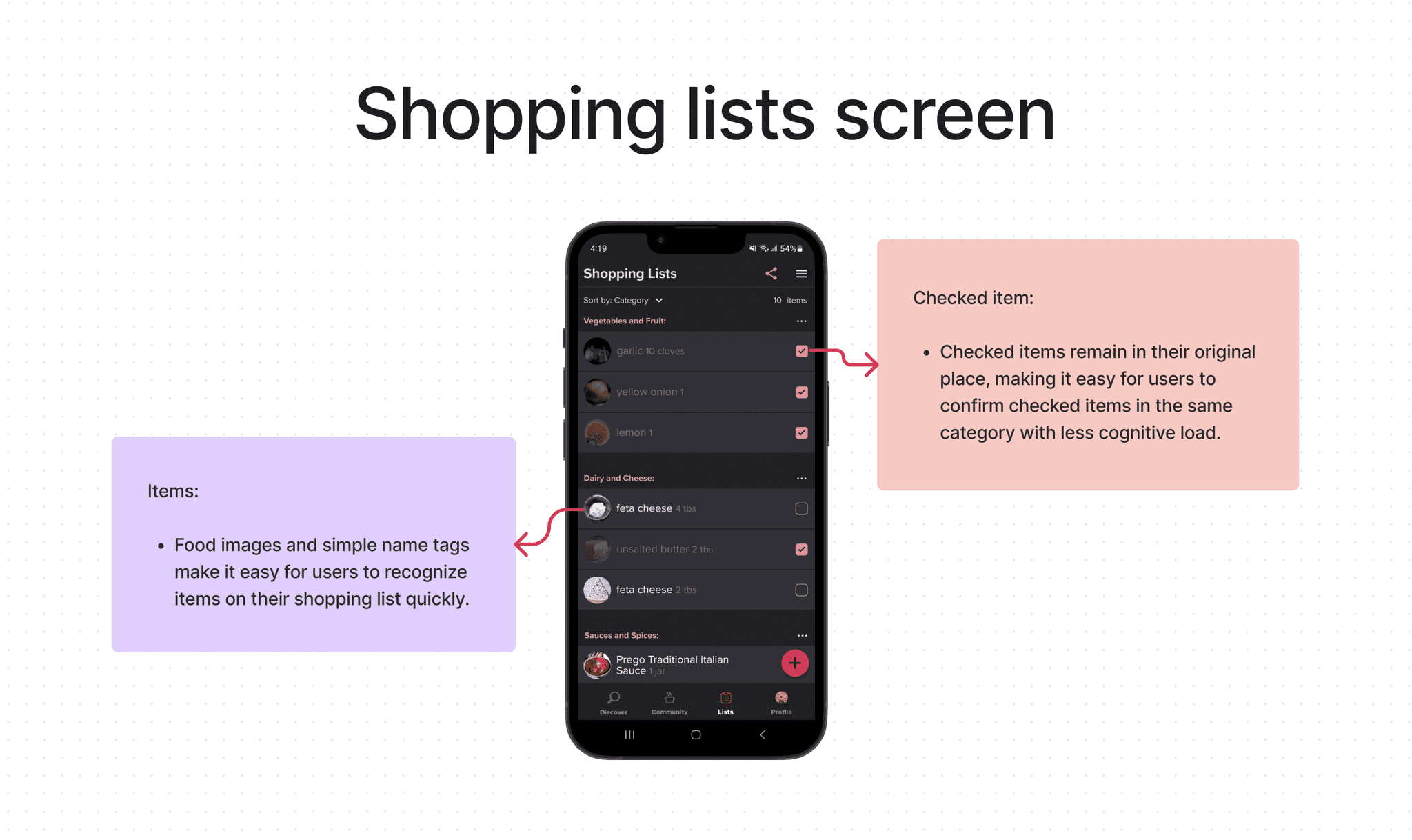
Easy viewing of unchecked and checked items
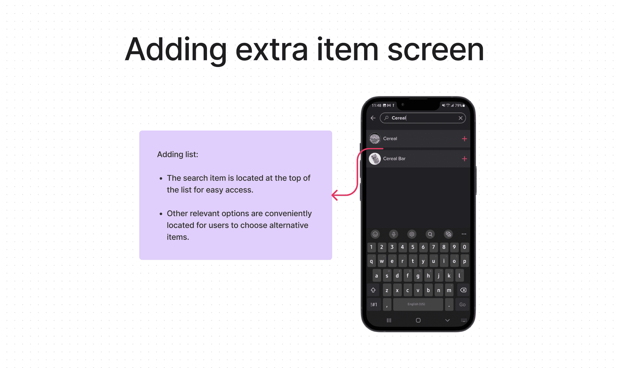
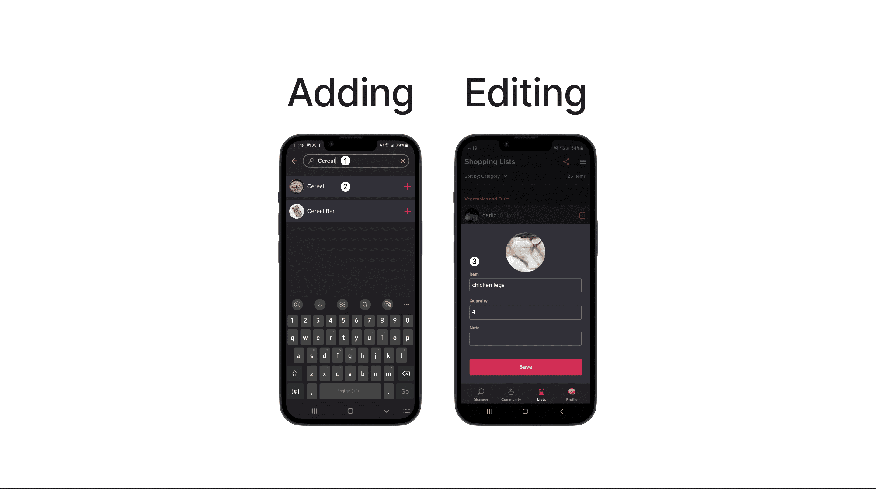
Adding extra items to the list
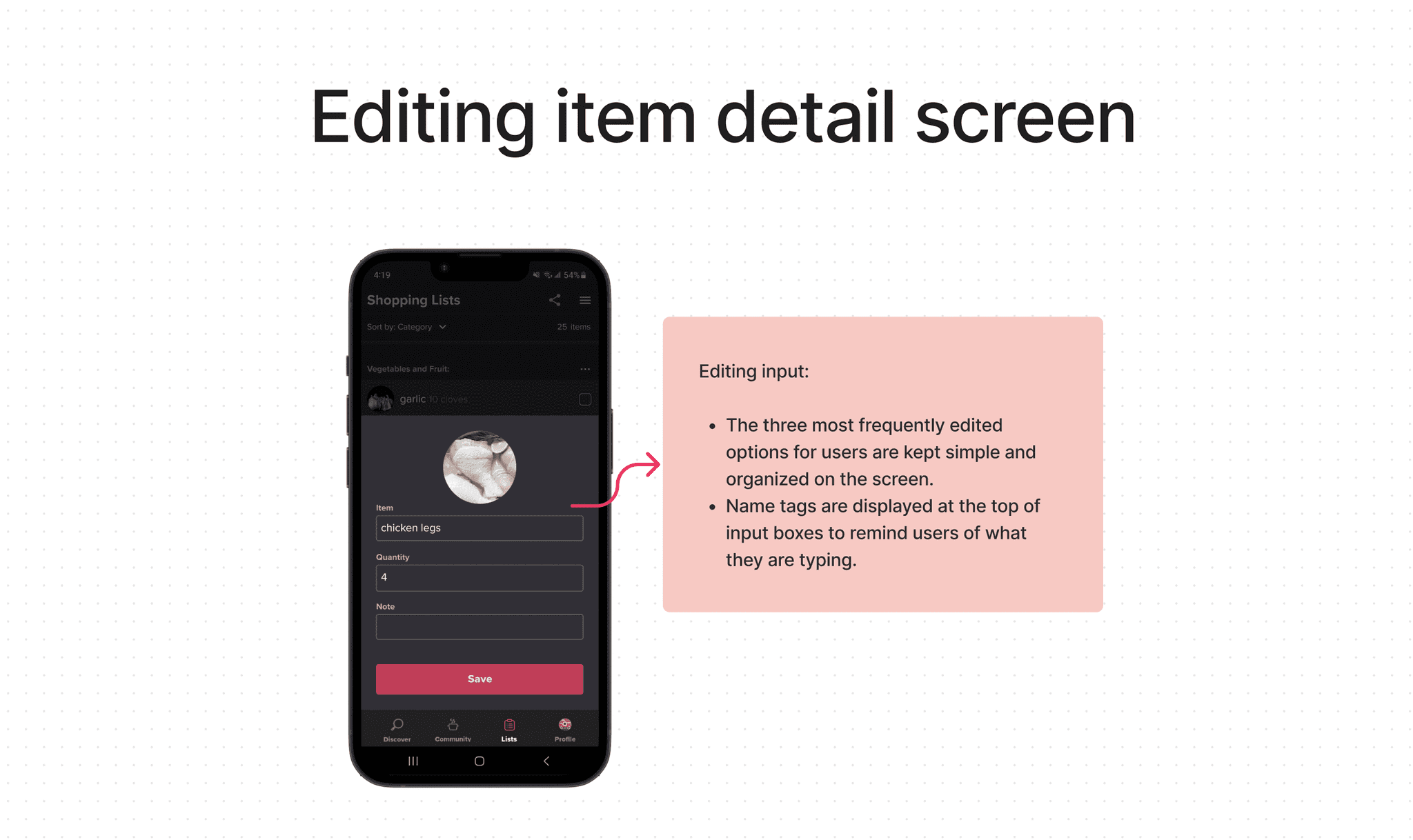
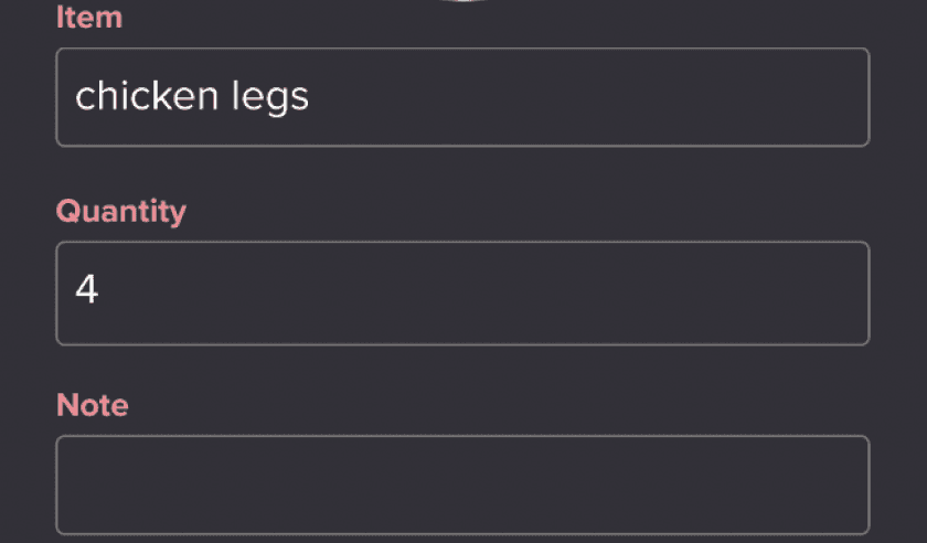
Editing item details
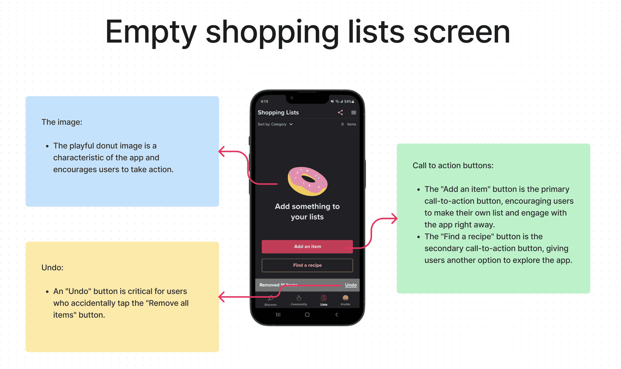
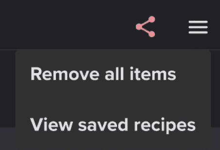
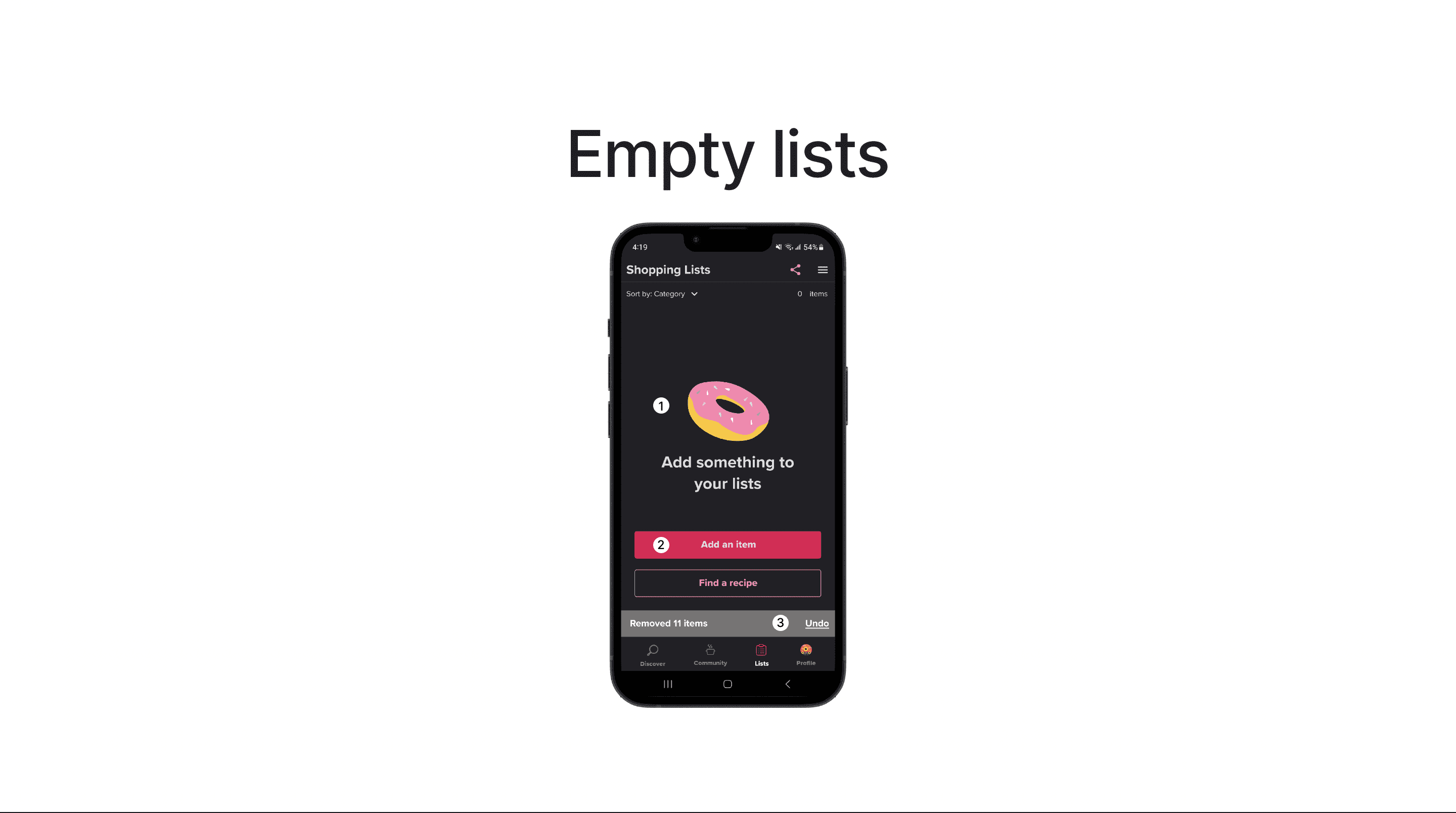
Removing all items with a single action
Undoing any accidental removal of items
Ideation
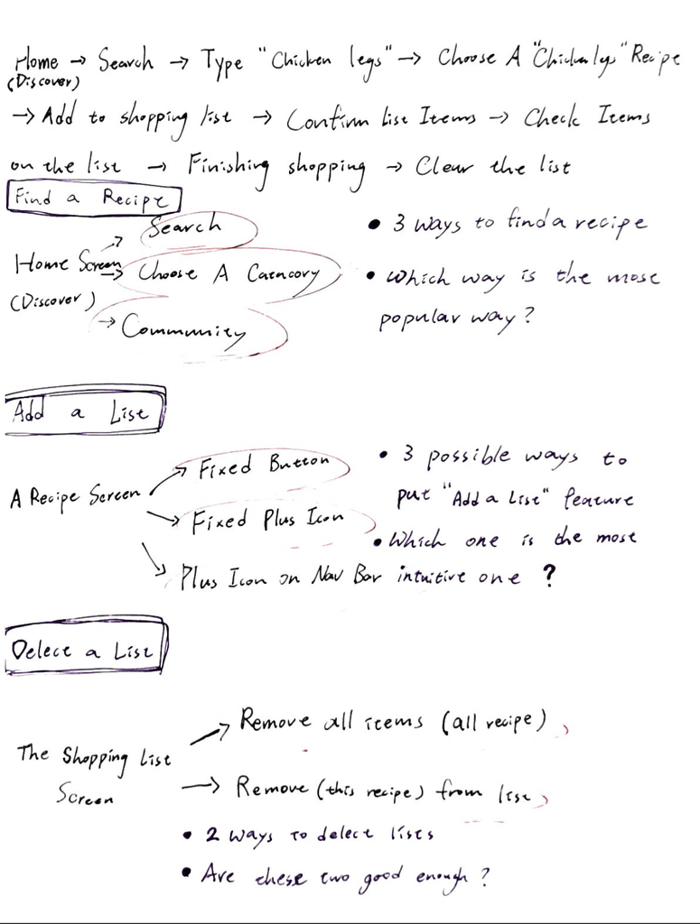
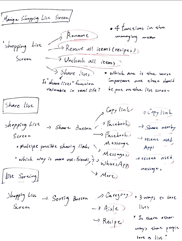
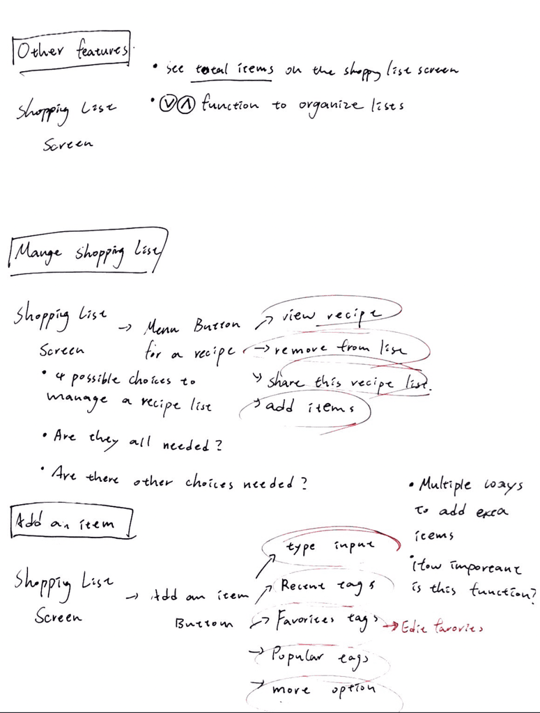
By listing out all the possible functionalities, I gain a clear understanding of the potential features that can be incorporated into each page. This helps in shaping a more well-defined and visionary product.
(The List of Functionality)
MOSCOW method
I prioritize the shopping list features by categorizing them into 'must-have' and 'good-to-have.' This helps me concentrate on the essential features for the app and its users. It ensures that I use my time efficiently and stay focused on the most crucial aspects.
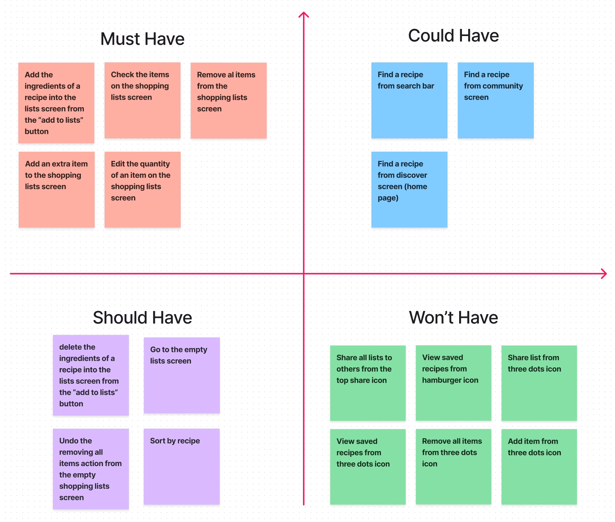
(The MOSCOW)
Low-fidelity wireframe
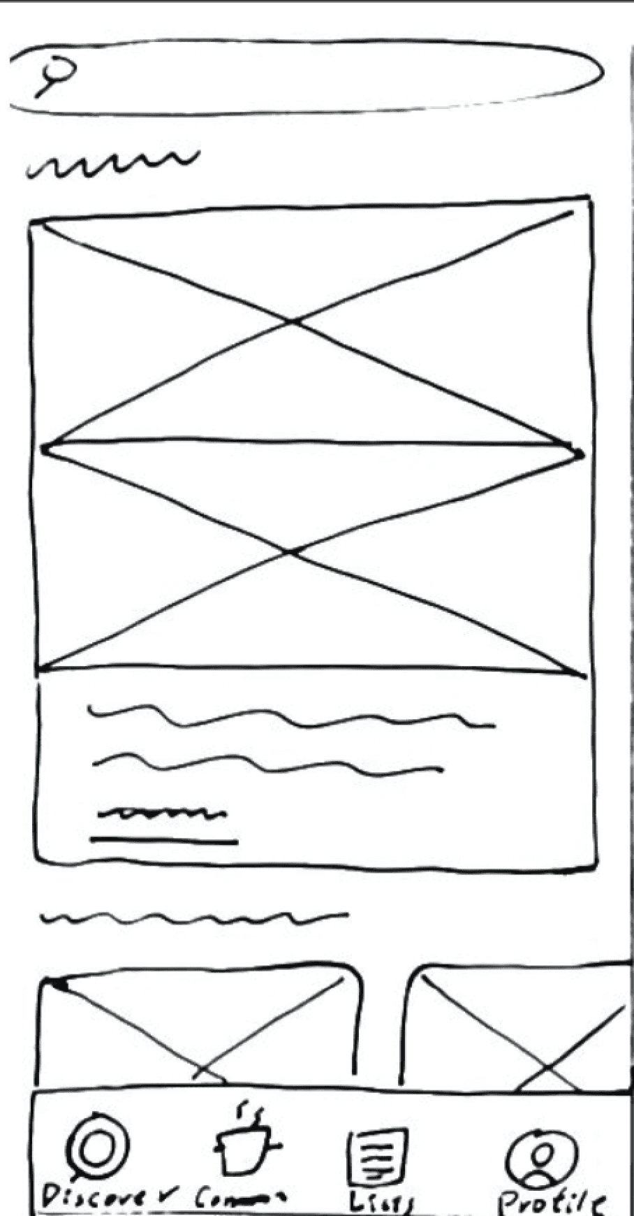
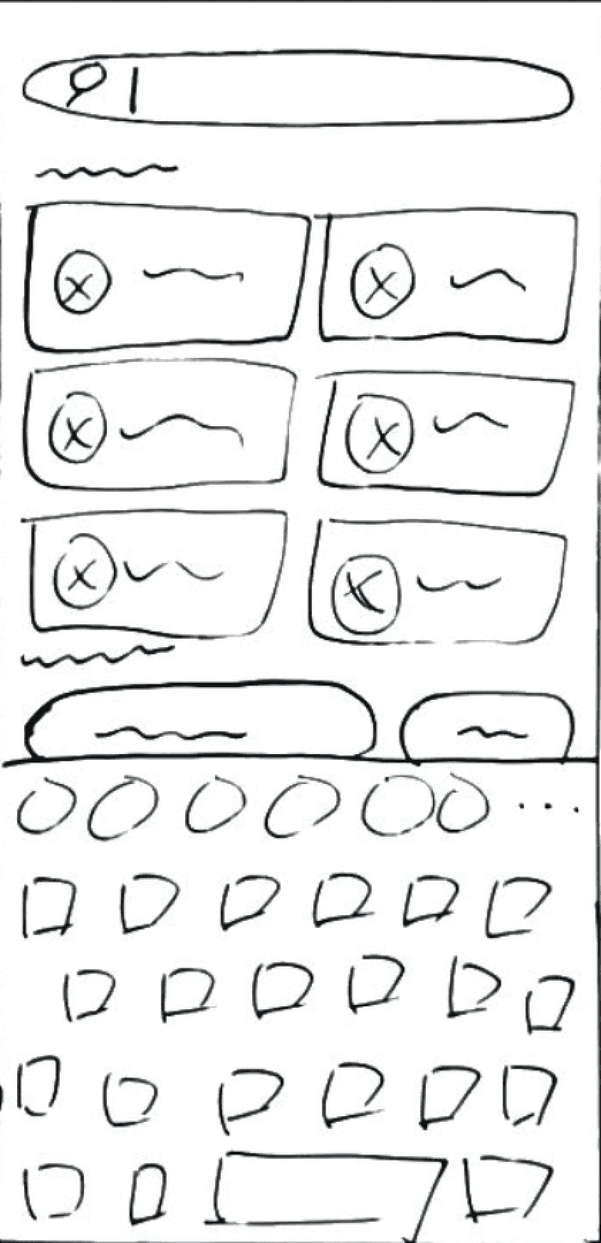
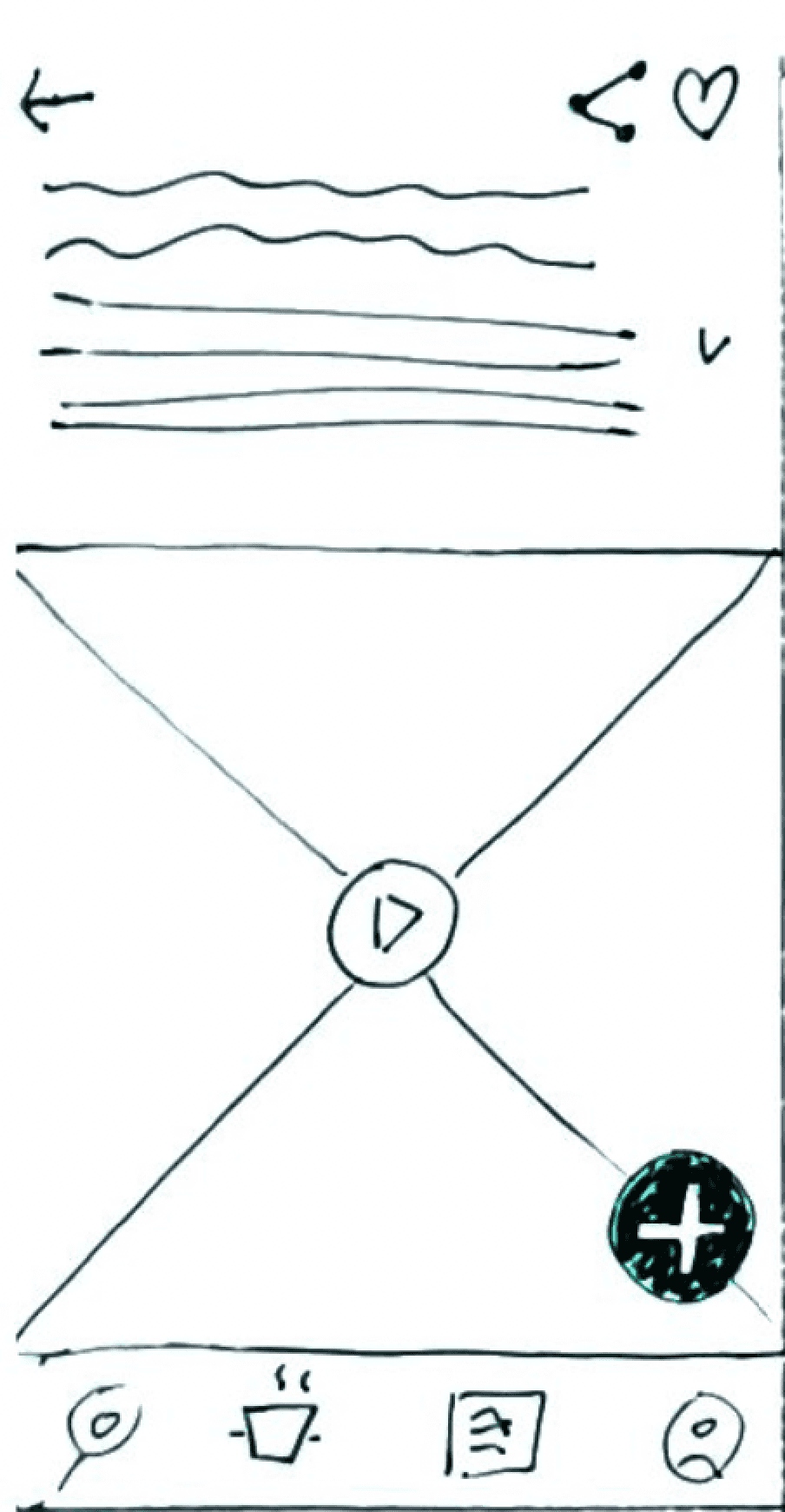
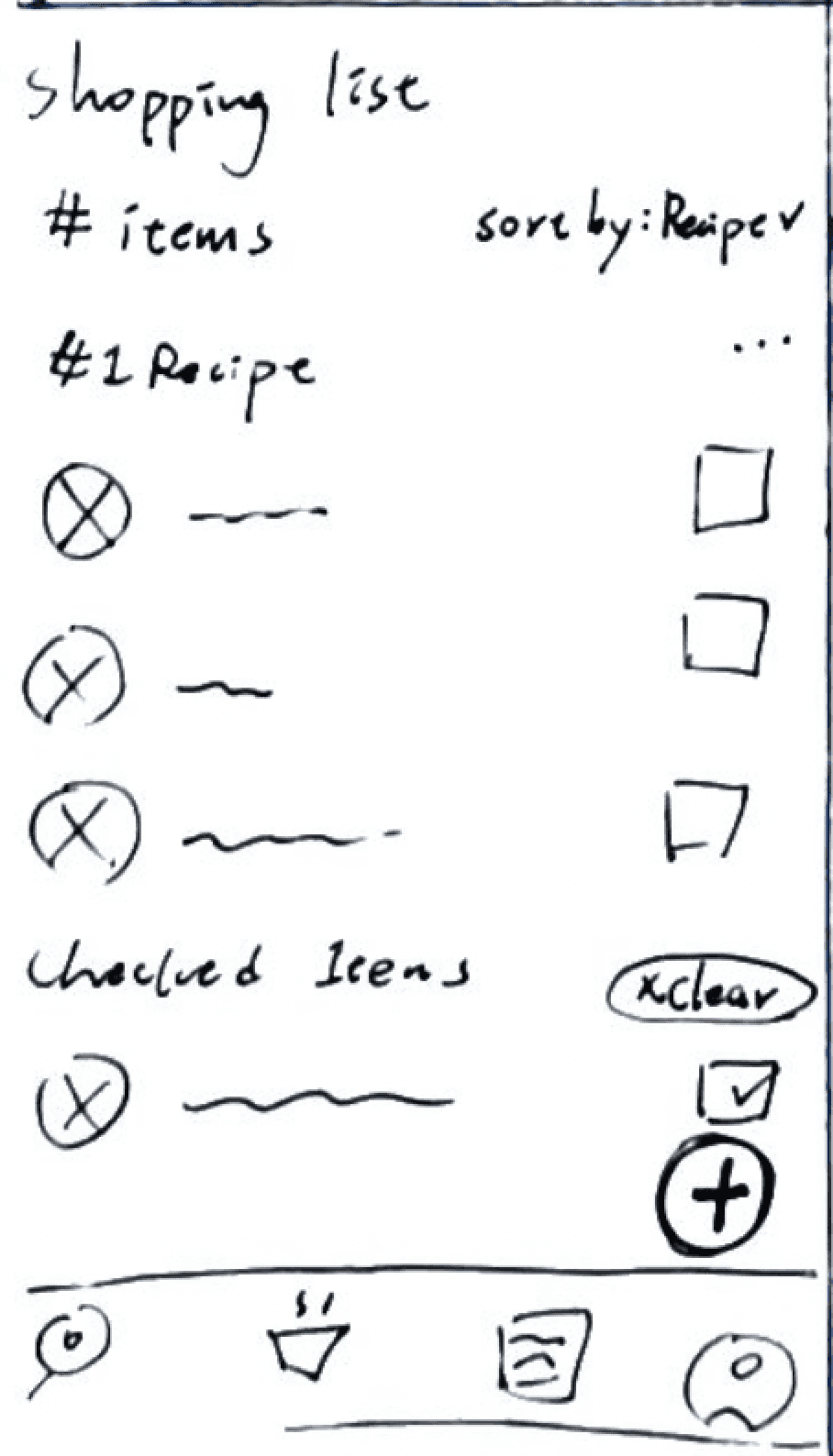
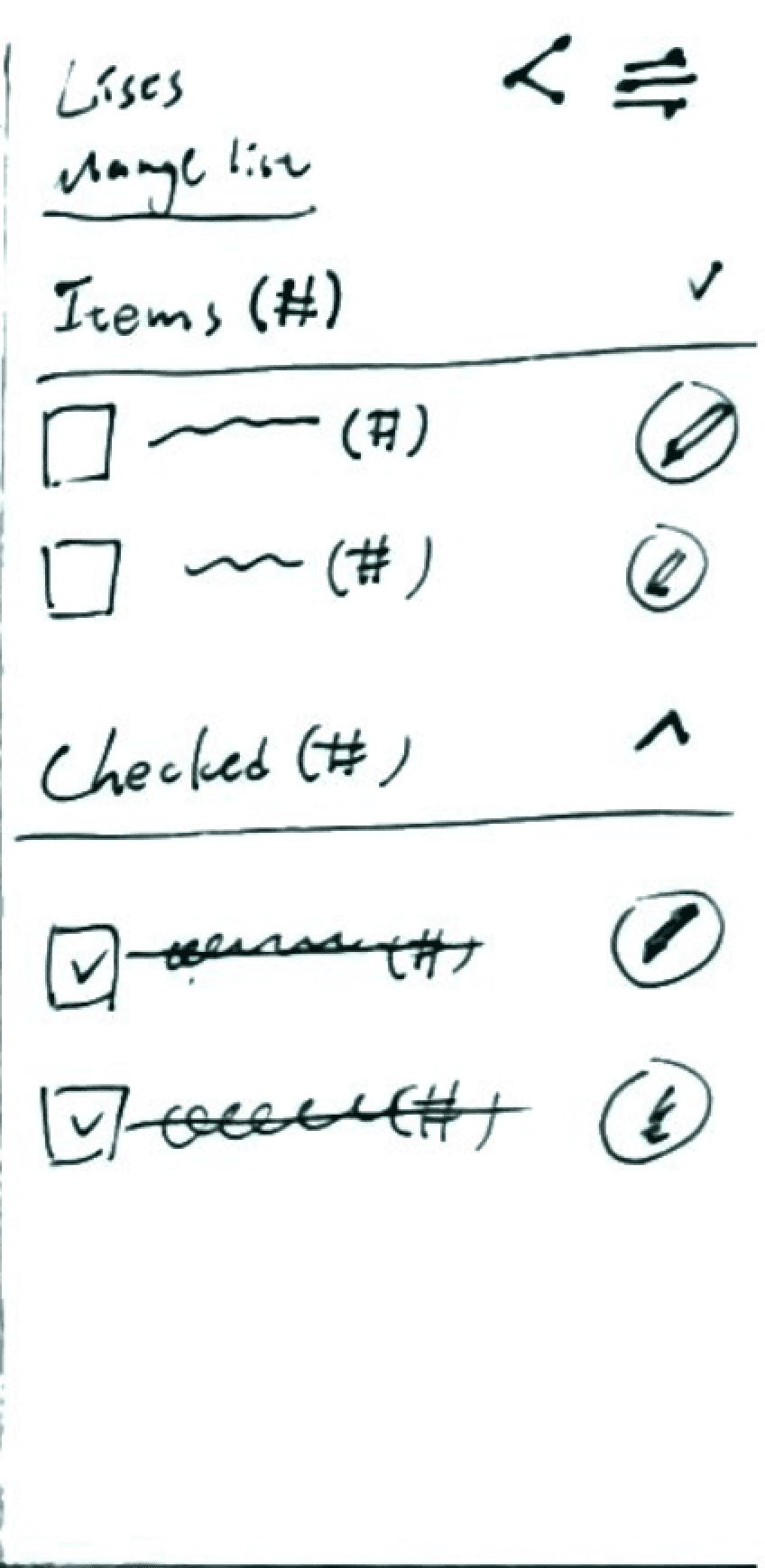
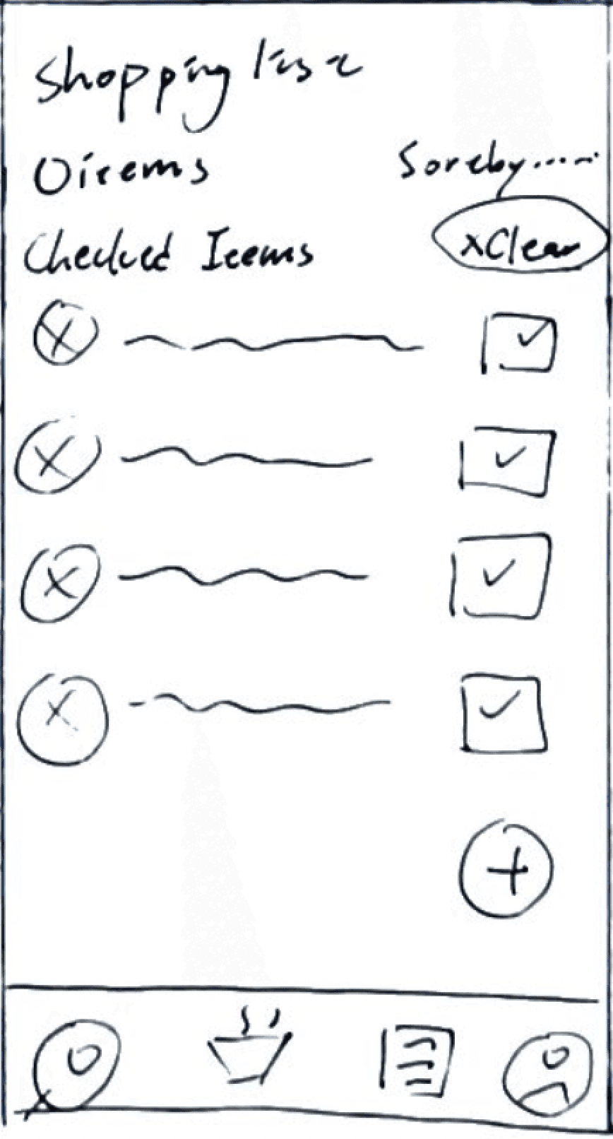
After organizing the research, I started sketching wireframes that proved instrumental in my design process, enabling me to swiftly explore diverse design possibilities and effortlessly fine-tune adjustments as needed.
3 major iterations
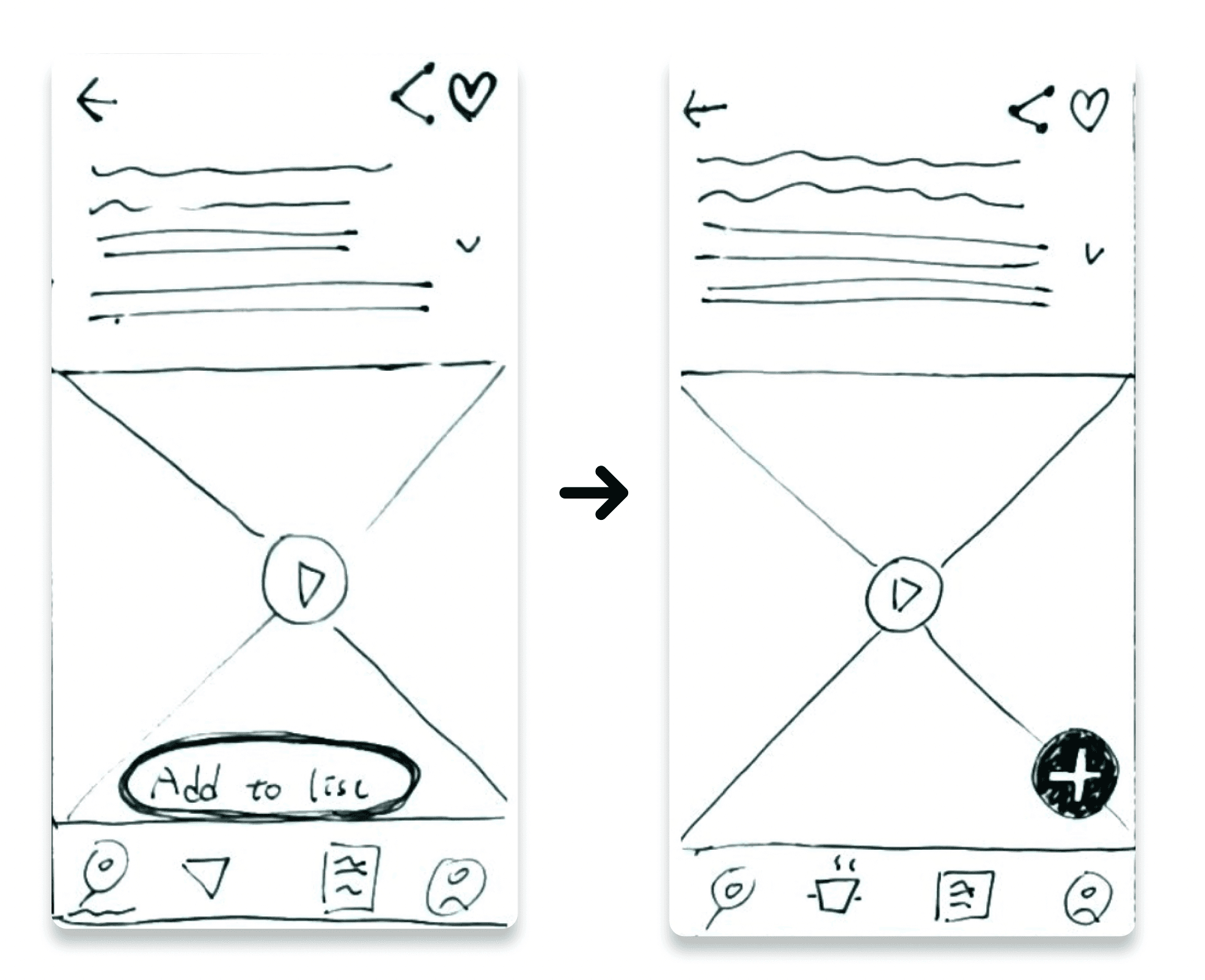
After testing the app with 5 users, I discovered three main issues with the design. First, it's more effective to use a fixed 'plus' button for adding items quickly. Second, people are more comfortable with the default sorting based on categories, mirroring grocery store habits. And third, I adjusted the placement of checked items to make it easier to double-check and reduce the annoyance of scrolling.
I put a 'fixed plus' button at the bottom right to make adding things to the list easy. It's there all the time, and it's better because it doesn't cover much of the screen. Also, it's in a spot that's easy to reach with your thumb. Unlike the old design with a big rectangle button that covered part of the recipe, making it hard for users to scroll and easy to accidentally tap the button.
The usability analysis showed that most people like having the default sorting of shopping lists based on categories. This aligns with users' habits at the grocery store, making it more convenient when checking items. In contrast, having a shopping list organized by recipes can be too messy and overwhelming for users, causing frustration.
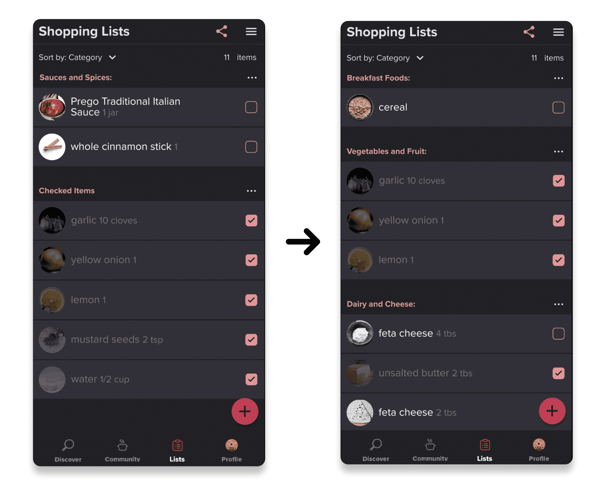
Keeping checked items in their place makes it easy for users to double-check and reduces irritation, especially when dealing with long or extensive lists that need a lot of scrolling. In contrast to the original left design, where checked items were grouped in one section, making it challenging for users to undo their selections, the updated design ensures a more user-friendly experience.
Design decisions
In the six design screens, I walked through the thinking behind each decision for the shopping list features. I focused on understanding what users need and how they use the app. The goal was to create a design that makes the shopping list features not just useful, but also easy to use. I wanted the experience to be smooth and satisfying for everyone using the app.
Prototyping video
In this prototype video, the shopping list feature presents users with a user-friendly tool for compiling and maintaining their shopping lists. Users can add, remove, and rearrange items effortlessly, tick off completed purchases, and maintain a well-organized and streamlined shopping experience.
(The Prototype of New Shopping List Feature)
Reflection and next steps
The design process was a rewarding journey that involved careful planning and thoughtful consideration. The ideation phase, where I generated ideas for new features, was particularly thrilling from a UX design standpoint. The process of organizing these features sparked even more ideas, and using wireframes played a crucial role in quickly shaping a clean and well-organized user flow.
Conducting usability testing was essential to ensure that each feature not only made sense but was also easy for users to navigate. Looking forward, I'm challenging myself to further enhance the user experience by adding an 'add to list' feature in the ingredient section, not just the recipe section. I believe users would find a personalized shopping list more useful based on their unique preferences in their daily lives. It's all about creating a design that not only looks good but also makes the user journey smoother and more enjoyable.
