Never Forget an Ingredient Again!
Easy Food Preparing with New Shopping List Feature
BACKGROUND
A Popular App for Quick and Easy Recipes
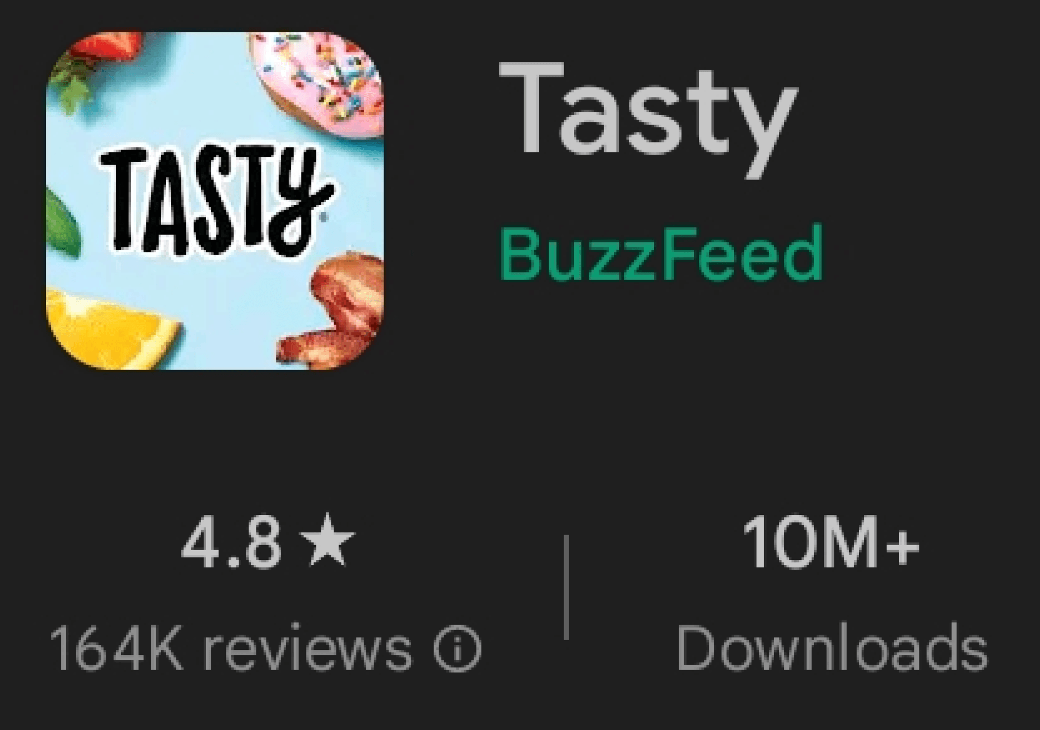
Tasty is a popular mobile app and website offering quick and easy recipes through engaging cooking videos. Launched in 2015 by BuzzFeed, the app has become a major player in the online food space, with millions of users across the world. Tasty has also expanded to include other cooking-related content, such as articles, quizzes, and collaborations with major brands.
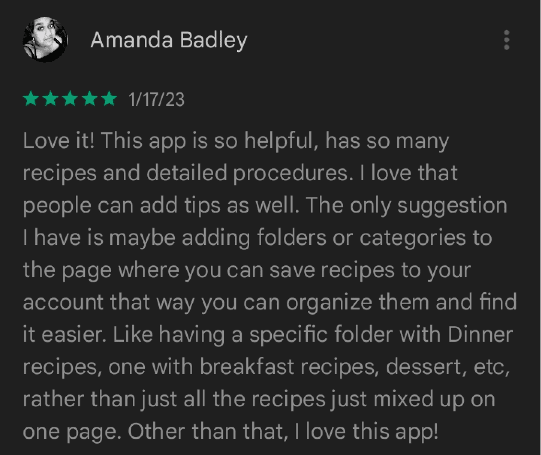
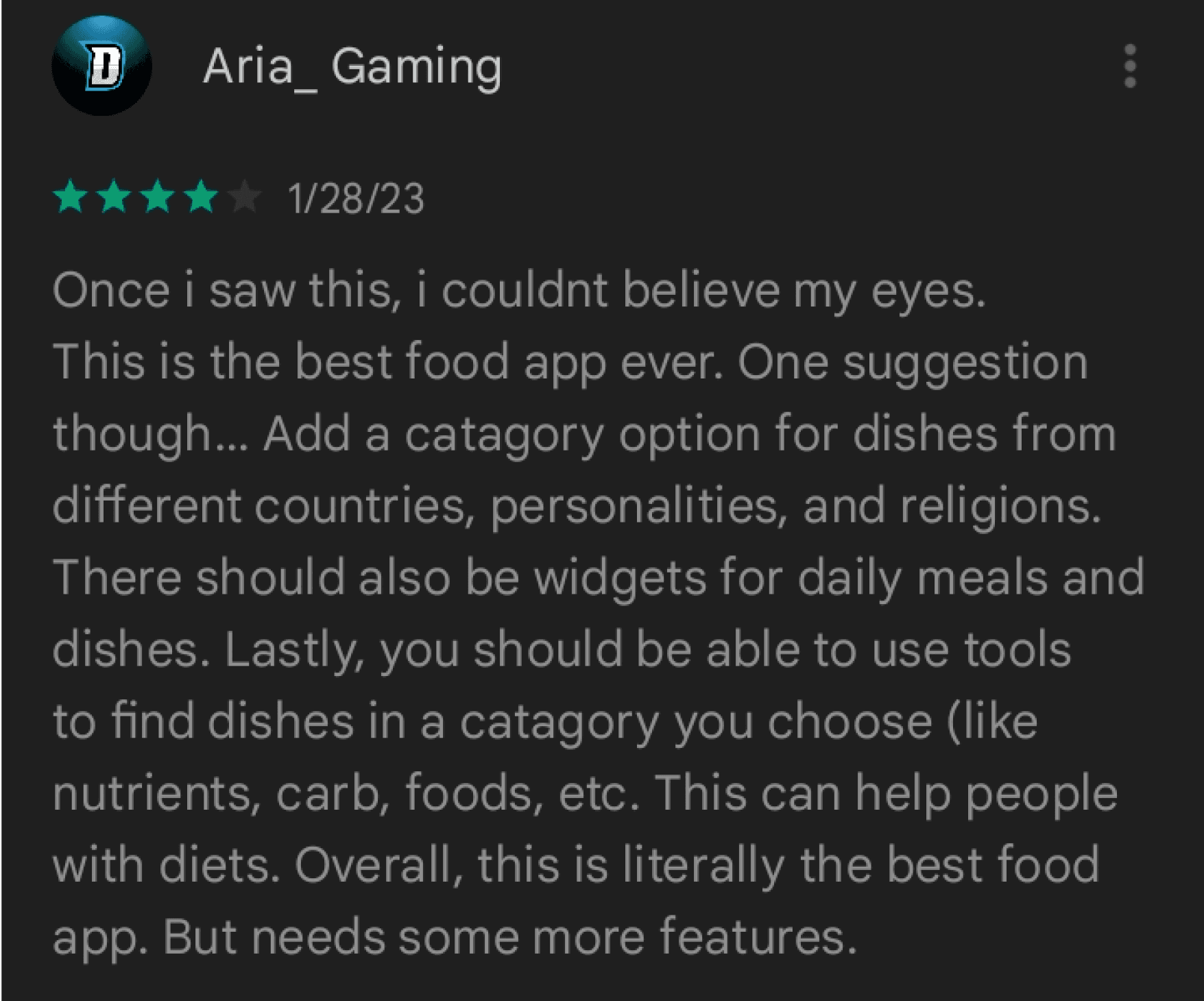
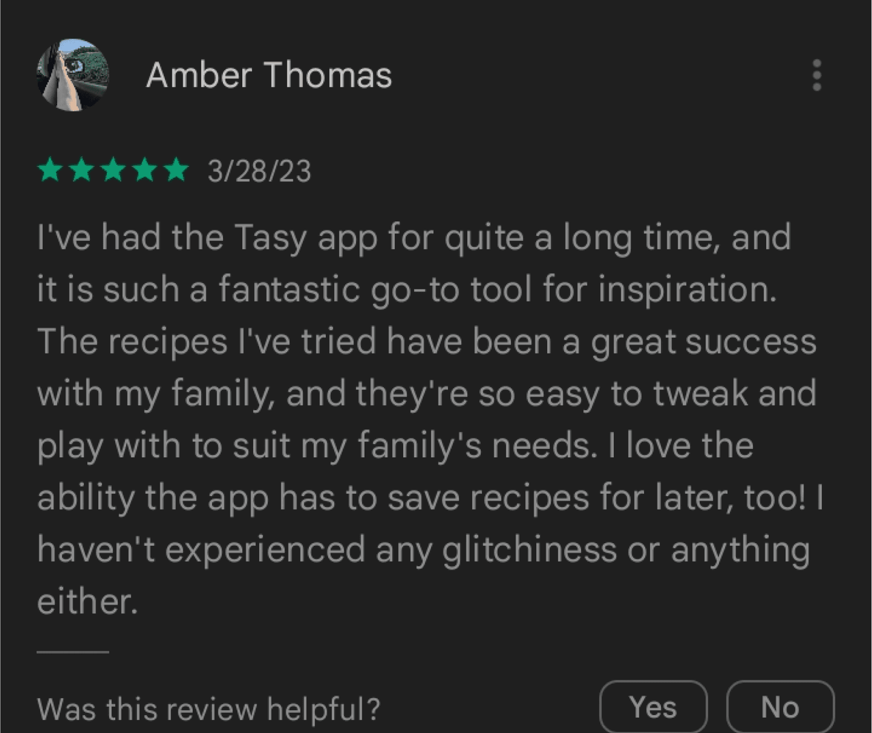
(The Review of Tasty APP)
PROBLEM
A Missing Shopping List Feature in Cooking Apps Can Cause User Frustration and Abandonment
While Tasty APP is a go-to for discovering new recipes and accessing easy-to-follow instructional videos, many users struggle with food preparation. One major obstacle is the task of creating a shopping list, which can be time-consuming and require organizational skills. This can discourage users from completing the food preparation process, leading to a less satisfying cooking experience.

SOLUTION
Streamlining Food Preparation with an Integrated Shopping List Feature
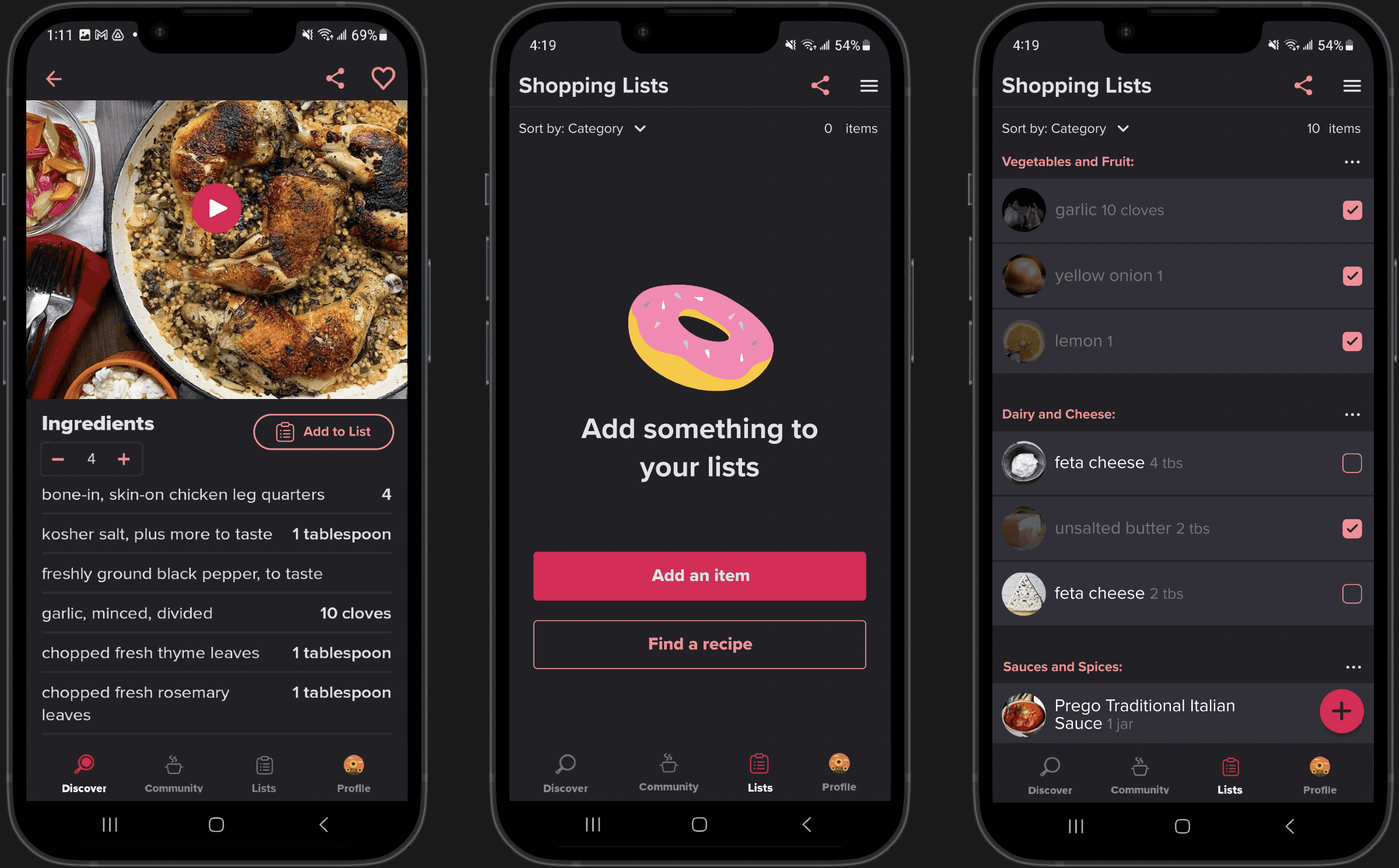
My proposed solution is to integrate a shopping list feature within the Tasty APP, which will help users organize their ingredients and streamline the food preparation process. The key functions of this feature include:
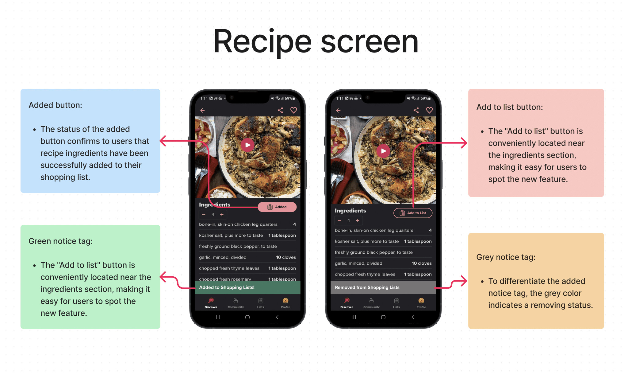
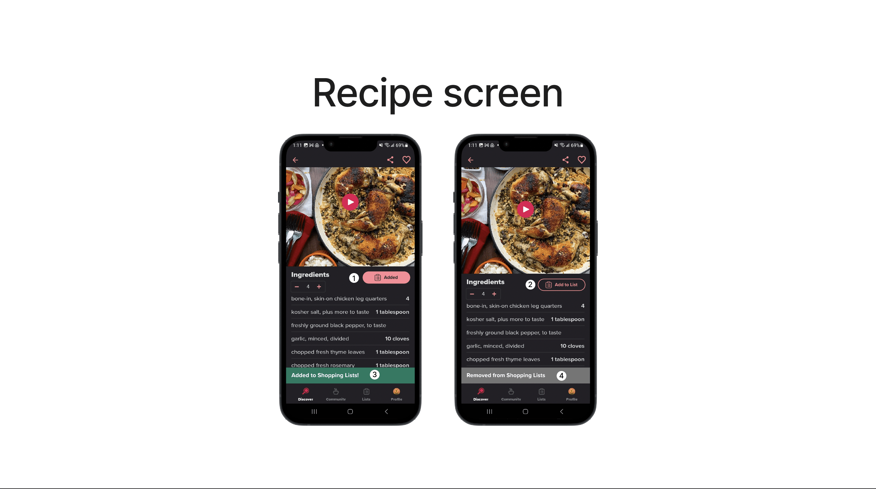
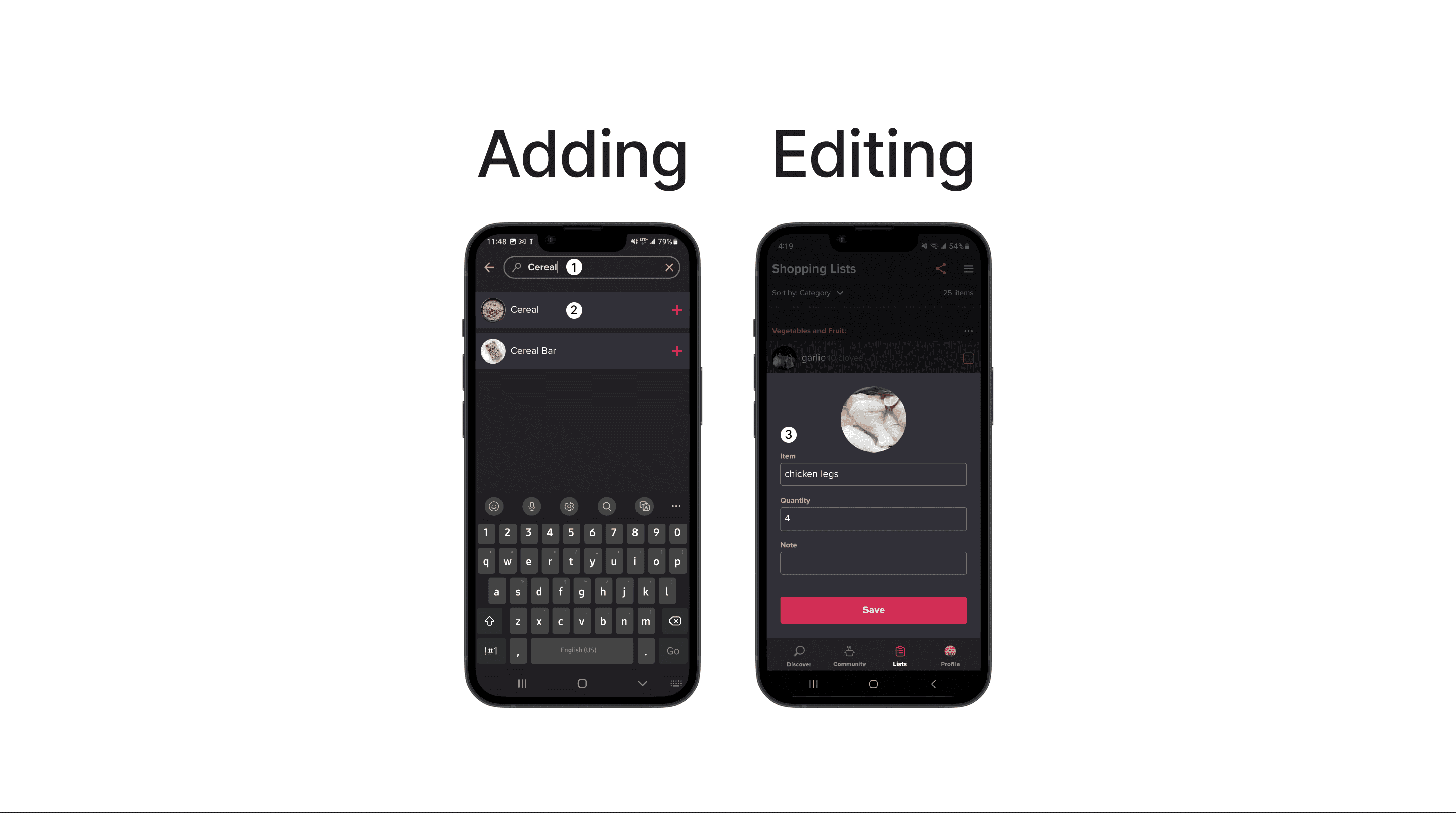
Adding recipe ingredients directly to the shopping list
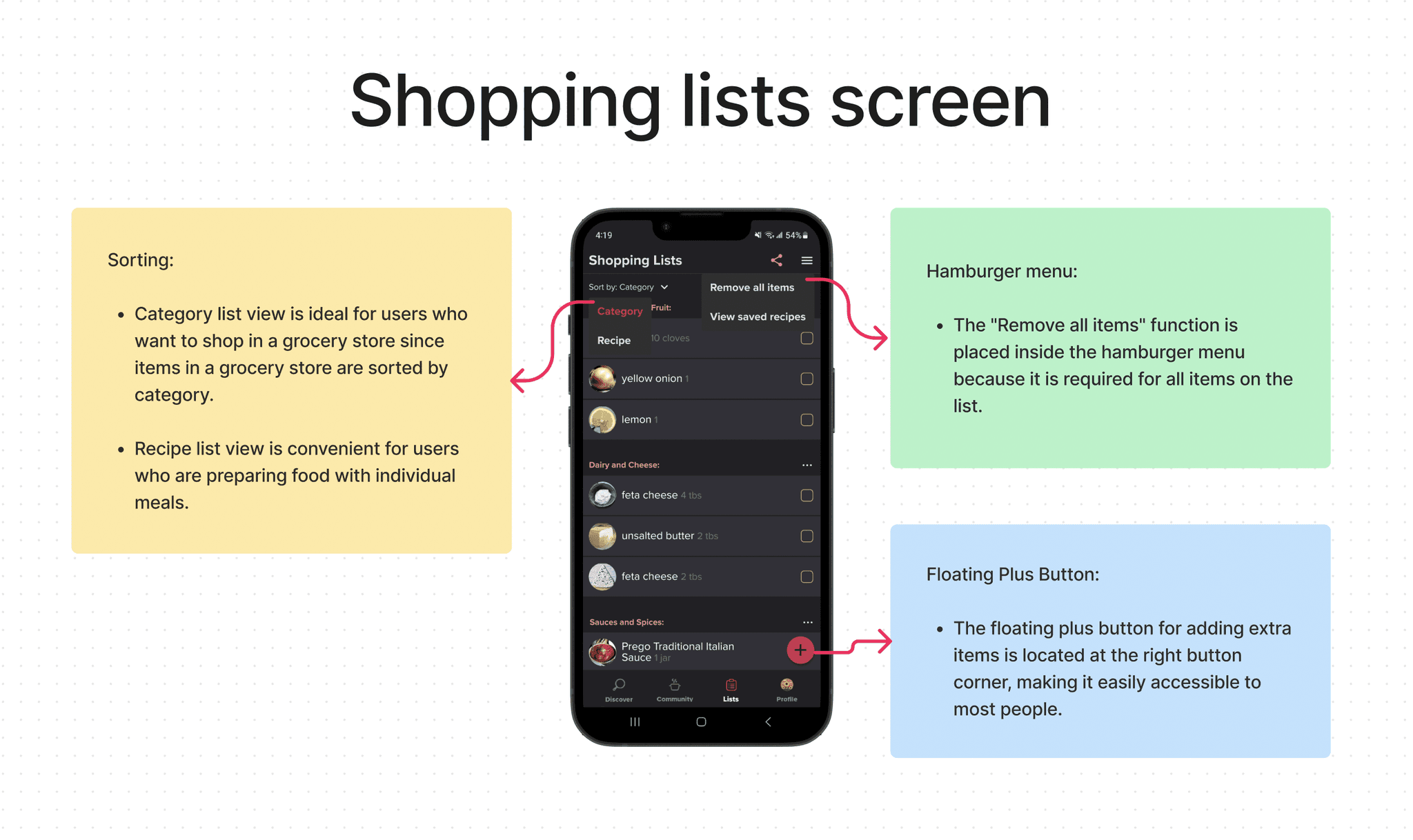
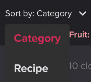
Sorting the list by category or recipe
Easy viewing of unchecked and checked items
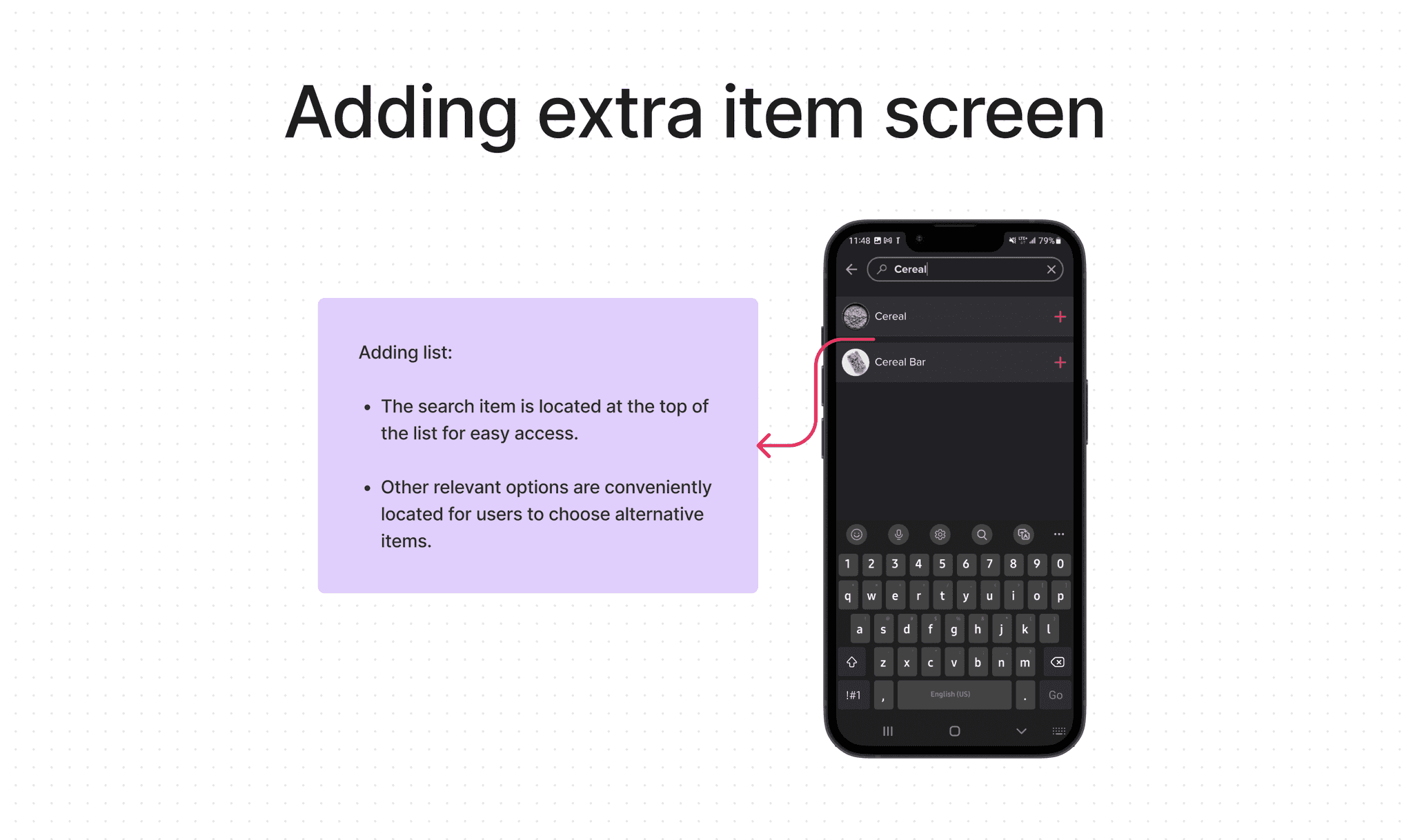
Adding extra items to the list
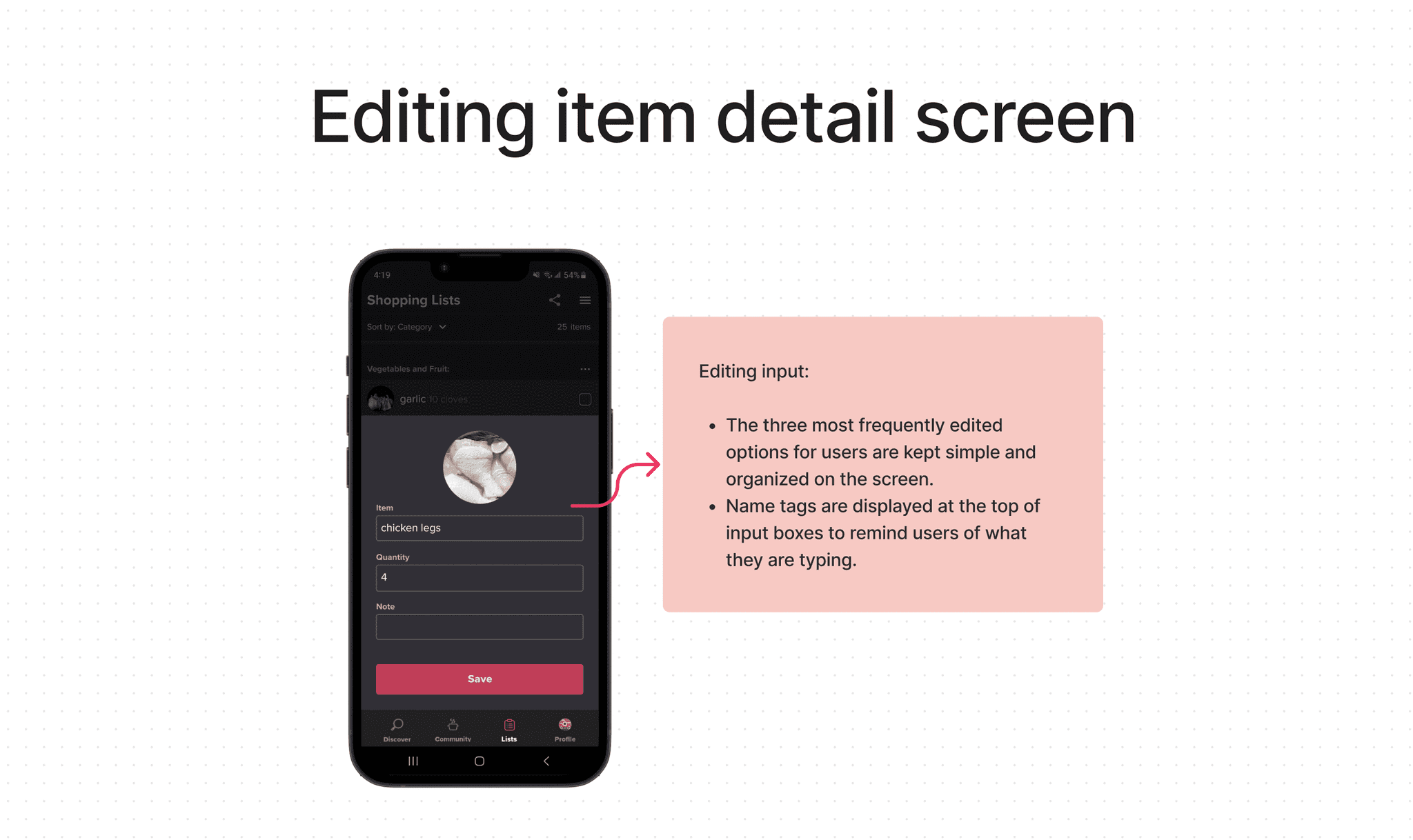
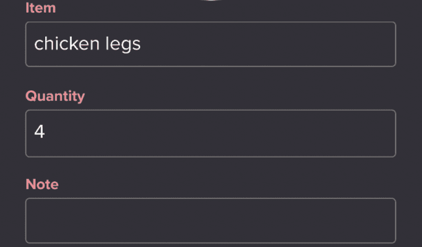
Editing item details
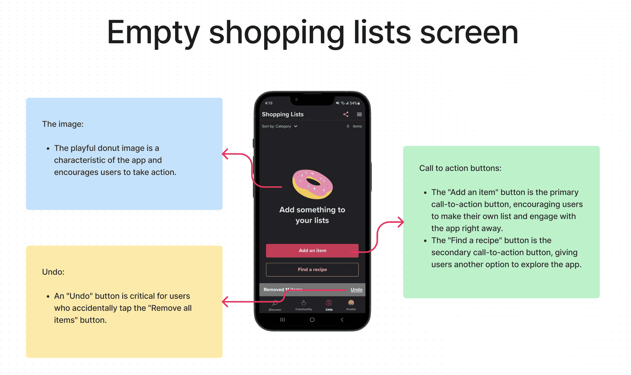
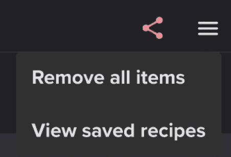
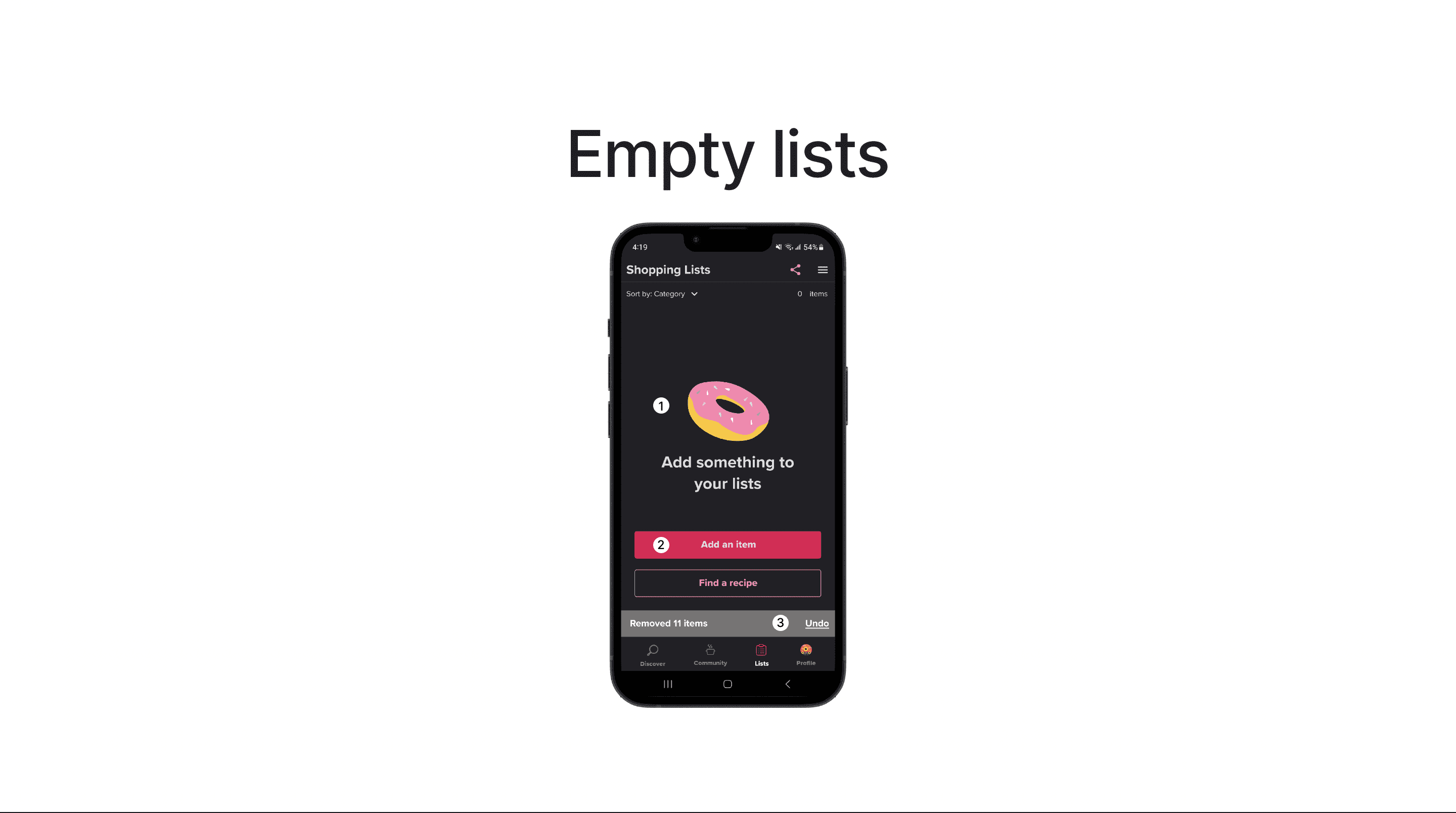
Removing all items with a single action
Undoing any accidental removal of items
COMPETITIVE ANALYSIS
Shopping List Feature Analyzation: Whisk vs. Tom Thumb Deals & Delivery Grocery Apps
Offering diverse and intuitive sorting options is able to enabling using experience and find information efficiently.
A checkbox with an item image helps users simplifies the selection process and improves efficiency.
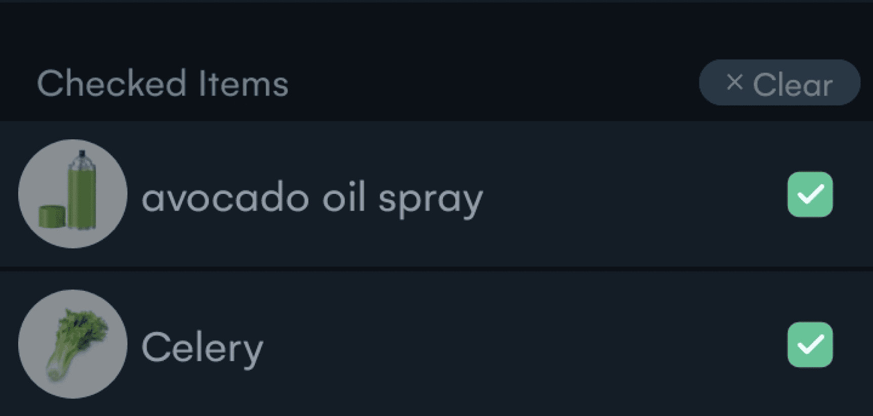
Darken checked item with checked mark presents the visual hierarchy and organizes the list.
A search bar on top with a plus icon helps users clarify the purpose of the function.
The undo button is important for users to reverse mistakes and prevent frustration.
The CTA button on the empty list is a good way to lead users to keep staying and using the APP.
IDEATION
Comprehensive Functionality for Home Page, Recipe Page, and Shopping List Page
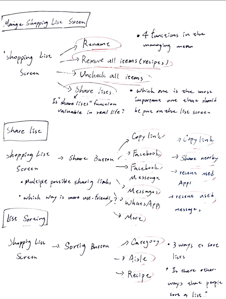
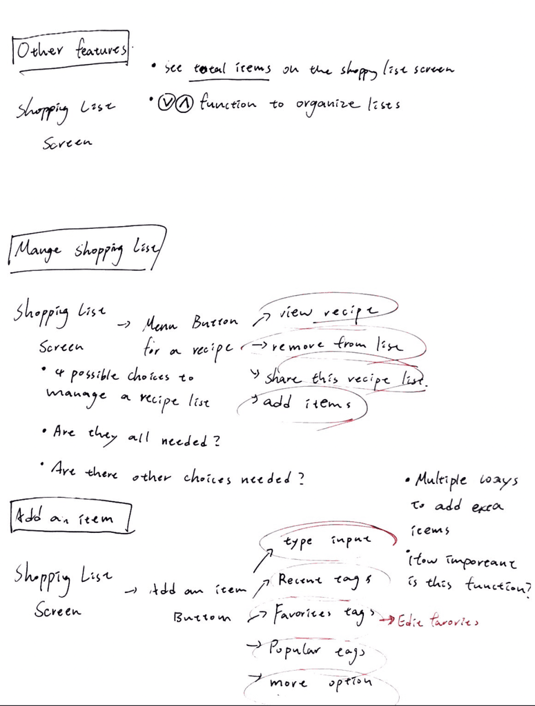
By listing out all the possible functionalities, I gain a clear understanding of the potential features that can be incorporated into each page. This helps in shaping a more well-defined and visionary product.
(The List of Functionality)
MOSCOW METHOD
Prioritize the Functions of the List Feature
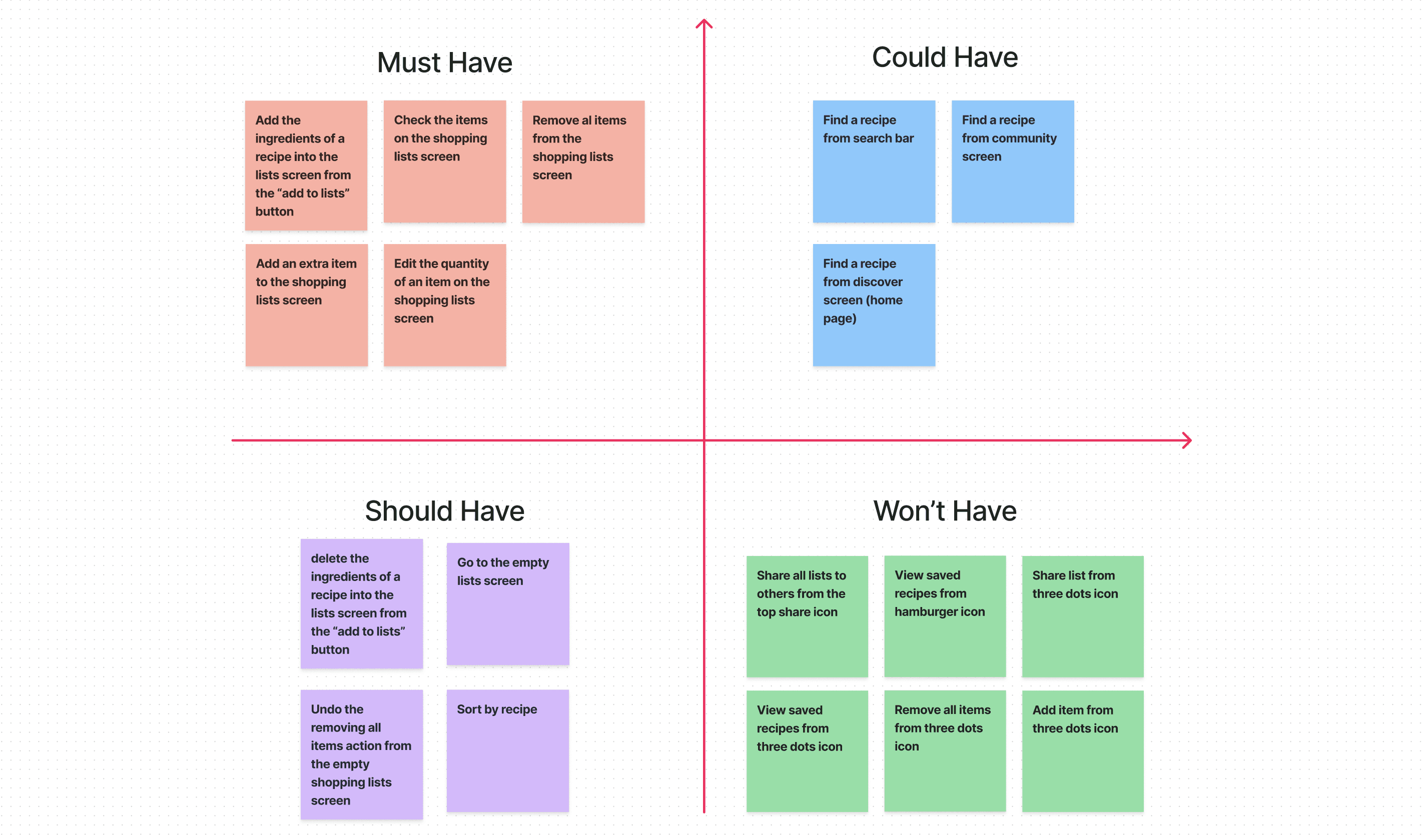
(The MOSCOW)
LOW FIDELITY WIREFRAME
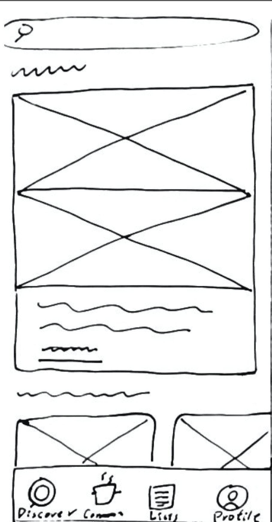
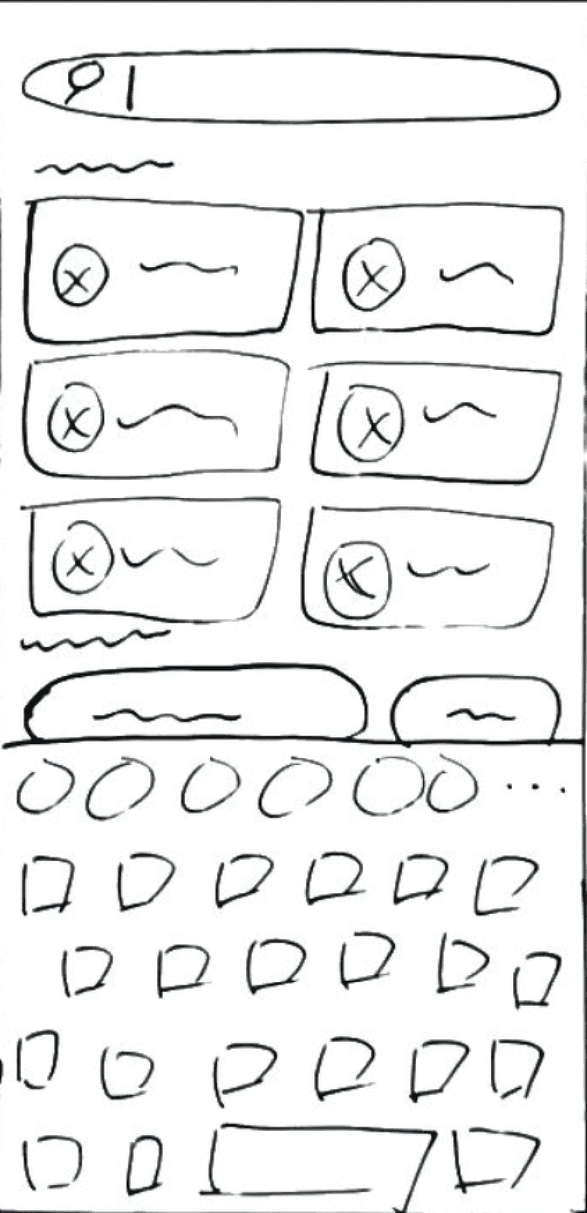
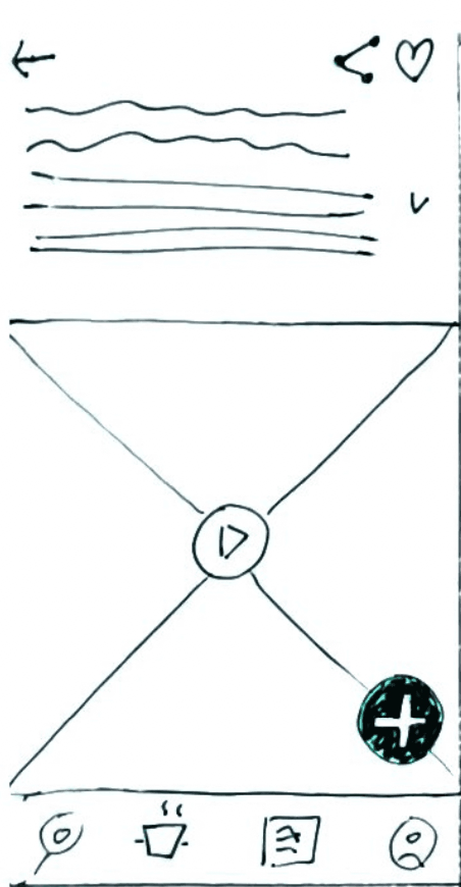
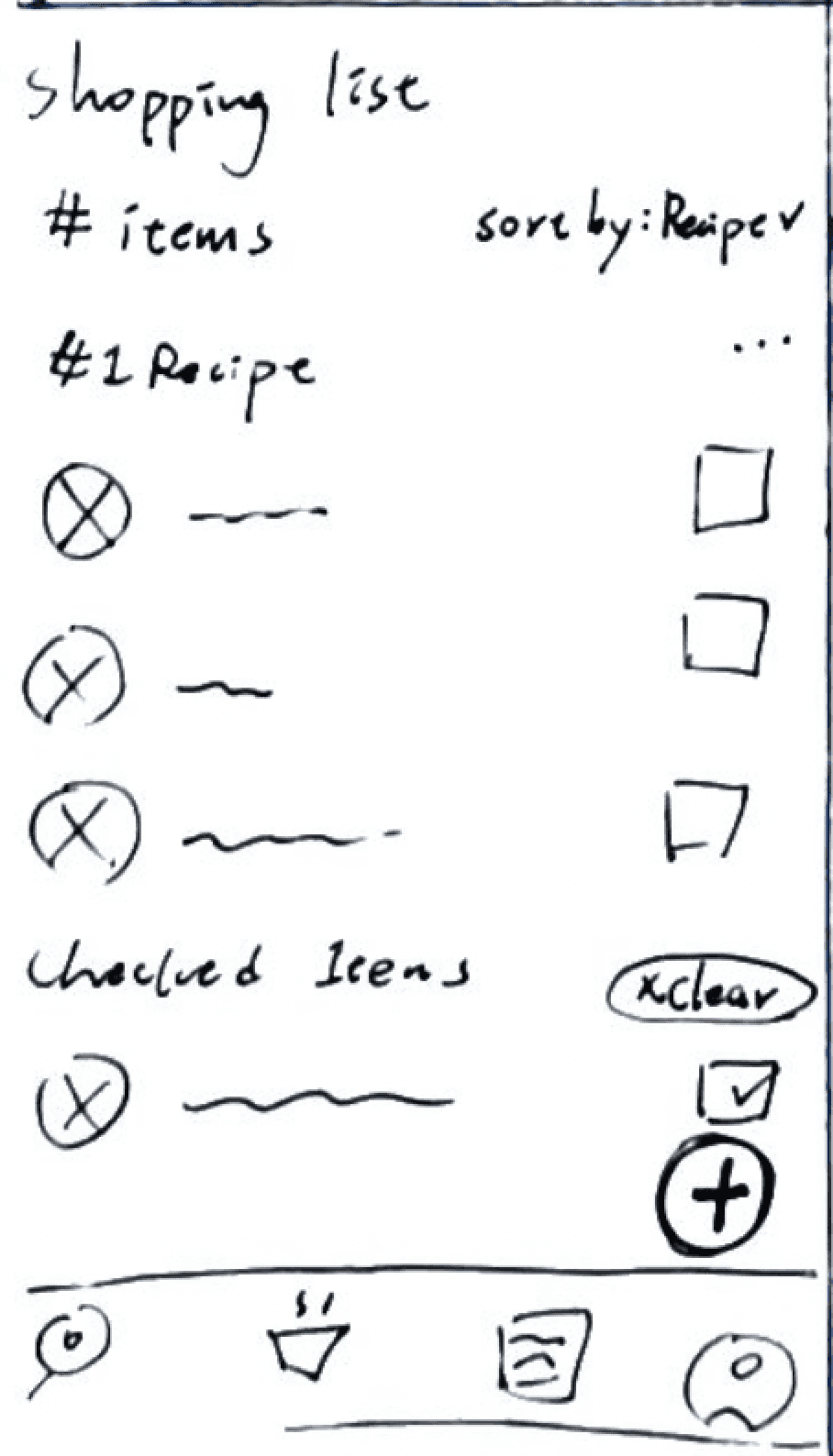
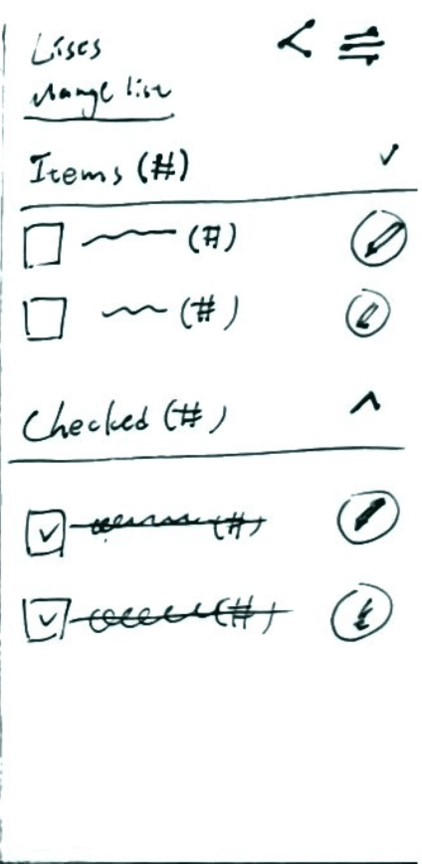
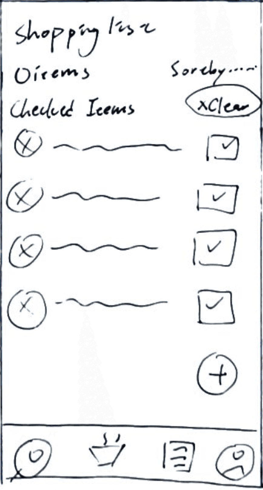
Low-Fidelity Wireframe Demonstrating Tasty APP and Shopping List Integration
Sketching wireframes proved instrumental in my design process, enabling me to swiftly explore diverse design possibilities and effortlessly fine-tune adjustments as needed.
USER FLOW
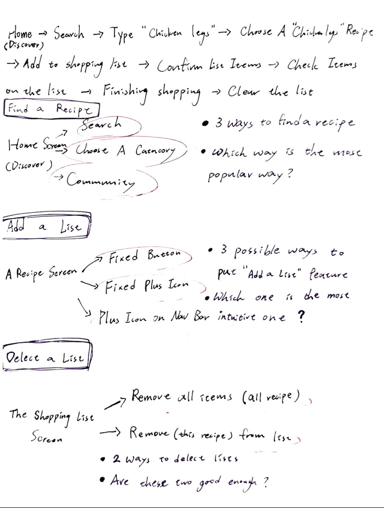
Five Main User Flows of the List Feature
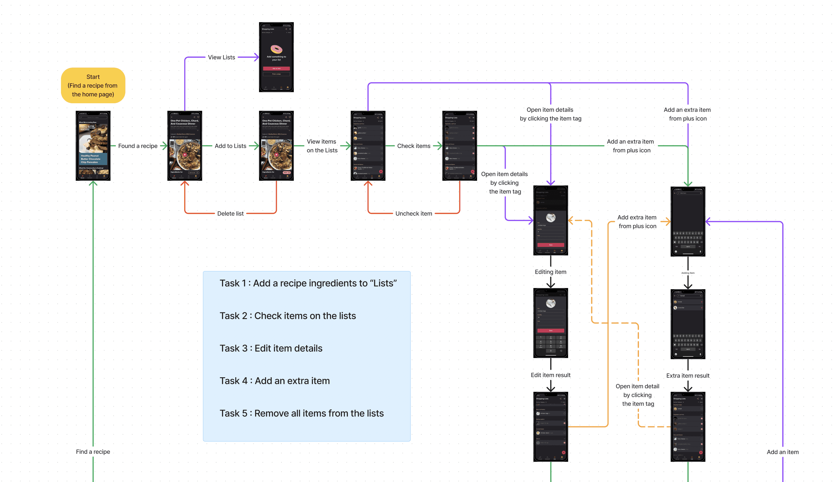
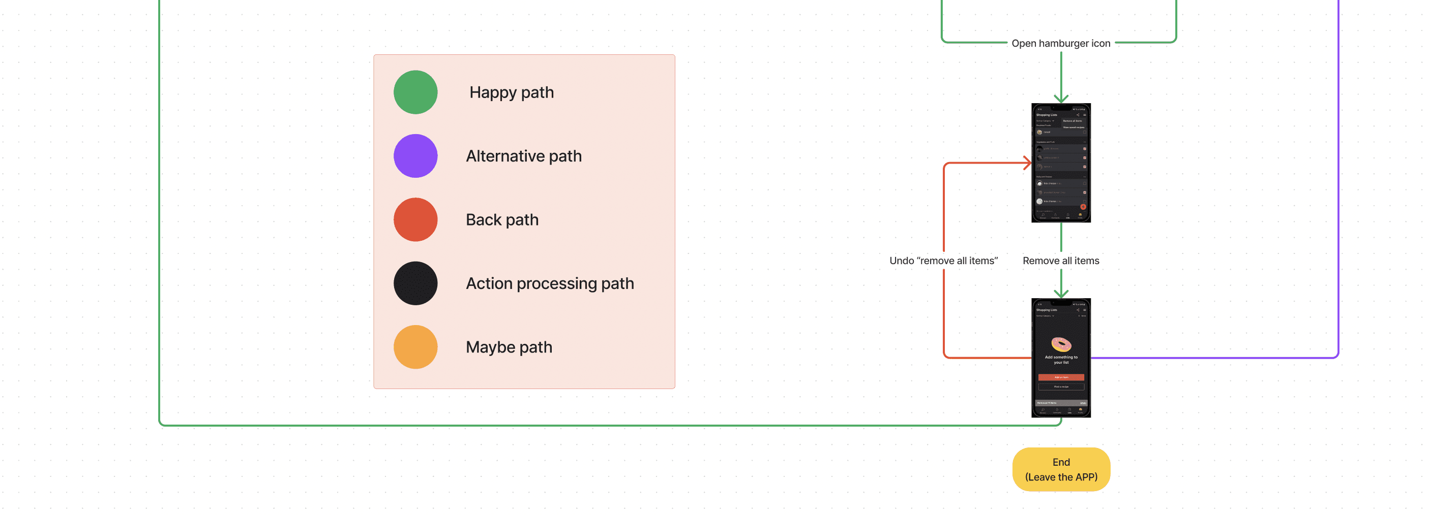
(The User Flow)
TESTING & IMPROVEMENTS
3 Major Iterations
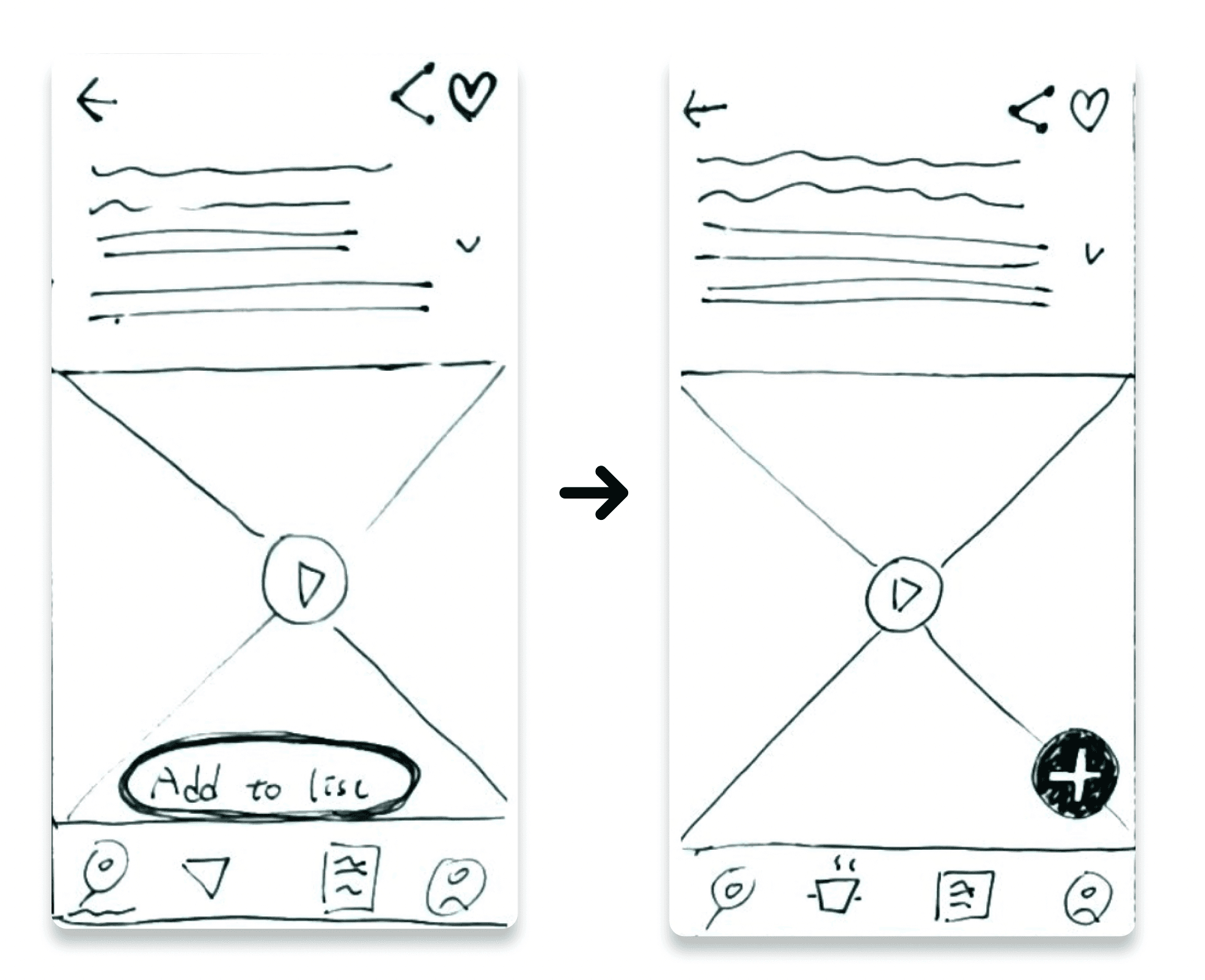
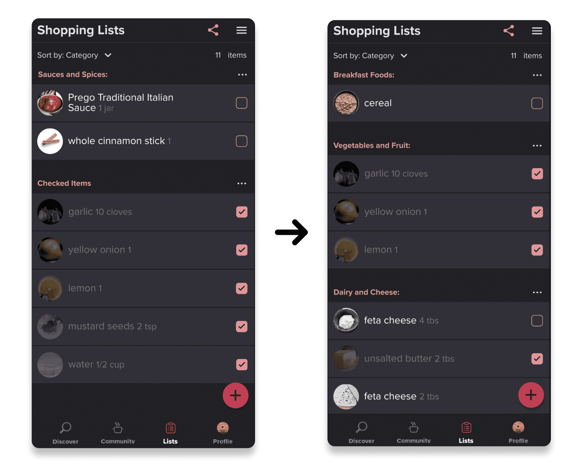
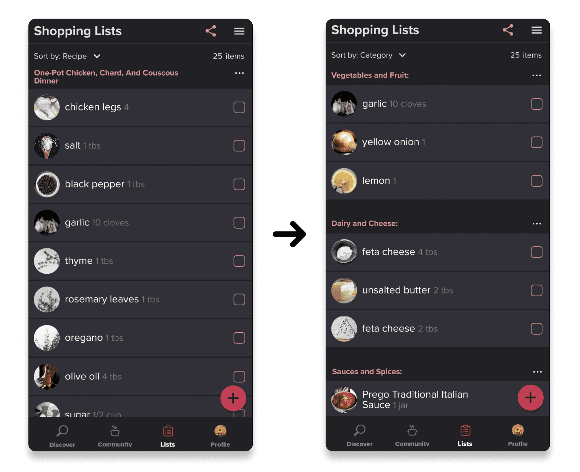
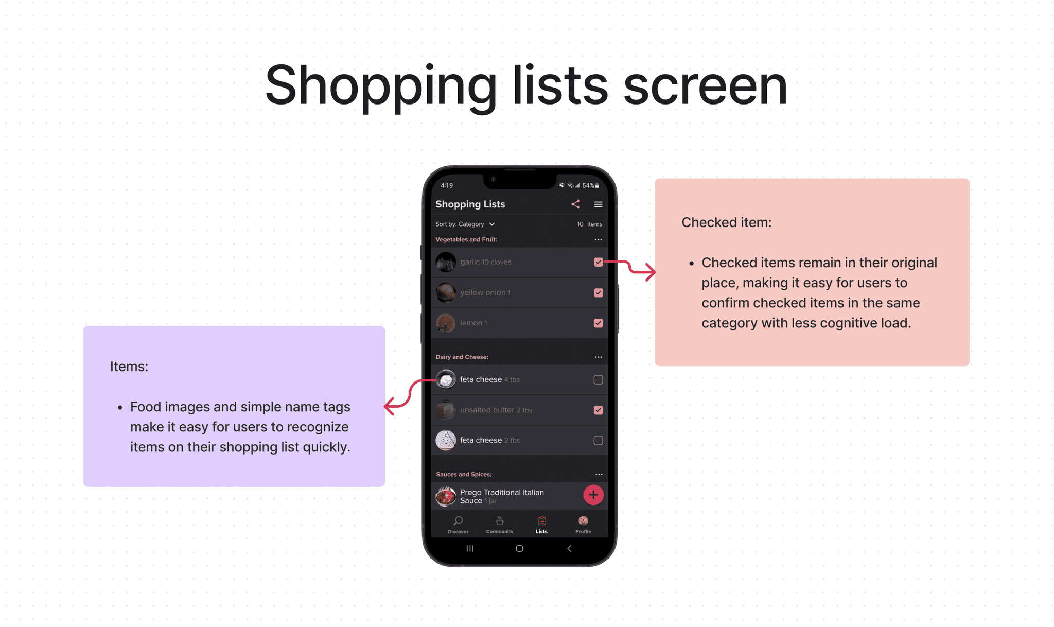
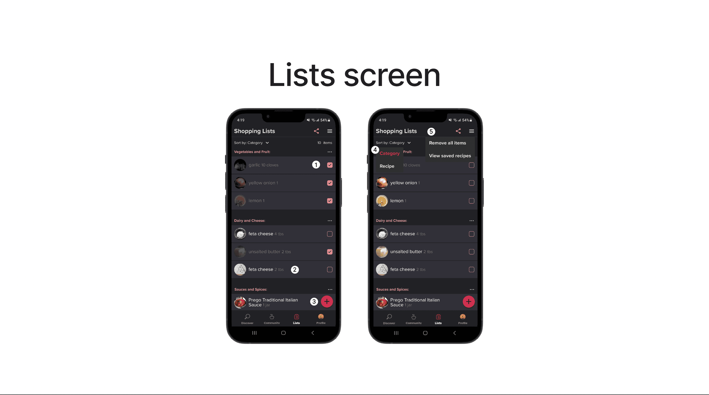
Implemented a fixed plus button for efficient list additions, defaulted to category-based sorting for familiar grocery store habits, and optimized checked item positioning to ease double-checking and minimize scrolling irritation.
Efficient 'Add to List' Functionality
I've placed a fixed plus button at the right bottom corner for convenient and easily accessible list additions, considering that it covers less screen content and is more thumb-friendly for users.
Default Category-Based Sorting
I've made category-based sorting the default for shopping lists to align with users' grocery store habits, providing greater convenience during item checks.
Optimizing Checked Item Position
Maintaining checked items' position ensures easy double-checking and reduces user irritation, especially with long or extensive lists that require frequent scrolling.
DESIGN DECISION
Design Thinking Perspectives on Adding, Checking, Sorting, Editing, and Removing Items
THE DESIGN
Check Out the New Shopping List Feature on Prototype Video/Figma File
(The Prototype of New Shopping List Feature)
THE CONCLUSION
Reflection and Plans for Continual Improvement
I was pleasantly surprised to discover that the Tasty APP offers different interfaces for iPhone and Android. While I initially expected all the features to be available in the downloaded app, I later realized that the Android version did not include the shopping list feature, unlike its iPhone counterpart. This experience served as a valuable lesson, highlighting the significance of conducting thorough research on a company and its products before embarking on app design.
In addition to exploring the app itself, I now understand the importance of considering other factors such as the company website and user reviews. Adopting a more comprehensive approach enables me to ensure that my designs are user-friendly and cater to the needs of all users across various devices and platforms.
Throughout this project, I learned that even a small addition of a new feature can open up numerous opportunities for additional functions. However, the ideation phase can sometimes feel overwhelming, resembling a tangled ball of yarn with user and task flows. To address this challenge, I discovered the MoSCoW Method, which proved to be immensely valuable in organizing my thoughts and prioritizing tasks.
By focusing on the "must-have" functions, I effectively allocated my time and resources, avoiding distractions from lower-priority features. Going forward, I intend to continue utilizing the MoSCoW Method in my future design projects, especially when dealing with multiple flows. This approach has streamlined my design process and optimized my output. Ultimately, by staying focused on the most important tasks, I can create more efficient and user-friendly designs that fulfill the needs of both my clients and end-users.
