01. Background
Problem
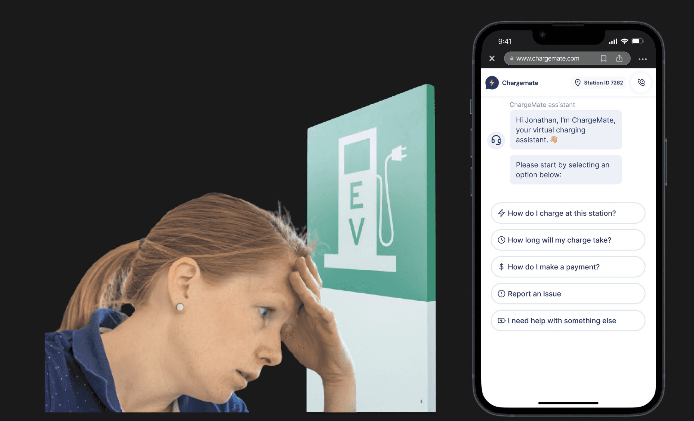
Each charging network has its methods for initiating a charge, causing confusion. Drivers often don't know what went wrong because apps or charging stations don't provide specific error messages.
Solution
Create an AI chatbot assistant ready to help solve any charging problems. This quick and easy process reduces wait times and frustration, providing EV drivers with a seamless and efficient charging experience.
02. Research & Emphasize
User Interview
I interviewed the stakeholders and the developer to review the original design. From these discussions, I understood the project's MVP (Minimal Viable Product). Using this understanding, I conducted competitor research on similar products.
The MVP
Redesign the user interface to be more modern and user-friendly.
Provide intuitive methods for users to identify and solve charging problems quickly.
Include features to save user data and feedback for continuous improvement.
03. Discovers & Design
Discover 01
Efficient Onboarding & Immediate Support
To minimize user stress, our onboarding process is designed to be direct and concise, enabling users to quickly achieve their goals. We also provide immediate access to critical information and support options, empowering users to resolve issues in their preferred manner.
Design 01
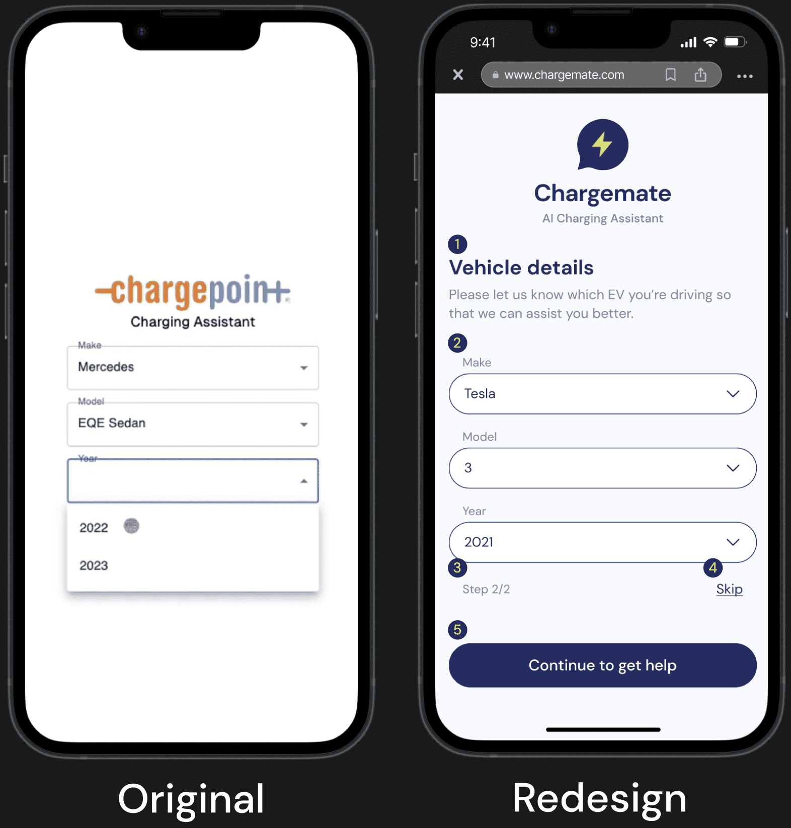
Enhance Onboarding Experience
Clear Navigation: Use straightforward headings and help text to guide users smoothly through the screen.
Readable Layout: Ensure ample space between sections to enhance readability and scanning.
Page Indicators: Display page numbers to inform users of the process length and motivate them to complete it quickly.
User Empowerment: Allow users to determine if the onboarding steps address their specific problems.
Descriptive CTA Buttons:Provide clear text on CTA buttons, so users understand the outcome of their actions.
Discover 02
Optimize User Interaction & Streamline Communication
Think ahead for the most common charging problems users might encounter. Rather than having users type out potential issues, provide suggested options for them to choose from. This saves users time and simplifies the problem-solving process.
Design 02
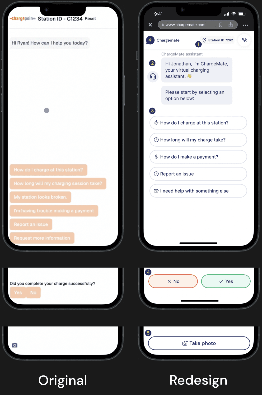
Elevate the Chatting Experience
Highlight Customer Service: Place station ID and phone service at the top with icons for quick access to essential functions.
Humanize Greetings: Use friendly greetings and direct users to identify issues through categorized FAQs.
Organize FAQs by Priority: Prioritize FAQs from top to bottom and use icons for easy scanning and navigation.
Clear Yes/No Options: Design distinct yes/no buttons to avoid confusion and improve user decisions.
Prominent Photo Upload Button: Use a large, clear button for photo uploads to indicate action and enhance accessibility.
Discover 03
Collect User Feedback
User feedback guides iterative UX/UI design to ensure interfaces are intuitive, functional, and meet user expectations, promoting continuous improvement for a user-friendly experience.
Design 03
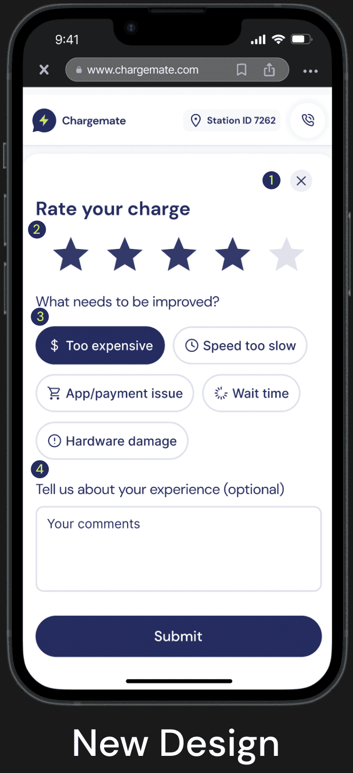
User-Driven Feedback Screen
Empower User Choice: Implement an optional feedback screen where users can choose whether to leave feedback.
Simplify Feedback with Rating Stars:Use rating stars as a straightforward and common method for users to provide feedback quickly and effortlessly.
Efficient Reason Selection: Enable users to select specific reasons by tapping buttons, reducing cognitive load and saving time.
Optional Detailed Input:
Offer users the option to provide additional details to further enhance the product, ensuring feedback is comprehensive but not mandatory.
04. Usability Test
Test Questions
I conducted a usability test and prioritized seven key questions to evaluate where the ChargeMate design meets and falls short of user needs for an EV virtual assistant.
05. Design System
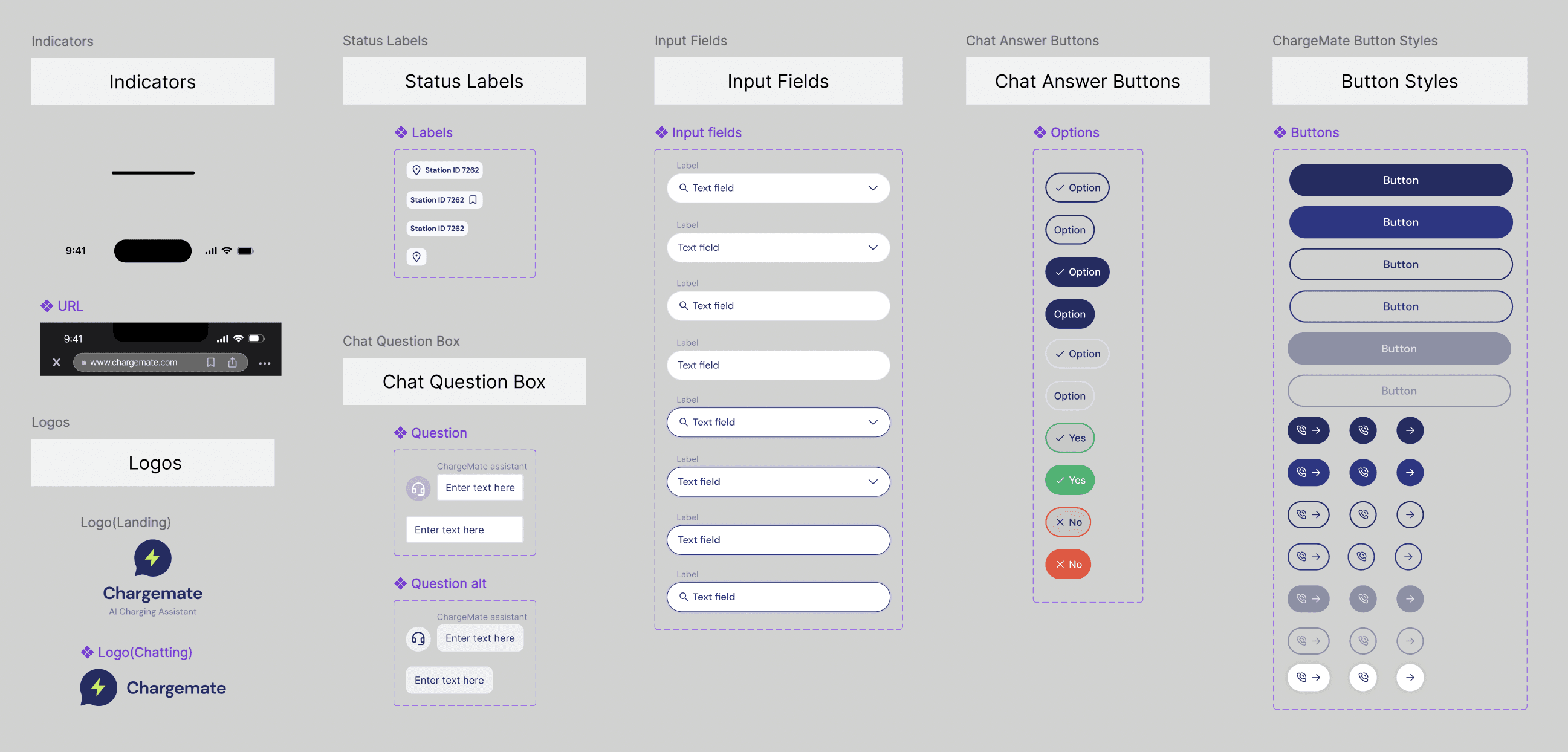
Component Organization
Creating and organizing components as I designed the chatbot was essential for gaining an overview of its elements and ensuring adherence to the design system. This approach facilitated a clear understanding of how each component fits into the user interface (UI) and user experience (UX).
06. Prototype
User Journey for EV Charging Station Chatbot:
Scan QR Code:
The user scans a QR code sticker at the charging station.
Information Collection:
Step 1: The user is prompted to provide contact information (optional).
Step 2: The user is prompted to provide vehicle details (optional).
Chatbot Interaction:
The chatbot initiates interaction, guiding the user through various options.
The user can interact by selecting options and providing photos as needed.
Feedback:
At the end of the interaction, the user is presented with a screen to leave feedback about their experience.
07. Reflection & Next Steps
Communication
User Feedback
Engaging with stakeholders, designers, developers, and users has been crucial in refining the design to meet users' needs, company requirements, and developers' vision. User feedback highlighted pain points, while stakeholder input ensured business objectives were met. Collaborating with developers confirmed technical feasibility. This iterative process led to a more intuitive and user-friendly design.
Despite the limited number of participants in our usability testing, their feedback proved invaluable in identifying and addressing significant design confusion. This feedback guided meaningful improvements to our user interface, enhancing its intuitiveness and user-friendliness. Moving forward, I advocate for ongoing feedback collection to gather diverse perspectives and further refine our design to better meet user needs and expectations.

