01. Motivation
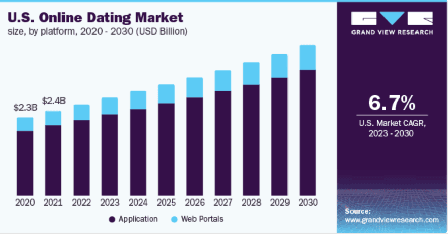
Statista predicts 441 million global users and $8.7 billion in revenue in the online dating market by the end of 2023.
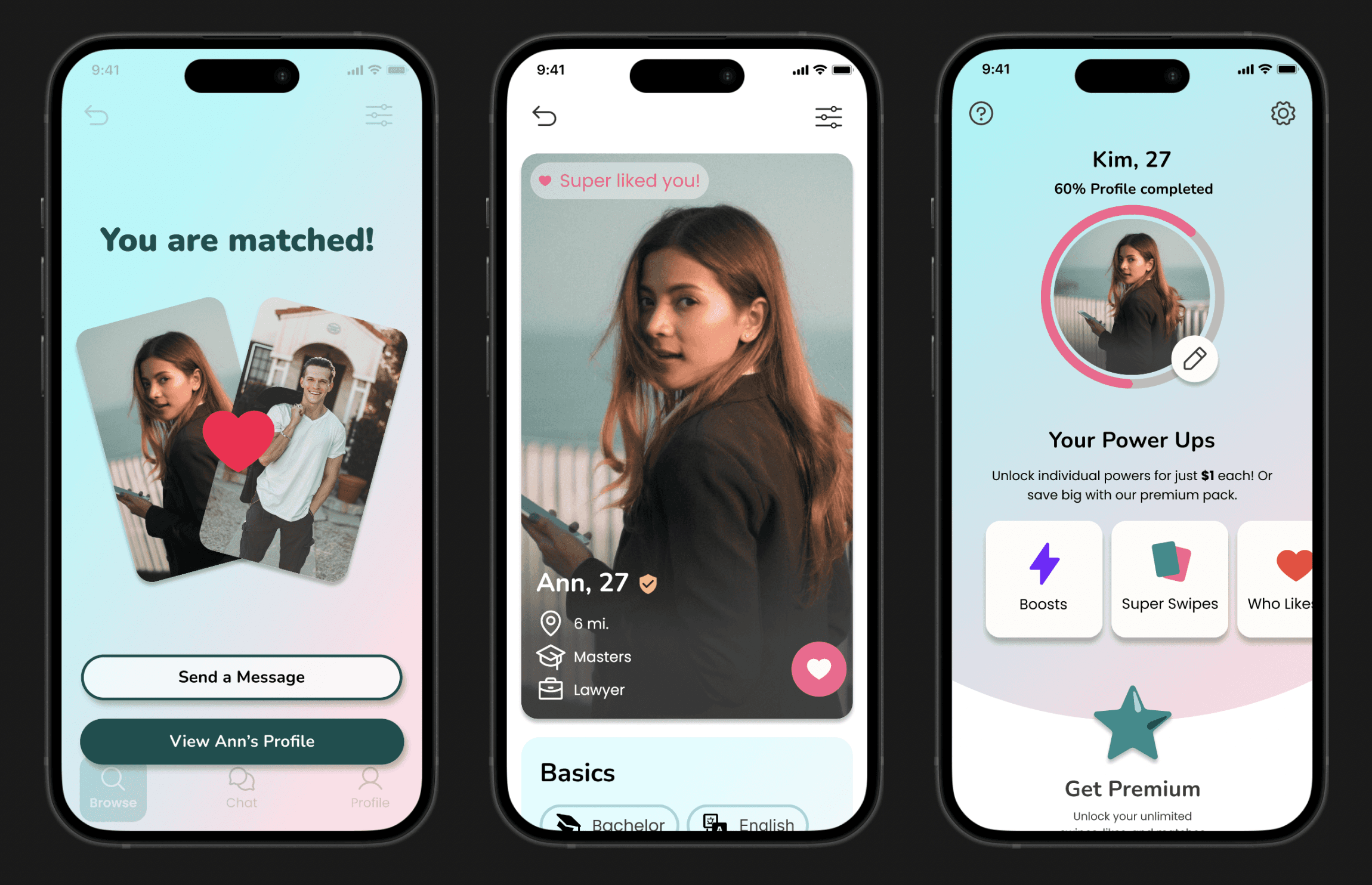
The CEO plans to launch a dating app using the company's existing entertainment platform for promotion.
02. Problem
The CEO's strategy was to launch a basic functionality dating app within three months, and then leveraging existing marketing resources with it.
However, this approach meant the app would lack standout features compared to competitors in the market.
03. Solution
04. Discovers & Design
The design team and I started from analyzing competitors' strengths, weaknesses, opportunities, and threats (SWOT), interviewed users for their firsthand experiences, and reviewed feedback on competitors.
Discover 01
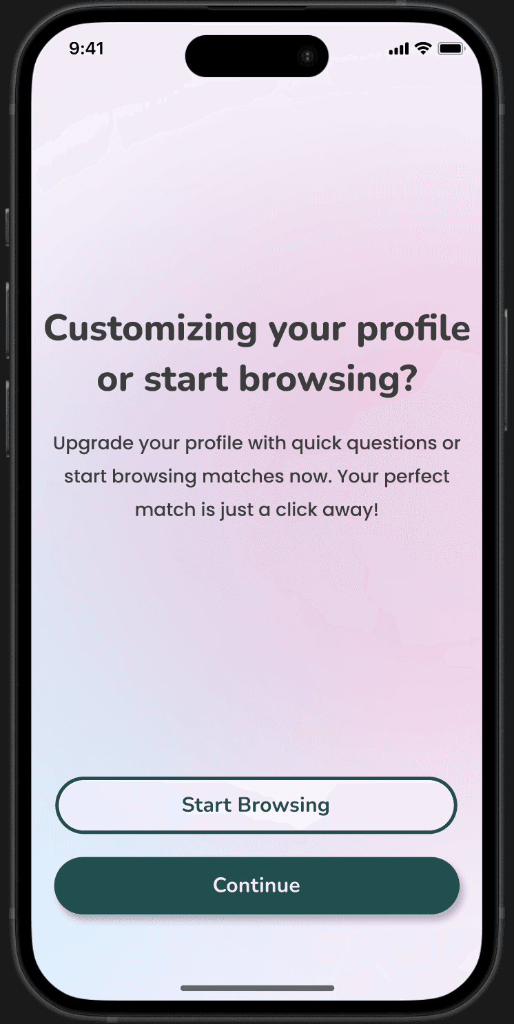
Long Onboarding Process
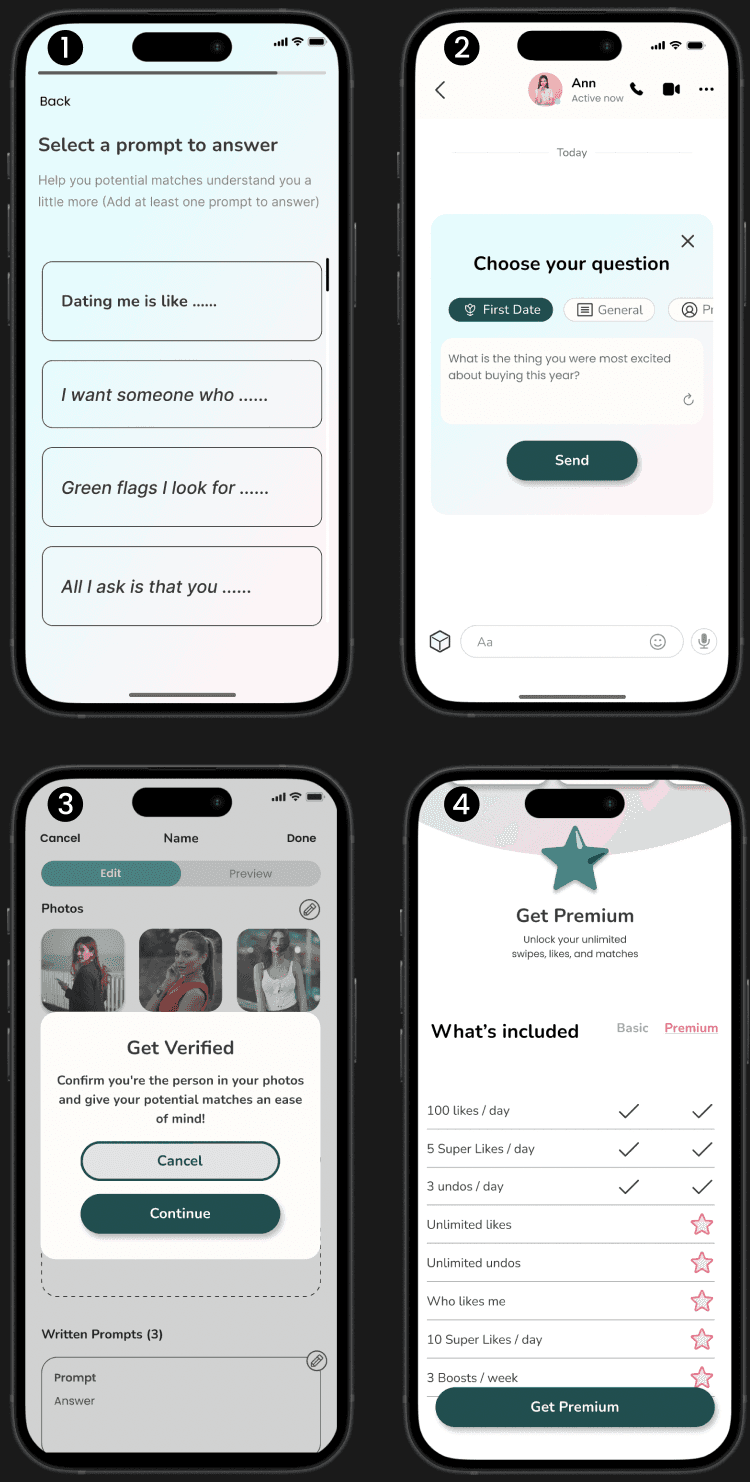
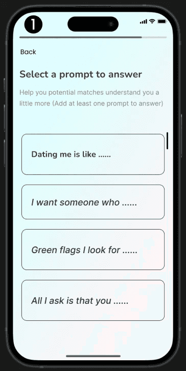
Having detailed prompts in profiles makes users' profiles special, but too many steps can bother users and discourage them to complete the process.
Design 01
Shortcut Options
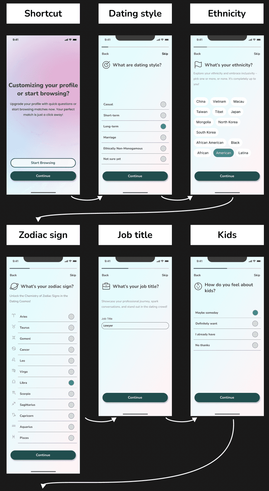
After completing basic information, users can customize their profiles by setting dating preferences or begin browsing.
They can then add more details later, reducing frustration during onboarding and allowing for profile inspiration from others.
Discover 02
Chatting Support
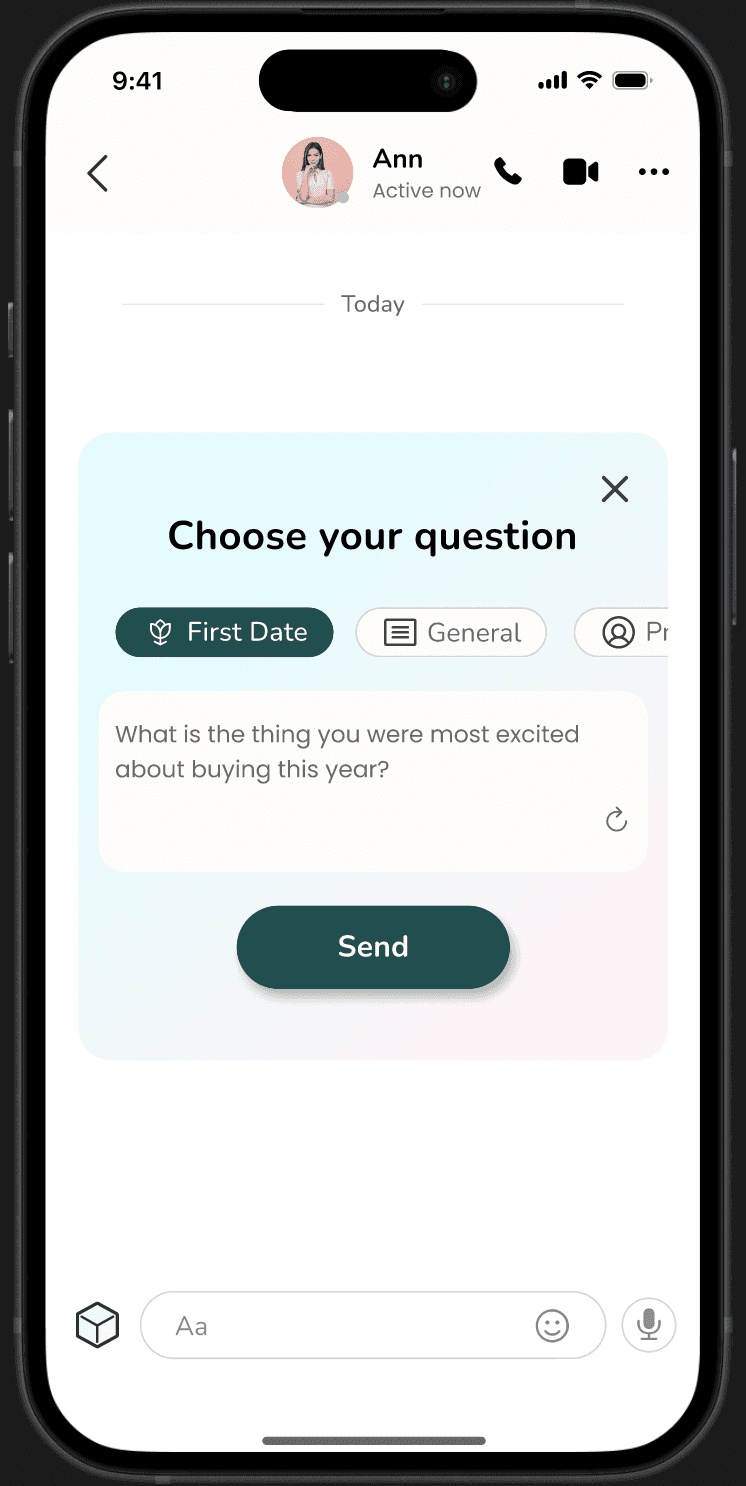
While a prompt generator in chat can spark conversation ideas and add fun, relying solely on canned questions may create a robotic conversation tone.
Design 02
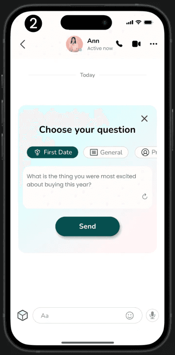
Ice Breaker Generator
The design team and I have enhanced our question generator with an icebreaker feature.
Users can select chat topics and personalize them before sending, adding a human touch and aligning with user preferences rather than relying on random topics.
Discover 03
Premium Plan
Introducing a premium plan is ideal for serious users seeking to stand out.
However, if users can't trial premium features before payment, it may deter them from utilizing and benefiting from them in the online dating realm.
Design 03
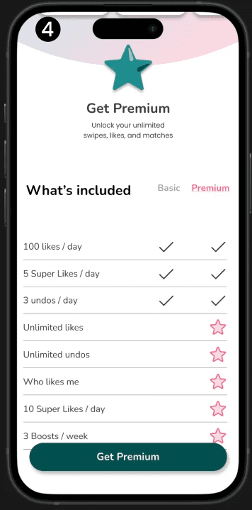
Individual feature Plan
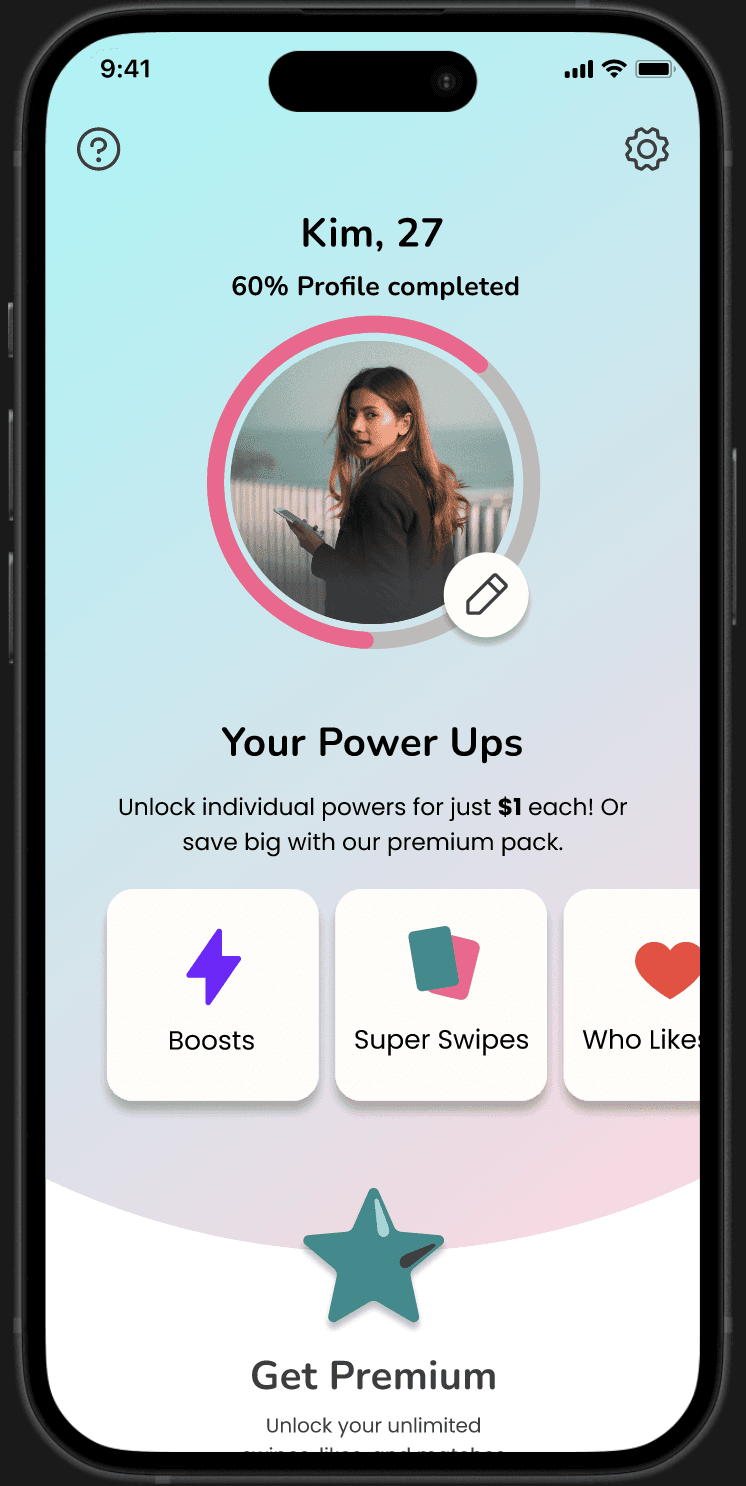
Instead of purchasing a full premium variety pack, users should have the option to buy individual features that benefit them the most.
This allows users to pay for what they need and also test features with a cheaper plan.
Discover 04
Fake Profiles
The rise in scam and fake profiles tarnishes the reputation of the online dating market and drives users away.
Design 04
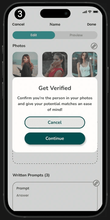
Verification System
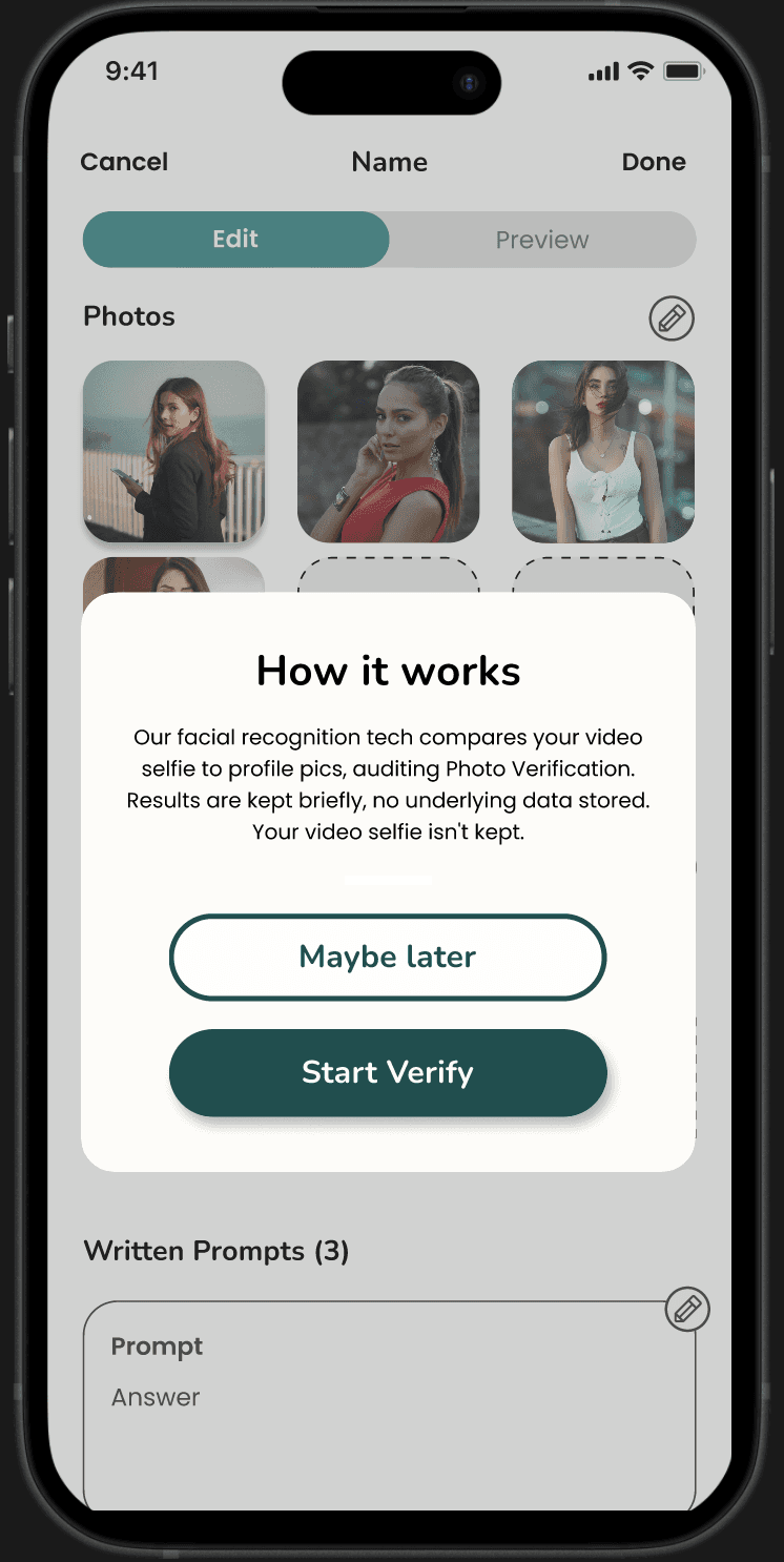
Implementing a verification system is essential for safeguarding users and the company from insincere individuals, fostering a safer and friendlier dating environment.
The verification process should be user-friendly and quick to complete, enhancing convenience for users.
05. User Journey & Design Thinking
Access Options & Authorization Pop-ups
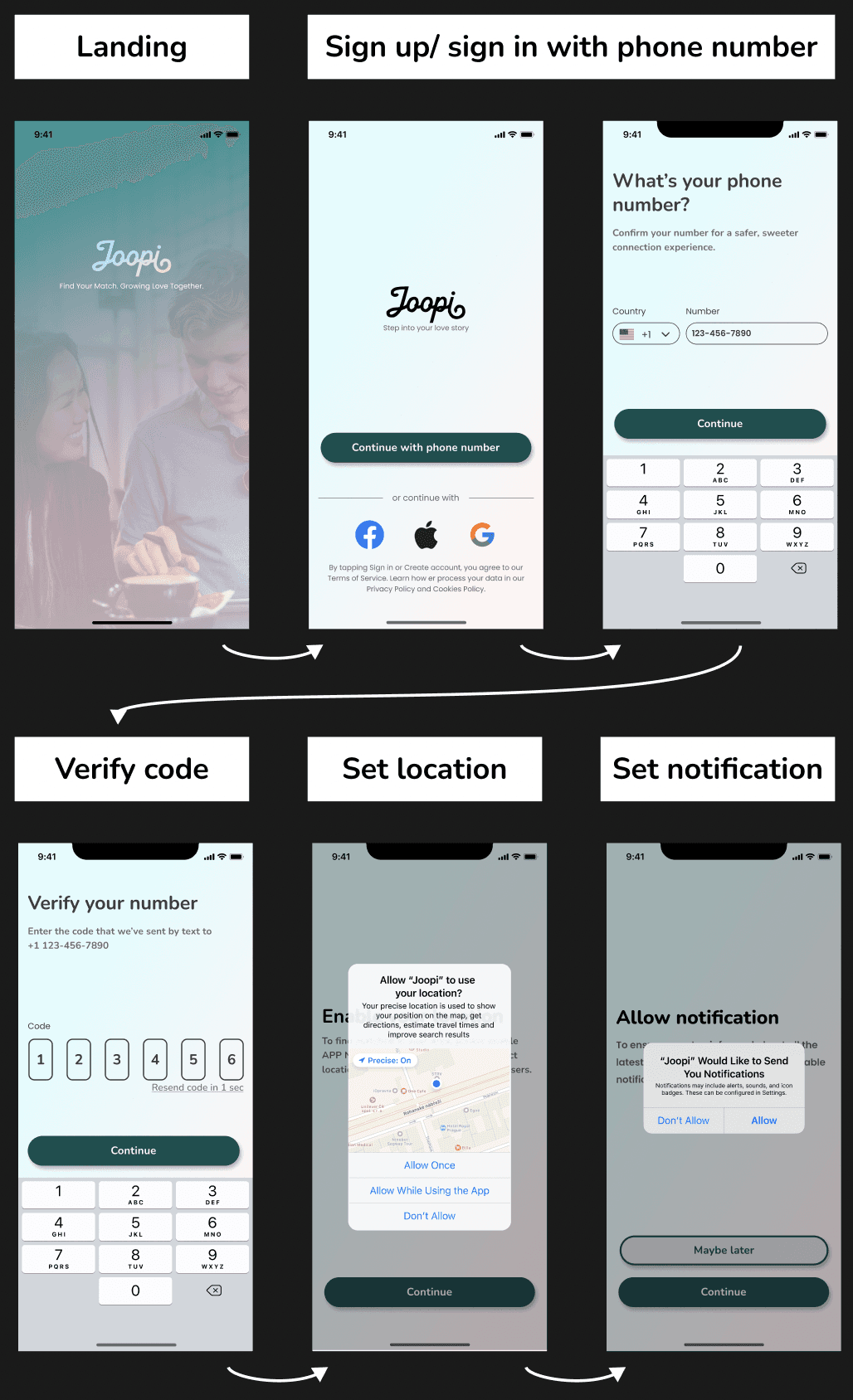
I simplified the onboarding process by crafting a user journey and site map to understand user needs and prioritize steps.
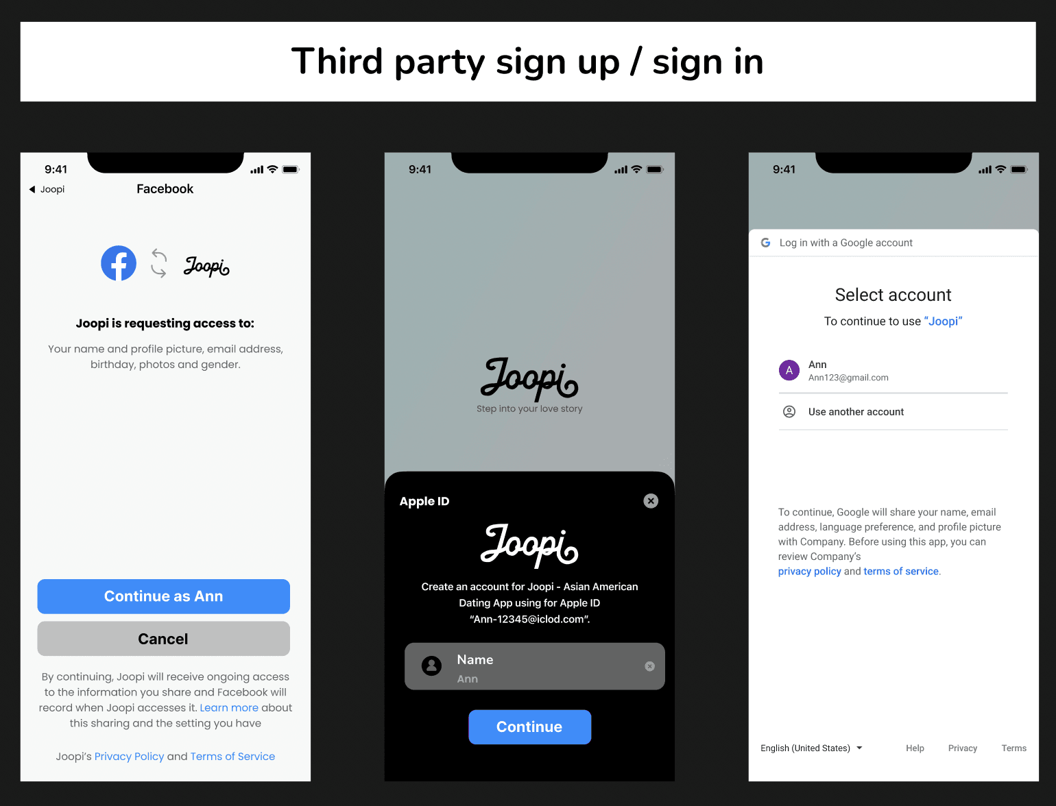
In the first step, I ensured multiple sign-up/sign-in options to suit users' preferences.
Furthermore, integrating location and notification authorization pop-ups improved user engagement and personalized settings.
Basic Profile
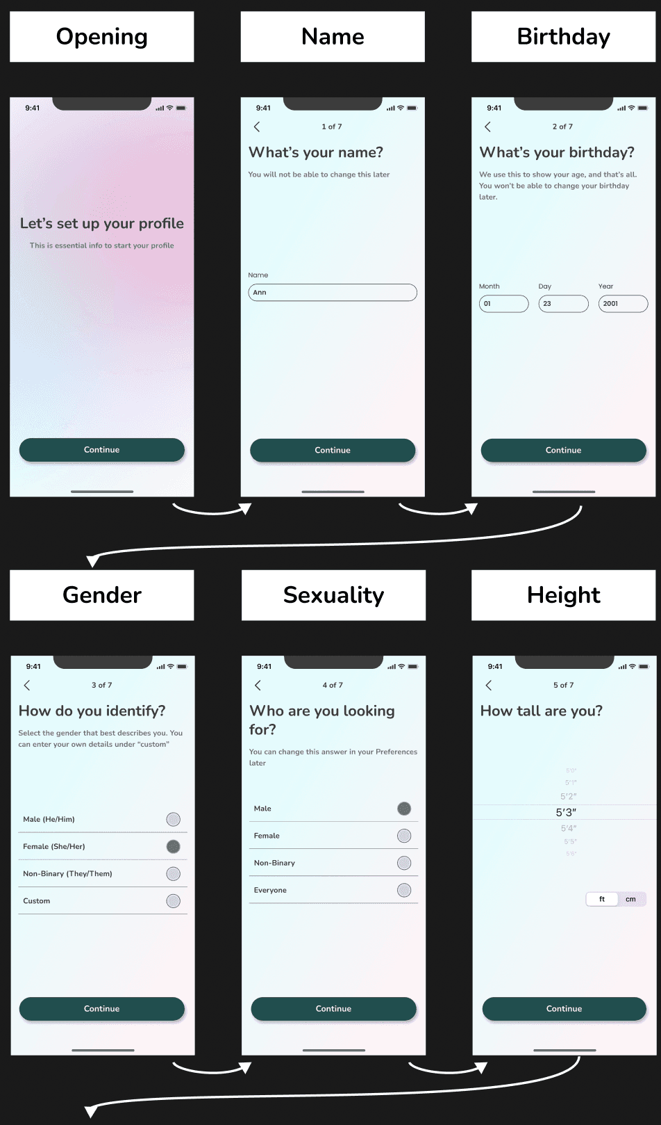
I created a user profile template with 7 basic user information that users prioritize.
This includes a height screen, considering that over 50% of women prefer taller partners, according to Height Dating Statistics.
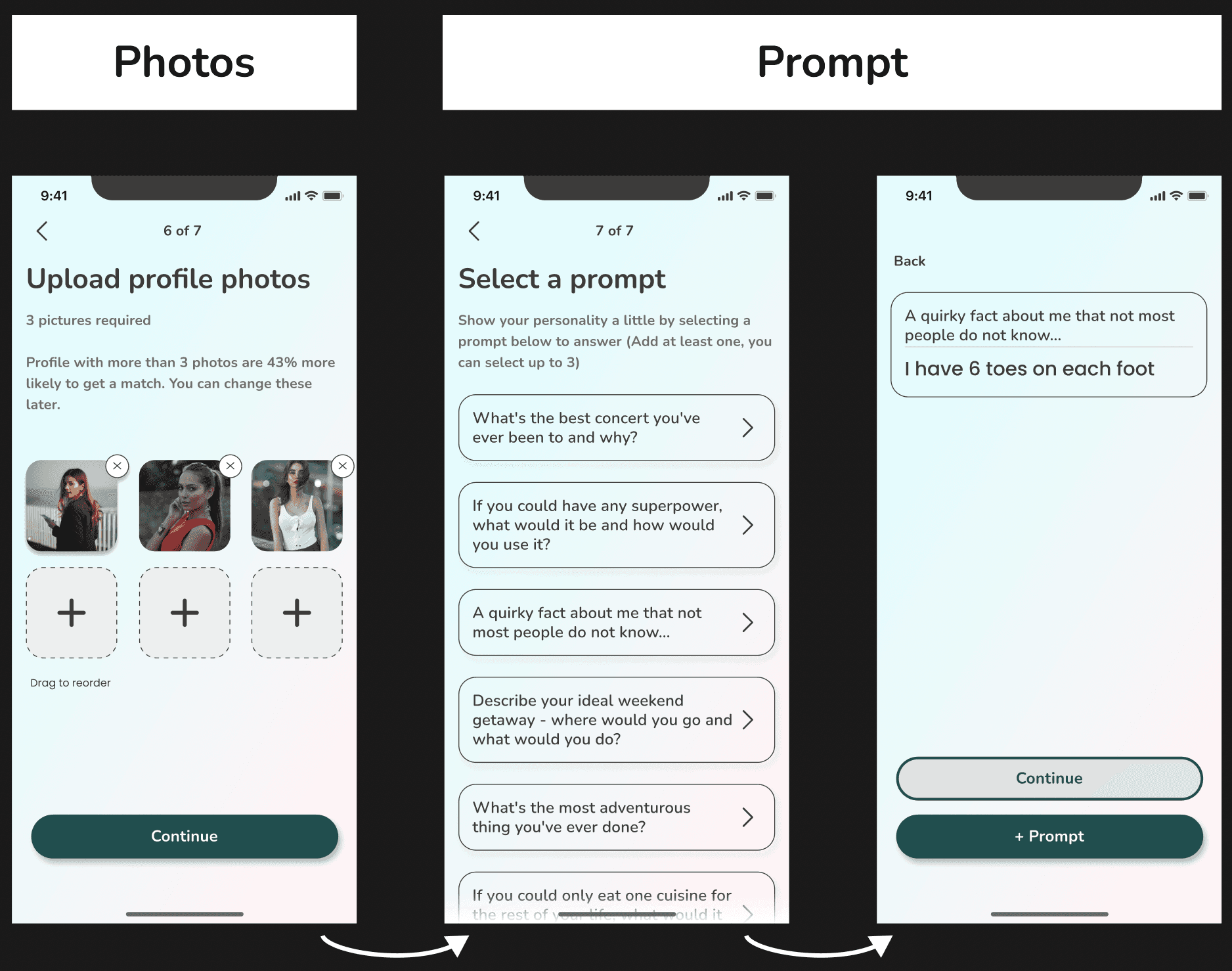
Encouraging users to upload at least 3 pictures boosts their chances of getting matches by 43% and improves their credibility.
Prompting users to write a unique prompt adds personality and helps them stand out.
Shortcut
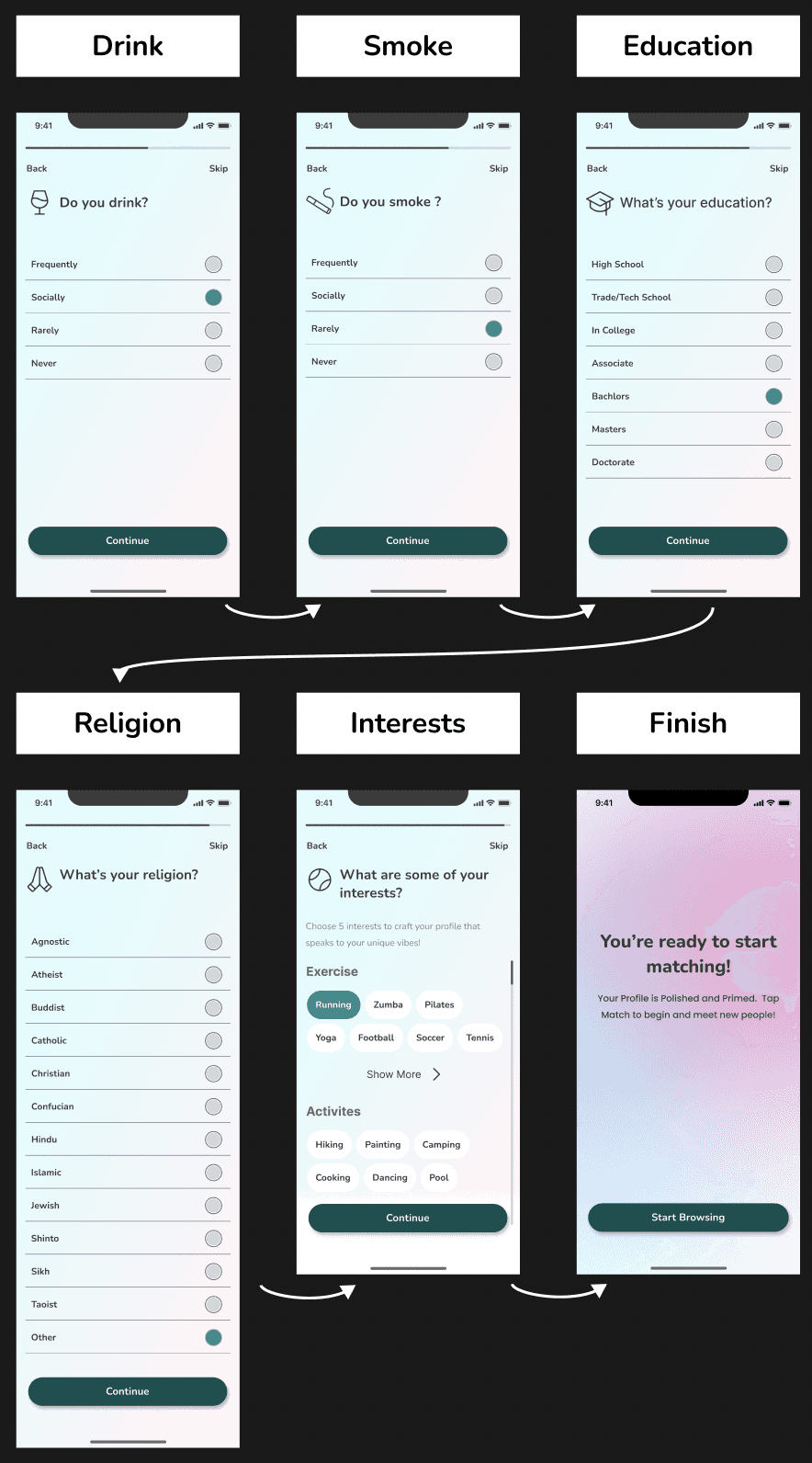
I added a shortcut for users who want to start browsing right away, minimizing frustration with the lengthy onboarding process.
Users can skip screens and return later to complete their profiles, ensuring flexibility.
In the final onboarding step, I simplified the process by offering options to choose from instead of extensive filling.
06. Design System
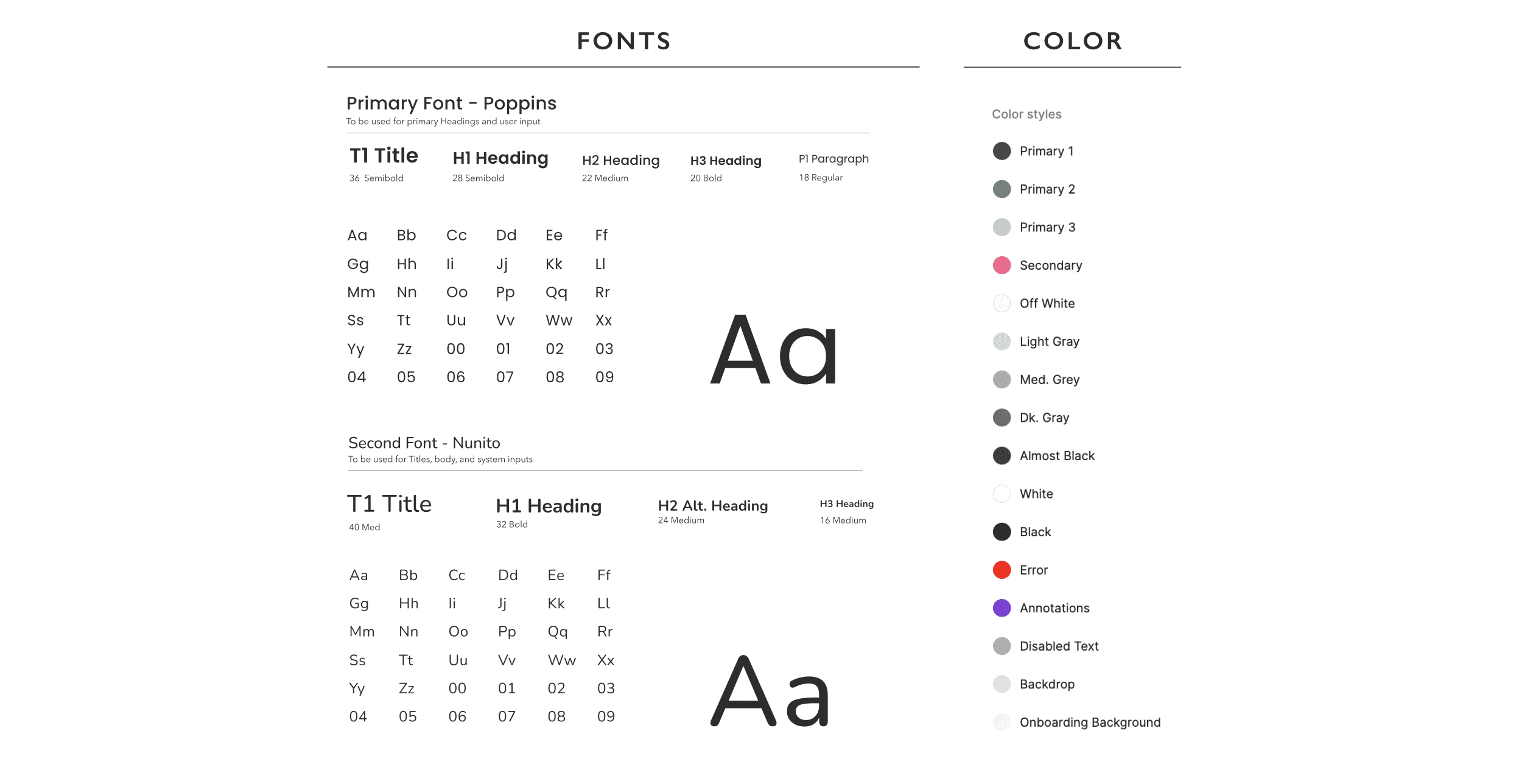
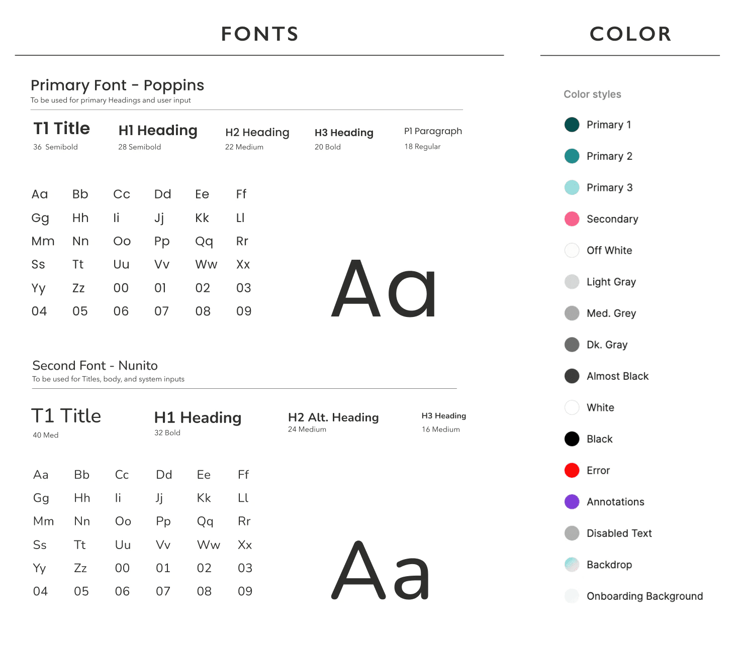
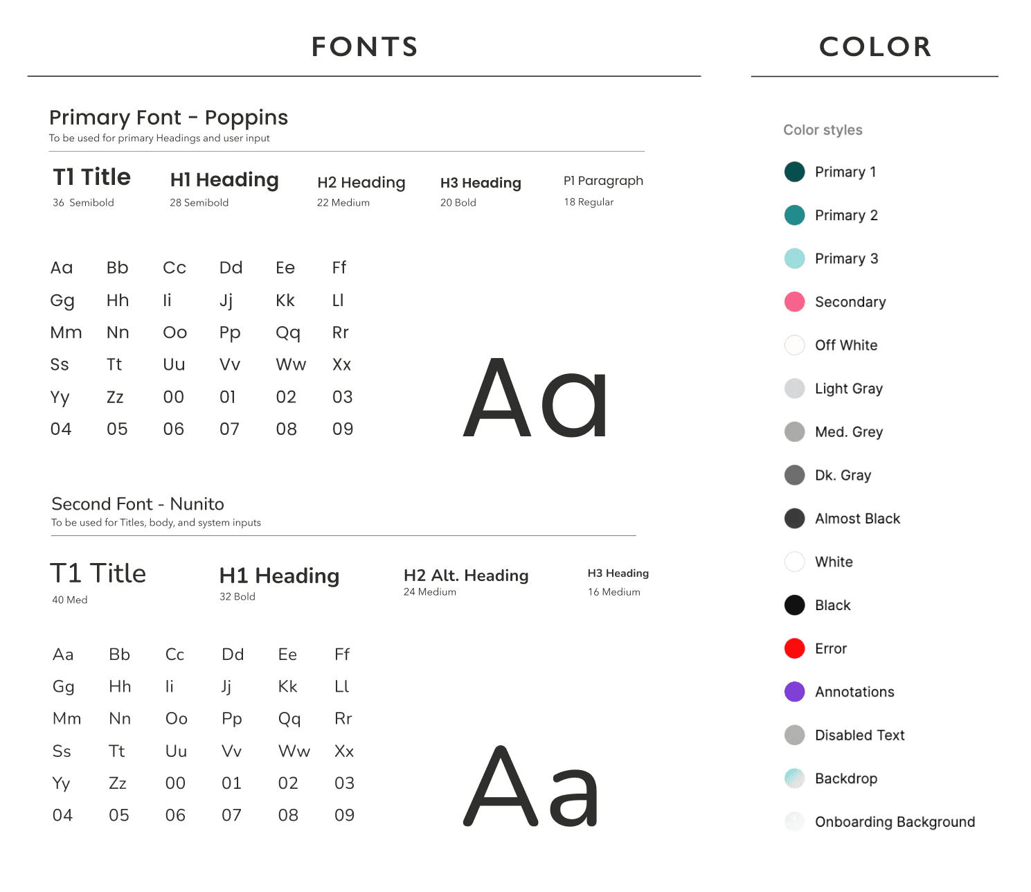
Fonts & Color
The fonts and colors give off a young, simple, and coordinated feel.
The design team and I picked Poppins and Nunito fonts because they're simple and commonly used in apps.
Our colors include steel, pink, and neutral tones, creating a all sex balanced and inviting look.
Component Library
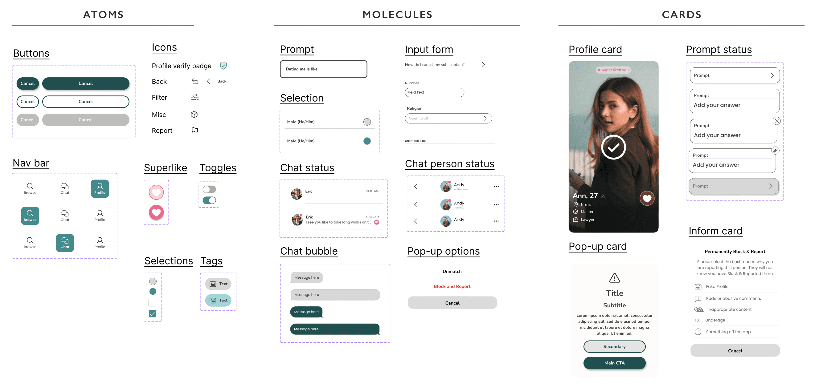
To enhance organization within our component library, the design team and I introduced a categorization system: atoms, molecules, and cards.
This approach streamlines component retrieval, enabling quicker and more intuitive access to specific elements, thus optimizing our workflow for efficiency and convenience.
07. Reflection & Next Steps
Collaboration
The most significant insight gained was from our collaborative efforts across different functions.
Within the design team, we fostered efficient communication and functional collaboration, especially when faced with challenges such as unclear direction, which we resolved by seeking guidance from our mentor.
Engaging with developers and founders provided invaluable perspectives that I had not previously considered.
Additionally, I realized the importance of optimizing existing product features to remain competitive in the market. Users are drawn to simplicity, convenience, and user-friendliness, which are essential factors for product success.
User testing
While I couldn't participate until the app launch due to financial considerations, I recognize the importance of conducting usability testing with target users and gathering reviews. Given the opportunity, I would ensure iterative testing to refine the app design continually.
