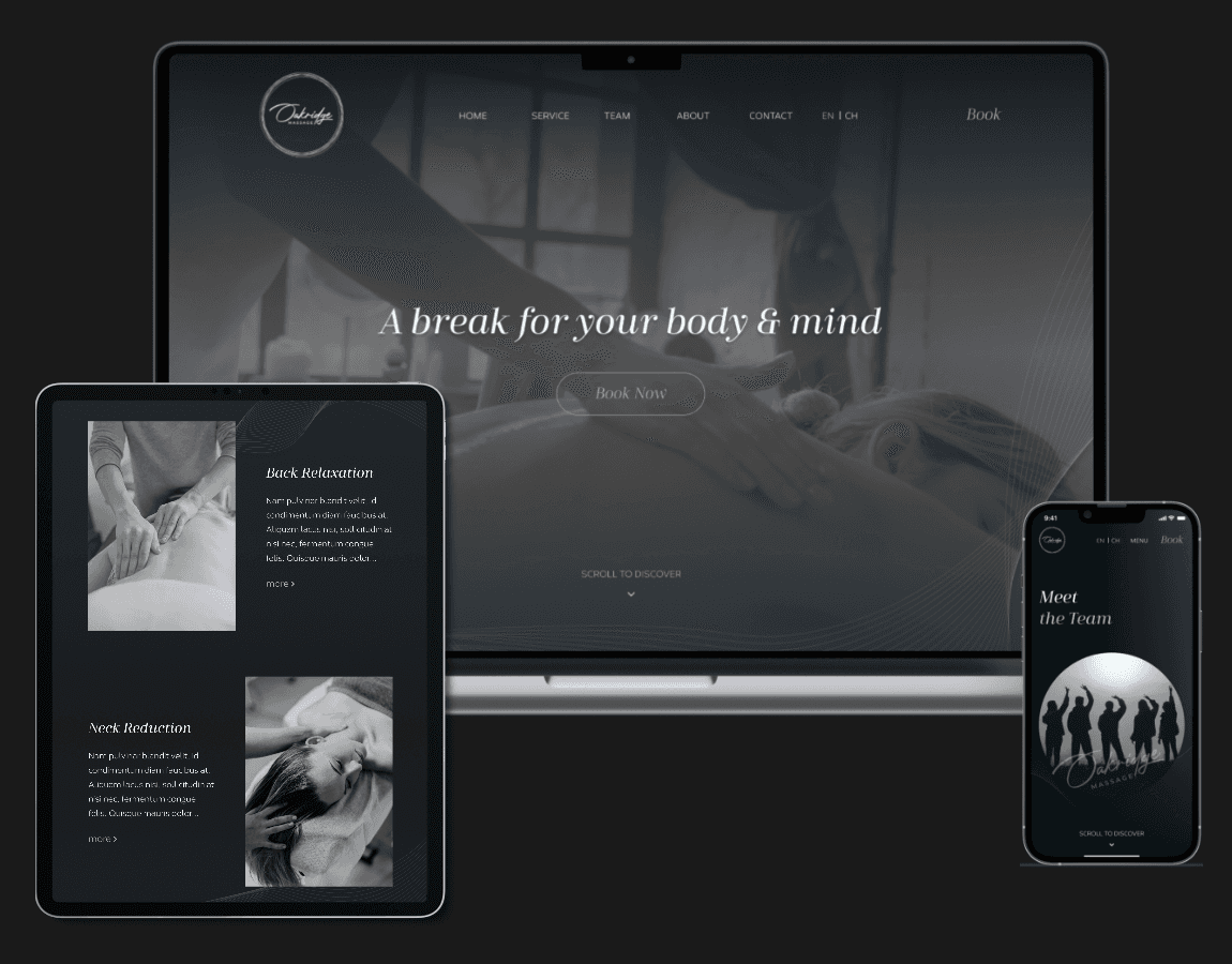
Seamless, Modern, Responsive Web Design
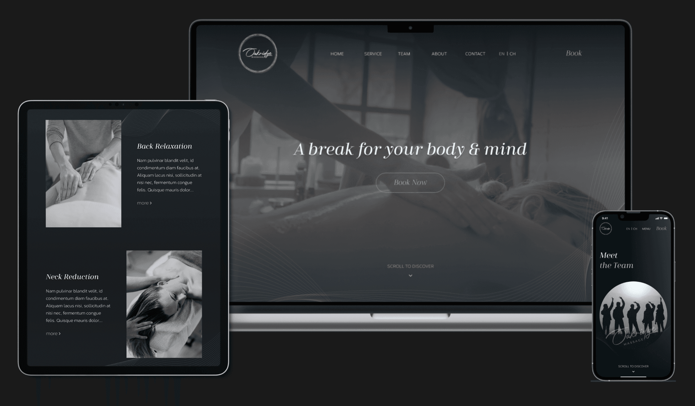
Massage Services and Online Experience in Oakridge
Outline
Company
Timeline
Jan 2023–Mar 2023
Role
UX UI Designer
Team
UX UI Mentor x 1
UX UI Designer x 1
Developer x 1
Seamless, Modern, Responsive Web Design
Elevating Your Relaxation - Massage Services and Online Experience


01. Background
Motivation
A skilled massage therapist in Vancouver wanted to start his own business. He needed a website that make people feel relaxed, offer a sense of luxury, and be easy to use. The most important thing is to make it simple for people to book massage services online.
Achievements
Collaborated with stakeholders to define the brand identity and recommend best practices.
Conducted user interviews to uncover insights and identify pain points.
Designed wireframes and prototypes with clear visual hierarchy and logical information architecture.
Ensured a seamless hand-off to developers, incorporating feedback for improvements.
02. Research & Emphasize
User Interview
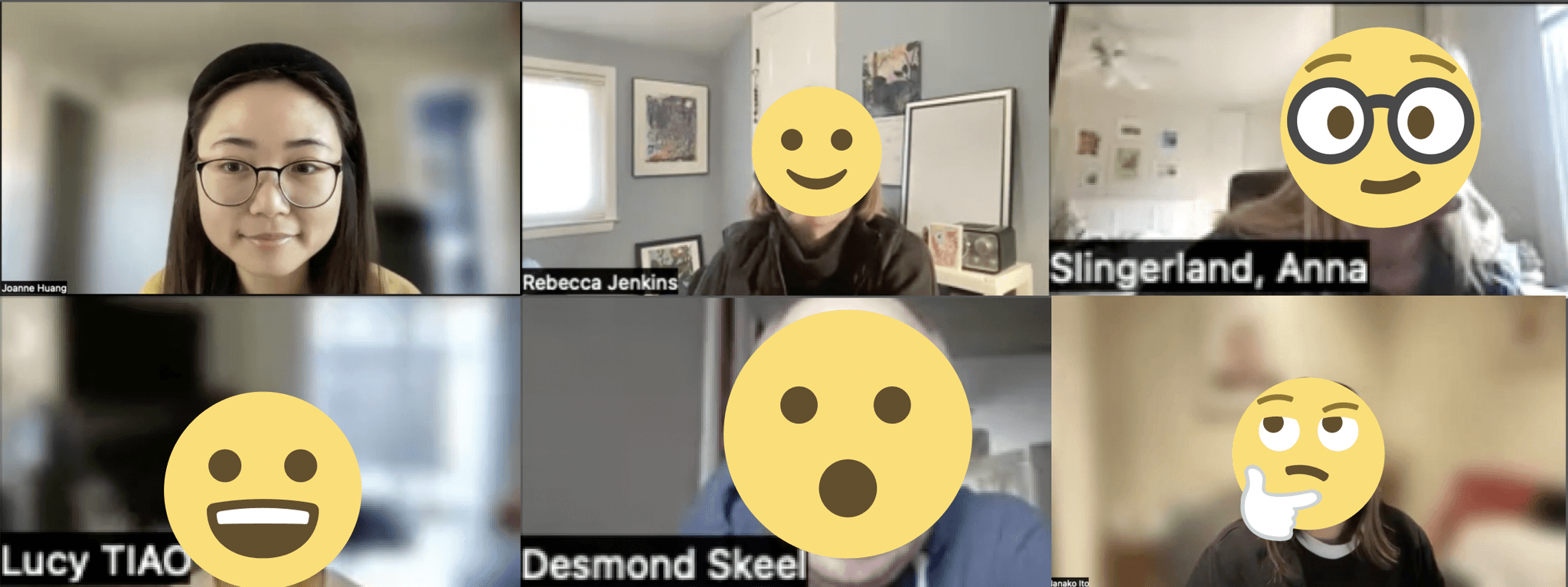
Before hands-on anything, I interviewed 5 target users with a competitive website, that helped me to emphasize and understand the needs, challenges, and motivations of users in the industry.
The Insights
Users like the video background on the landing page because it's a straightforward way to learn about the services, the environment, and the overall experience.
It's crucial for users to be able to navigate the website easily, particularly when it comes to finding information about the services offered, pricing, and the booking process.
03. Crafting Layout and Design
"How Might We" Approach
I used "How might we" thinking to make quickly try out different design options and change things smoothly when needed.
The Questions
How might we enhance the process of experimenting with various design choices for a more user-friendly experience?
How might we simplify the process of trying out different design possibilities and making smooth alterations as required?
Seamless, Modern, Responsive Web Design
Elevating Your Relaxation - Massage Services and Online Experience




05. Three Major Iterations
(The User Interview)
(The User Interview)
03. Crafting Layout and Design
"How Might We" Approach
I used "How might we" thinking to make quickly try out different design options and change things smoothly when needed.
The Questions
How might we enhance the process of experimenting with various design choices for a more user-friendly experience?
How might we simplify the process of trying out different design possibilities and making smooth alterations as required?
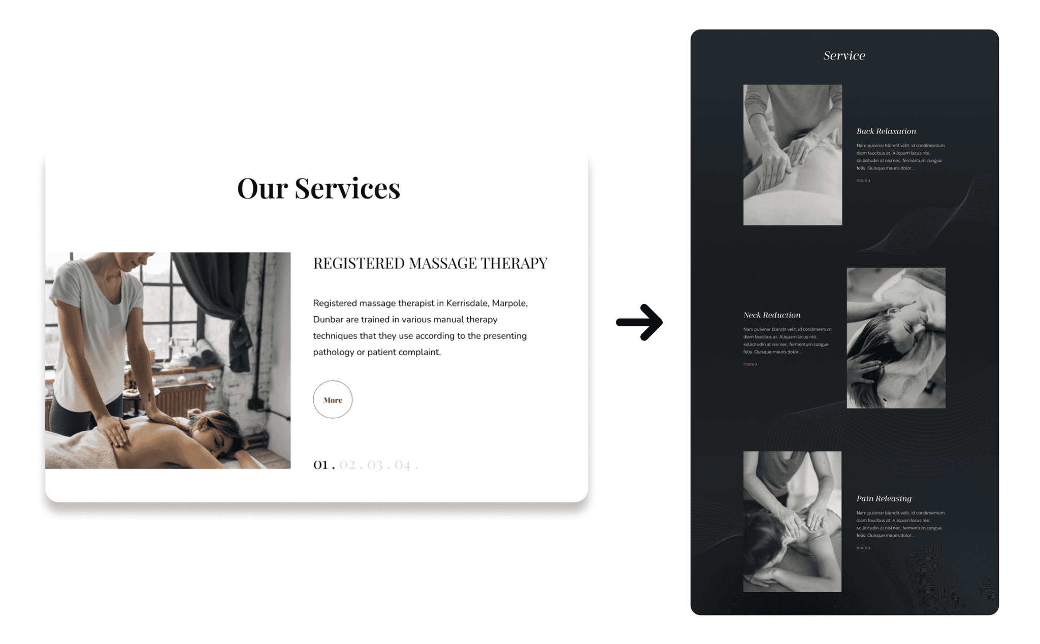
One - Simplified Service Selection
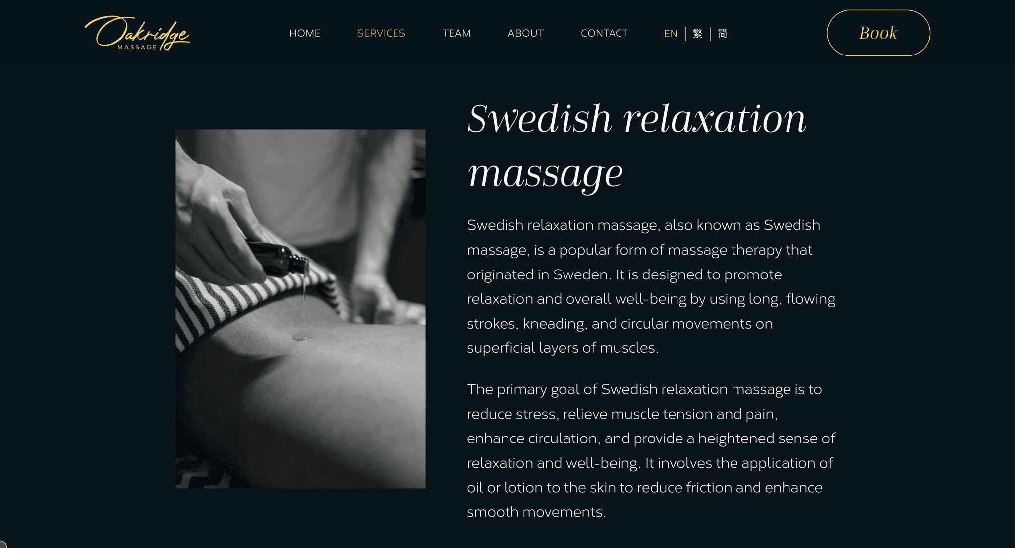
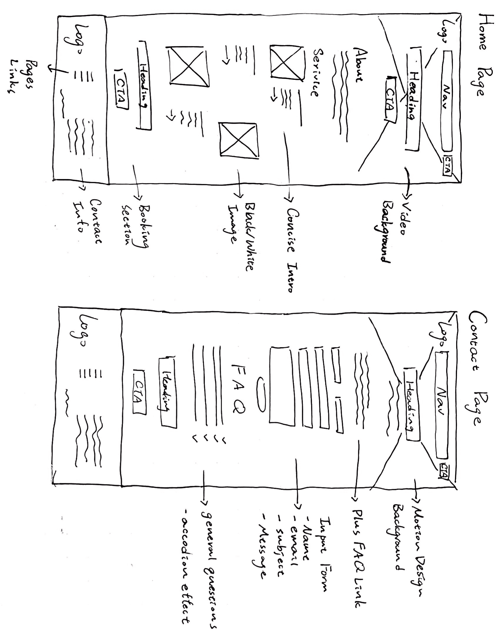
The redesign consolidates services onto a single page, making it easier to access everything with a simple scroll. This eliminates the need for 'more' or 'next session' clicks, enhancing user efficiency and providing a seamless experience.


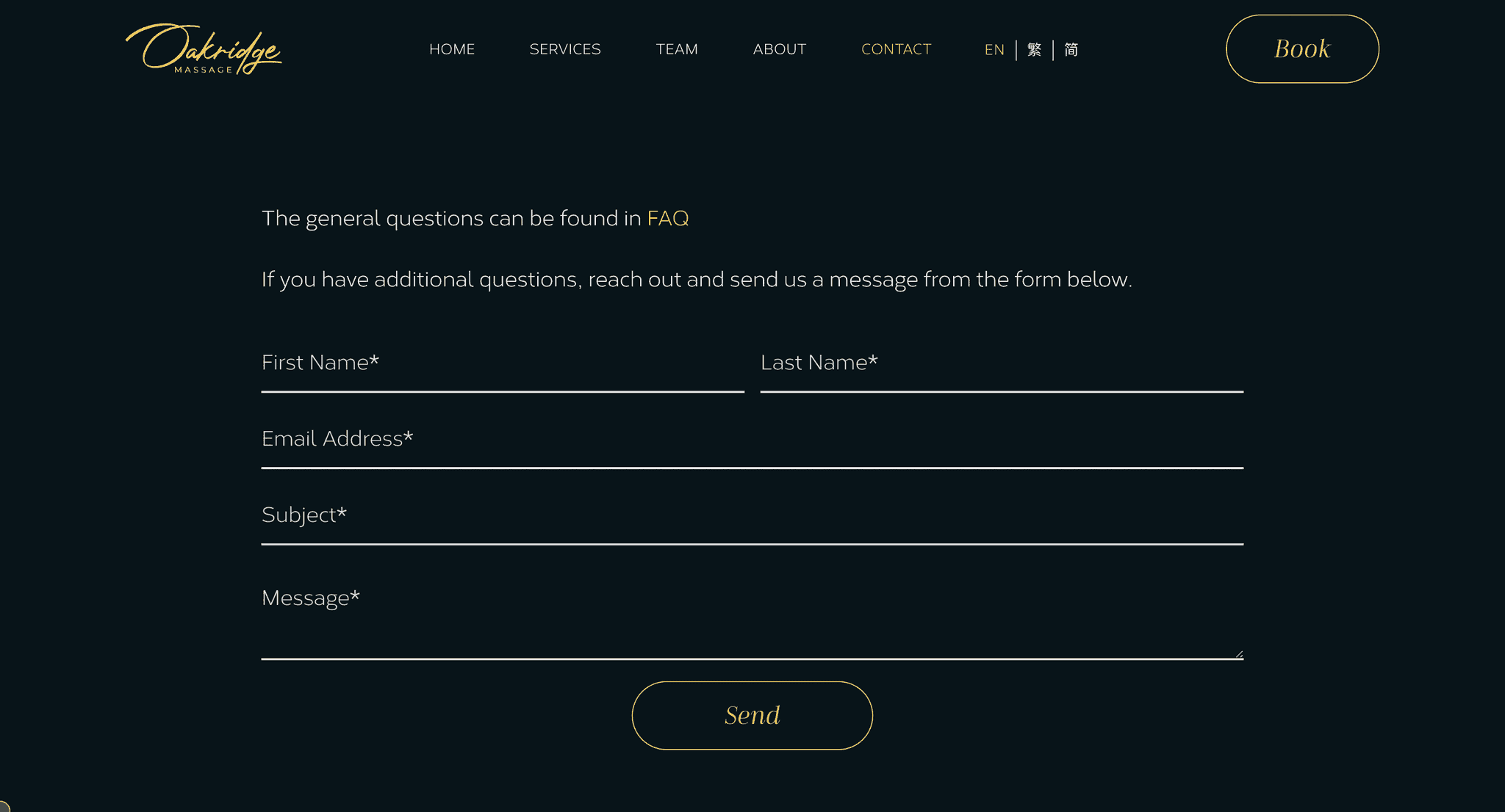
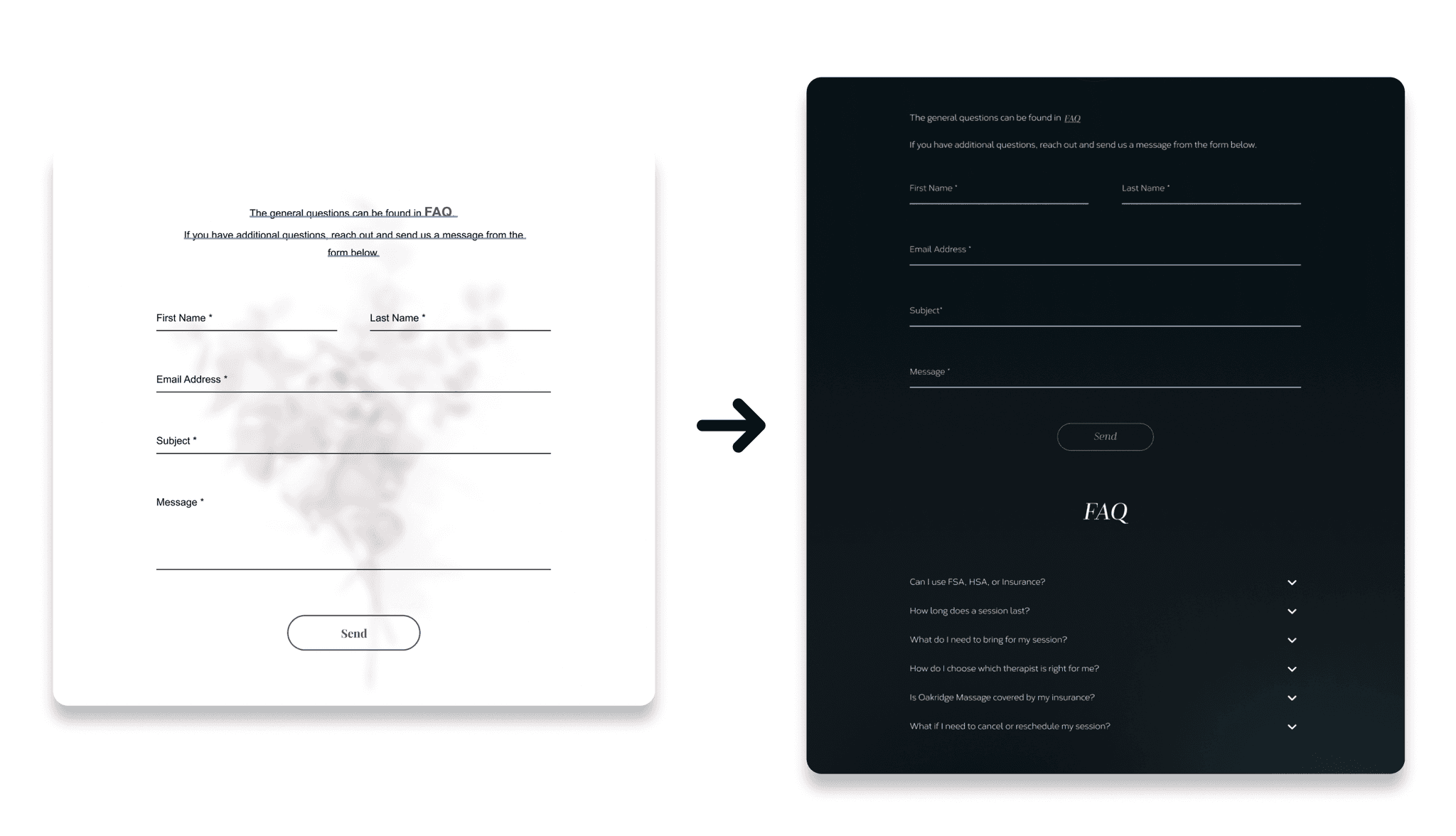
Two- FAQ Integration with Contact Form
Combining the Contact Form and FAQ enables quick access to answers, allowing users to find solutions before and after submitting queries. This setup makes it easy for users to find solutions on their own but still reach out for help if they need it.
(Low Fidelity Wireframe)
(Low Fidelity Wireframe)
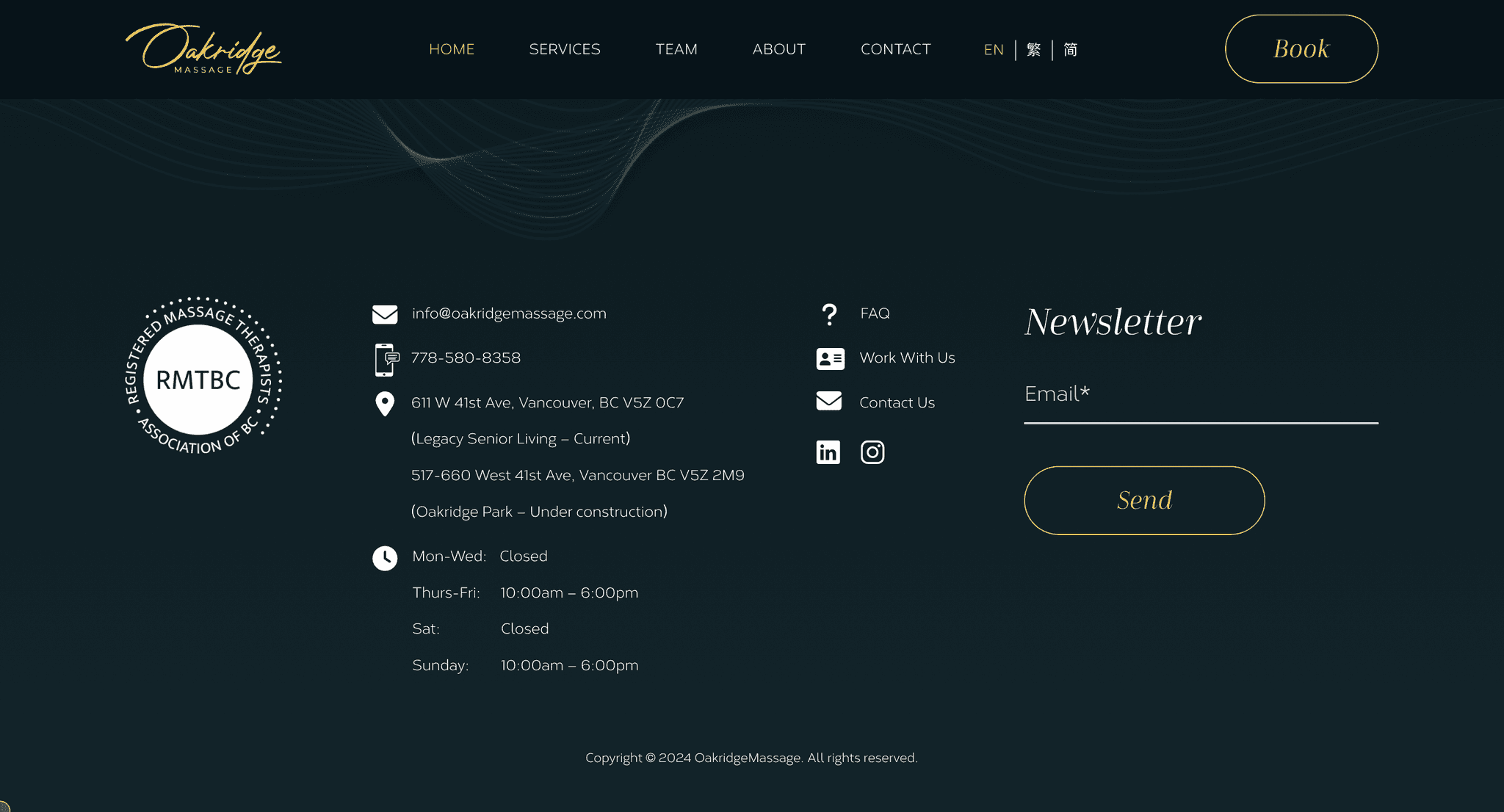
Three- Contact Info in Footer
Placing contact info in the footer ensures easy access on every page, unlike the original design that had it exclusively on the contact page. This adjustment is likely to contribute to a more user-friendly interface, reducing friction for those seeking assistance or additional information.
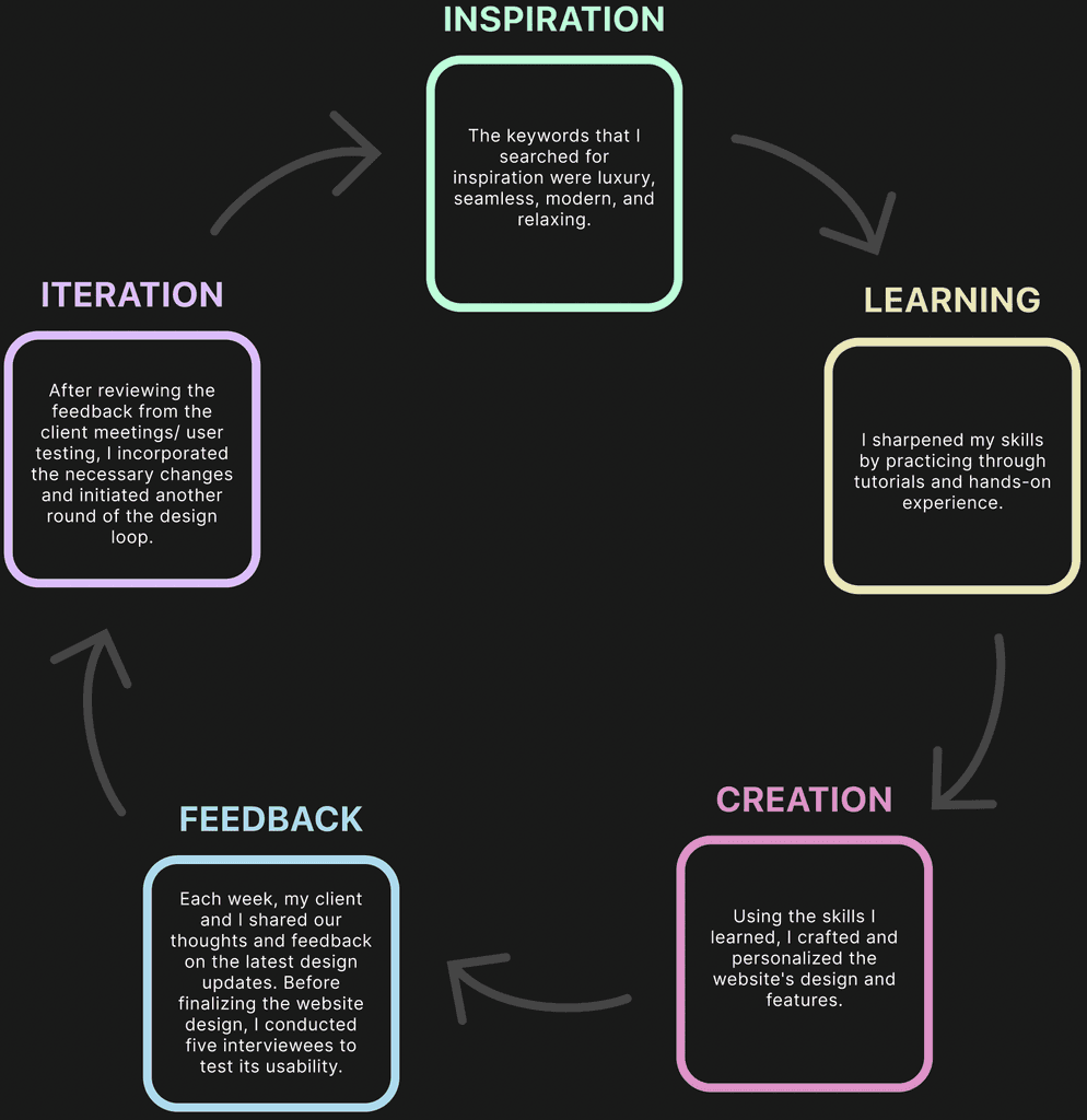
04. Five Design Steps Loop
06. Prototyping Video
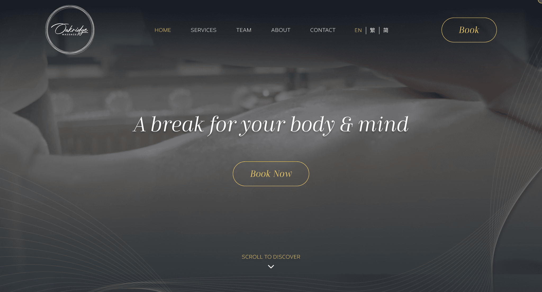
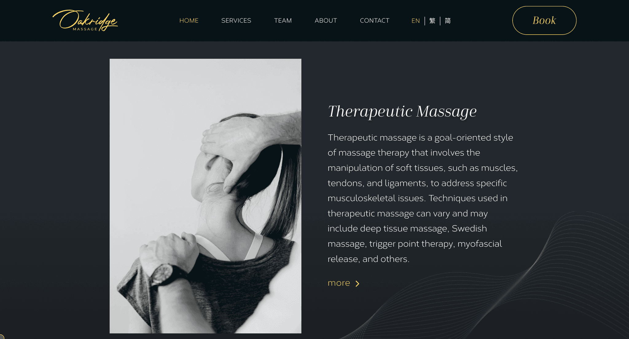
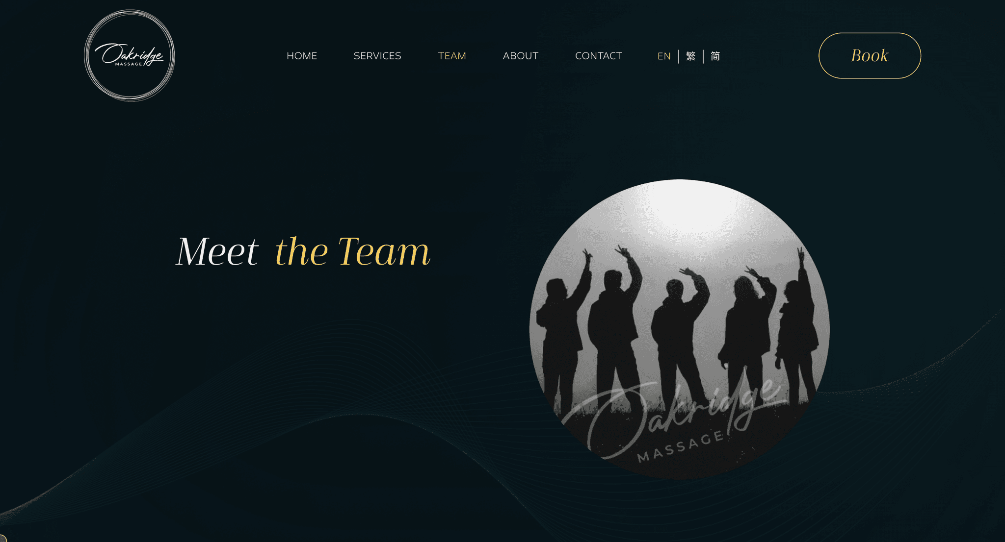
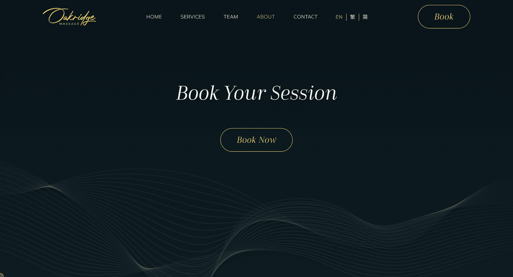
The final design features a sleek, luxurious layout with seamless user interaction, meeting stakeholders' requirements. The color, typography, and motion design align with the business brand. The booking section is prominently placed on every page and in the fixed navigation bar for user convenience and business enhancement. The stakeholders are delighted with the result and eager to pass it on to developers for implementation.


05. Three Major Iterations
One - Simplified Service Selection
The redesign consolidates services onto a single page, making it easier to access everything with a simple scroll. This eliminates the need for 'more' or 'next session' clicks, enhancing user efficiency and providing a seamless experience.
07. Reflection & Next Steps
Collaboration
This project not only expanded my experience in stakeholder communication but also taught me the value of approaching problems from diverse perspectives. Regular meetings played a pivotal role in grasping the essence of the Oakridge brand. Collaborating with my developer deepened my understanding of the importance of improving SEO.
Booking System Enhancing
As I look forward to the next phase of working on the Oakridge Massage website, my primary focus will be on enhancing the booking system. I strongly believe that a well-designed and efficient booking system will be a key factor in the overall success and user satisfaction of the website.


Two- FAQ Integration with Contact Form
Combining the Contact Form and FAQ enables quick access to answers, allowing users to find solutions before and after submitting queries. This setup makes it easy for users to find solutions on their own but still reach out for help if they need it.


Three- Contact Info in Footer
Placing contact info in the footer ensures easy access on every page, unlike the original design that had it exclusively on the contact page. This adjustment is likely to contribute to a more user-friendly interface, reducing friction for those seeking assistance or additional information.


06. Prototyping Video
The final design features a sleek, luxurious layout with seamless user interaction, meeting stakeholders' requirements. The color, typography, and motion design align with the business brand. The booking section is prominently placed on every page and in the fixed navigation bar for user convenience and business enhancement. The stakeholders are delighted with the result and eager to pass it on to developers for implementation.
(The Prototype of Web Design)
07. Reflection & Next Steps
Collaboration
This project not only expanded my experience in stakeholder communication but also taught me the value of approaching problems from diverse perspectives. Regular meetings played a pivotal role in grasping the essence of the Oakridge brand. Collaborating with my developer deepened my understanding of the importance of improving SEO.
Booking System Enhancing
As I look forward to the next phase of working on the Oakridge Massage website, my primary focus will be on enhancing the booking system. I strongly believe that a well-designed and efficient booking system will be a key factor in the overall success and user satisfaction of the website.
