Background
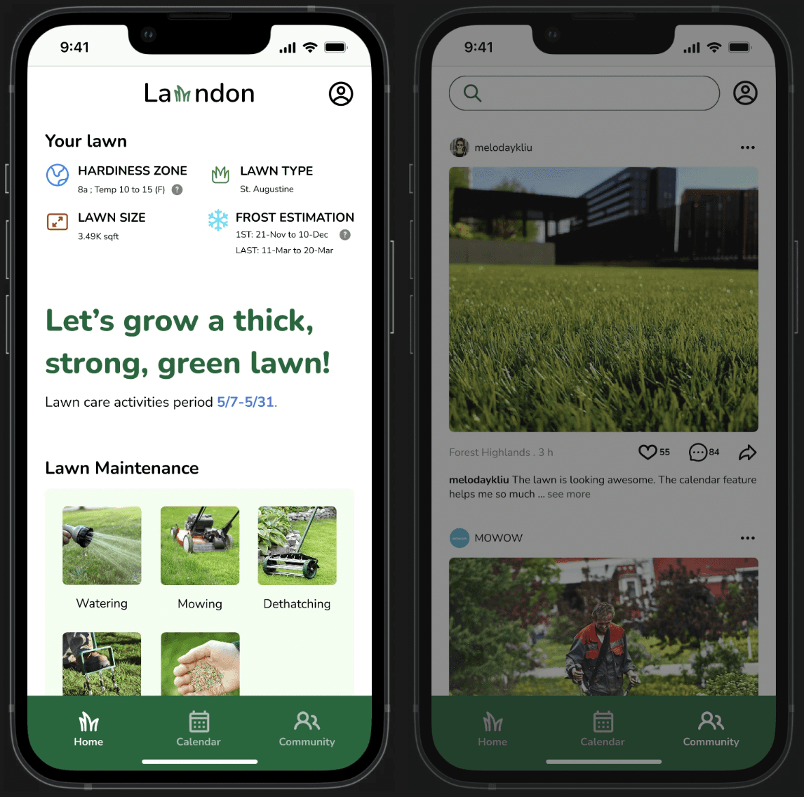
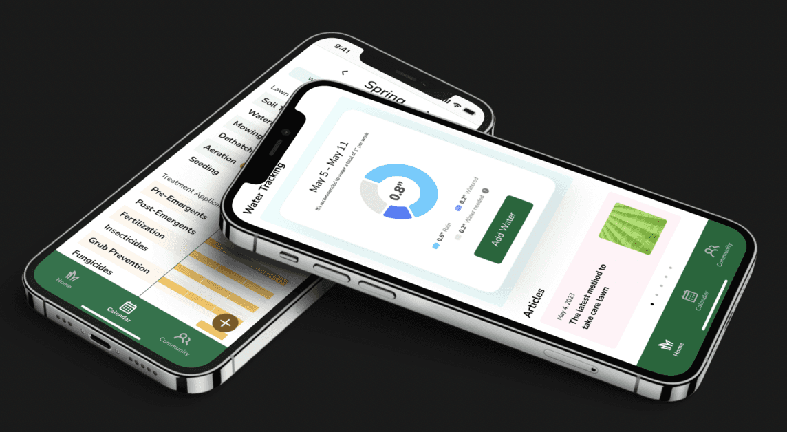
Lawndon is a user-friendly lawn care app with three key features.
It provides users with real-time updates on their lawn's status and requirements.
It offers a calendar feature to schedule and track lawn activities.
It connects users with a vibrant community for sharing tips and inspiration. Transform your lawn care experience with Lawndon.
User interview
Through interviews with my 5 neighbors, I gained valuable insights into their lawn care experiences.
Pain point:
People who take care of lawns are saying they don't know enough about how to do it right. They feel like they need more help and advice to make their lawns look good.
They're not sure when to use certain lawn stuff, like fertilizer or weed killer. They're feeling a bit lost about when it's the right time to put these things on their lawns.
Some neighbors mentioned feeling like they're on their own when it comes to taking care of their lawns. They might need more help or someone to talk to about it.
Storyboard
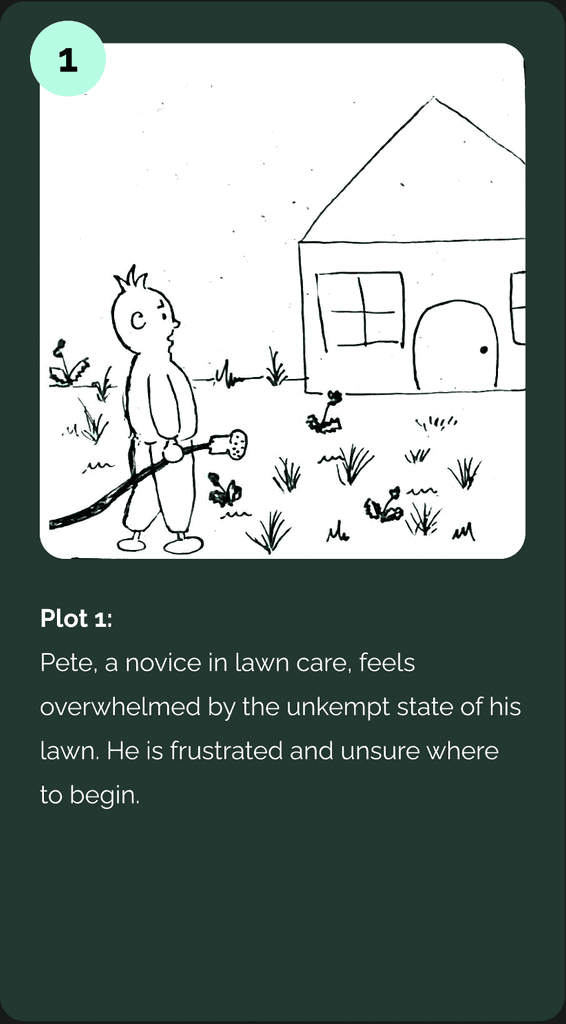
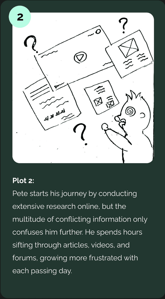
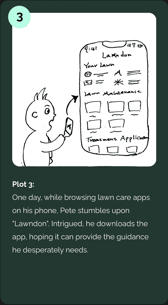
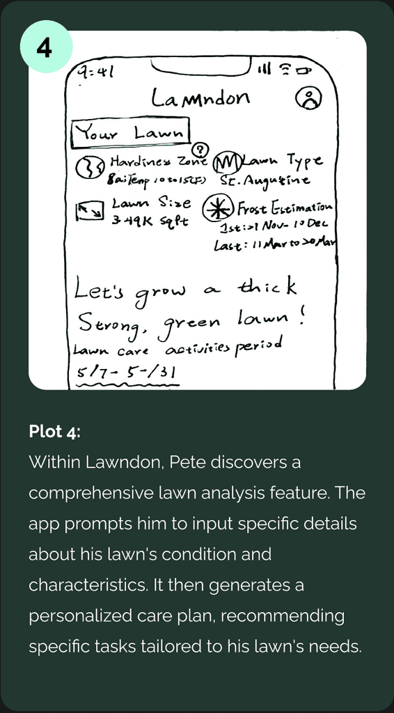
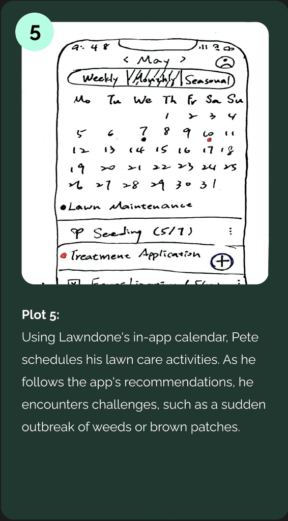
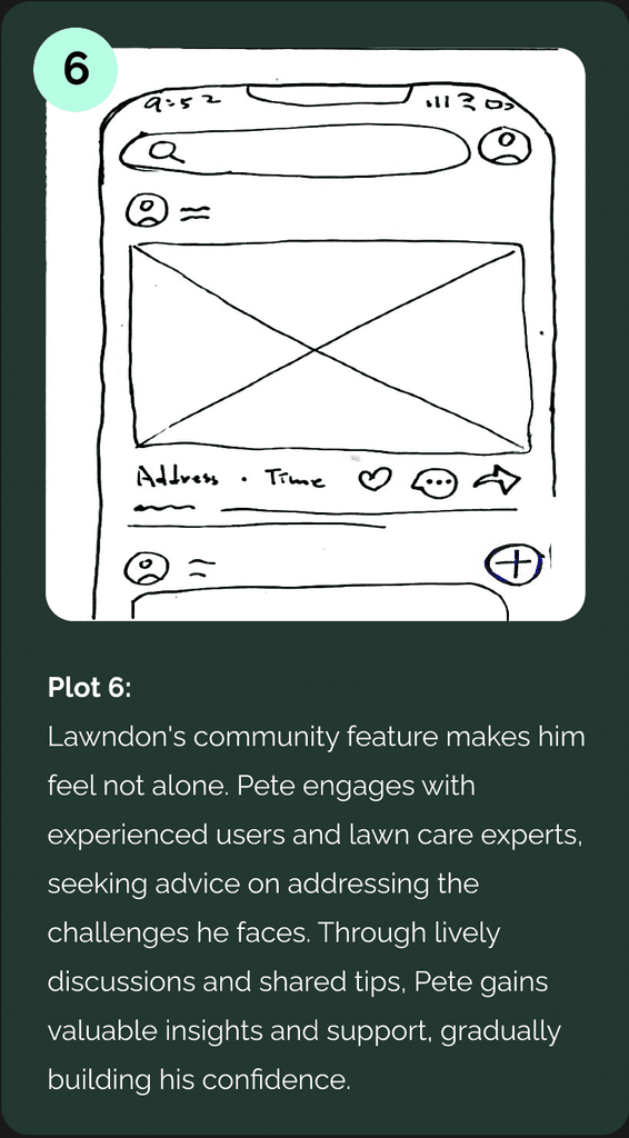
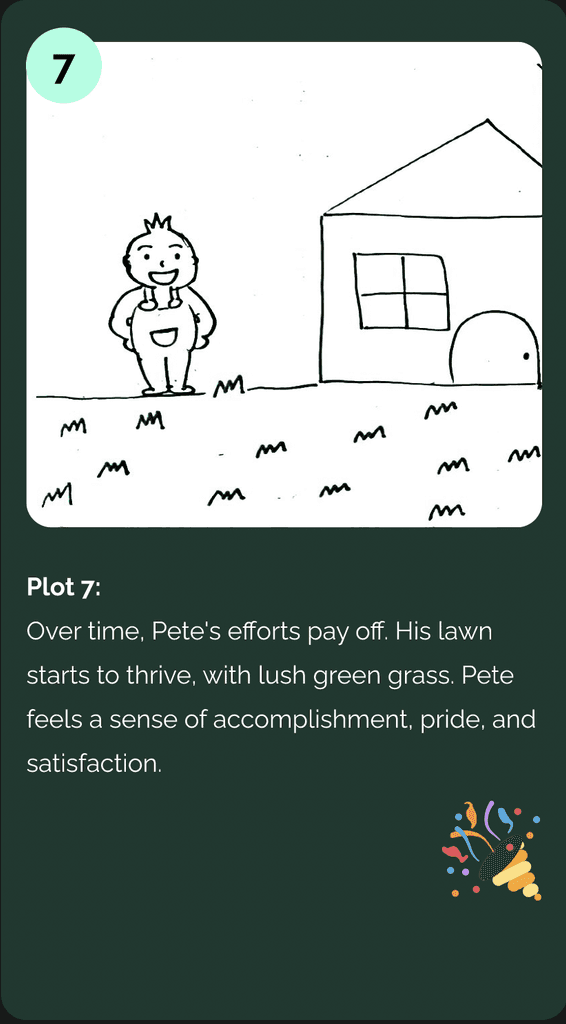
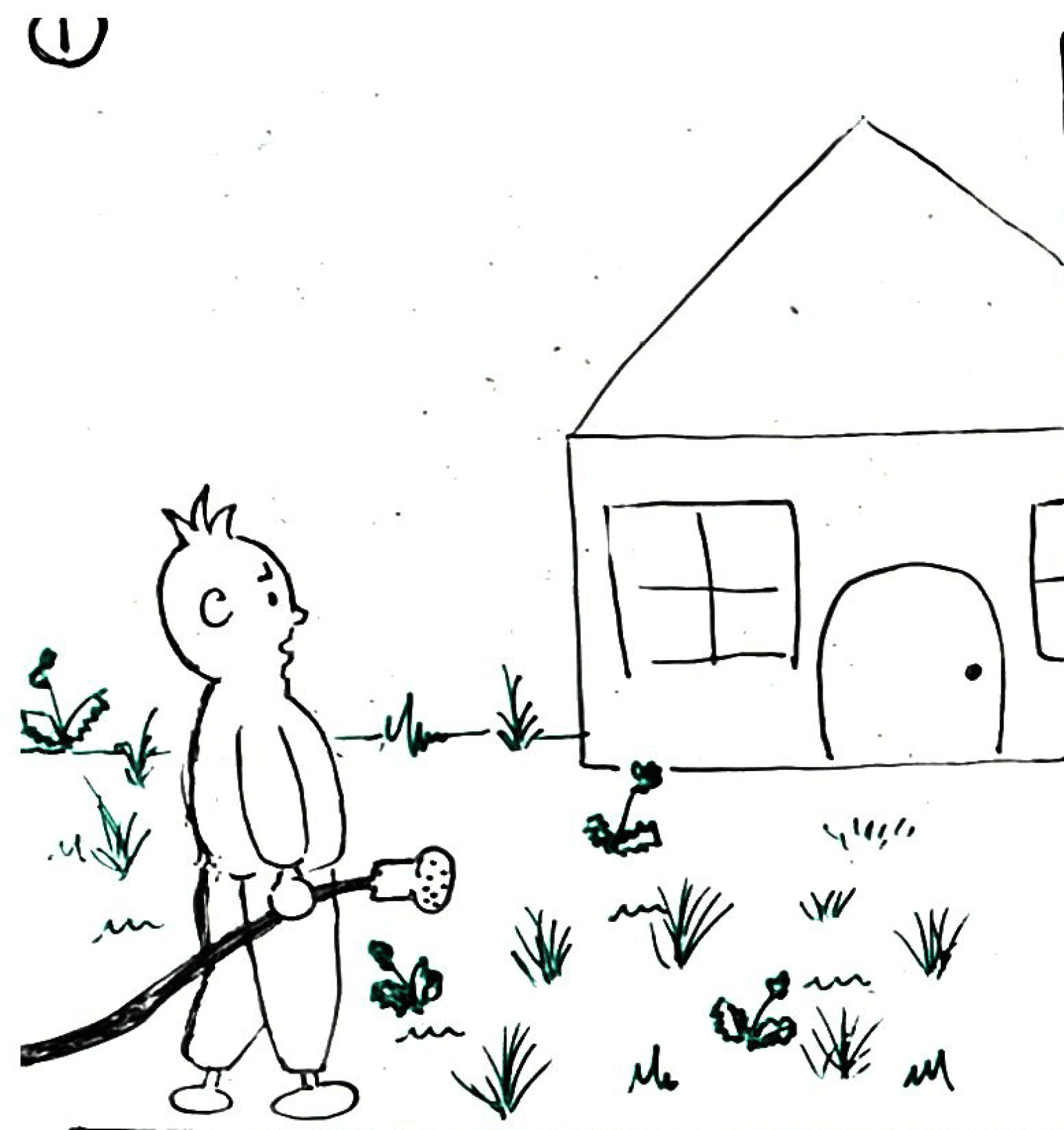
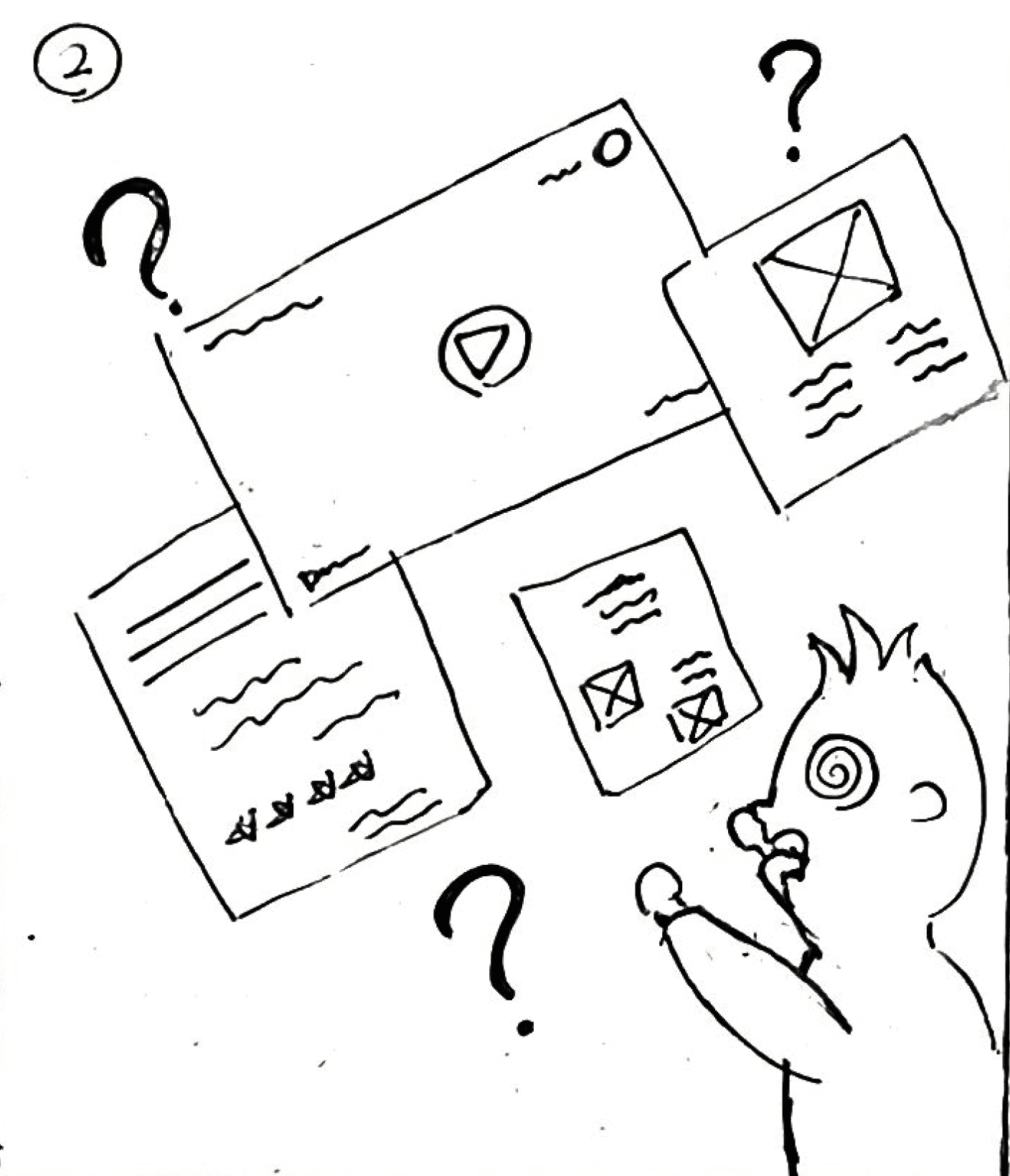
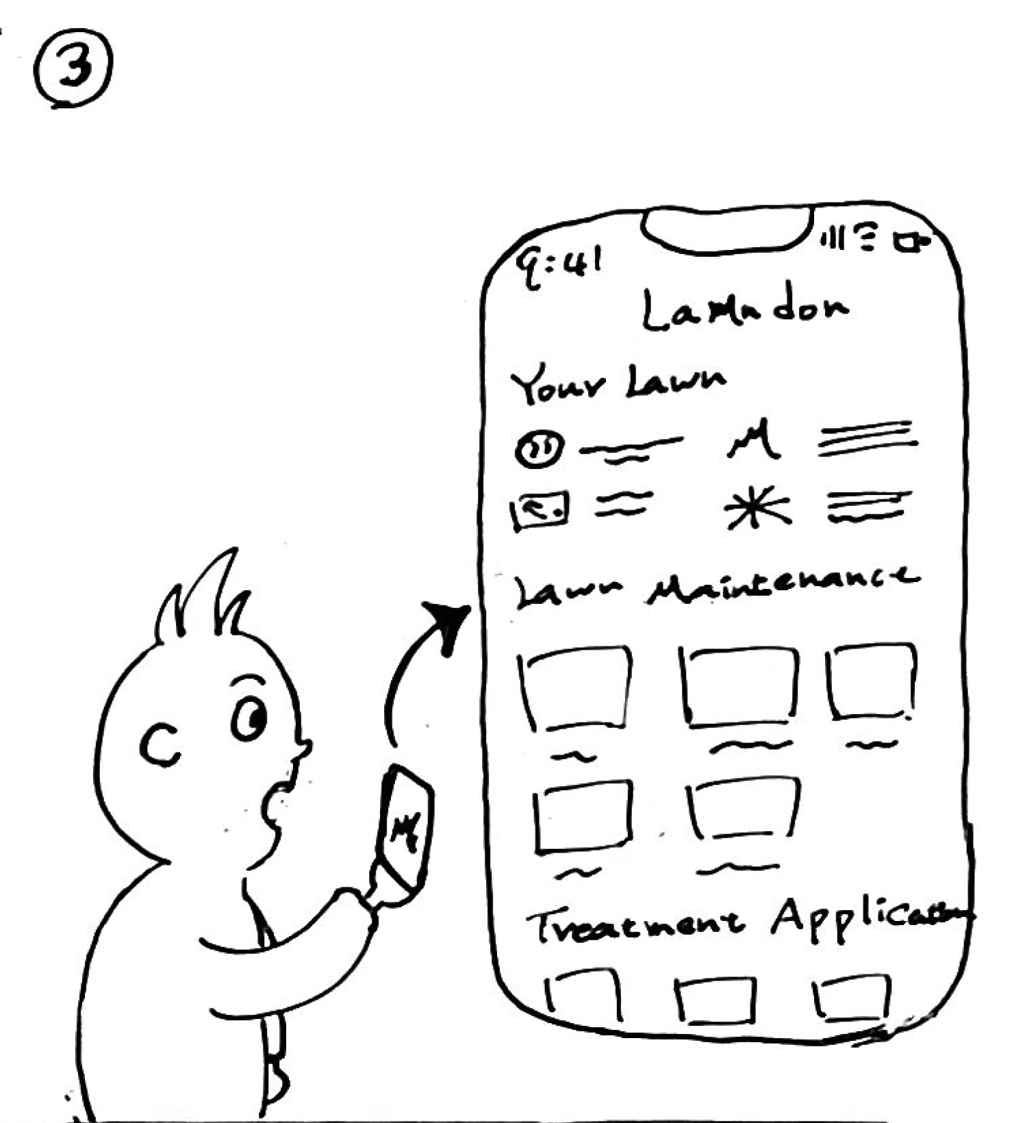
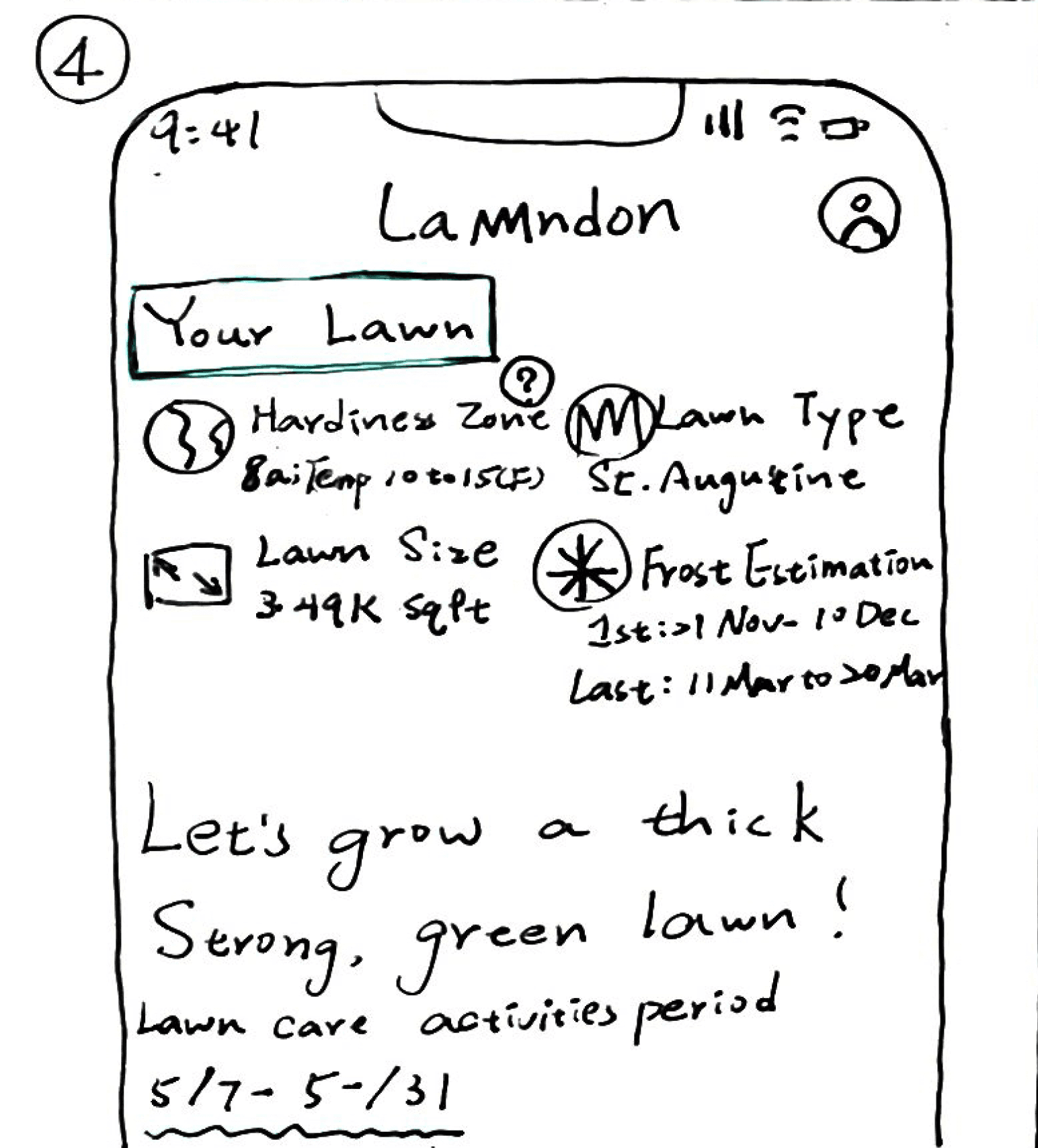
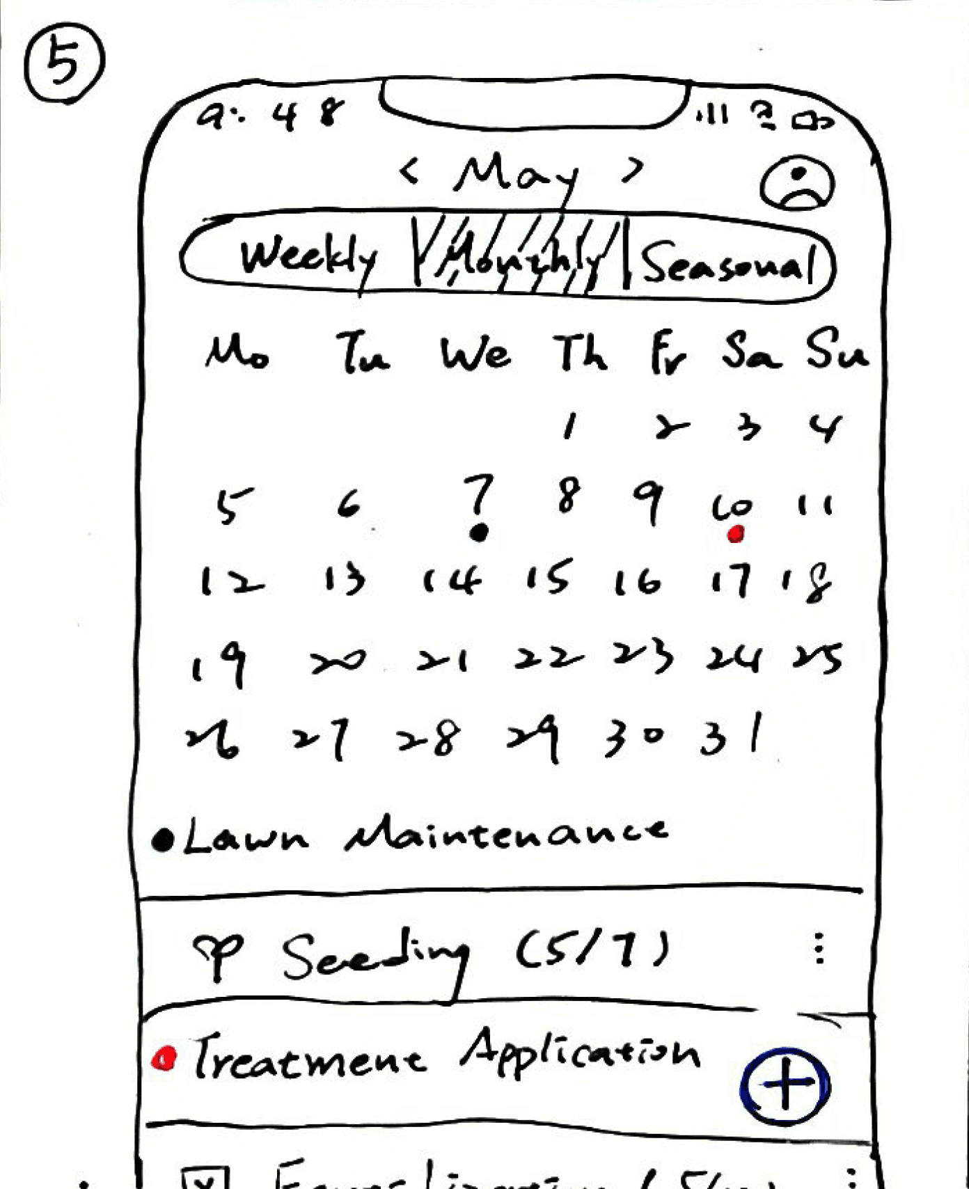
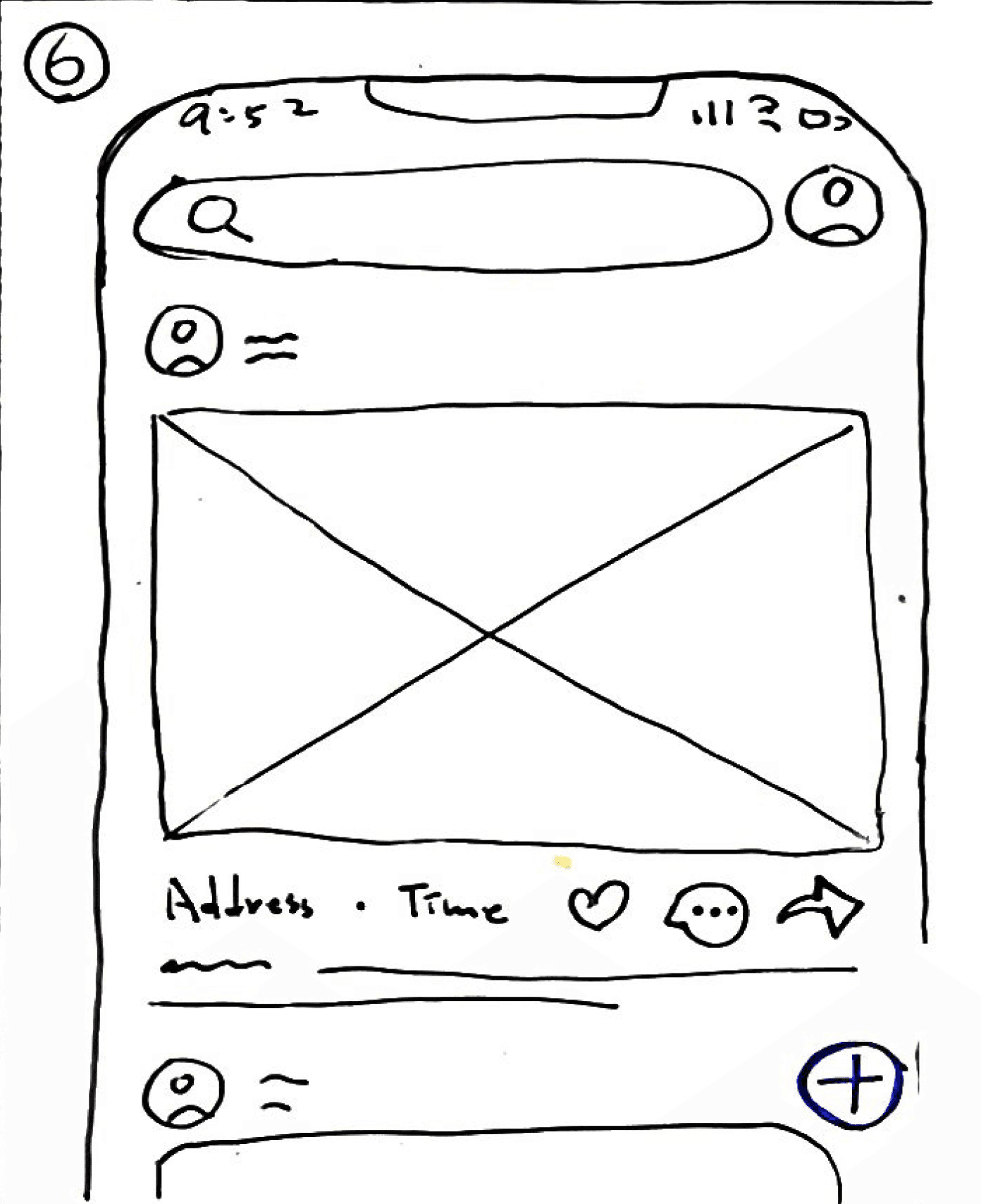
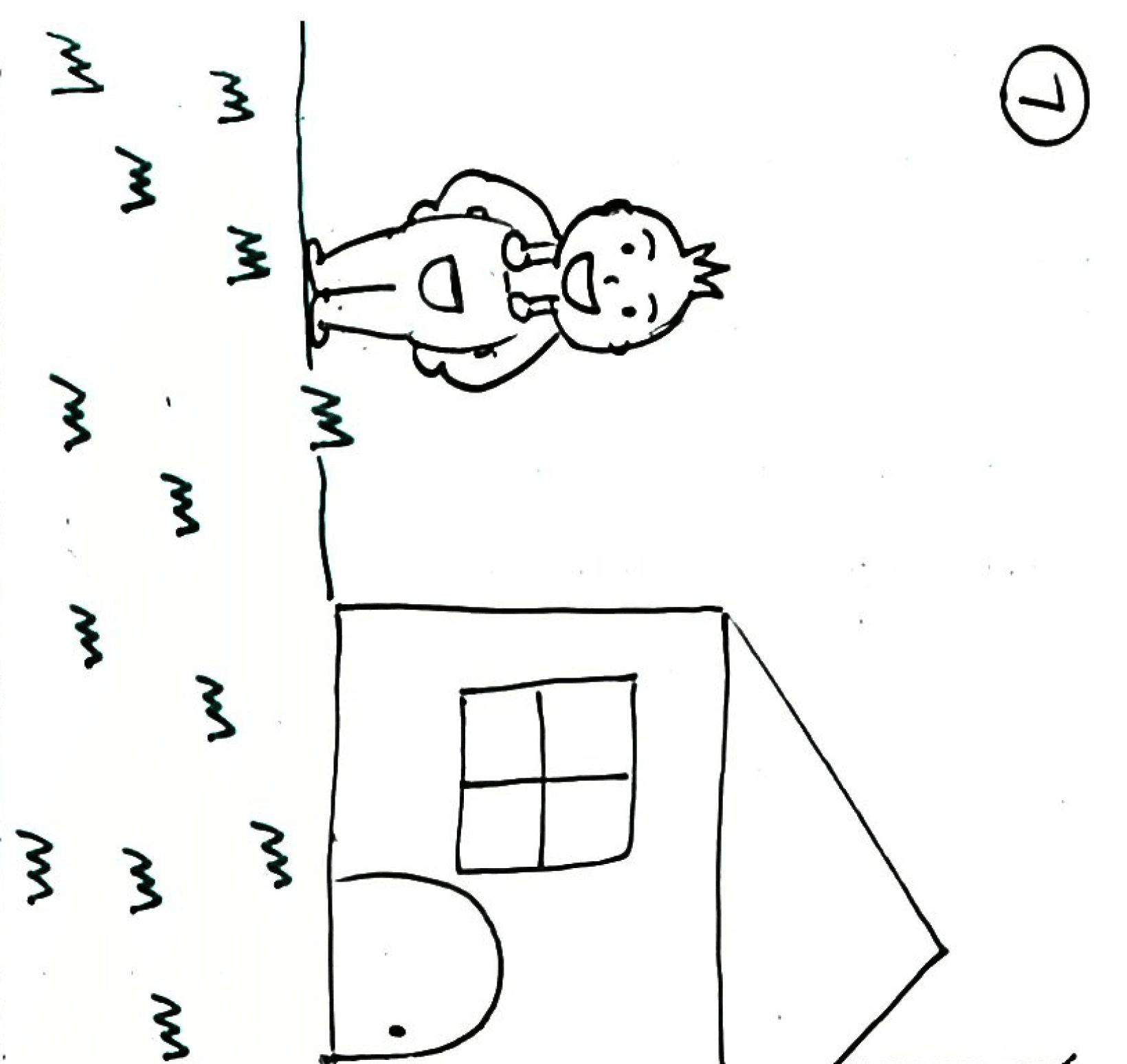
I gathered insights and experiences from my neighbors and crafted a story to illustrate the flow for Lawndon app's target audience. In the story, the central character is Pete, a regular lawn caretaker facing challenges in maintaining his lawn. Pete discovers the Lawndon app, and his lawn care journey takes a positive turn. With the app, he gains valuable lawn knowledge, efficiently organizes his lawn activities using the lawn calendar, and connects with other lawn caretakers in a supportive community.
(The Storyboard)
Low-fidelity wireframe
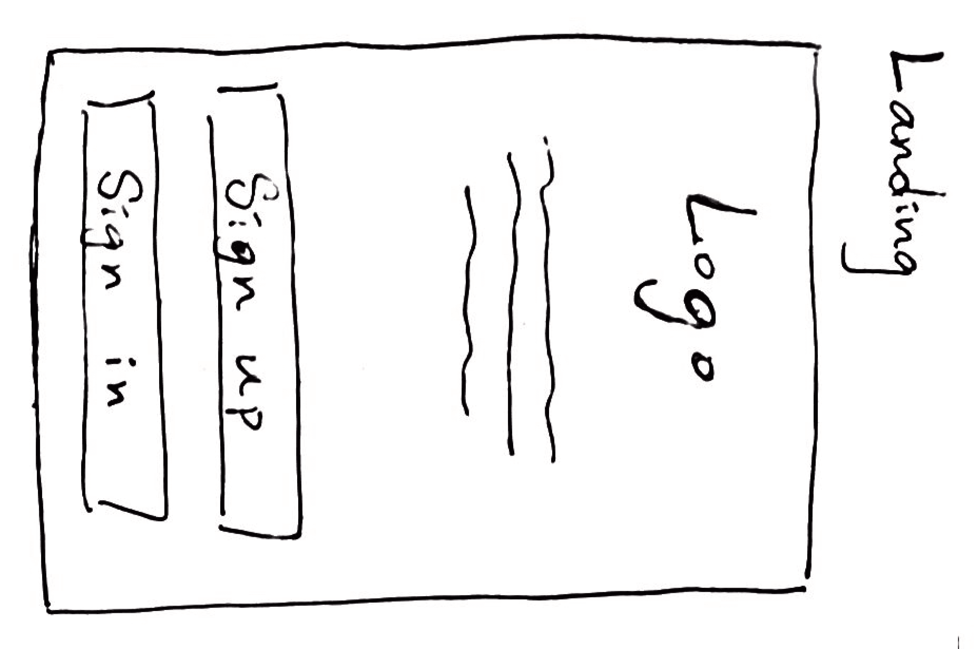
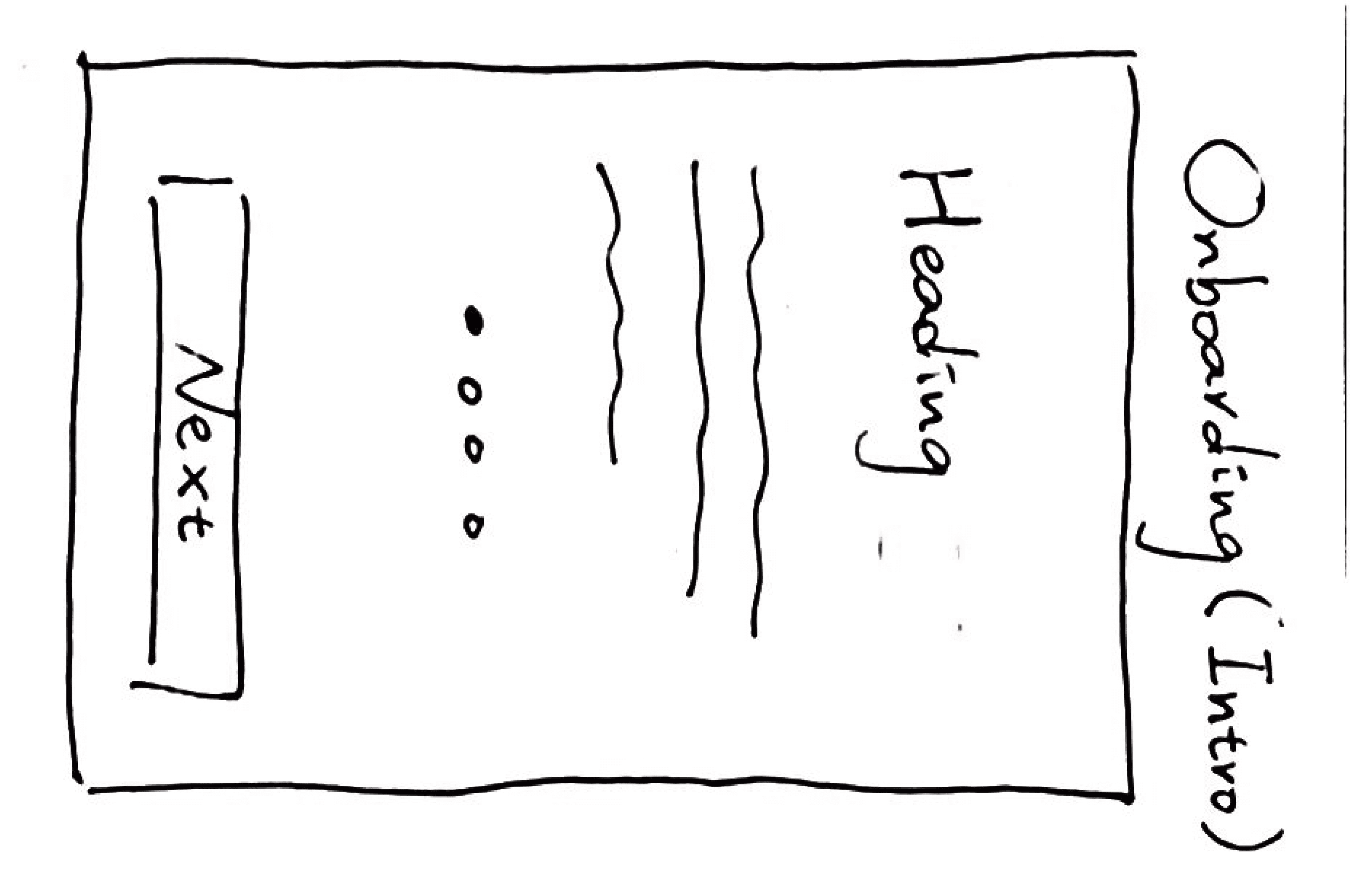
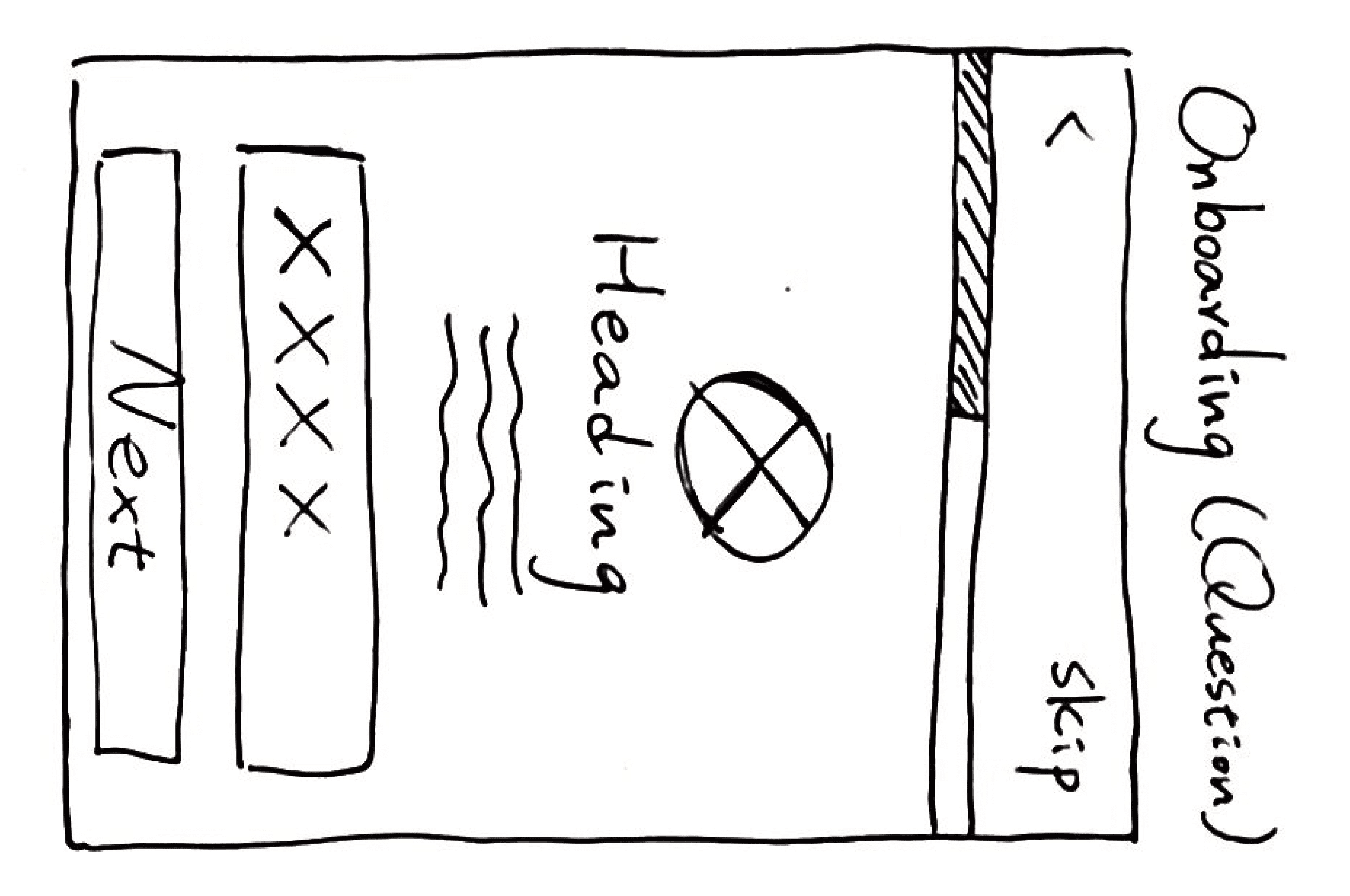
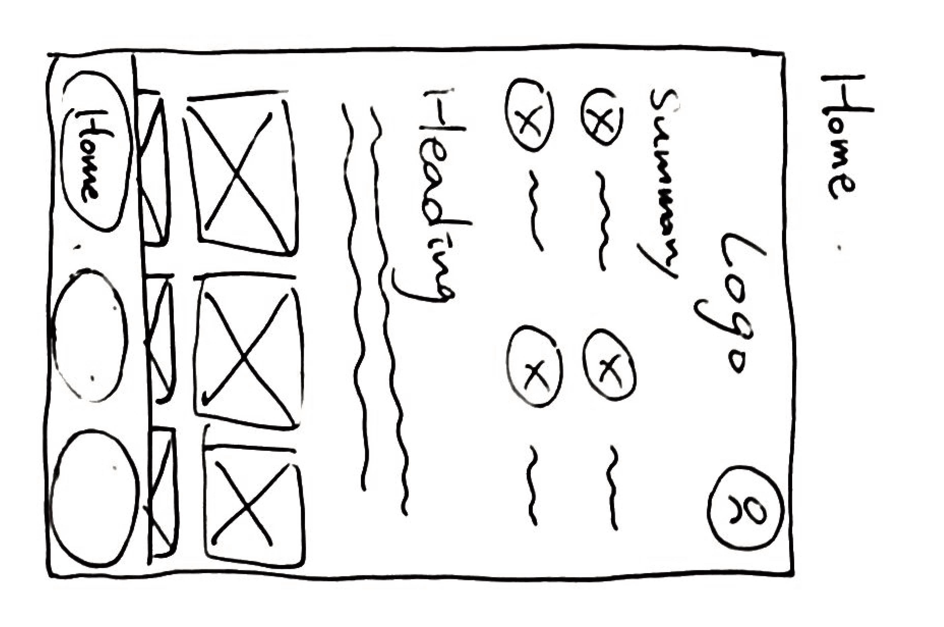
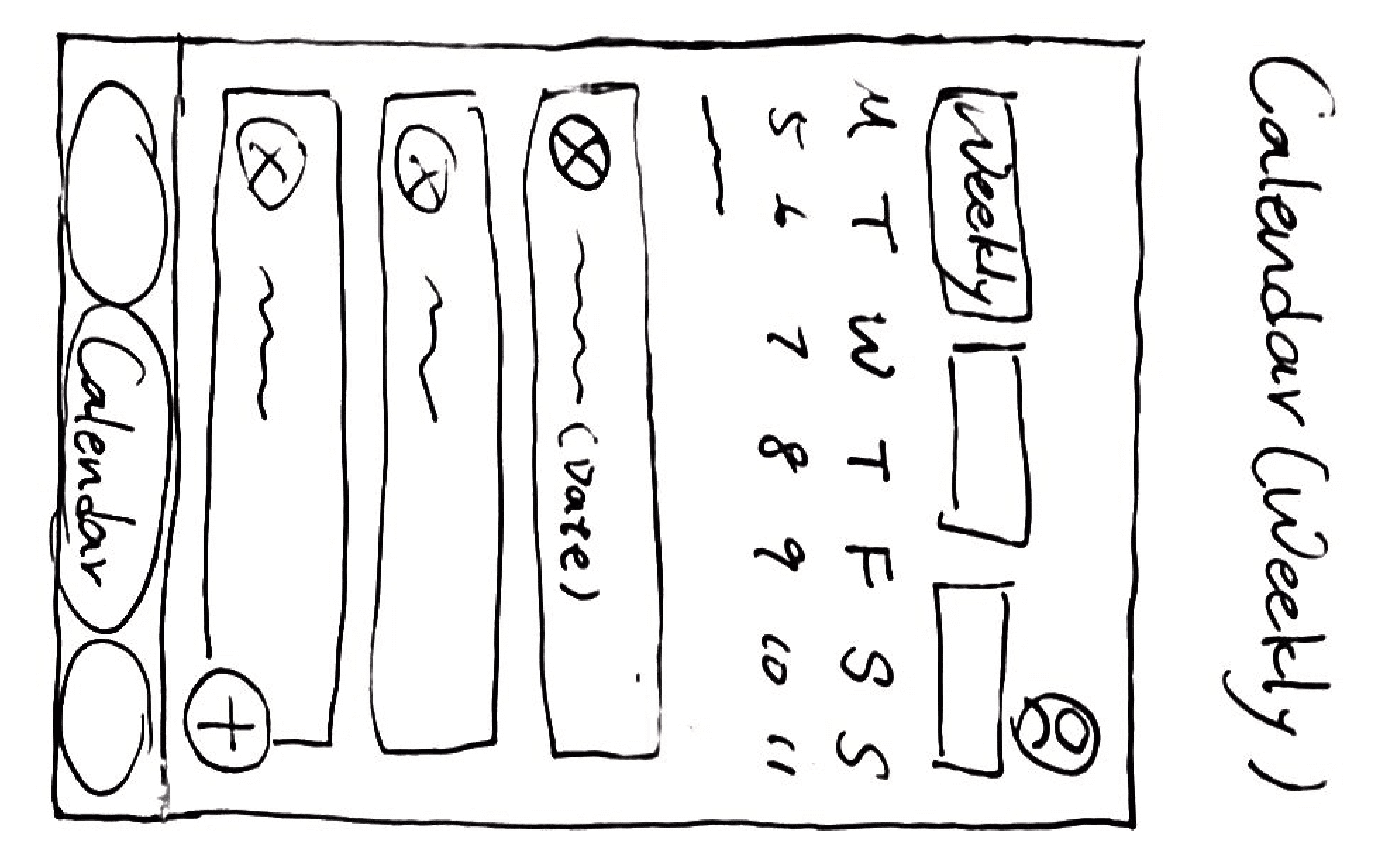
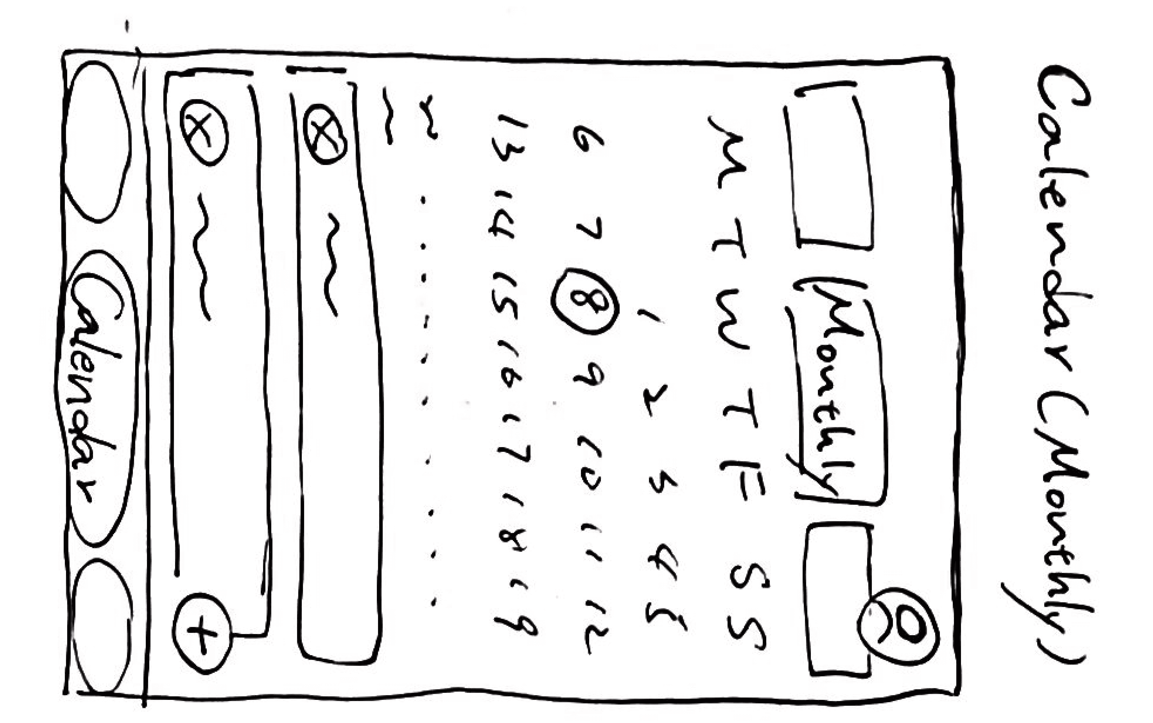
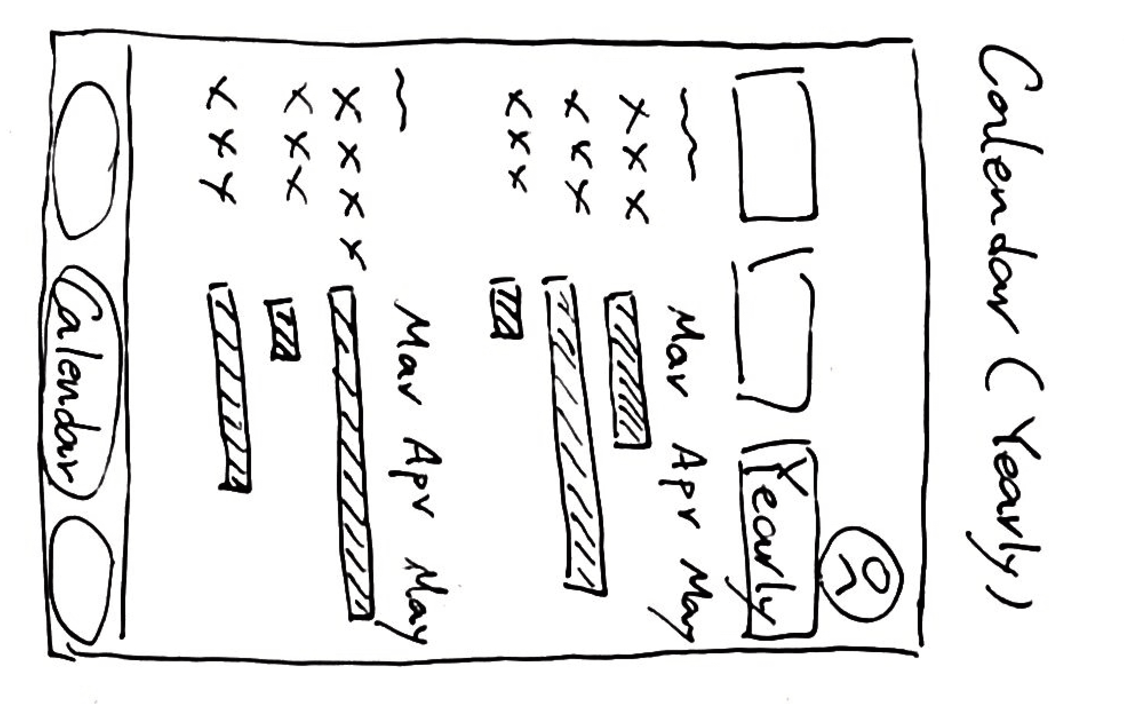
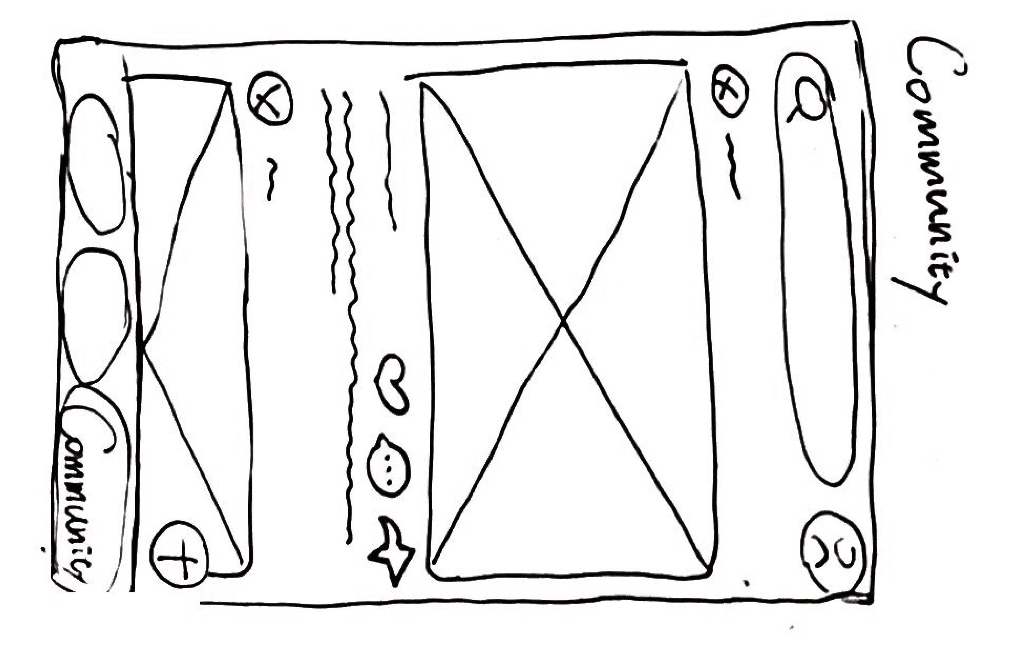
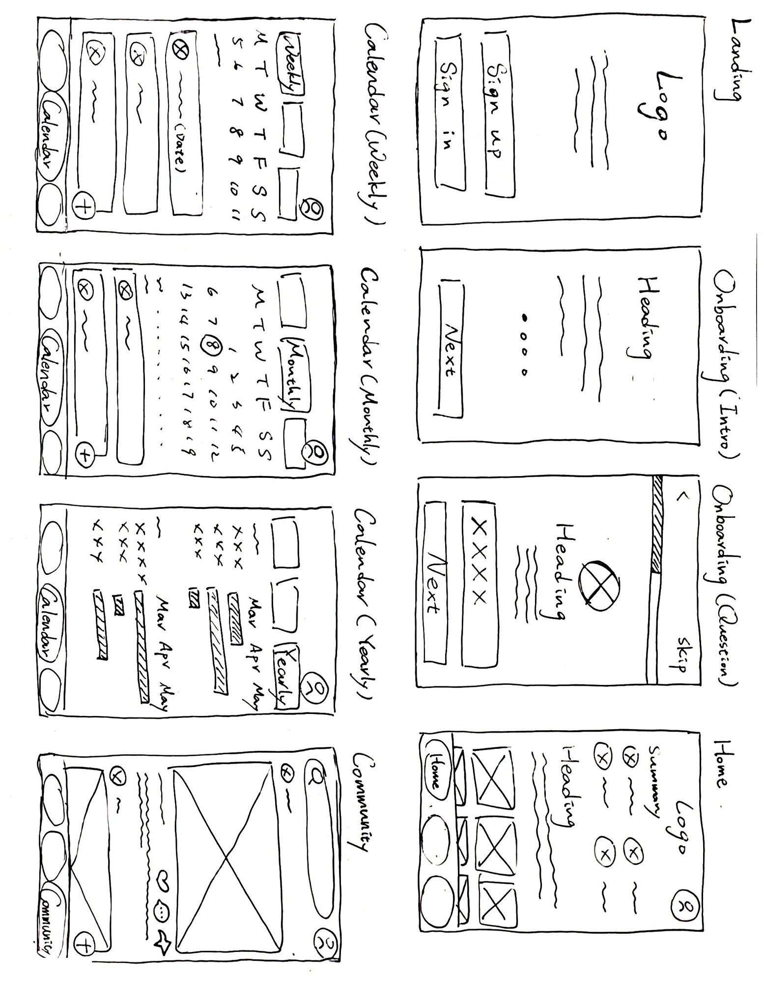
I began with a basic approach, sketching out low-fidelity wireframes that cover key screens such as landing, onboarding, home, calendars, and community. This initial draft lays the groundwork, providing a starting point for developing more intricate features for the app.
(The Low-Fidelity Wireframe)
Task flows
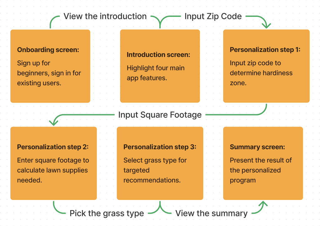
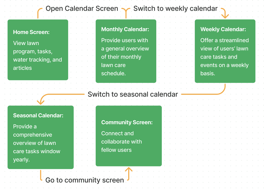
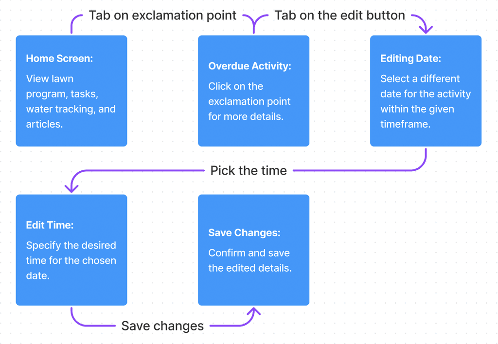
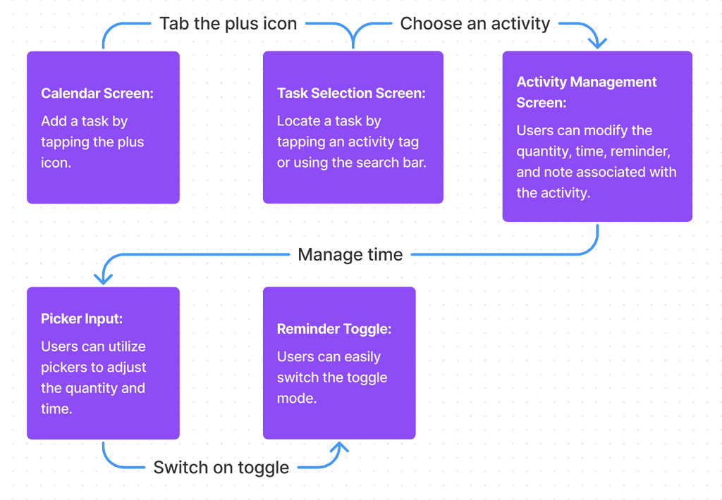
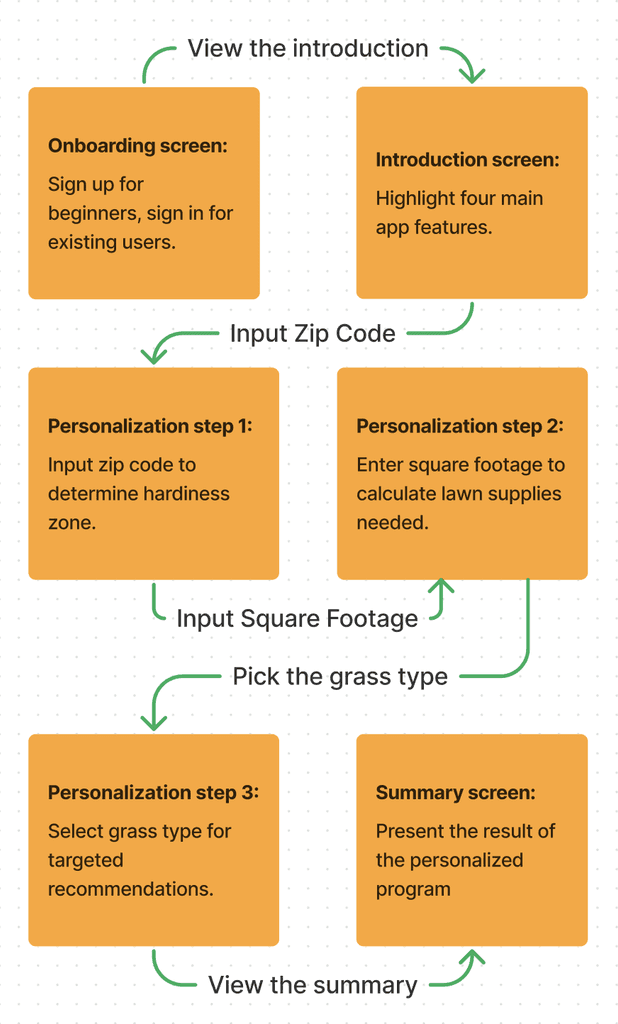
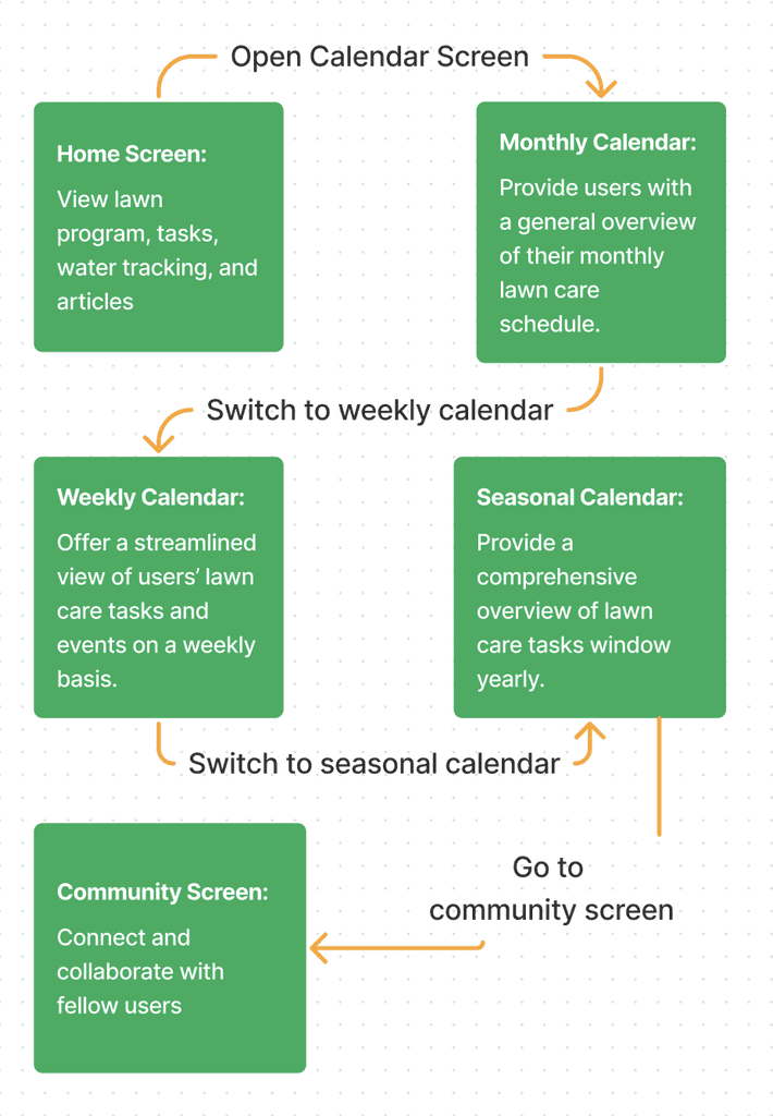
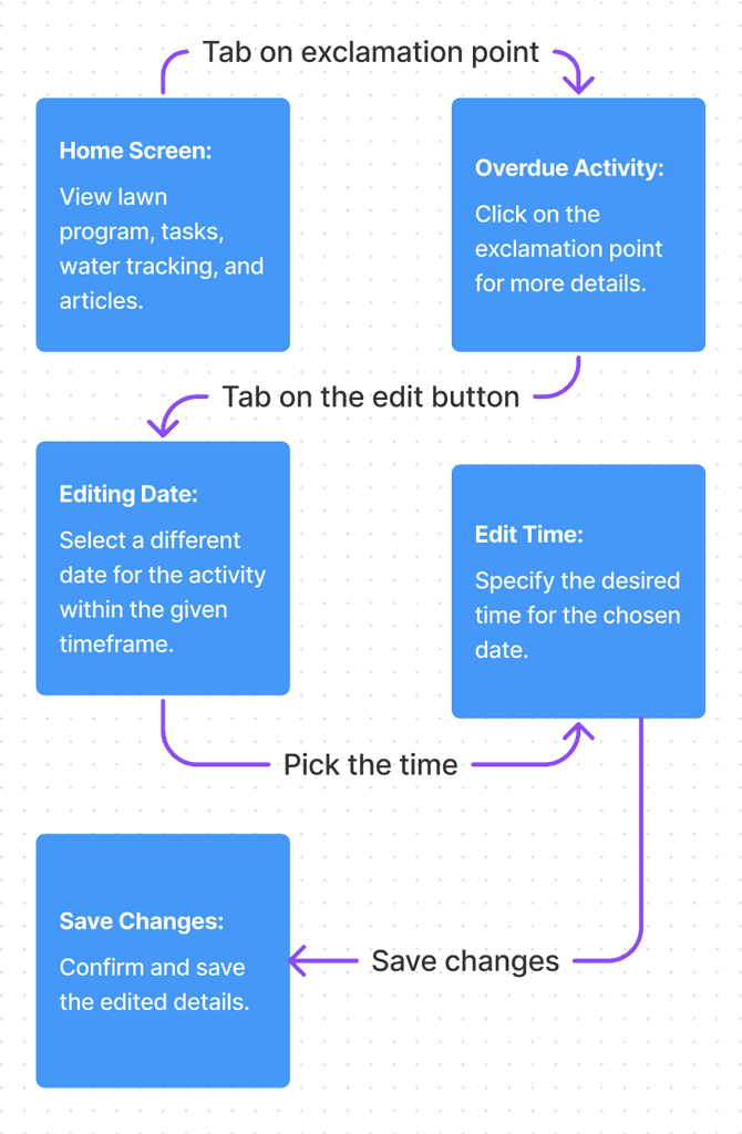
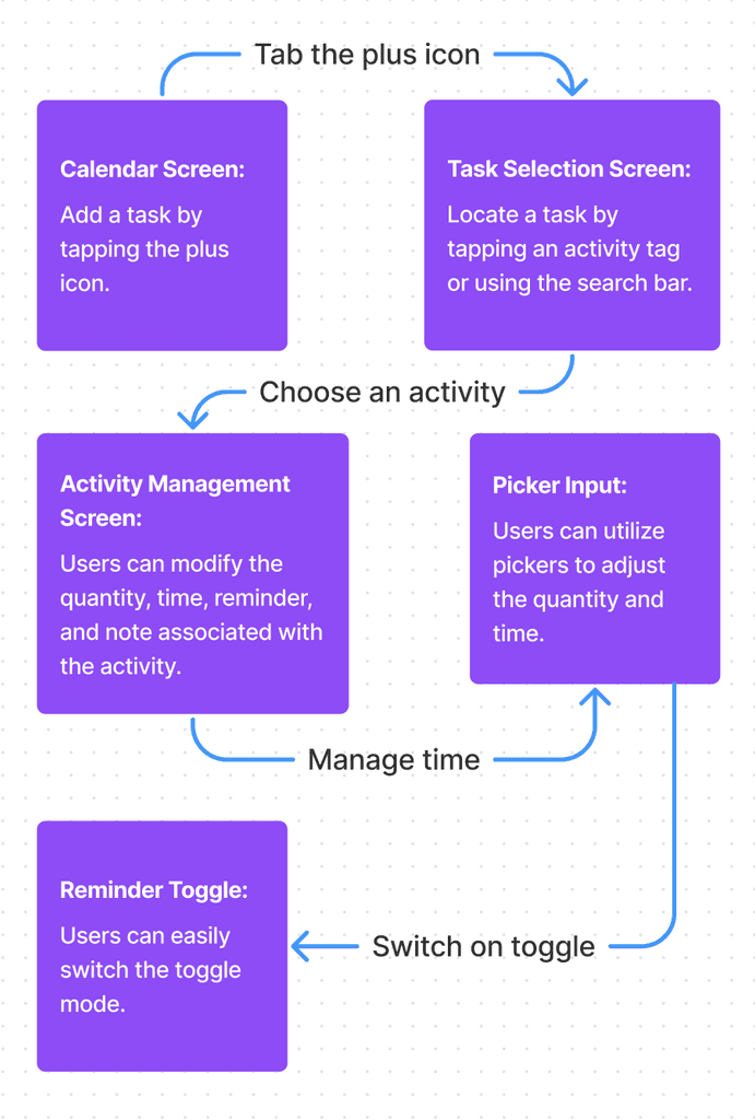
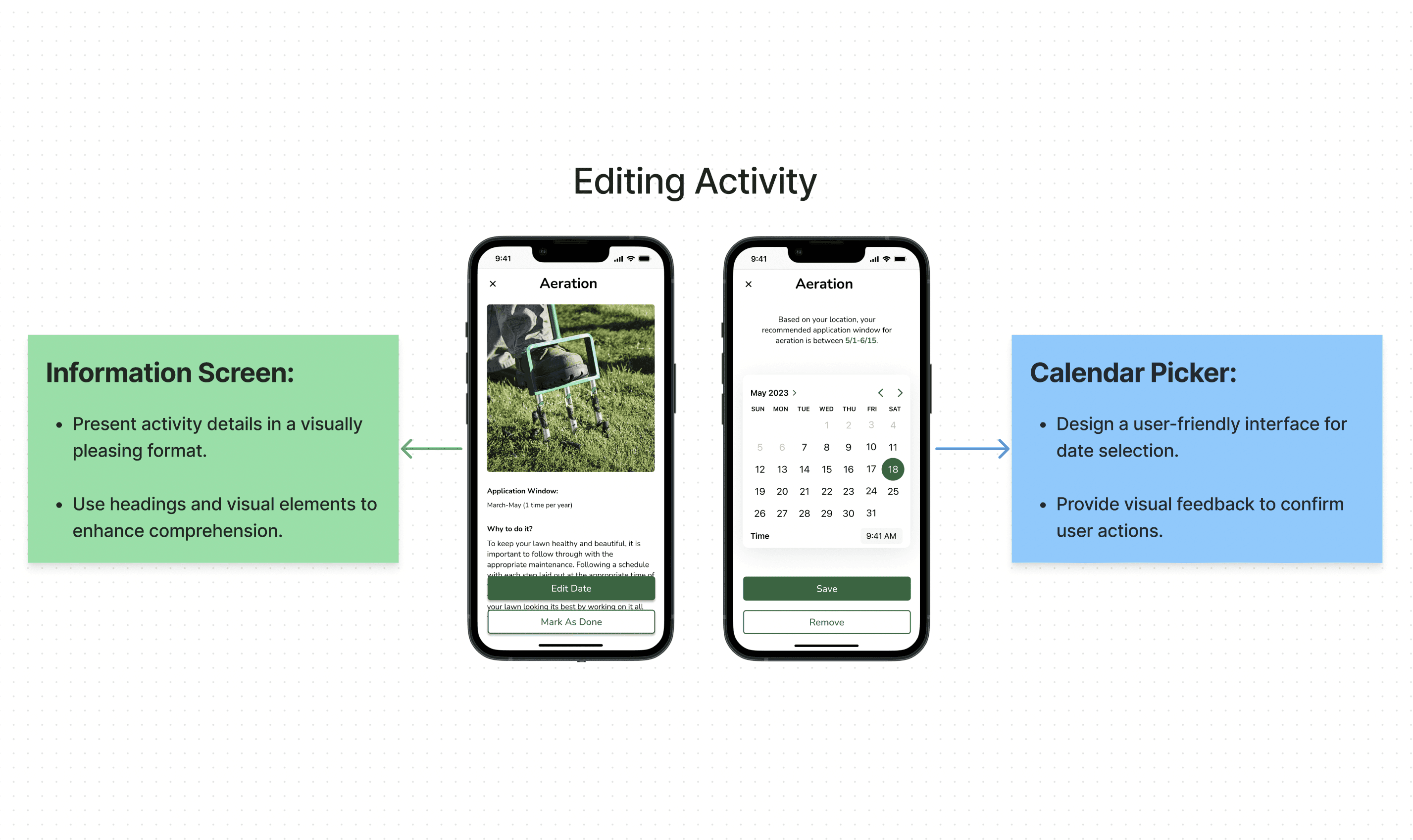
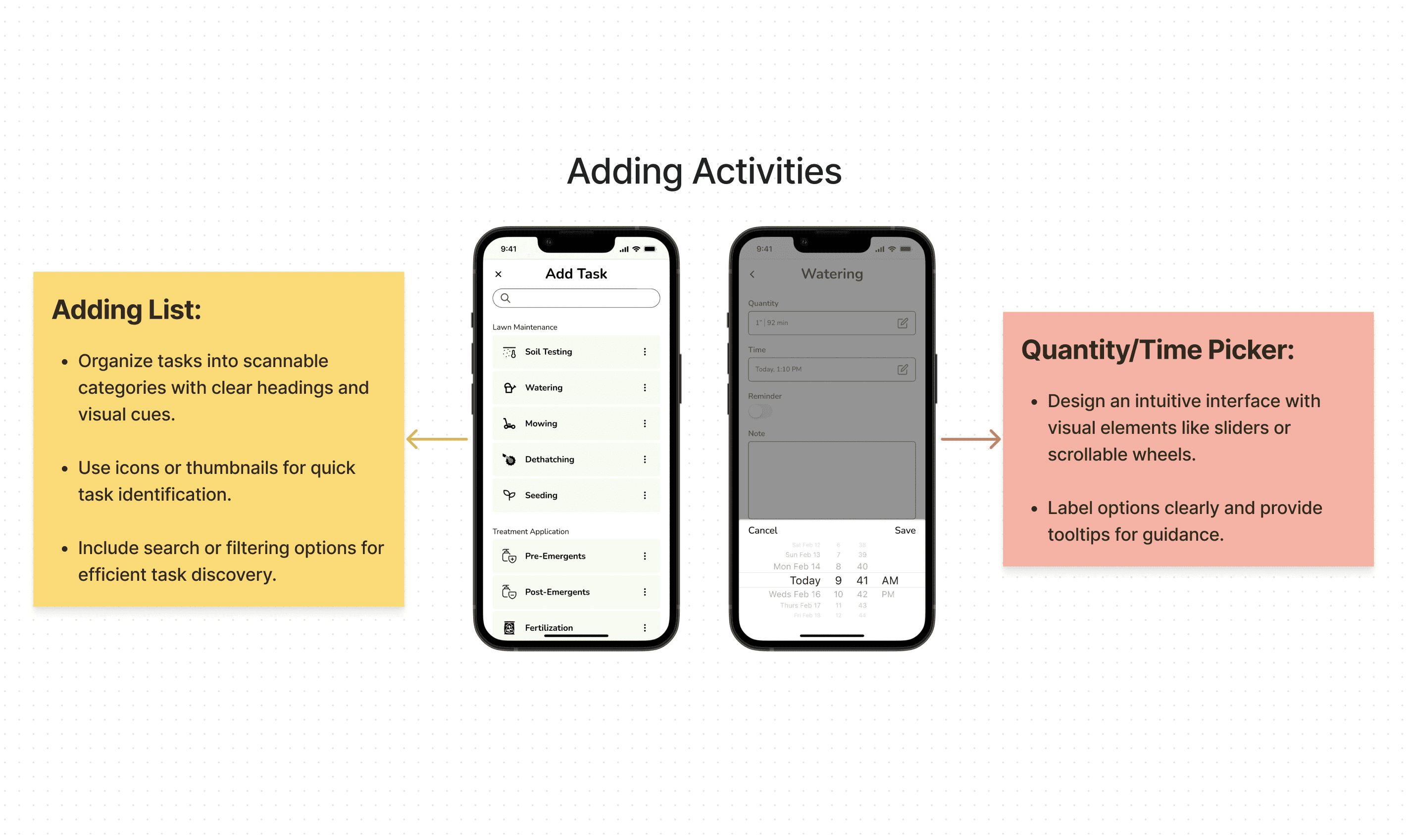
Following the app's structure, I developed task flows for crucial screens such as onboarding, home, editing, and adding tasks. These task flows aim to provide a clear understanding of the app's primary features, ensuring a user-friendly experience for onboarding, navigating the home screens, editing information, and adding tasks efficiently.
(The Task Flow)
3 major iterations
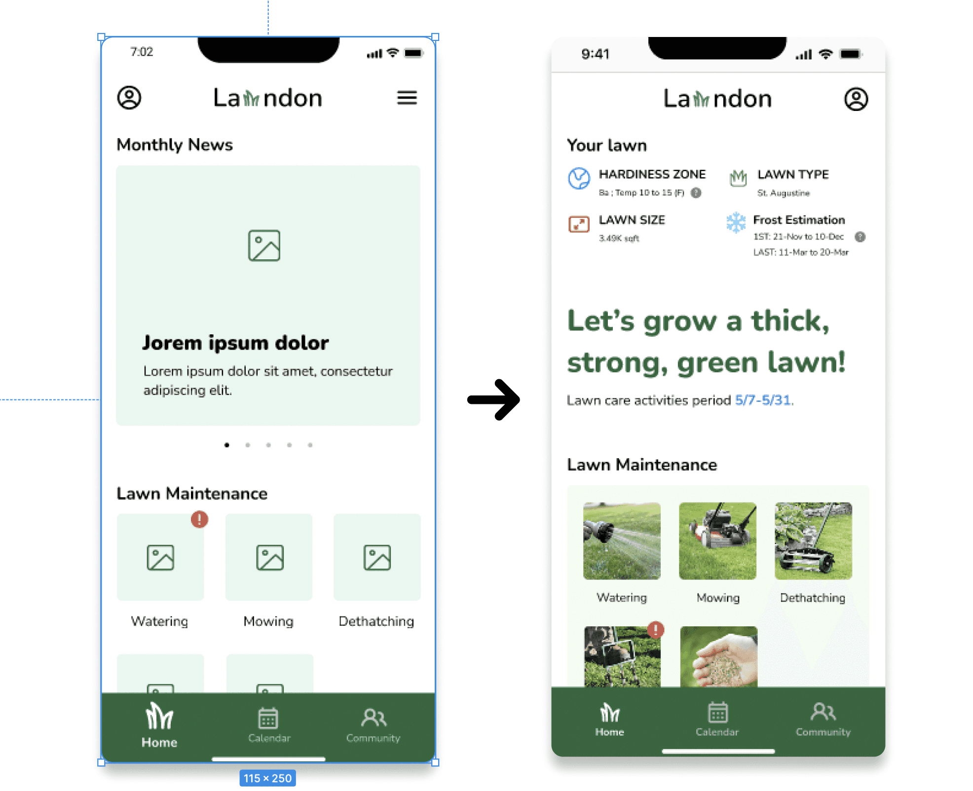
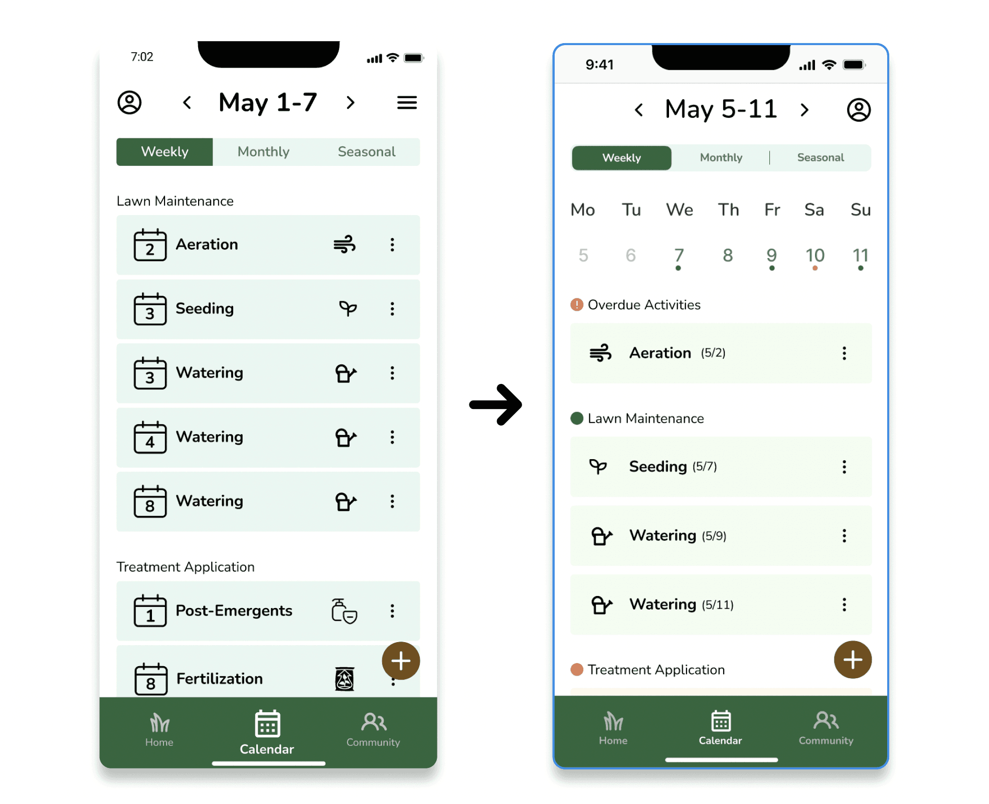
After 5 usability tests, I refined the design based on three key insights. Prioritized clear onboarding for new users, emphasized personalized lawn summaries, and optimized calendar functionality for group tasks and a better overview.
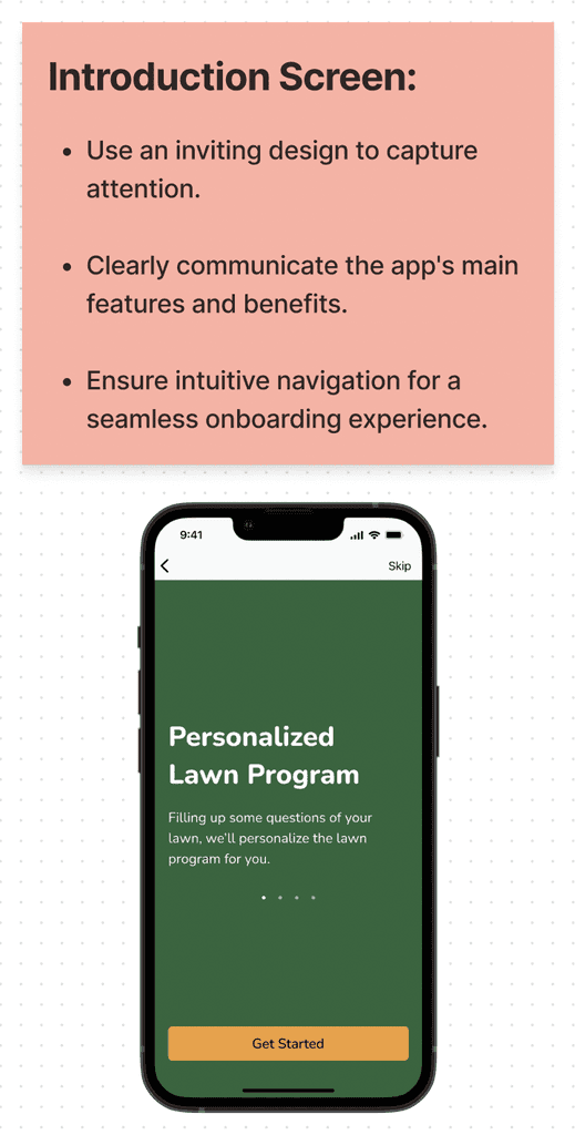
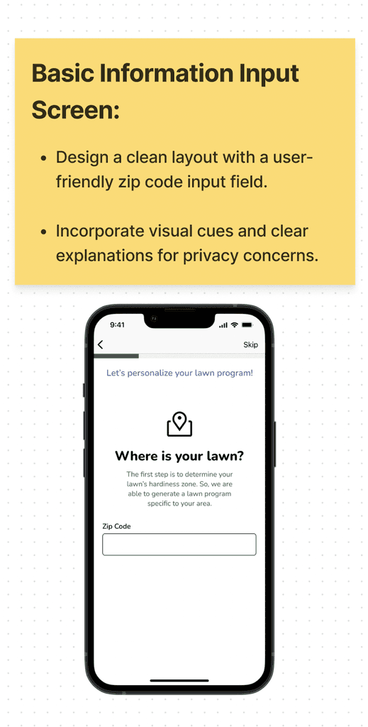
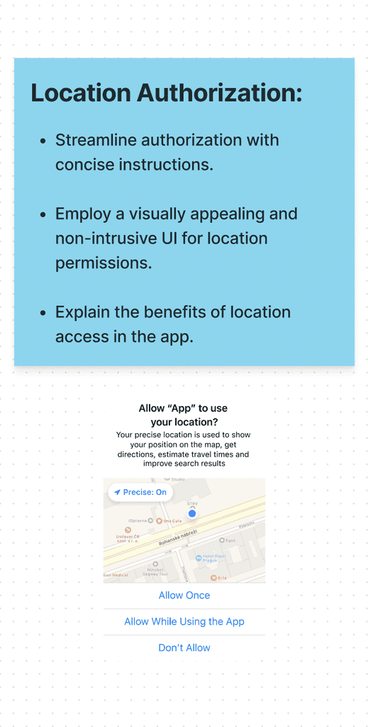
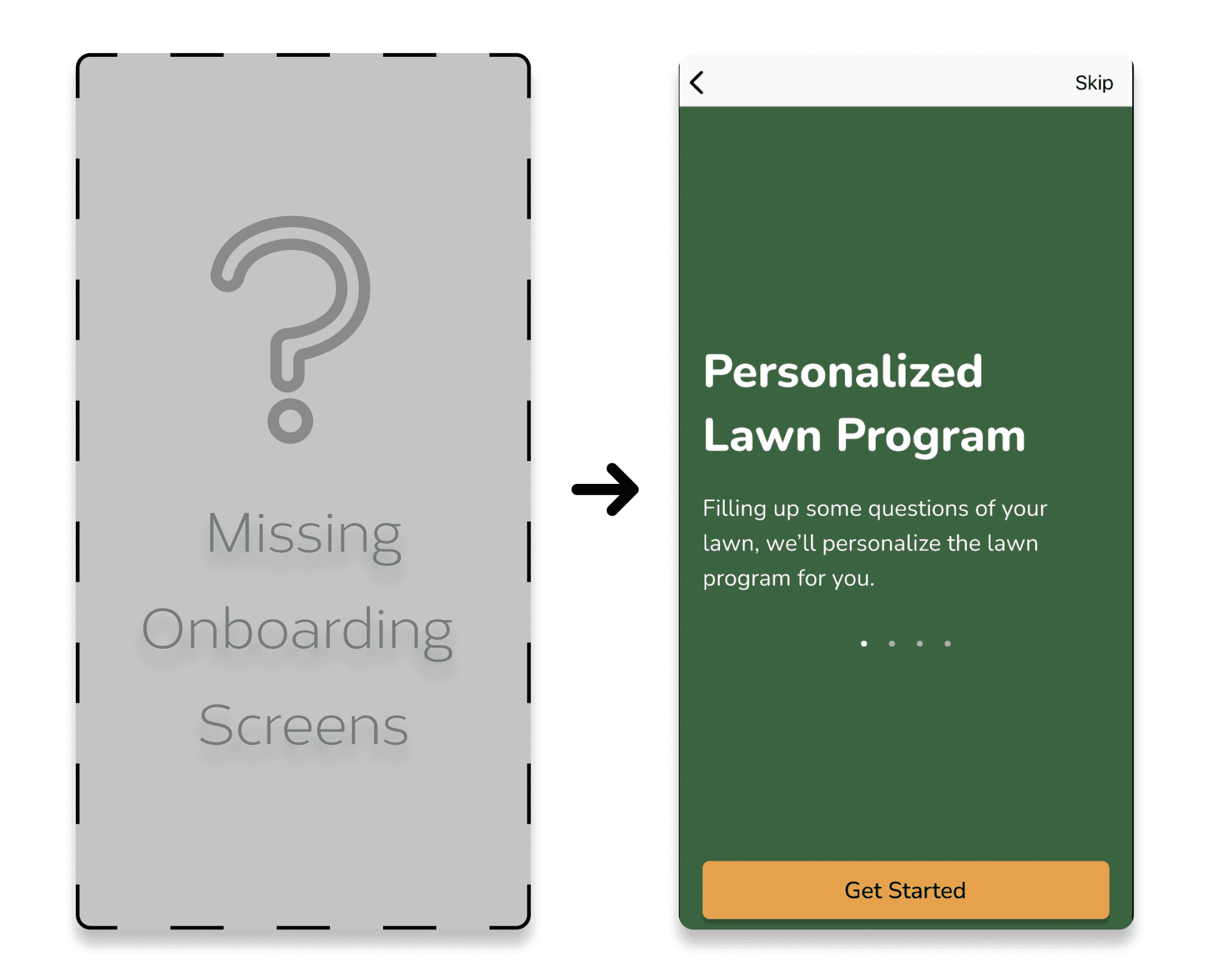
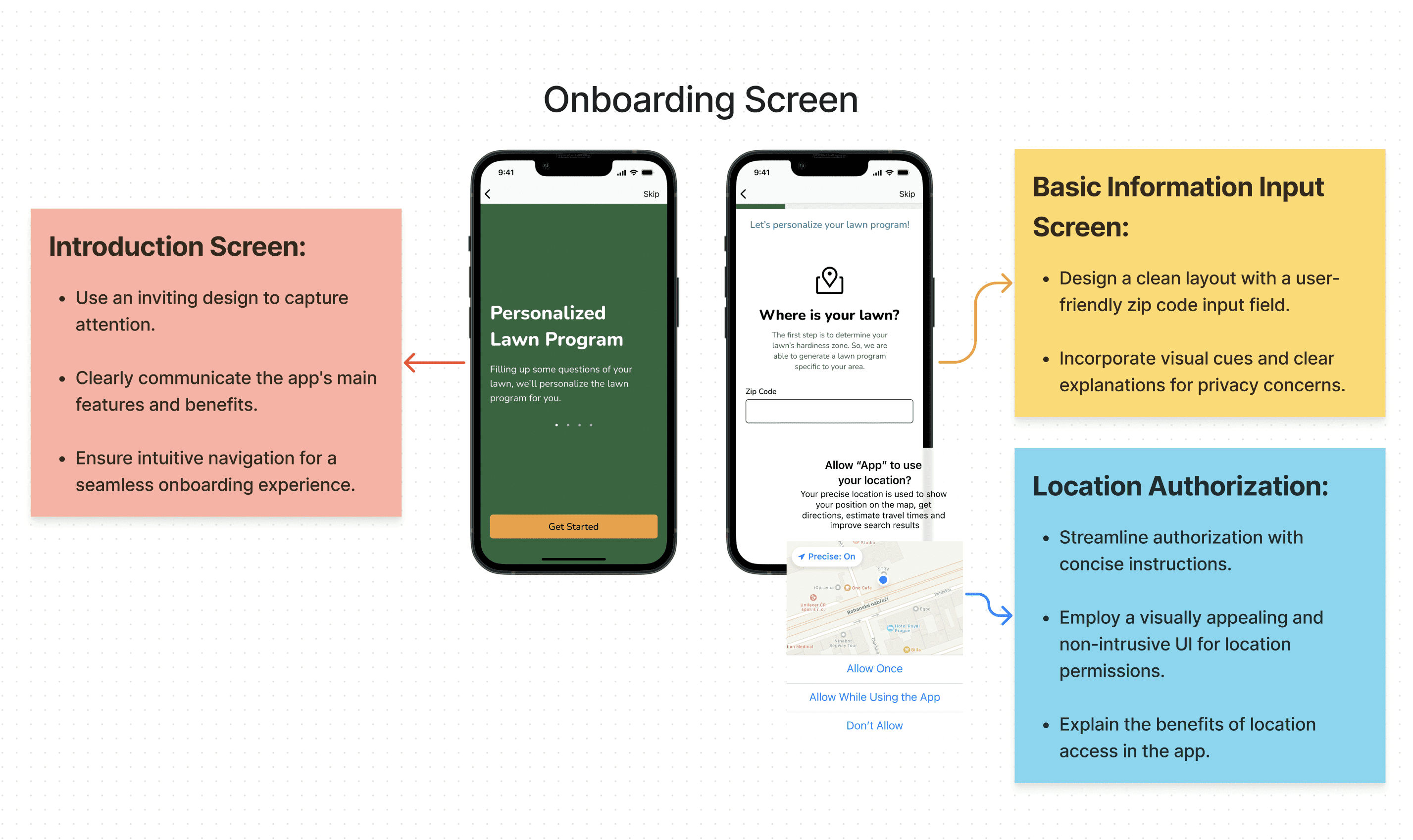
1 - Enhancing user orientation with onboarding screens
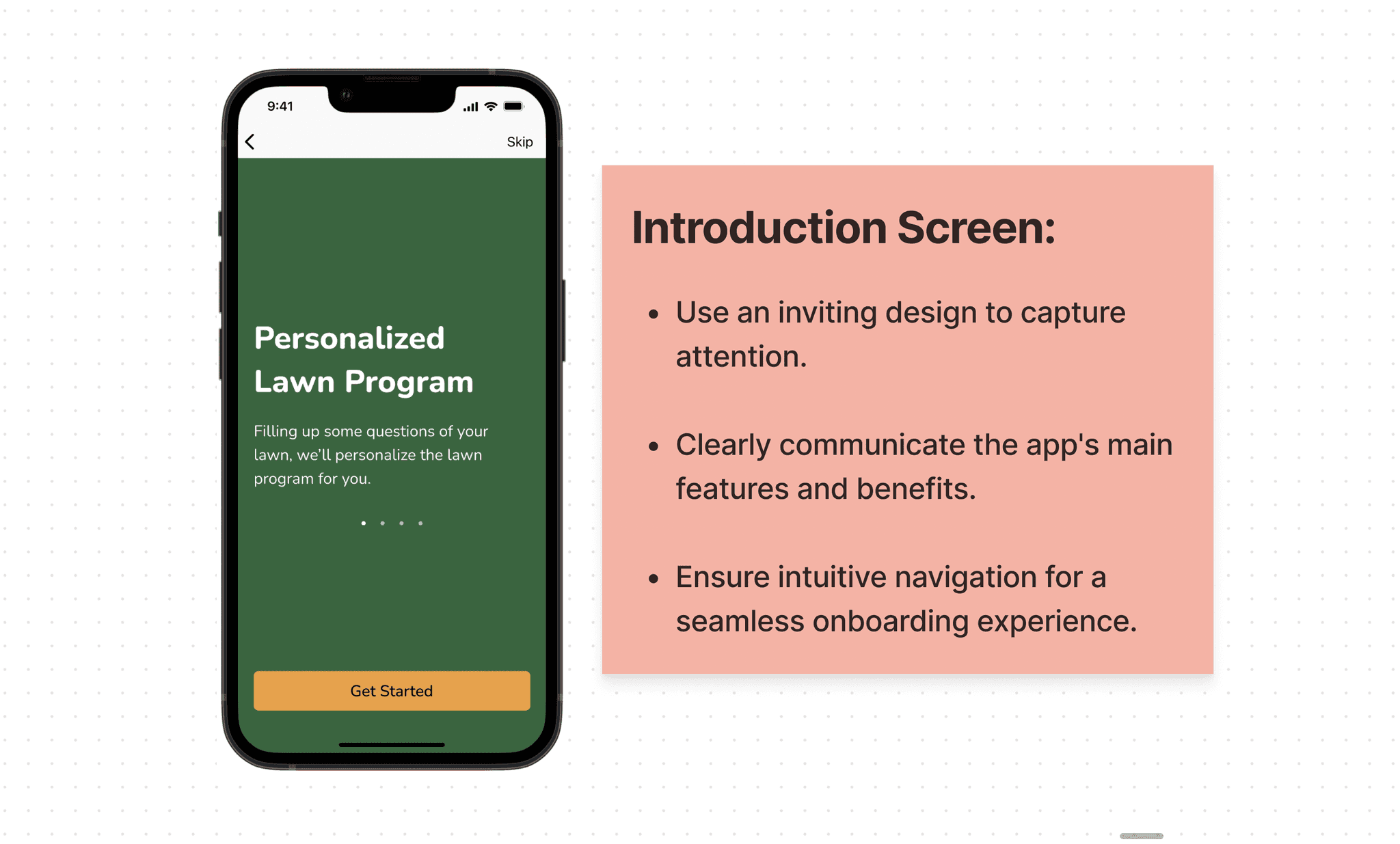
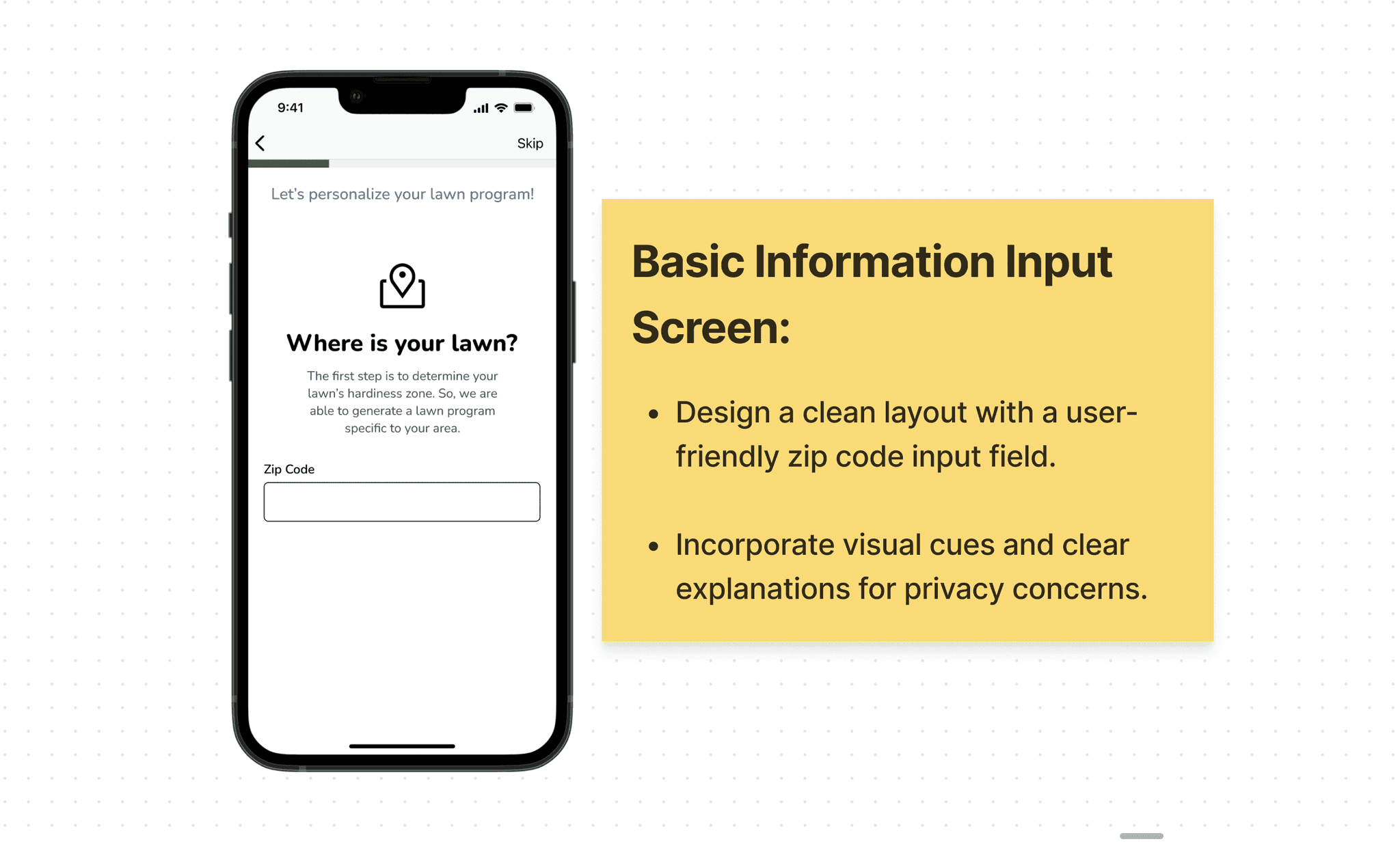
I discovered that without onboarding screens can discourage users from progressing, especially when they encounter confusion the first time they download the app. To solve the problem, I've implemented onboarding screens to guide users step by step, ensuring users have a chance to orientate the app in a leading way.
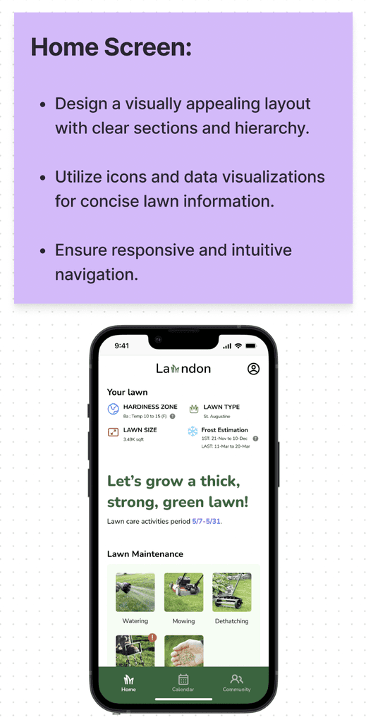
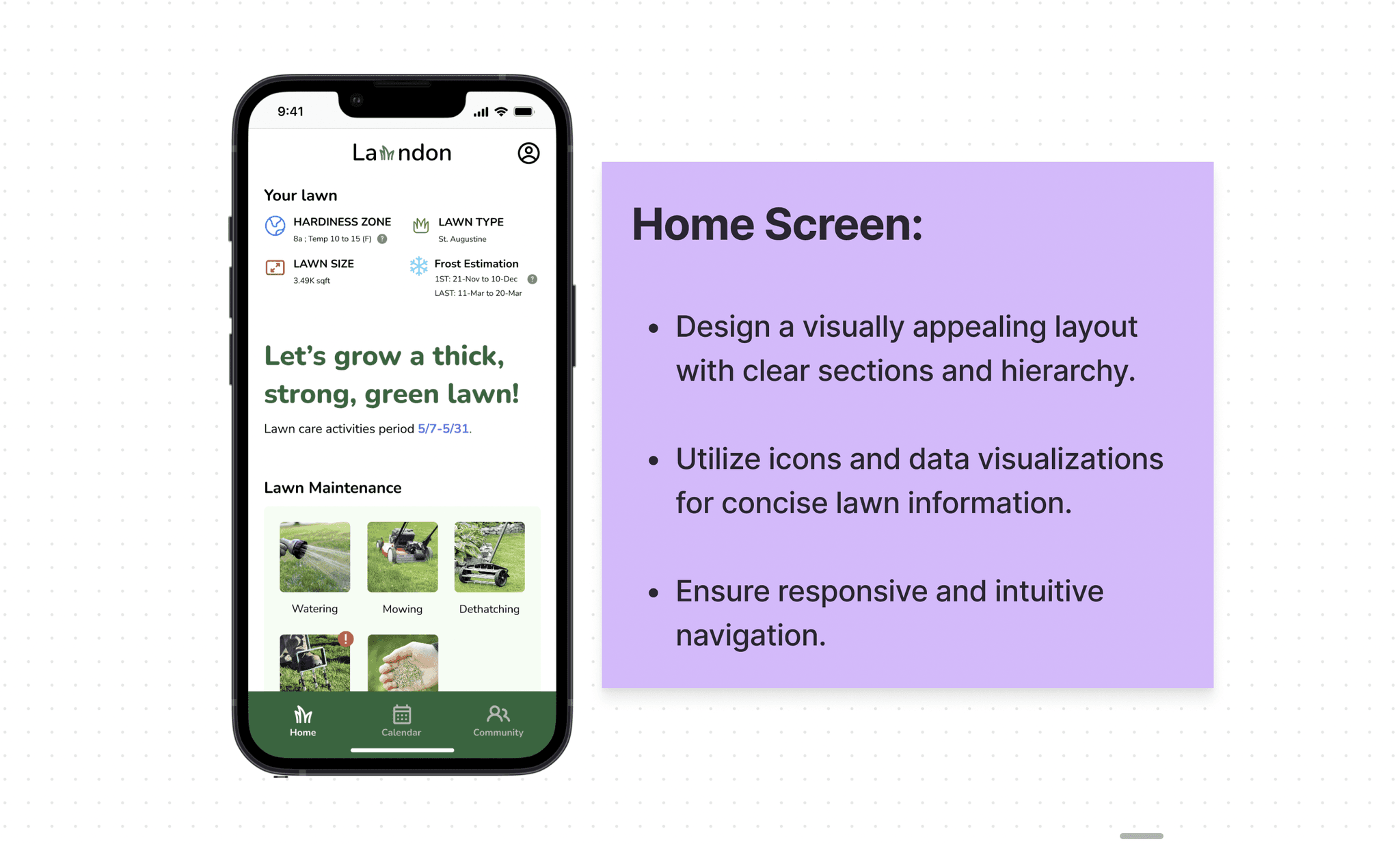
I chose to prioritize the personal lawn summary over monthly news at the top of the home screen, aligning with a user-centered approach. This ensures users can immediately access a more engaging and personalized experience when using the app.
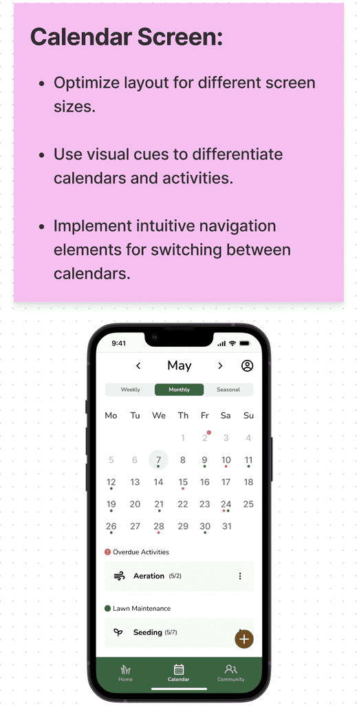
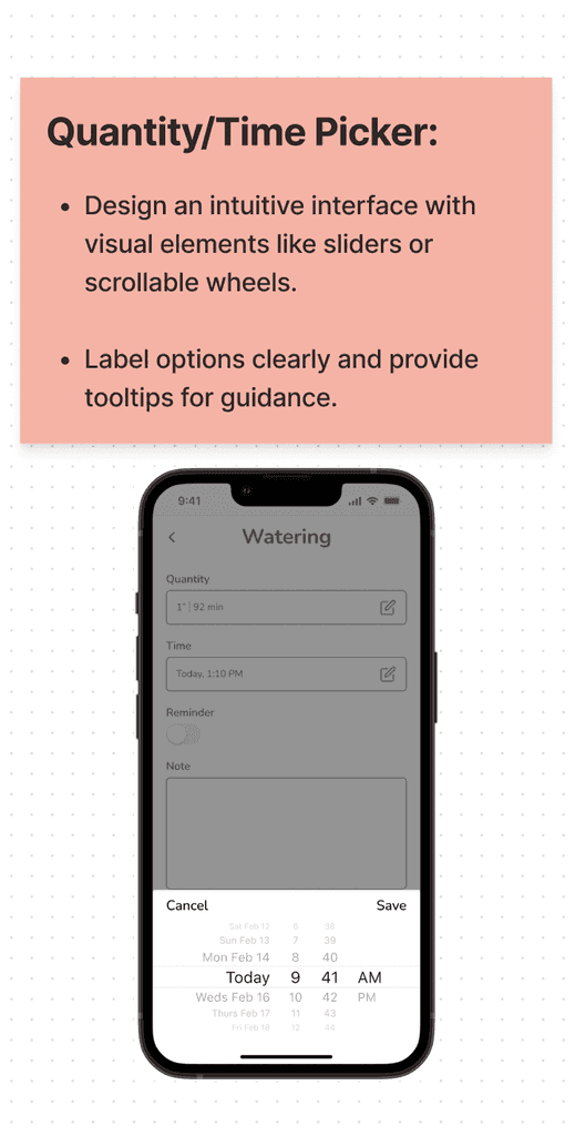
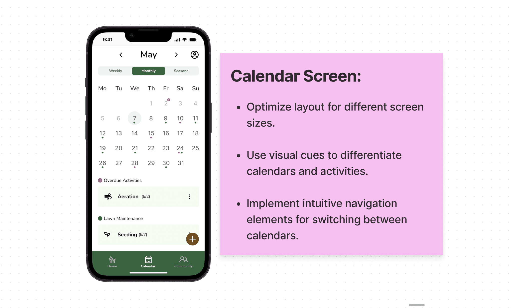
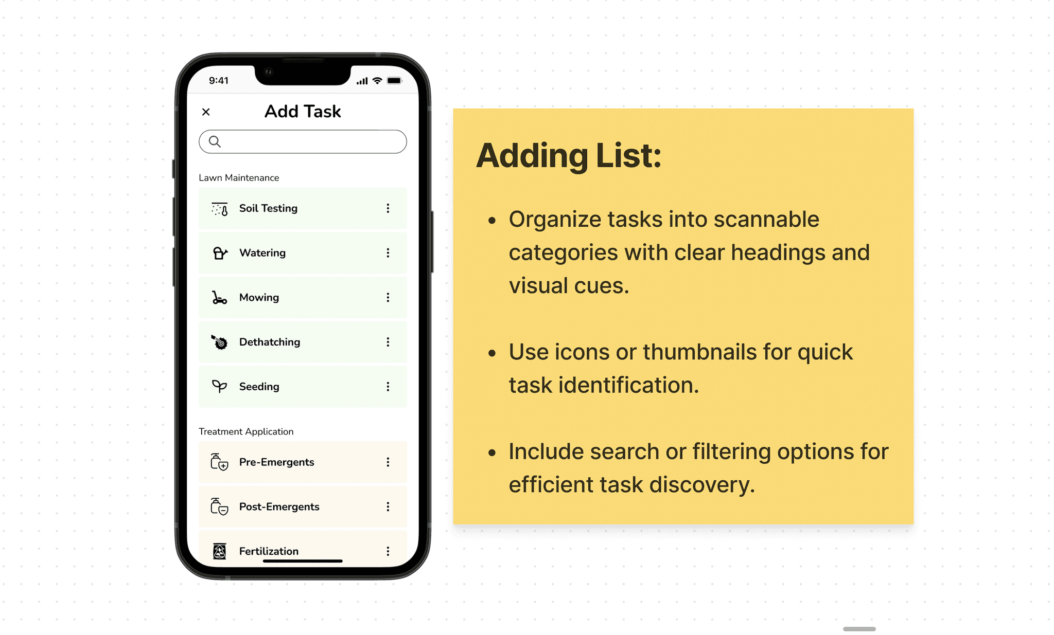
I added a weekly calendar for a quick schedule overview, so users are able to preview the upcoming lawn activities. I also restructured the interface, placing task icons first for improved clarity and usability.
Design decisions
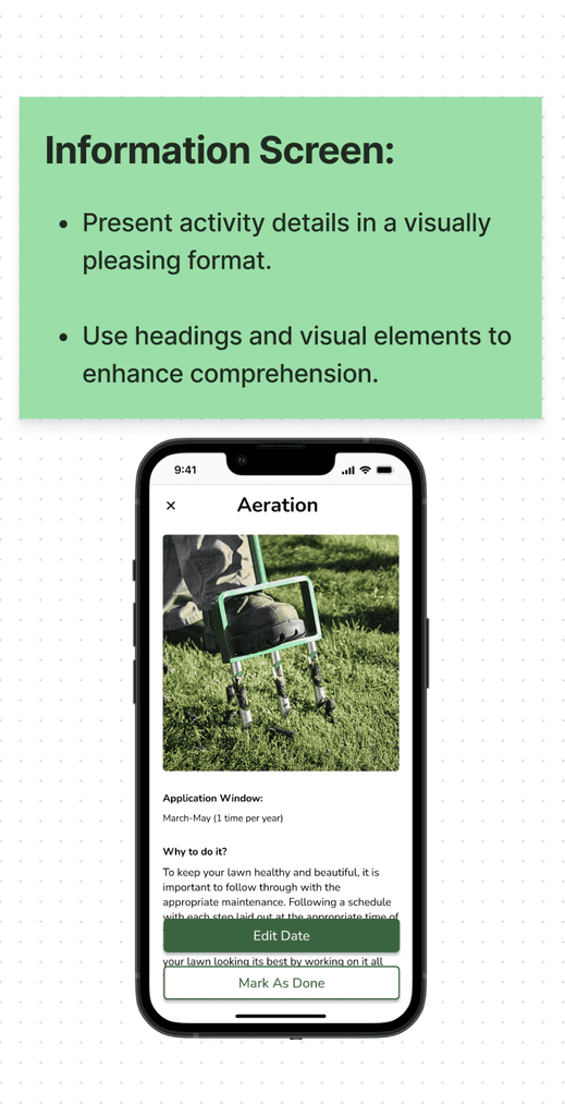
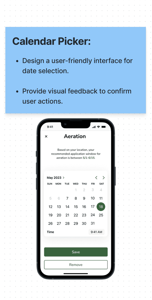
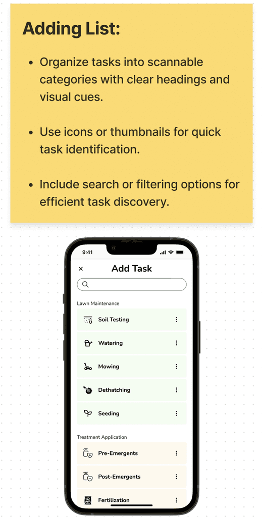
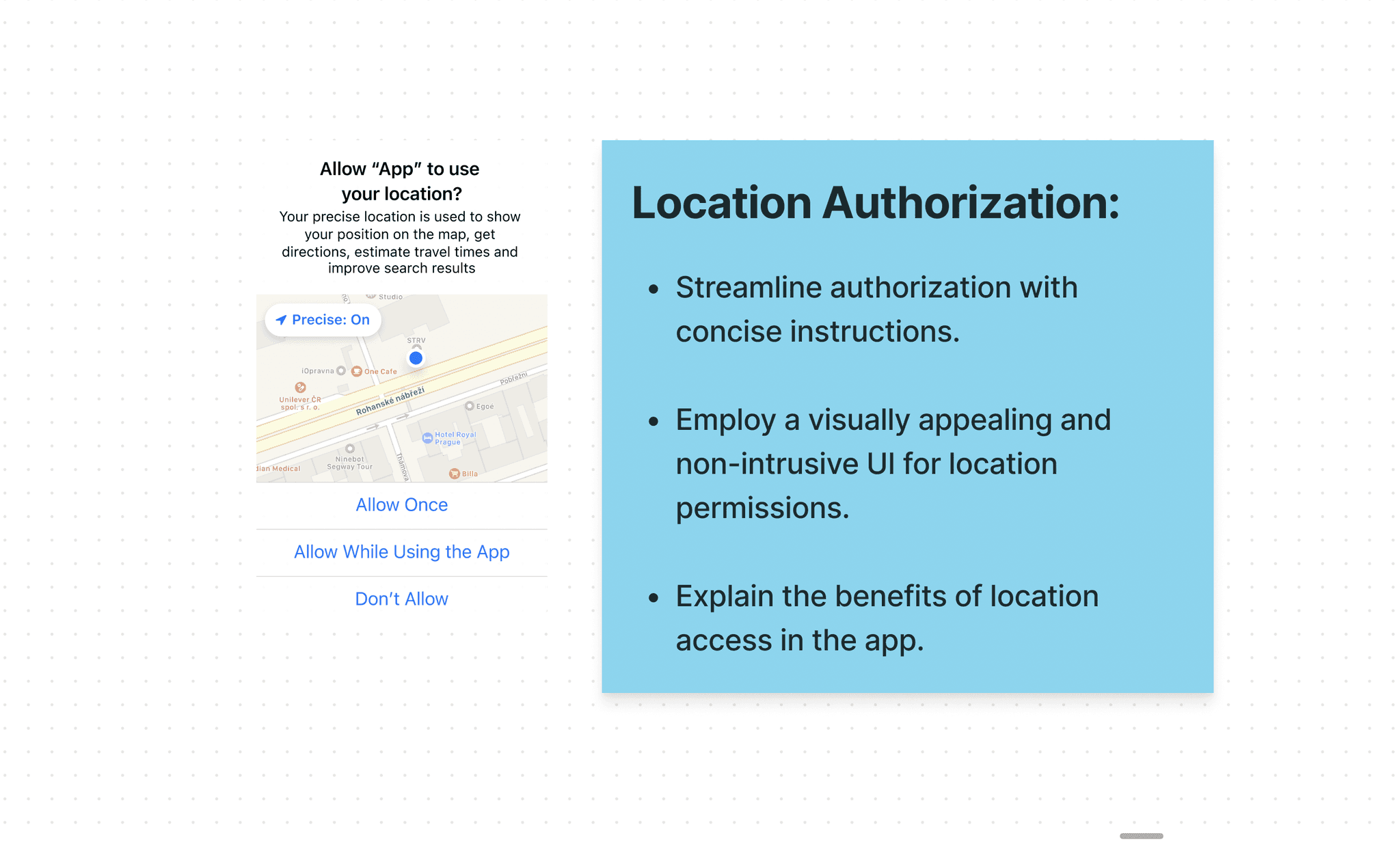
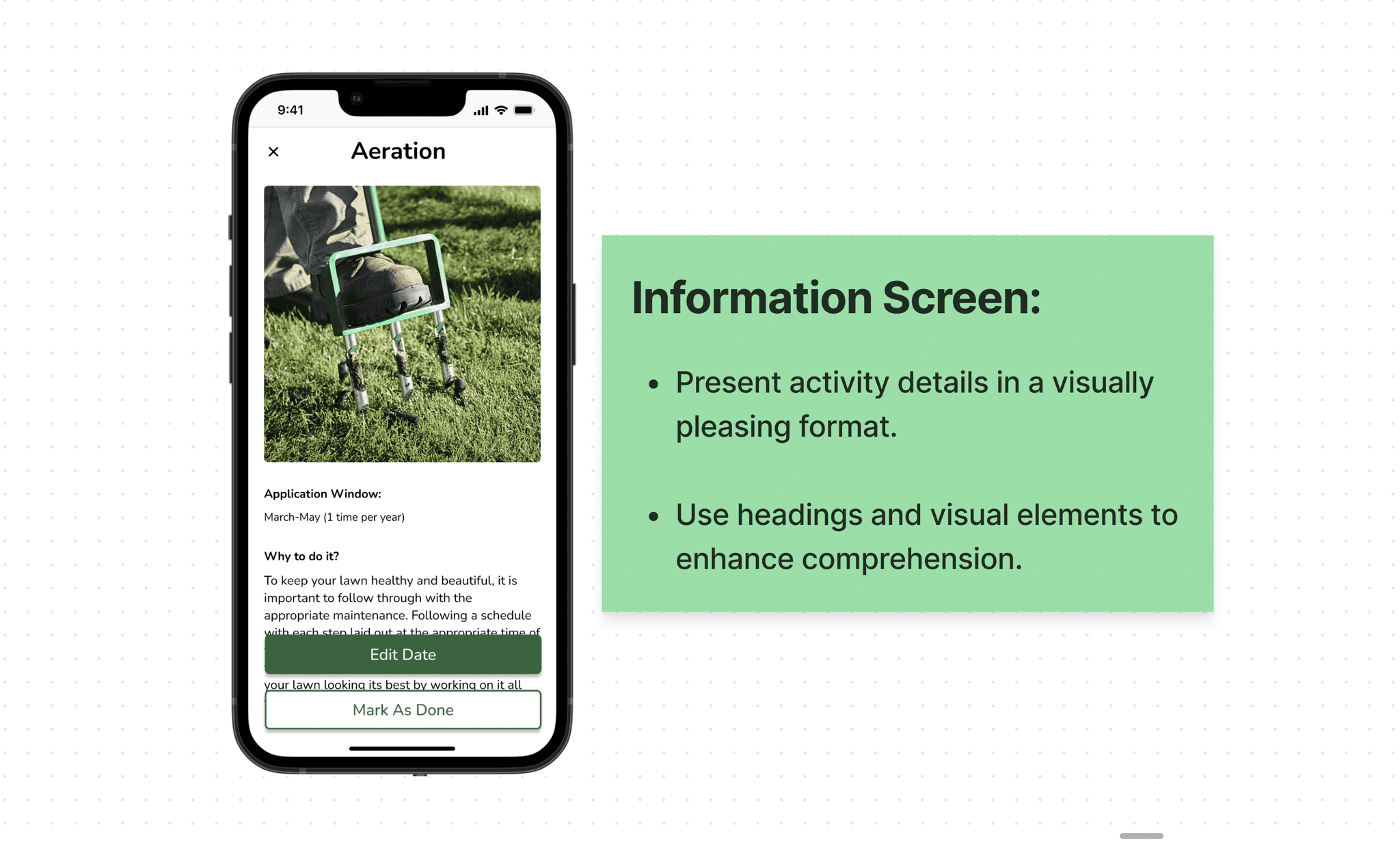
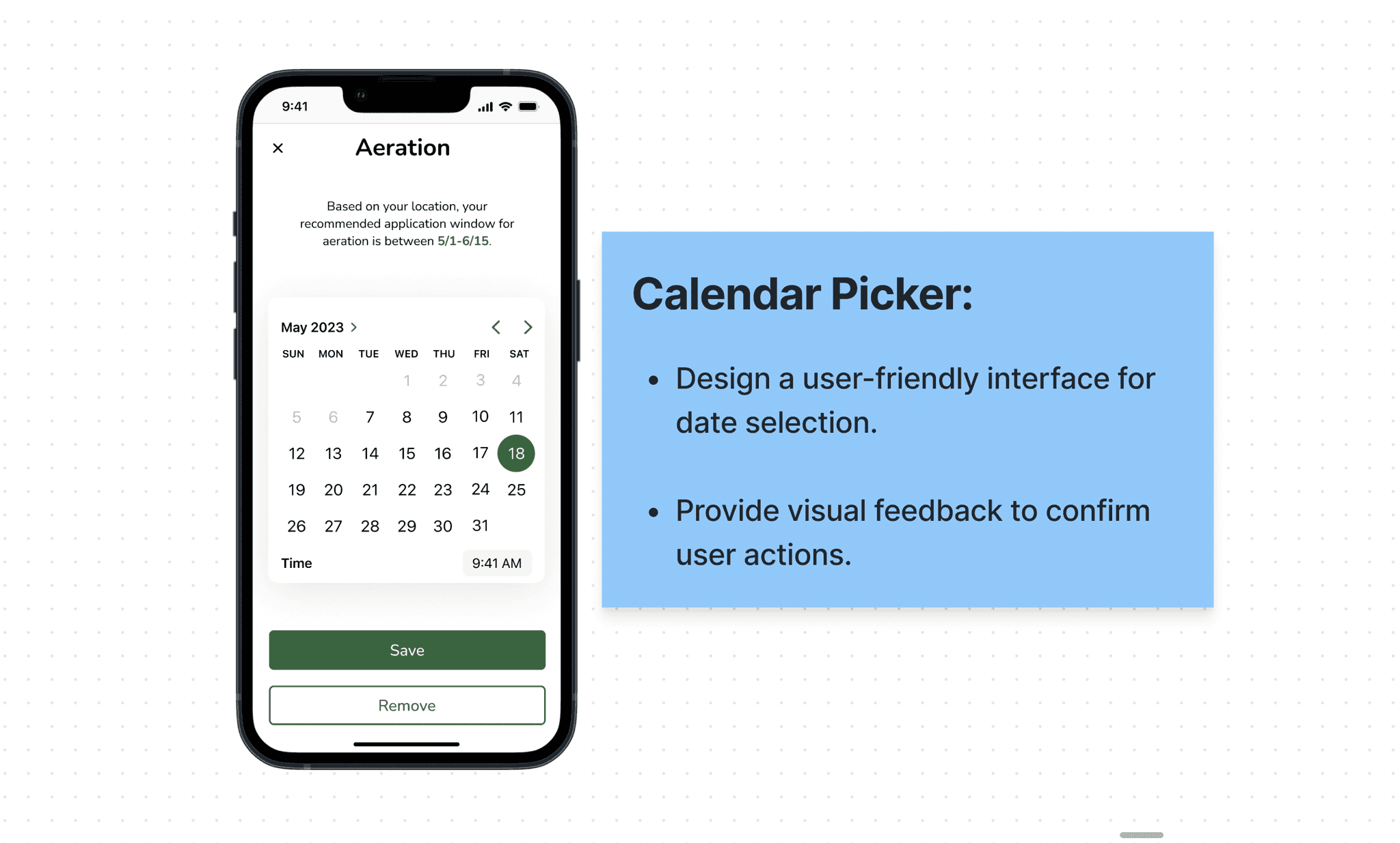
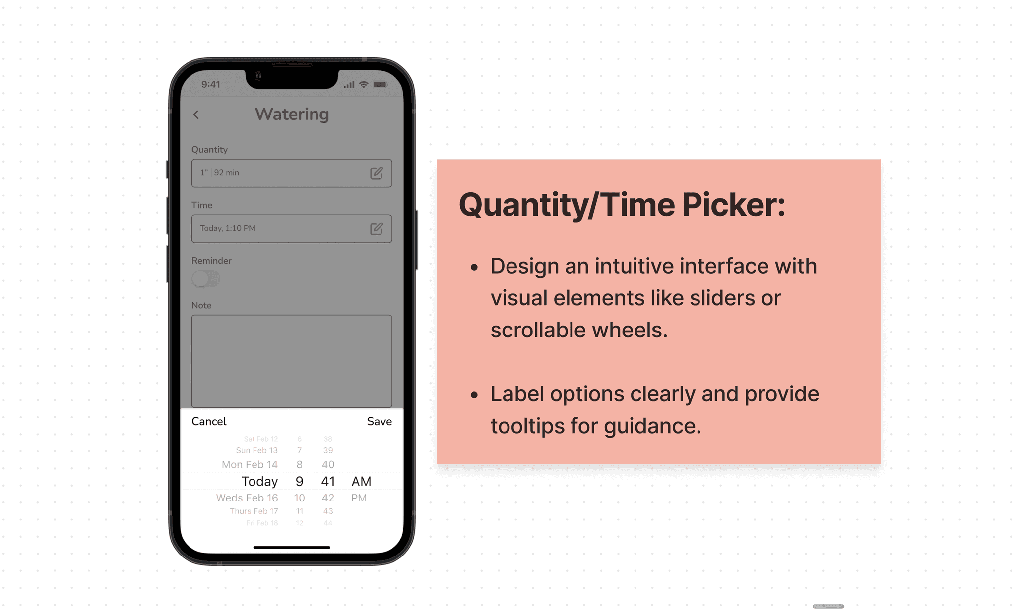
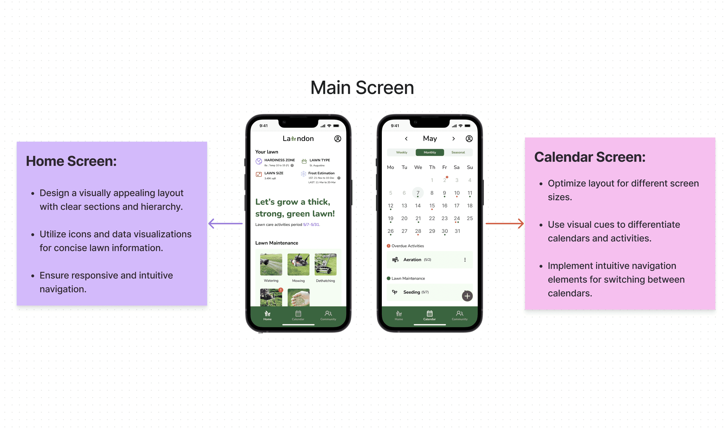
In the four design screens, I shared the why, what, and how of my choices. I aimed to make getting started easier, ensure the home screen is user-friendly, and simplify the calendar for better lawn activity management.
Prototyping video
In this prototype video, the app assists users in personalizing their onboarding experience. Users can also access information about their lawn status and gain knowledge directly from the home screen. The three calendar screens are designed to help users organize their lawn-related tasks on a weekly, monthly, and yearly basis. Additionally, users have the option to engage with fellow lawn caretakers through the community screen.
(The Prototype of Lawndon APP)
Reflection and next steps
My journey from zero to creating something extraordinary began with talking to neighbors about their lawn care experiences. I learned a lot, addressing common issues with innovative solutions. The in-person interviews added a human touch and made the project more enjoyable.
In the future, I aim to enhance the app by creating a thoughtful design system. This system will carefully organize every part of the app's look, ensuring it's easy to use and looks consistent. This approach isn't just about making the app more user-friendly; it's a strategic way to improve how users interact with the app. This means less confusion, smoother navigation, and an overall better experience for everyone using the app.
