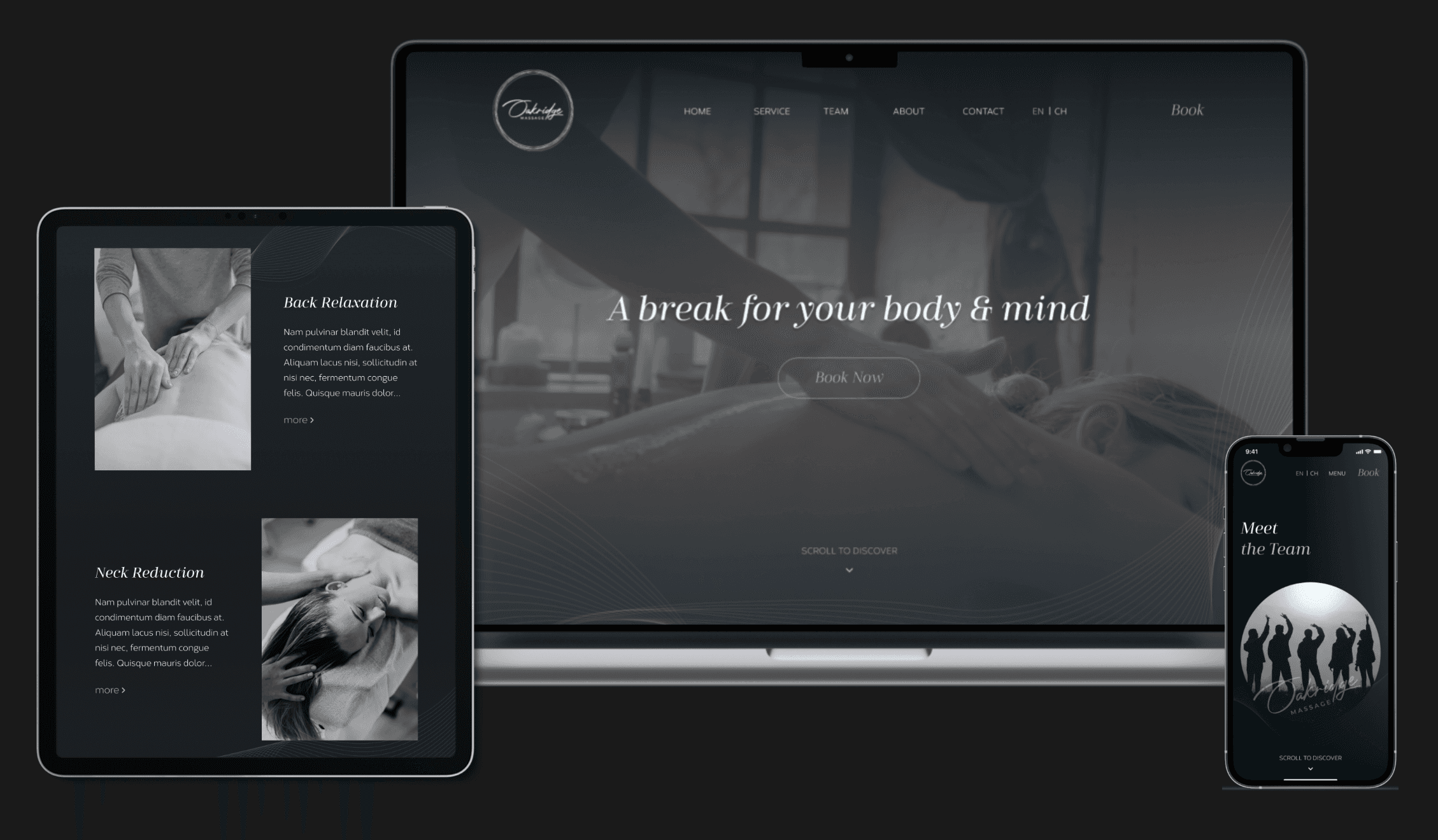
Seamless, Modern, Responsive Web Design
BACKGROUND
A Skilled Masseur Needs a Top-Notch Responsive Website for His Startup Business in Vancouver
Ever since discovering his passion for massage in 2013, David has dreamed of opening his own massage store in Vancouver's most popular area. He knows that a professional website is crucial for success, which is why he brought me on as his UI/UX designer to help bring his vision to life.
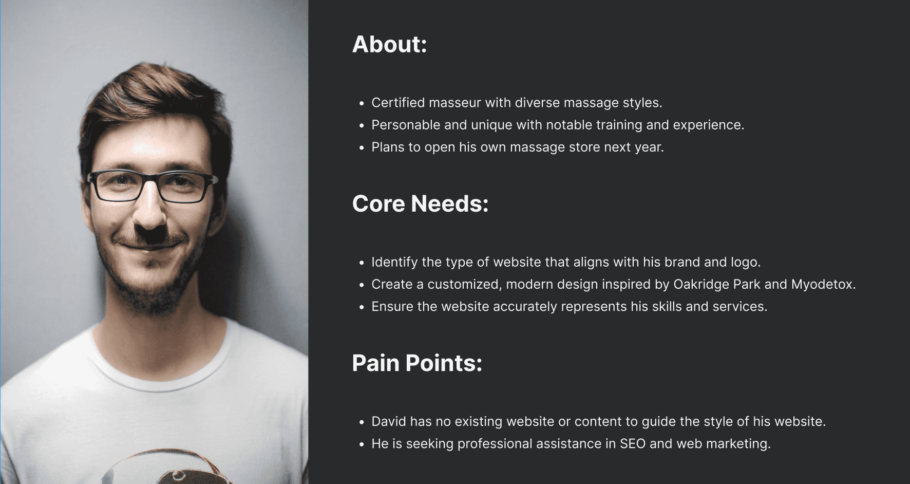
(The Persona)
PROBLEM
The Massage Owner Needs a Better Website to Retain Visitors and Increase Appointments
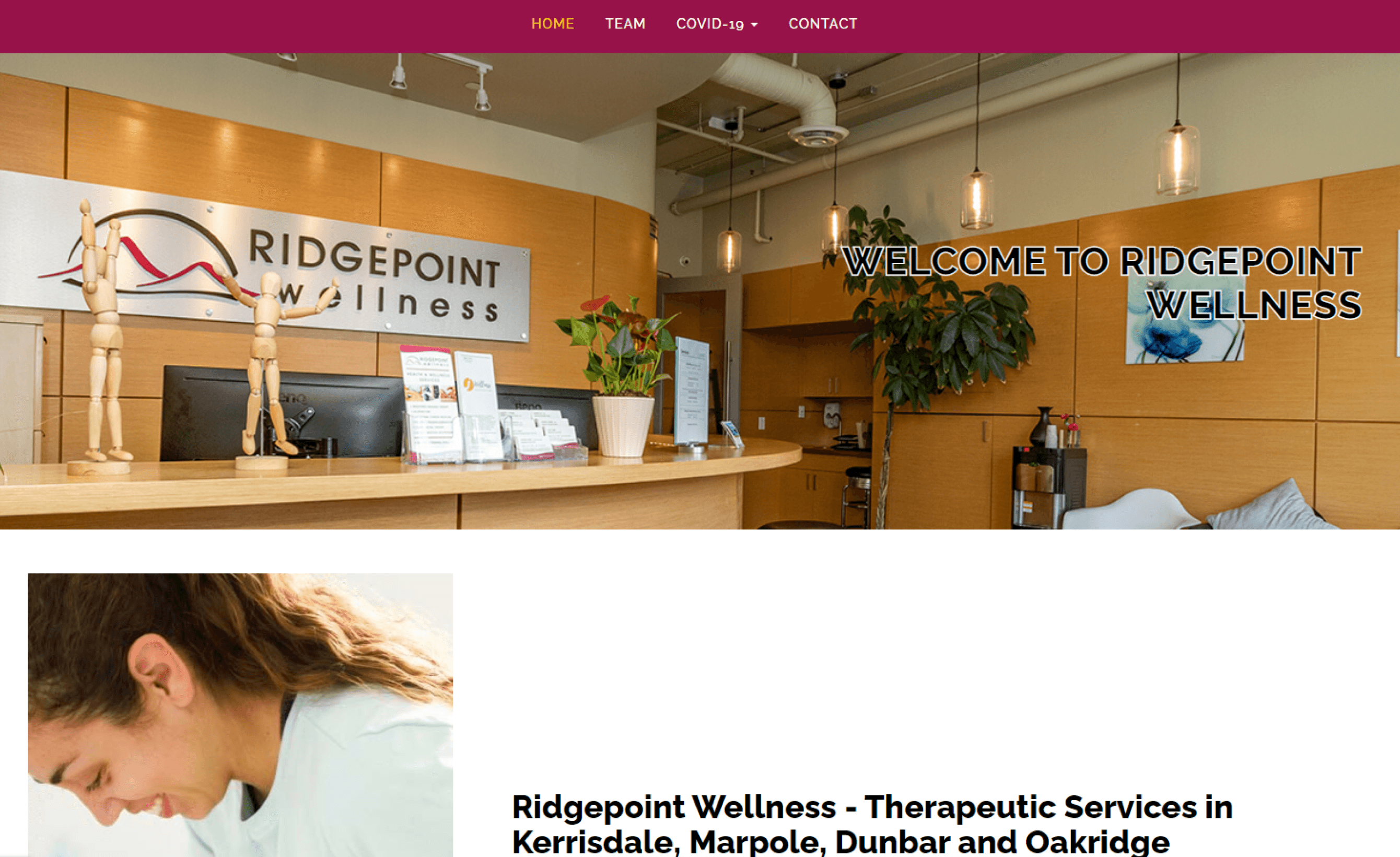
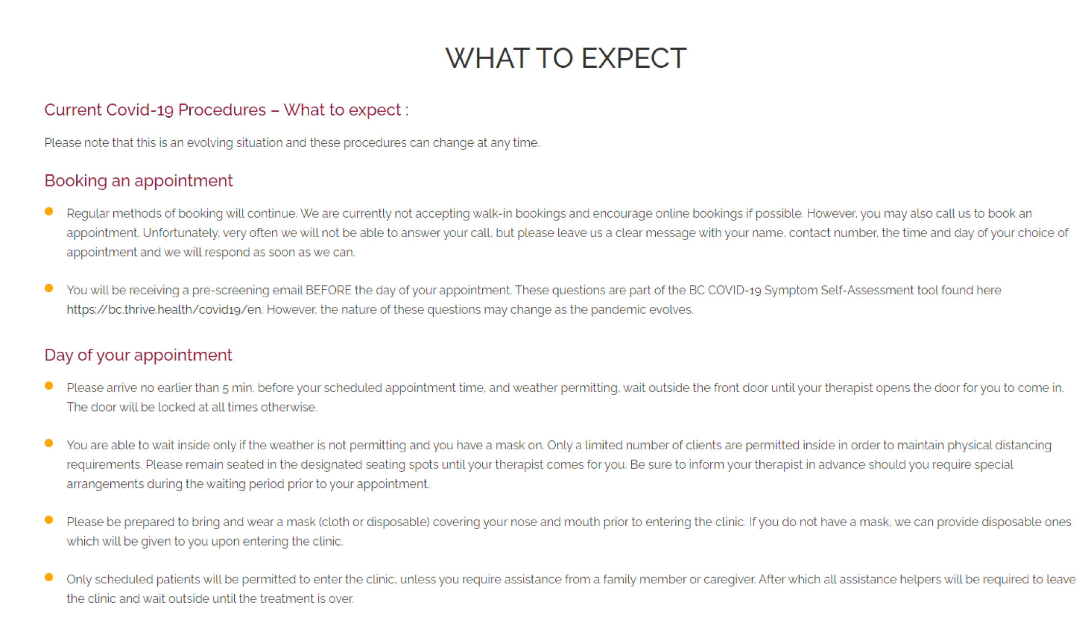
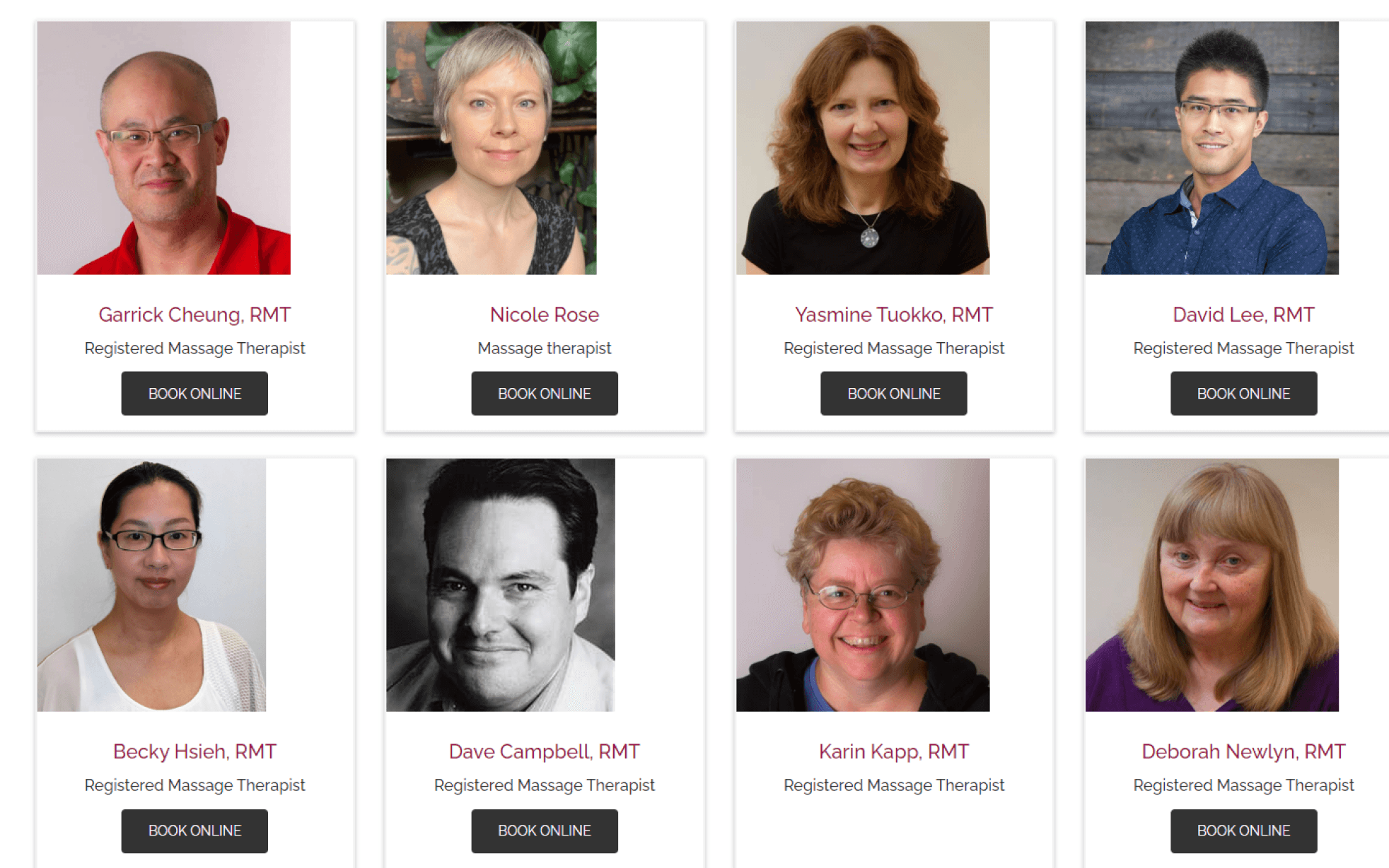
Many Vancouver massage stores are struggling to attract and retain customers due to their outdated and user-unfriendly websites, which puts them at a disadvantage in the competitive industry.
(Outdated Massage Website)
Easy navigation
Help users quickly find what they need, making them satisfied with the flows.
Seamless website layout
Make the website cohesive and harmonious, with consistent designs and smooth transitions between elements.
Related images and videos
Effectively convey the subject and evoke emotions in users.
Responsive website
Provide an optimal user experience on any platform to access the website.
Personalized features
Provide an optimal user experience on any platform to access the website.
Motion design
Capture users' attention and keep them to stay on the website.
USER INTERVIEW
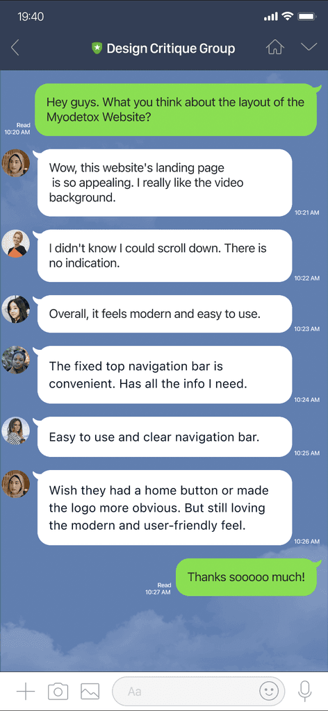
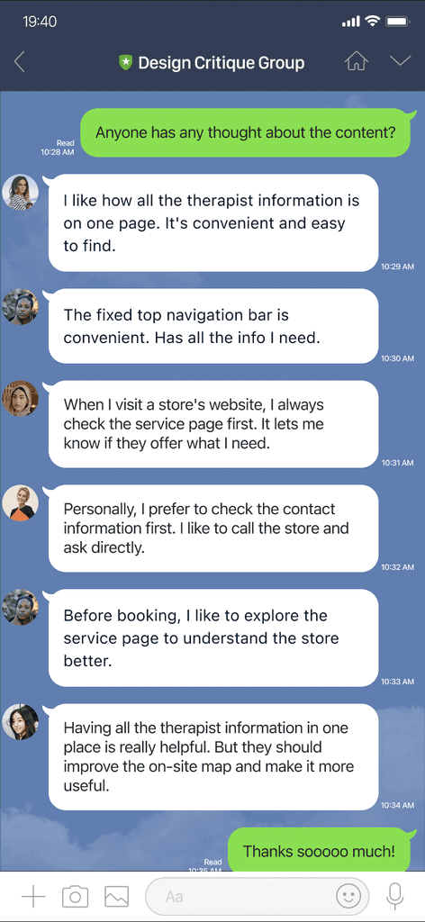
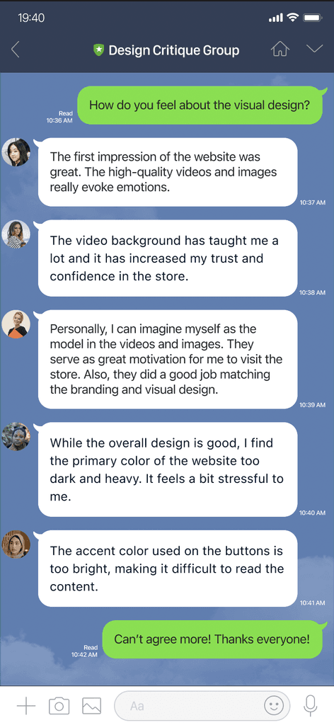
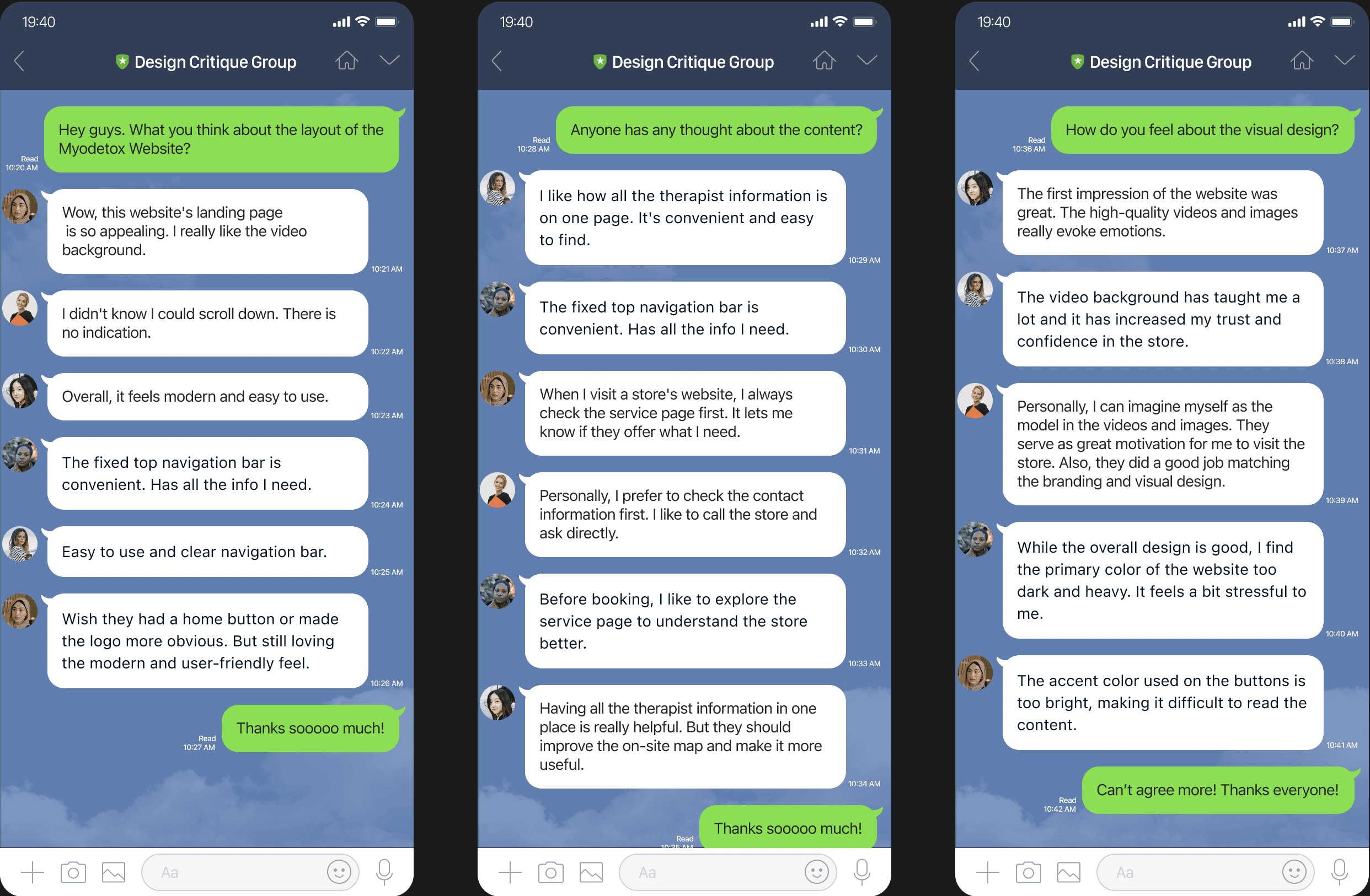
Target Website Myodetox - Views on Approval and Disagreements from Five Interviewees
Before hands-on anything, I gathered opinions about a modern physical therapy website - Myodetox, which is the most ideal and related website in Vancouver, to understand the needs, challenges, and motivations of users.
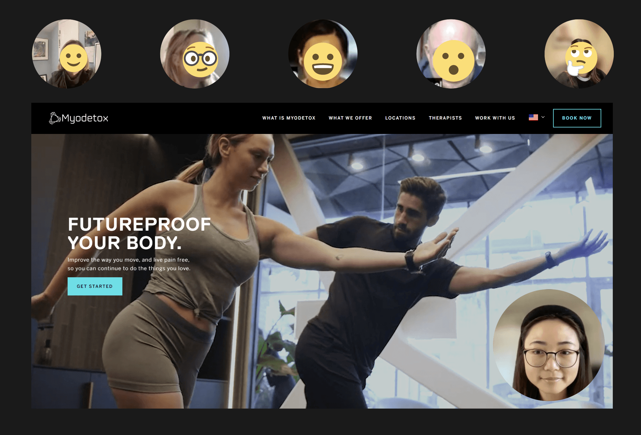
(The User Interview)
INTERVIEW QUESTIONS:
How would you describe your experience with other massage websites?
What is your main goal when visiting a massage website?
What do you like about the current page/screen/function?
What would prevent you from achieving a task/action?
What improvements could be made to make the website easier or better?
THE MAIN INSIGHT
Elements of a Positive User Experience: Layout, Content, and Visual Design
LOW FIDELITY WIREFRAME
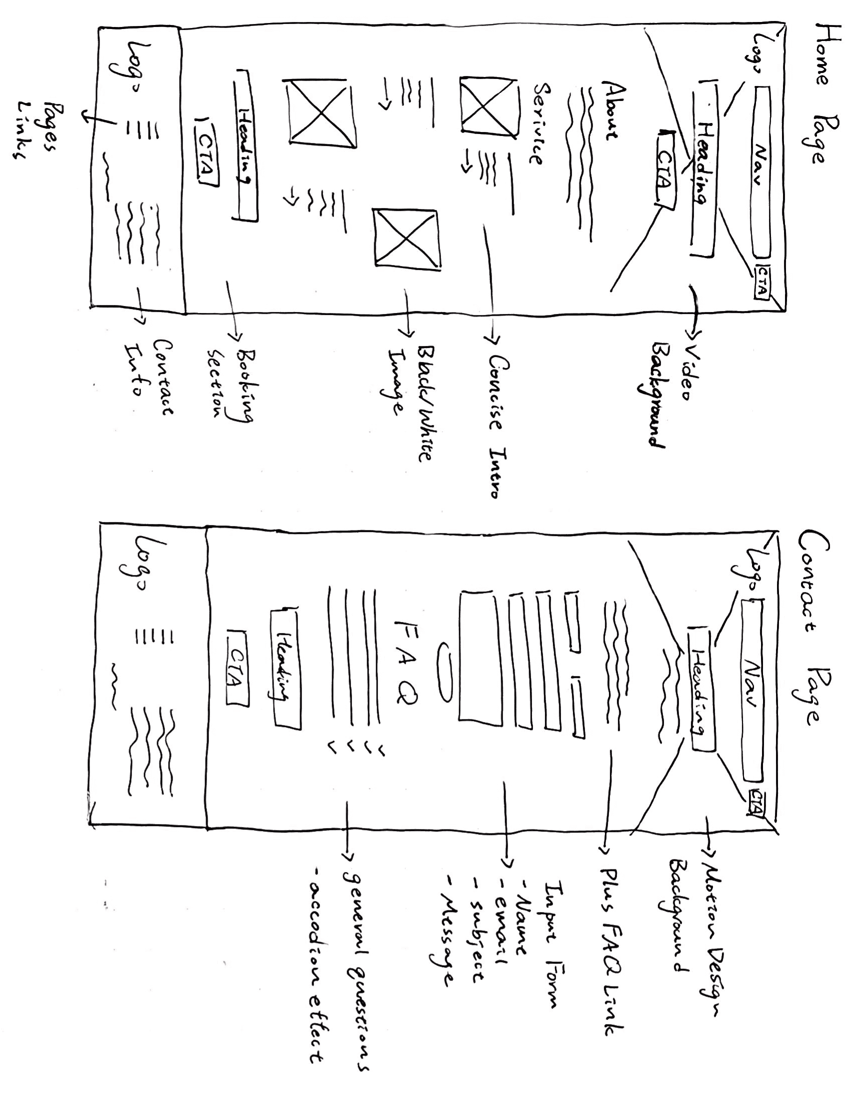
Crafting Layout and Design: Aligning Elements with Precision
Facilitating the rapid exploration of various design possibilities and allowing for seamless adjustments as required.
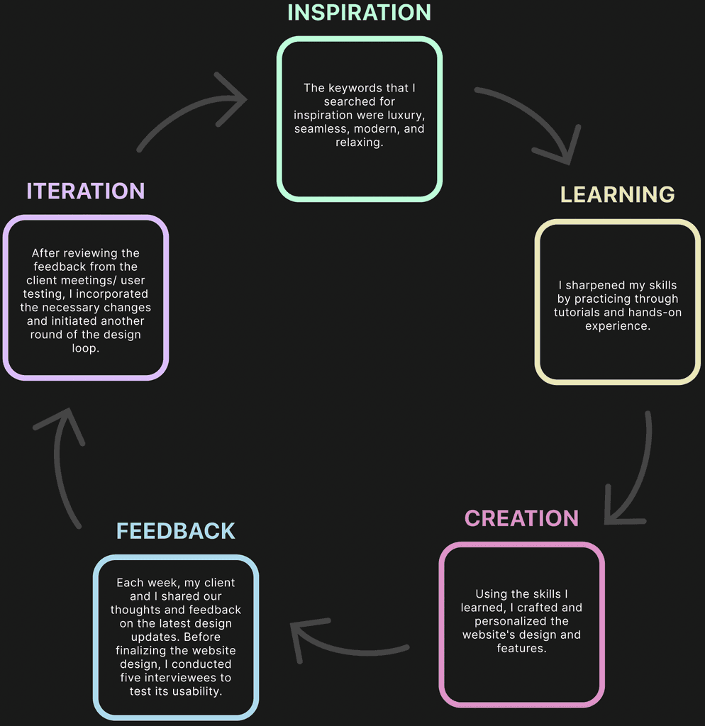
DESIGN PROCESS
Five Steps Loop
TESTING & IMPROVEMENTS
3 Major Iterations
I've streamlined service selection, integrated the FAQ with the contact form for quicker access to answers, and placed contact information in the footer for enhanced user convenience across all pages.
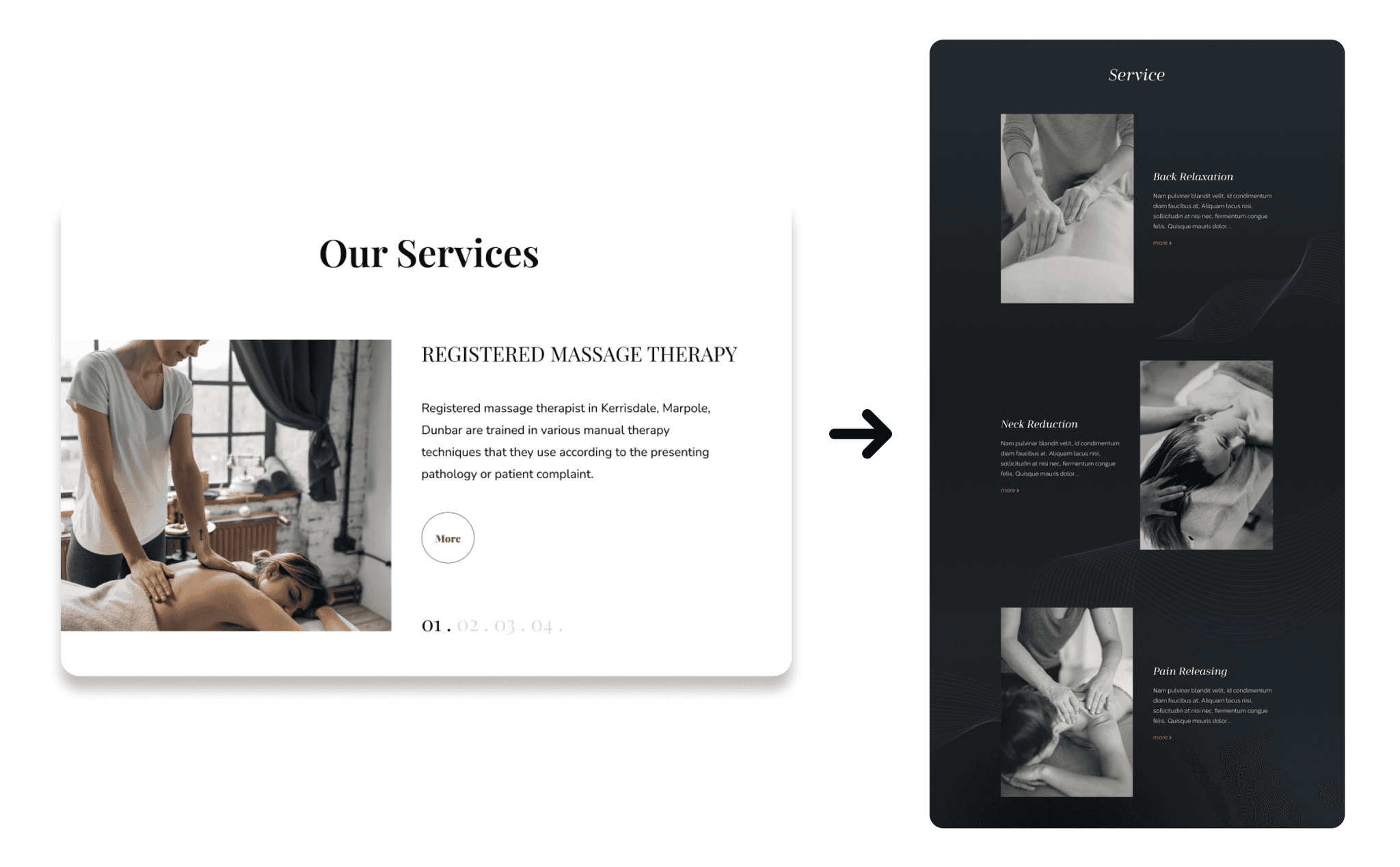
Simplified Service Selection
The redesign streamlines access to services on one page, promoting efficient scrolling and eliminating 'more' or 'next session' clicks, enhancing user efficiency and a seamless experience."
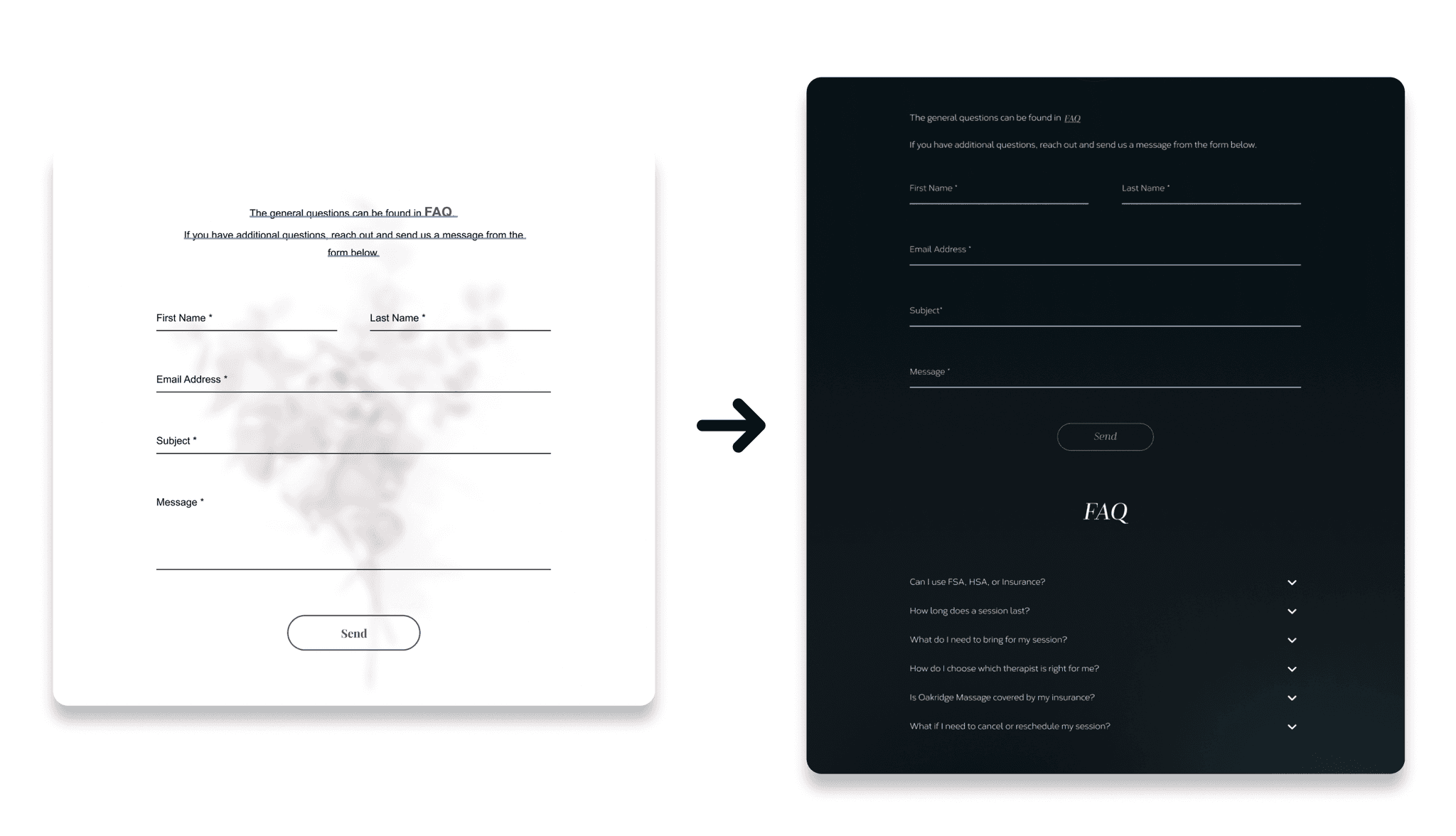
FAQ Integration with Contact Form
Combining the Contact Form and FAQ enables quick access to answers, allowing users to find solutions before and after submitting queries.
Contact Info in Footer
Placing contact info in the footer ensures easy access on every page, unlike the original design that had it exclusively on the contact page.
DESIGN DECISION
Interface Design
(The Color Pallet)
(The Typography)
Opening-after-delay animation
Introduce features gradually, providing a guided path for users to explore.
Parallax effect
Guide users to interact with the webpage, while also presenting information in a more digestible and enjoyable manner.
Proximity drop-down menu
Link to the navigation bar reduces user movement to access them.
Accordion
Save space and provide scannable questions.
Fixed input
Keep users aware of the requested information.
Wrong input value
Trigger an accent color reminder to maintain consistency in the design.
(The Prototype Video of Motion Design)
THE DESIGN
View a video of the complete website below
(The Prototype of Web Design)
THE CONCLUSION
Reflection and Plans for Continual Improvement
Some valuable lessons have been learned throughout the process. One of the main takeaways was the importance of considering content when designing. It became evident that content significantly impacts elements like video and image placement, as well as alignment. Even the length of the content plays a role in overall design.
To avoid similar issues in the future, the focus will be on prioritizing content confirmation and closely collaborating with clients to ensure consistent and authentic designs. By involving clients in the process and giving special attention to the primary text, designs that truly resonate and meet their needs can be achieved.
Although the project took longer due to the learning curve associated with implementing unfamiliar features, the mindset now revolves around viewing learning as an ongoing journey. The goal is to make incremental improvements each day to expedite project progress. This positive mindset serves as a powerful motivation and source of empowerment for future endeavors.
