BACKGROUND
Effortless Lawn Care Management Application
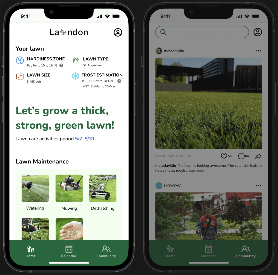
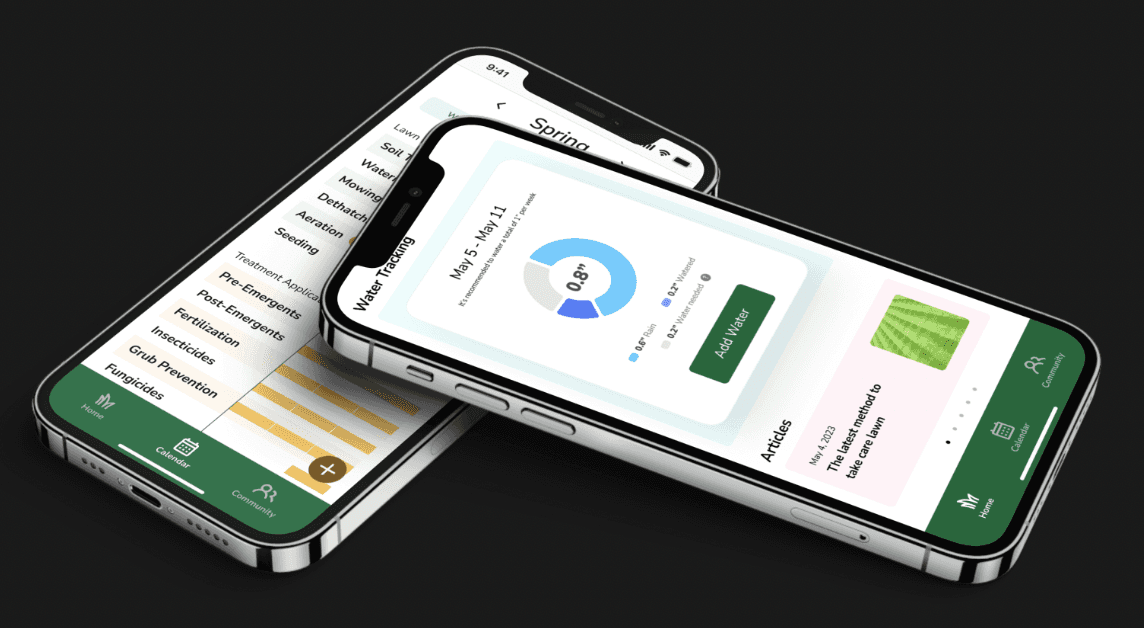
Lawndon is a user-friendly lawn care app with three key features. Firstly, it provides users with real-time updates on their lawn's status and requirements. Secondly, it offers a calendar feature to schedule and track lawn activities. Lastly, it connects users with a vibrant community for sharing tips and inspiration. Transform your lawn care experience with Lawndon.
PROBLEM
Lawn Care Challenges Unveiled: Tackling Information Overload, Tracking and Managing Issues, and Isolation
Many novice lawn care enthusiasts struggle with the lack of guidance and reliable information on how to effectively care for their lawns. The frustration intensifies as they encounter conflicting advice from various sources. Additionally, independently tracking and managing lawn activities becomes a daunting task. Furthermore, the absence of a supportive community compounds the feeling of isolation, leaving individuals without a platform to discuss their lawn care journey
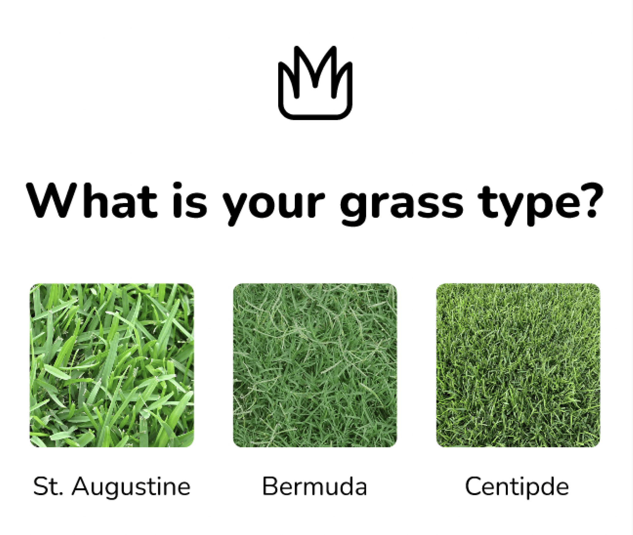
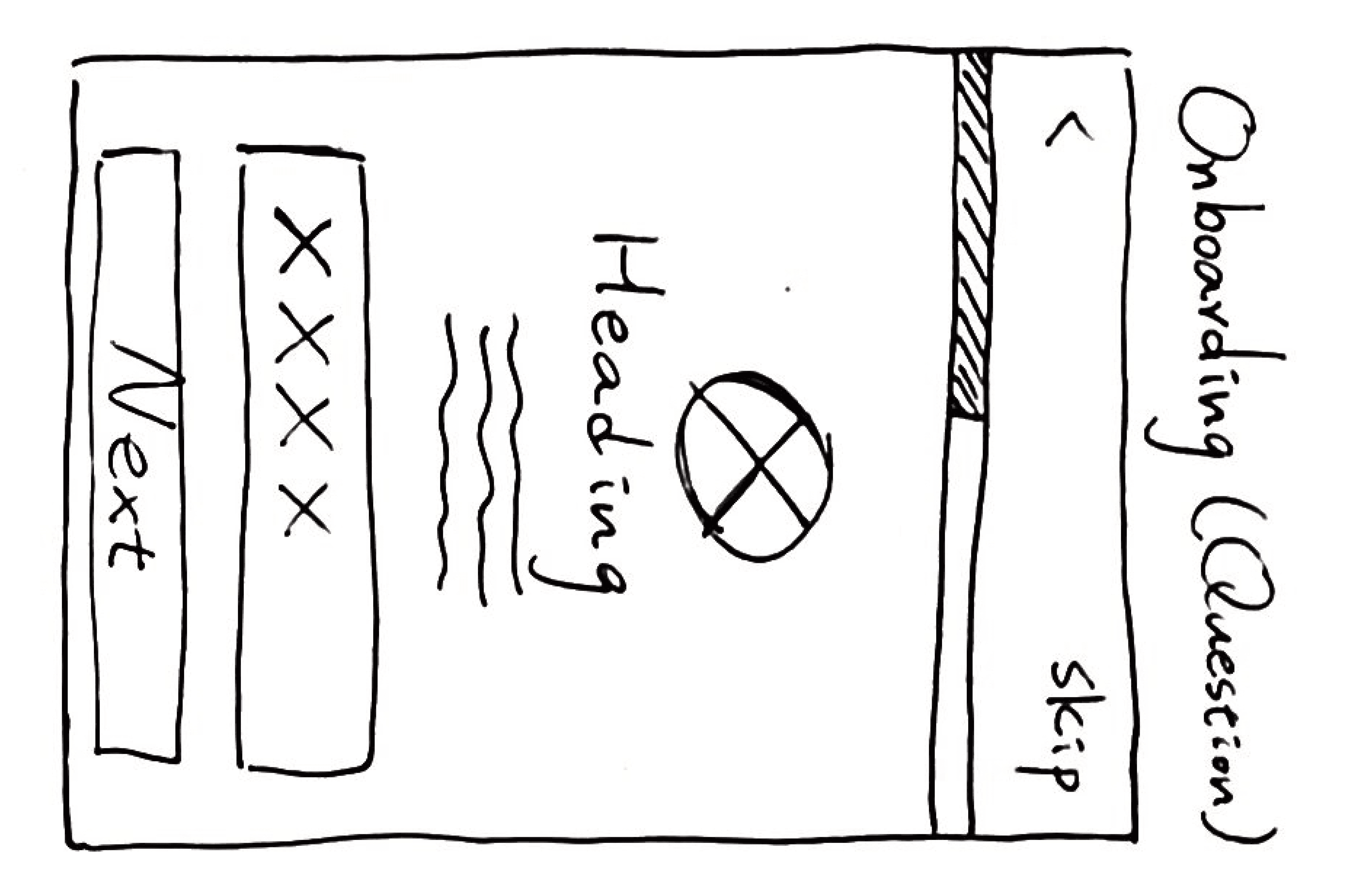
(The Onboarding Questions)
SOLUTION
Simplifying Lawn Care with Personalized Programs, Tracking, and Community Engagement
Simplifying Lawn Care
Lawndon aims to simplify the lives of lawn carers by providing a user-friendly application.
Personalized Lawn Program
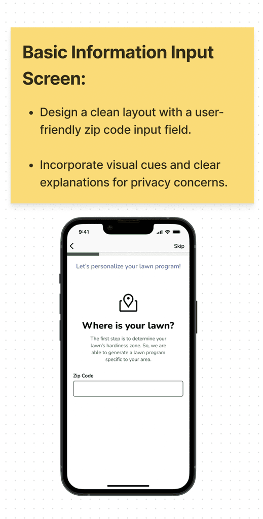
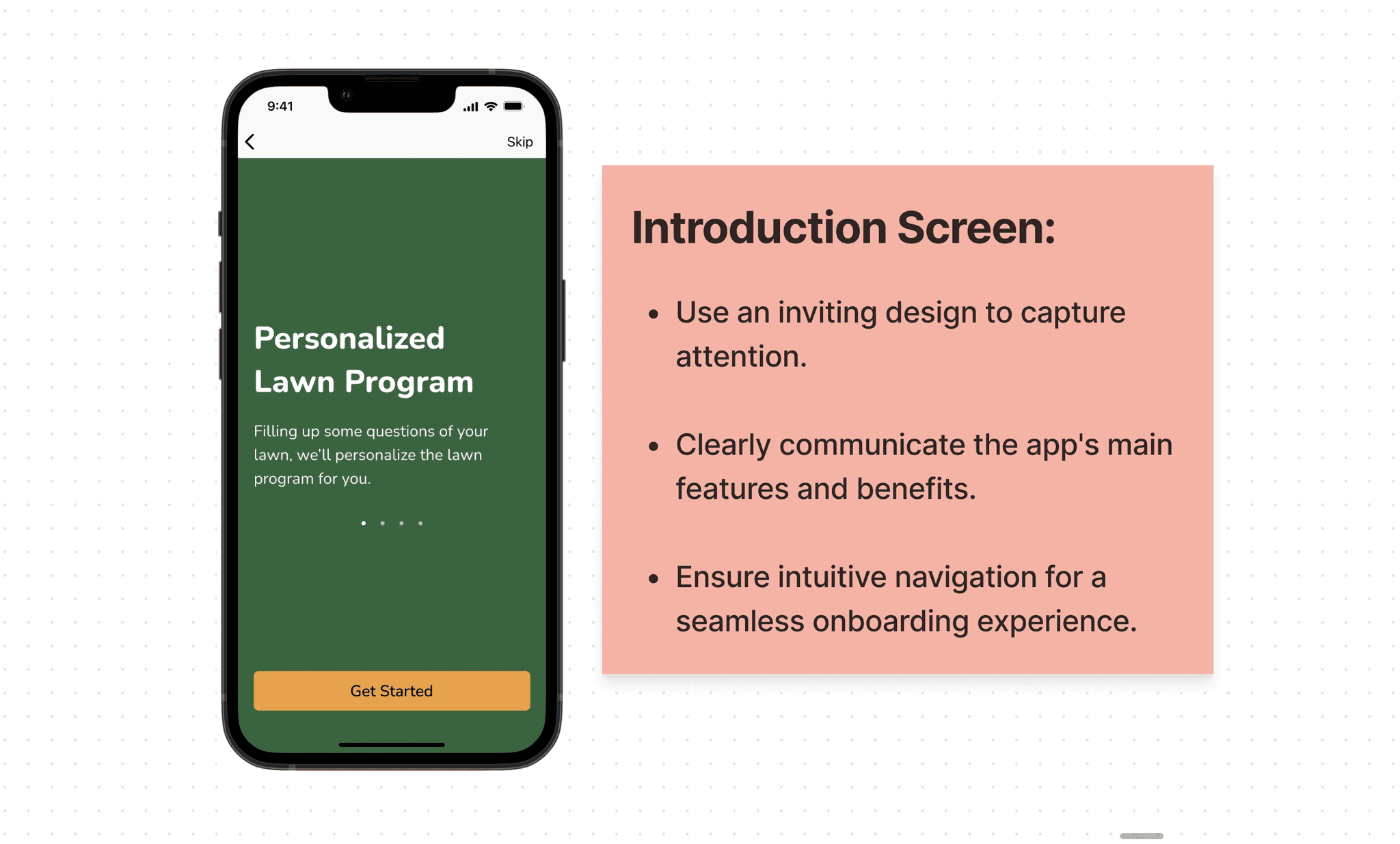
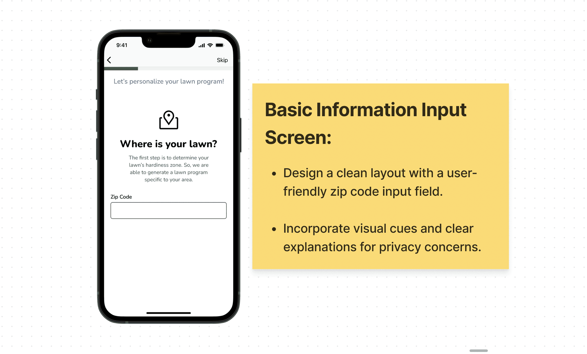
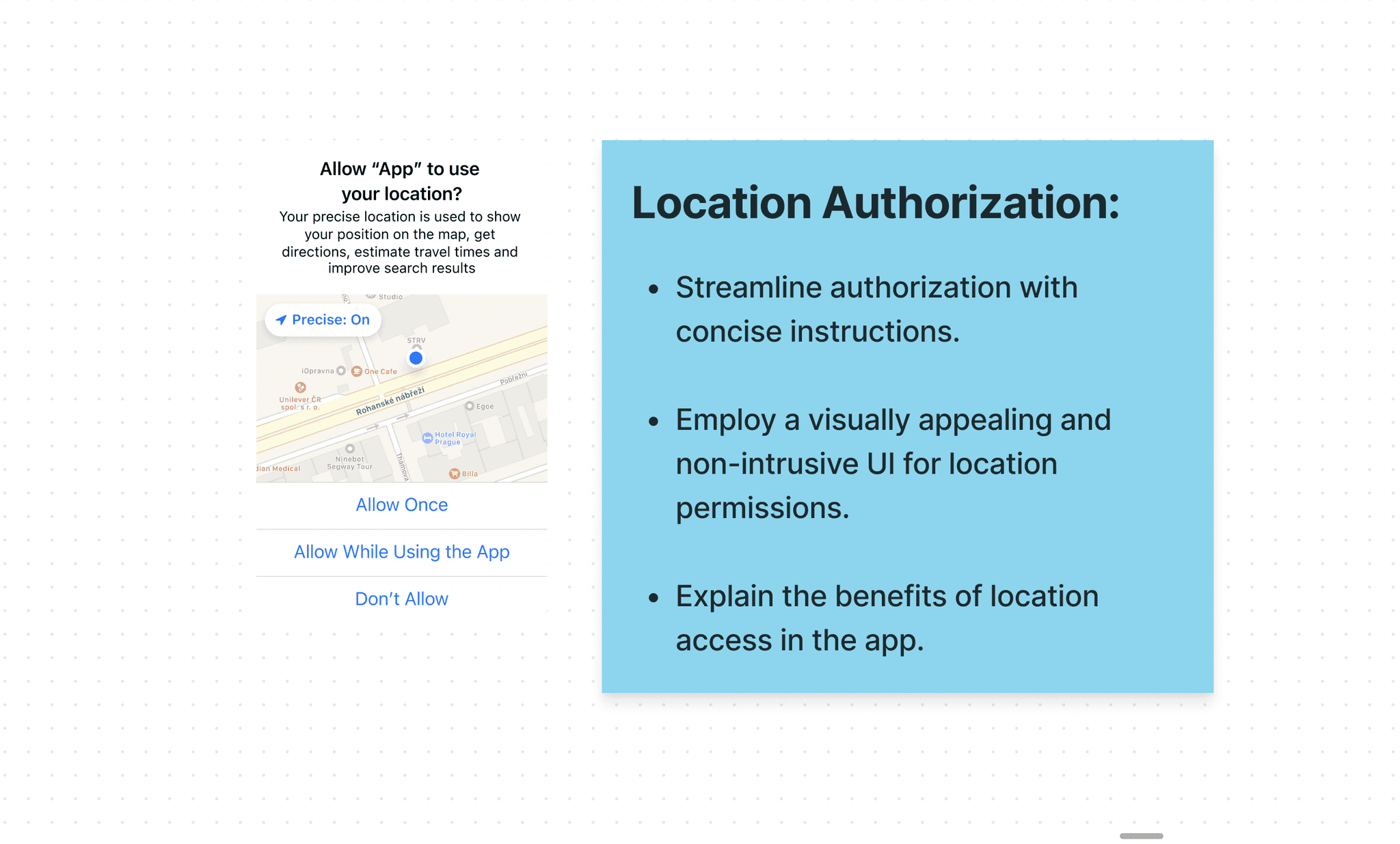
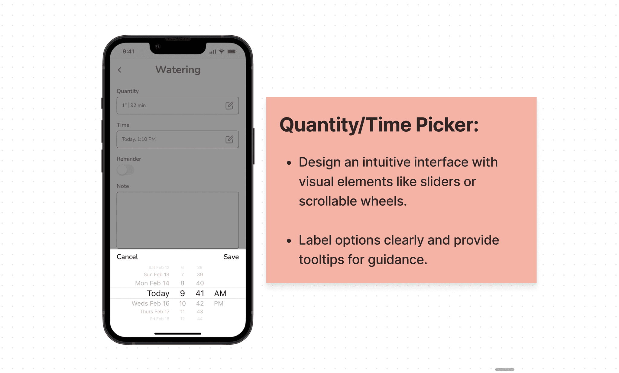
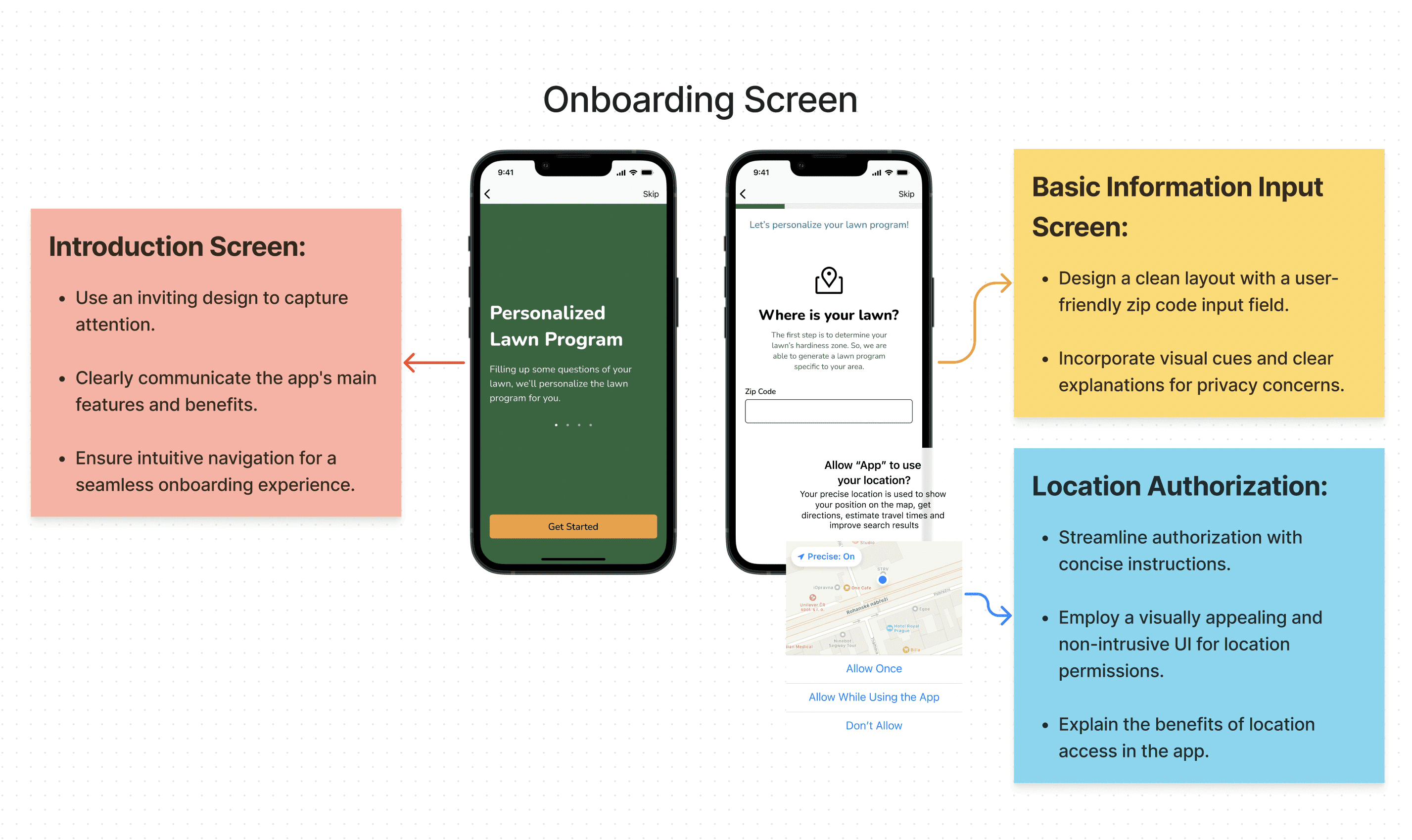
Users can create a customized lawn program based on their location and specific lawn conditions.
Home Screen
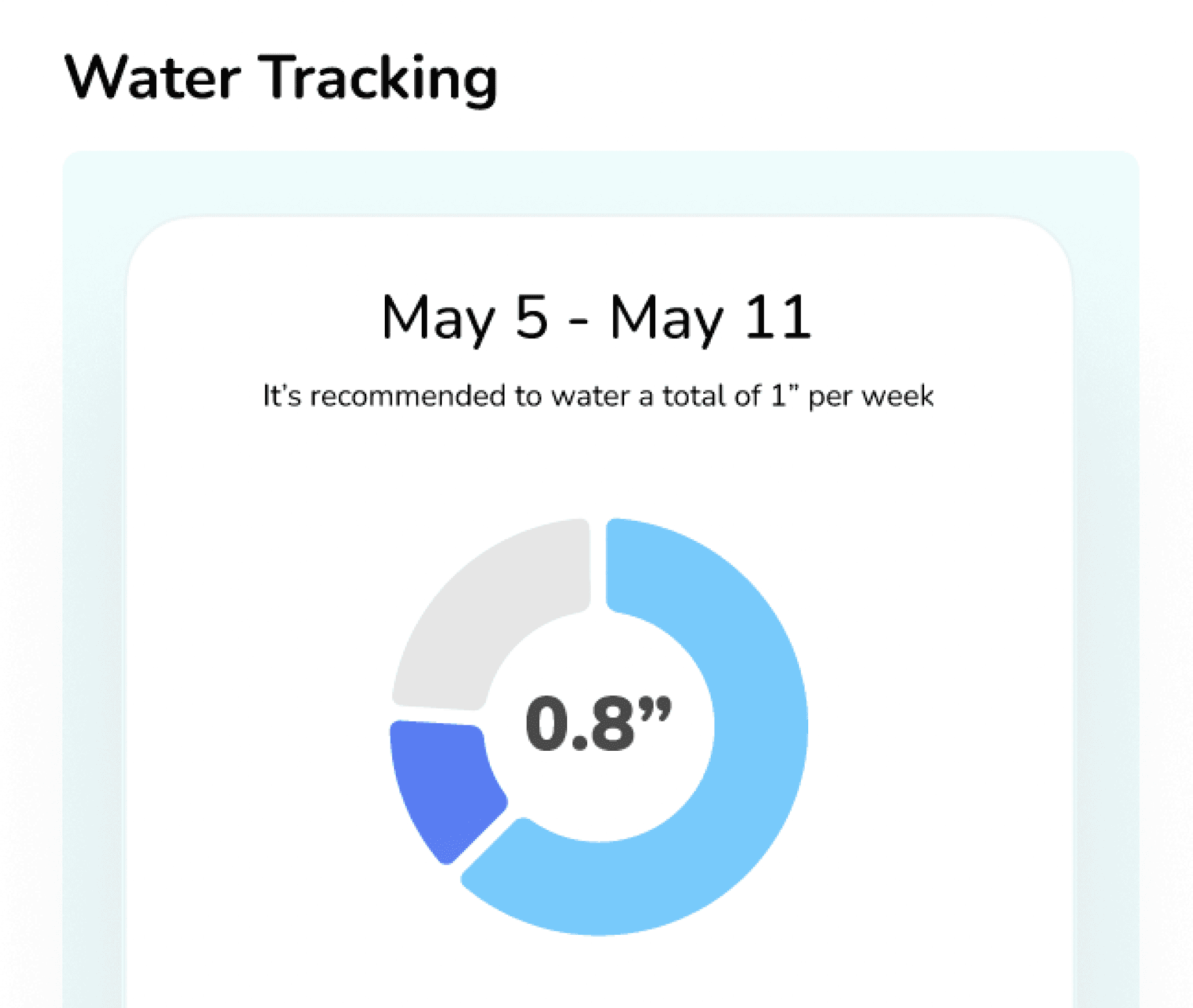
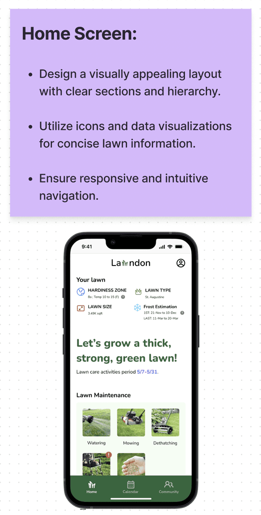
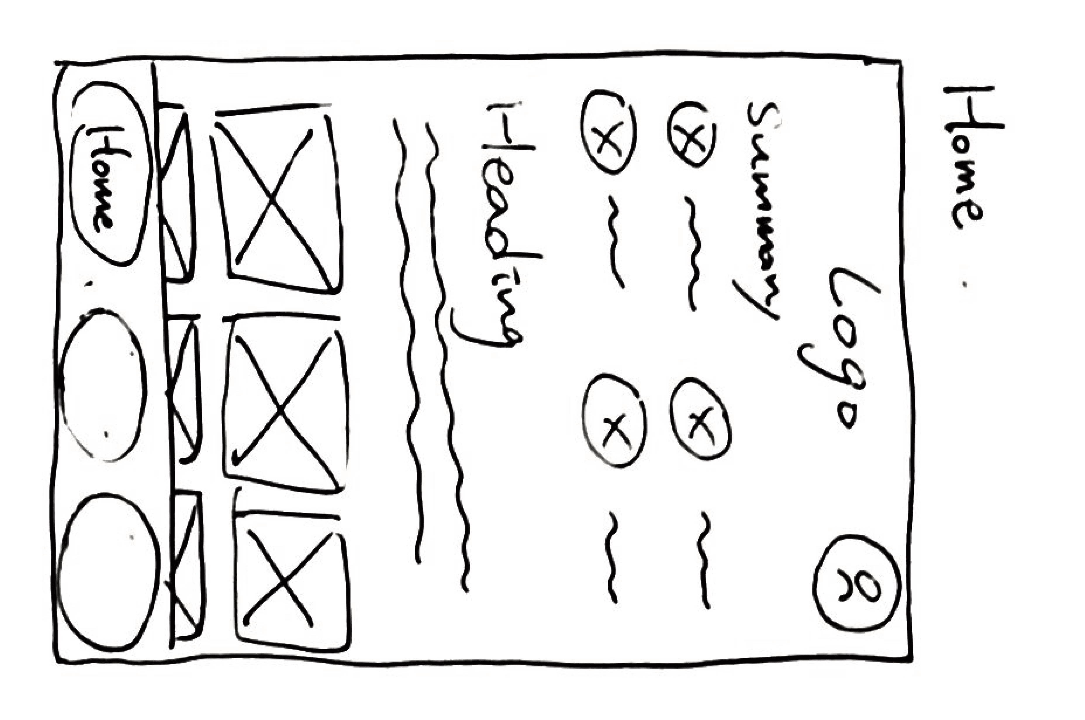
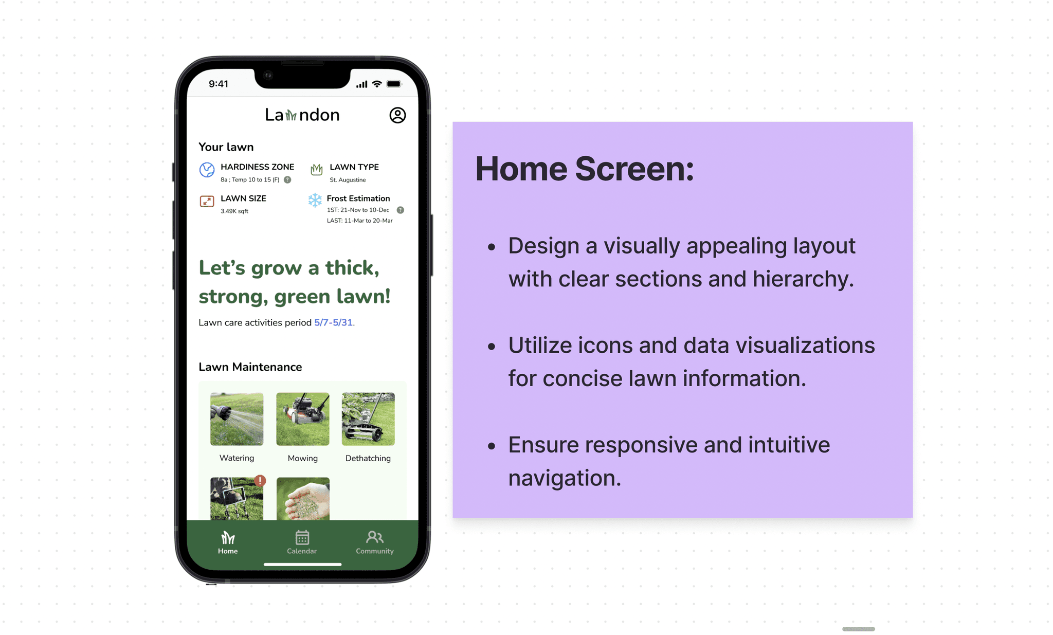
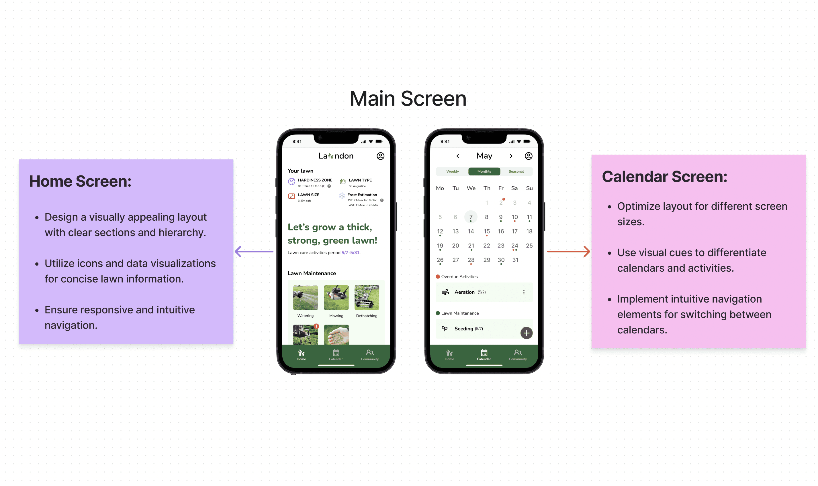
The home screen displays detailed information and status of users' lawn program, including tracking lawn activities and monitoring water supply.
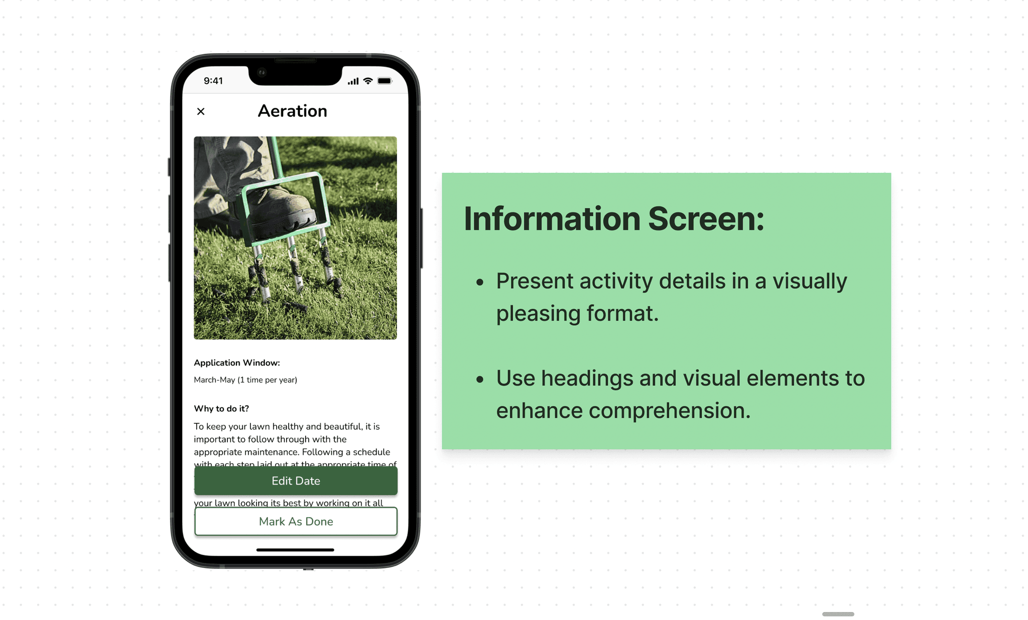
Access to Lawn Knowledge
Users can access a wealth of information about lawn care to enhance their knowledge and understanding.
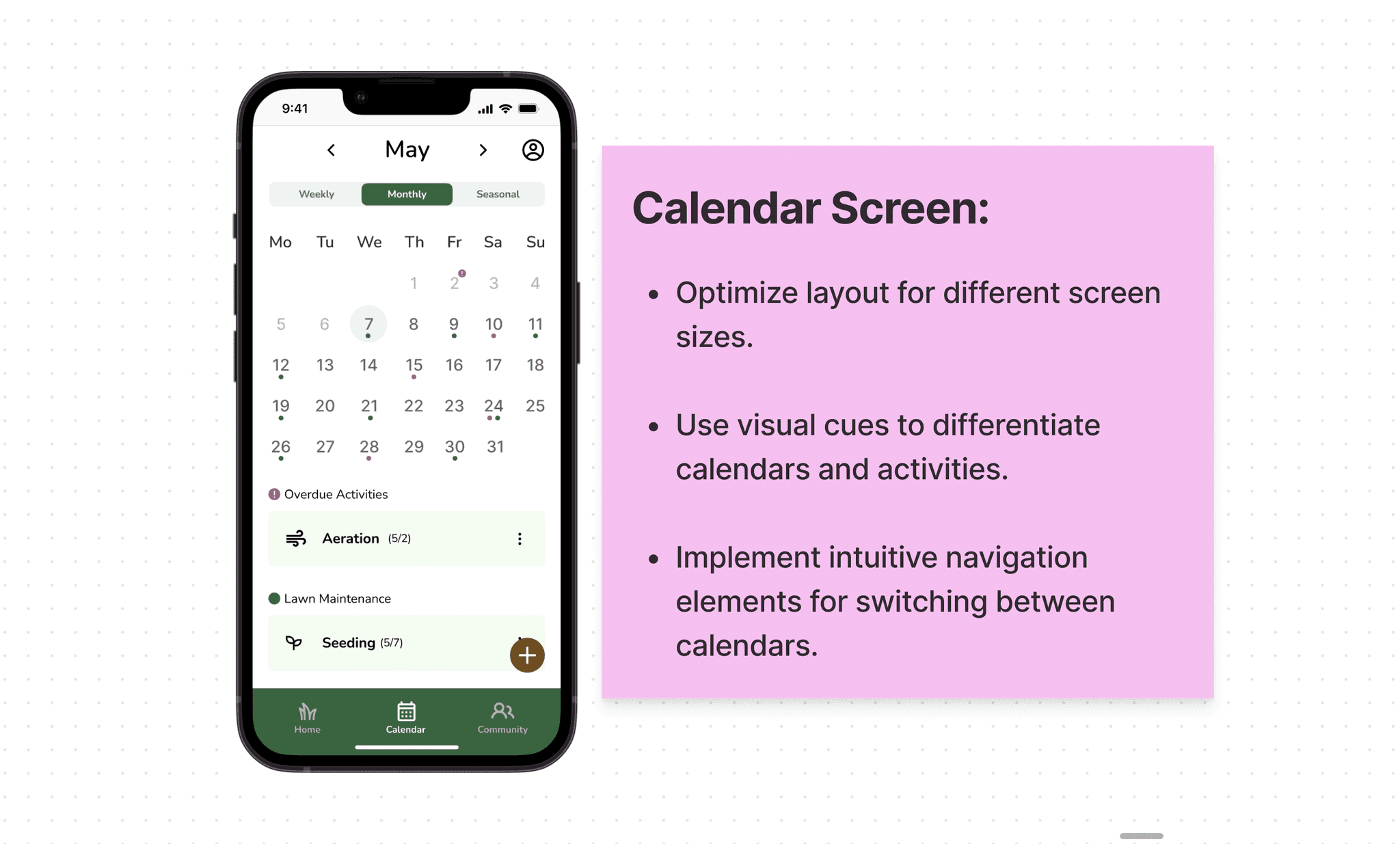
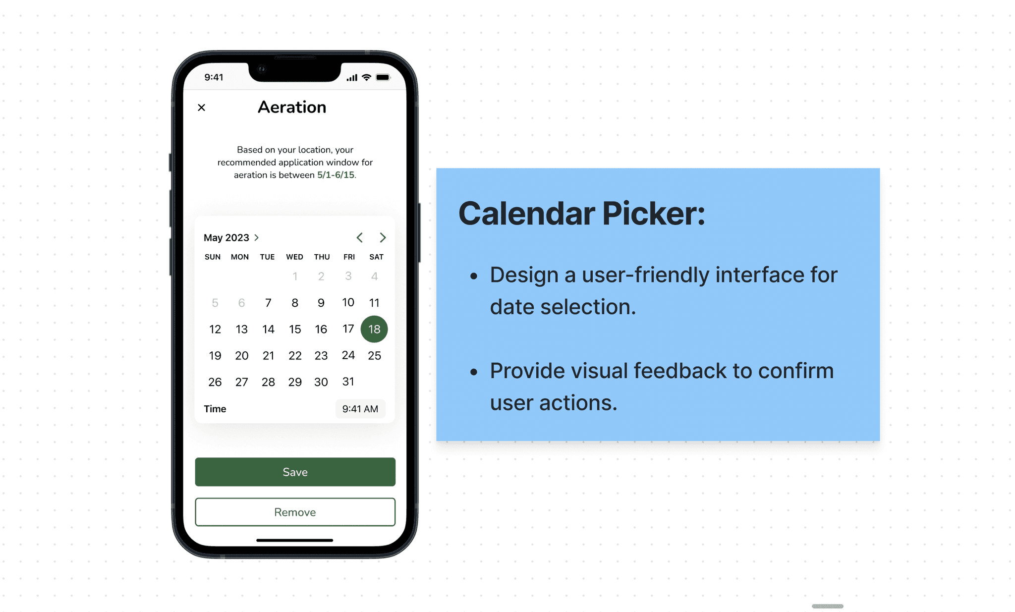
Calendar Screen
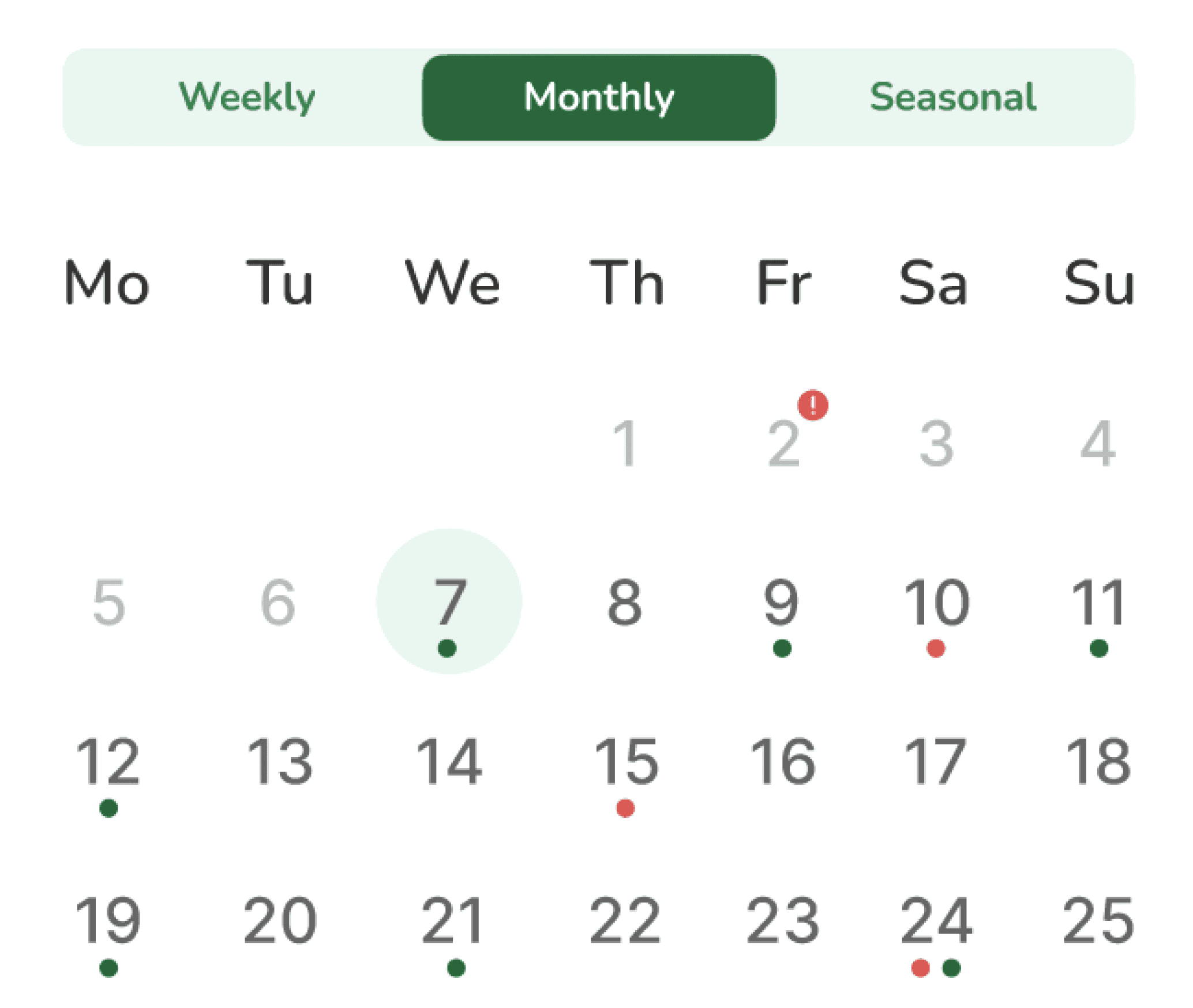
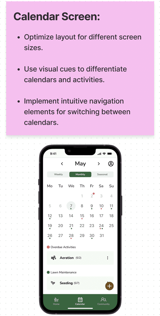
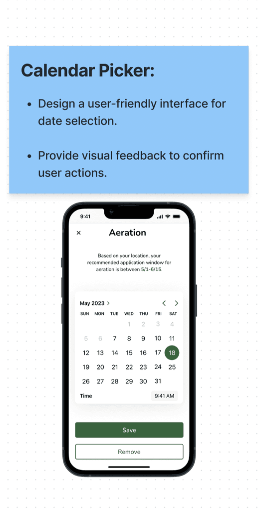
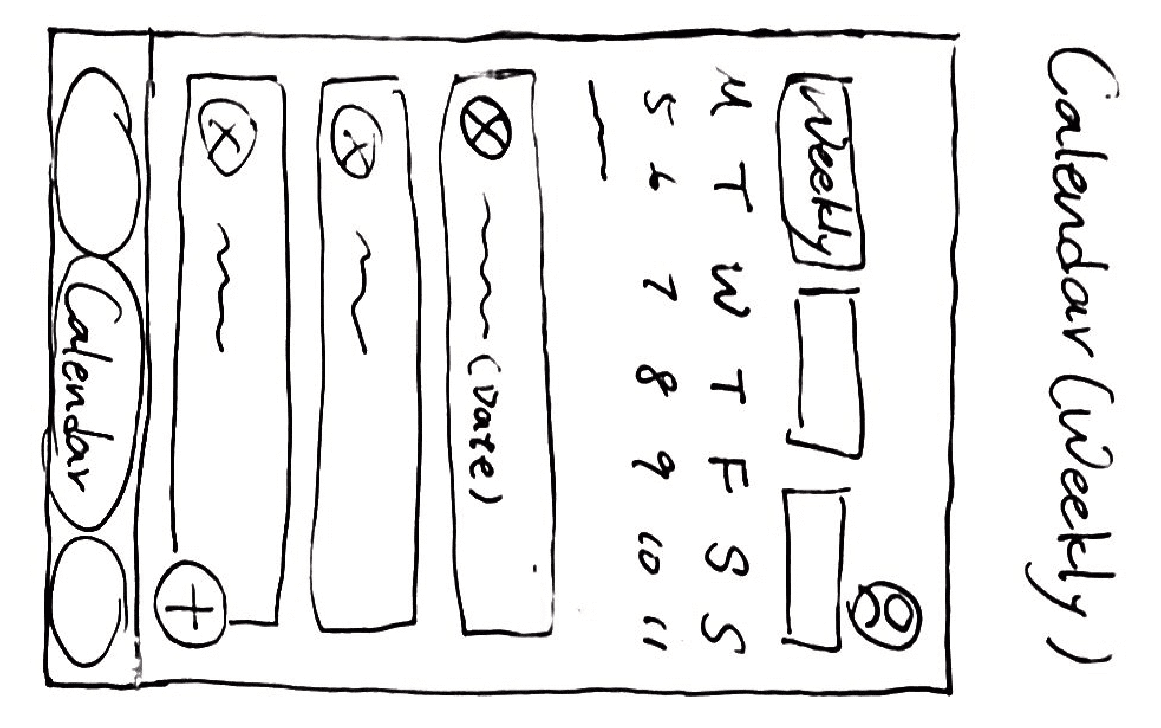
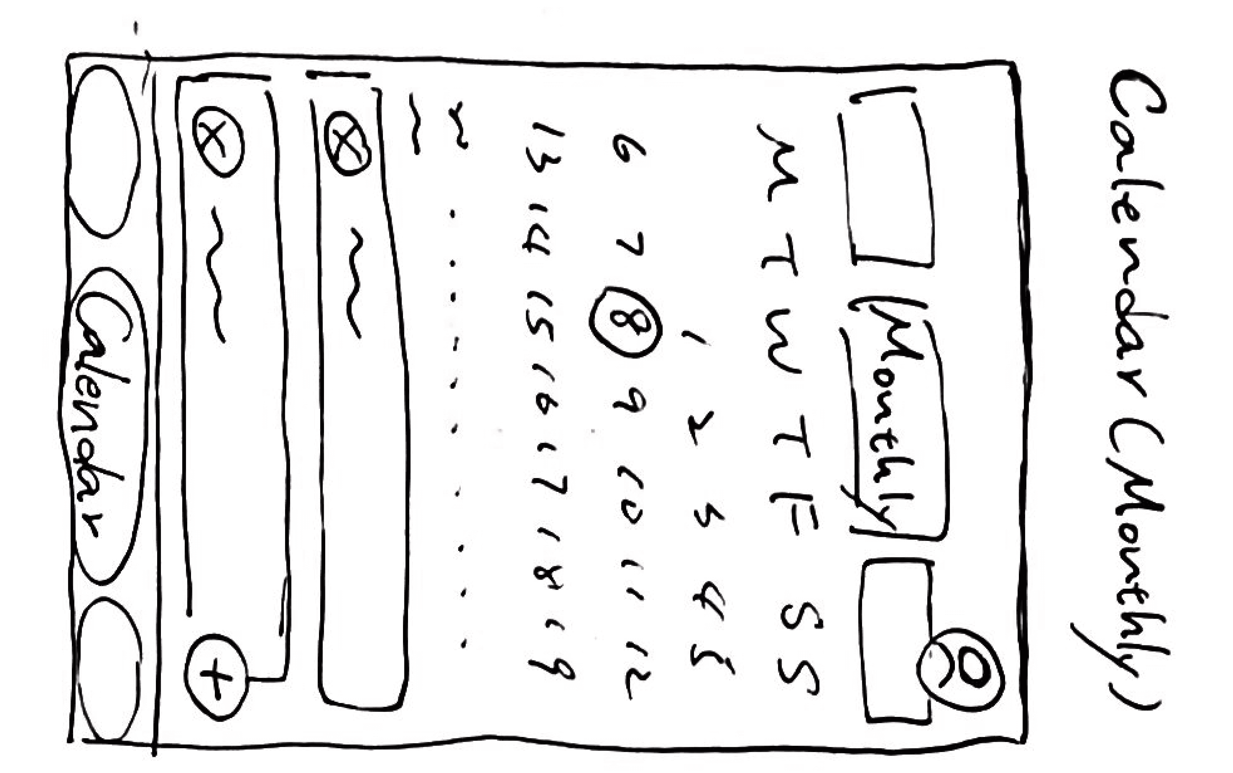
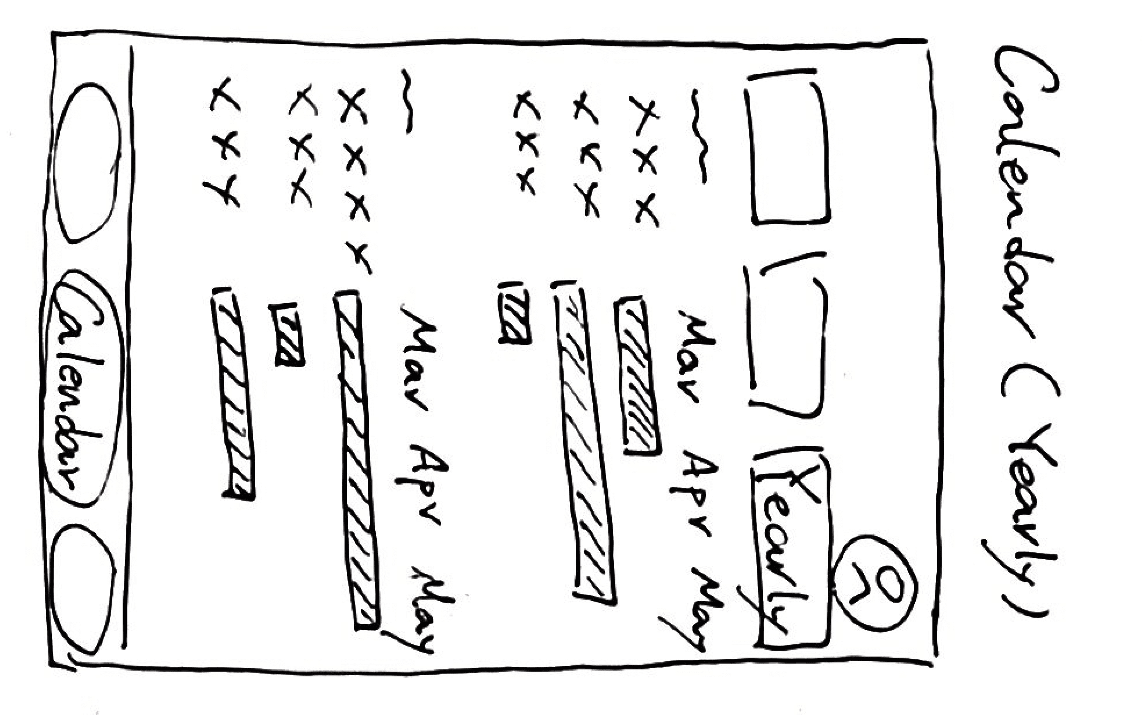
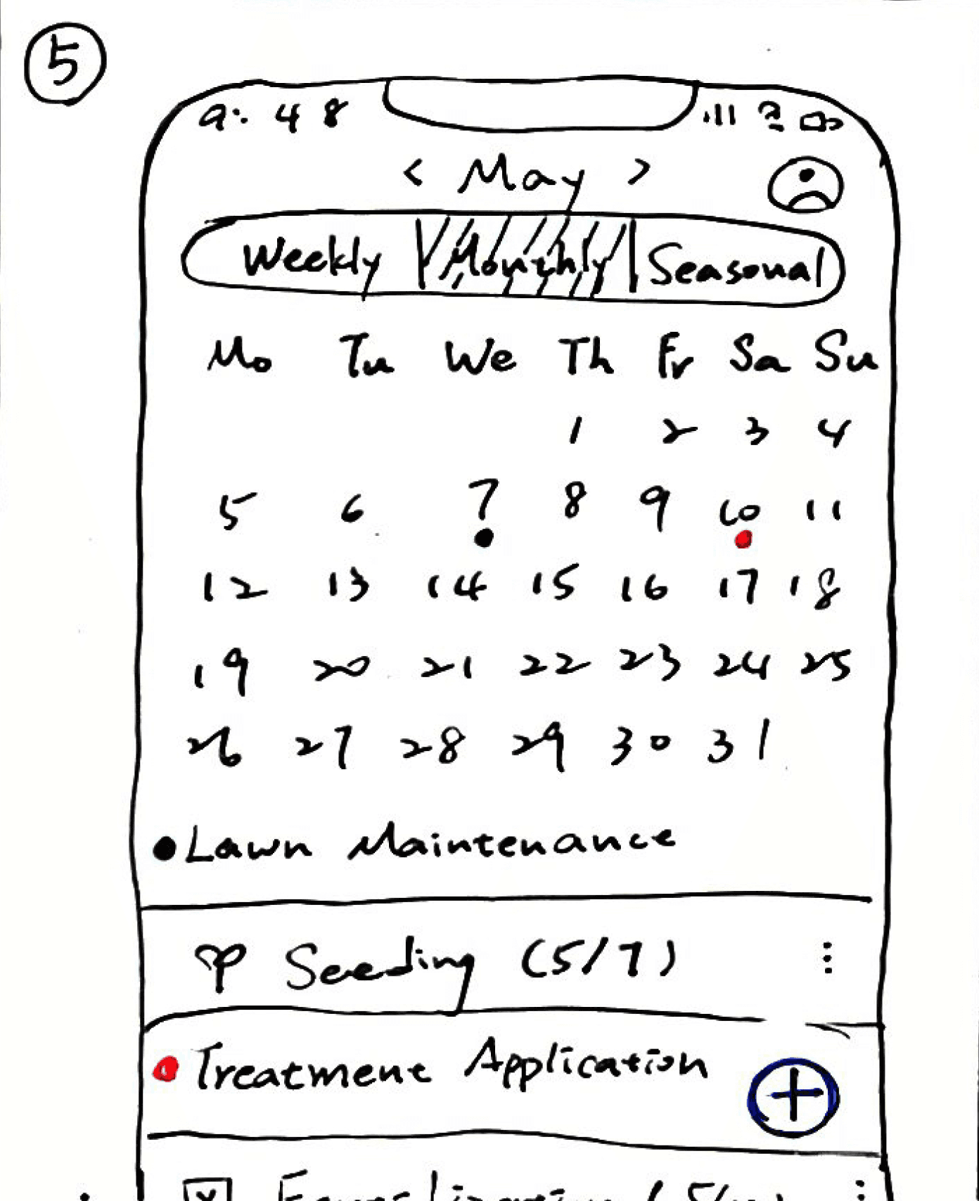
The calendar screen offers weekly, monthly, and seasonal views for planning and scheduling lawn activities.
Community Screen
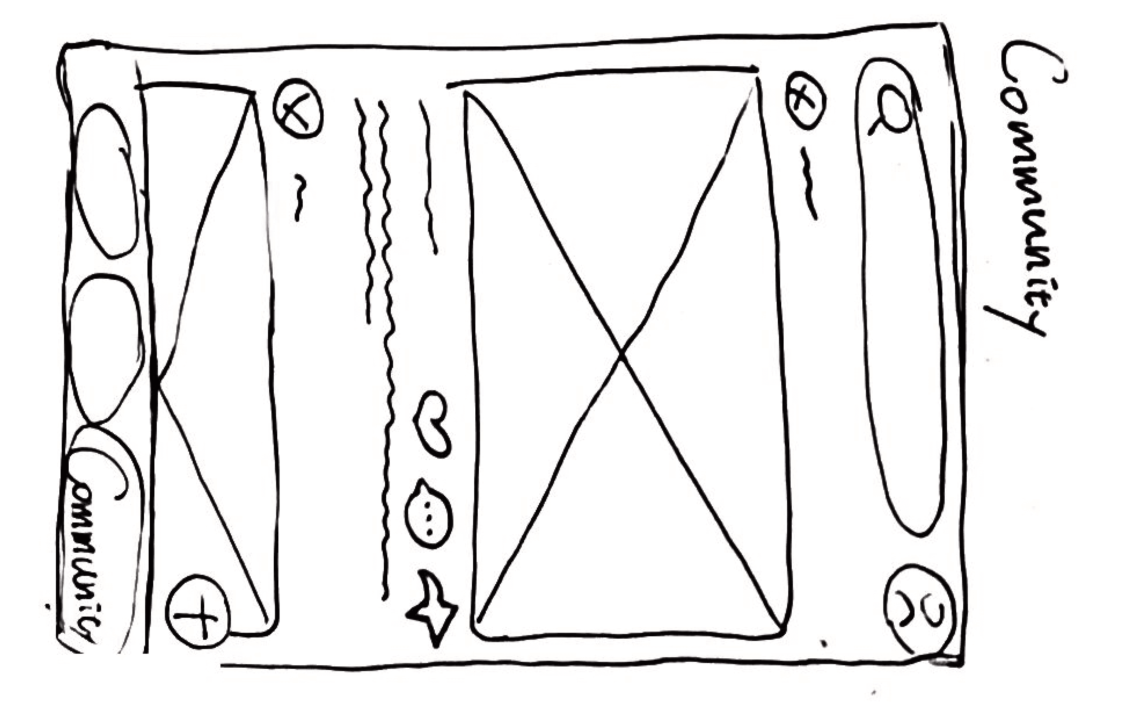
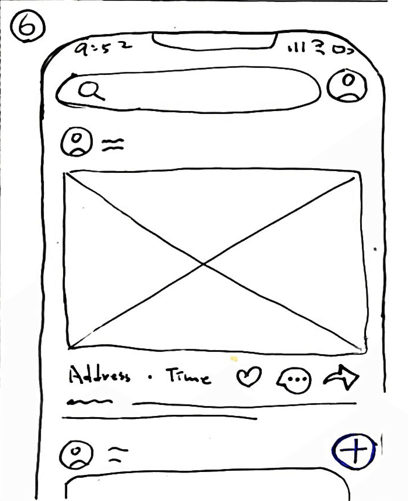
In the community screen, users can engage with a supportive community, share news, discuss questions, and seek inspiration for their lawns.
Goal
Lawndon's ultimate goal is to help users achieve a thick, strong, and green lawn by providing the necessary tools and resources.
USER INTERVIEW
Neighbor Interviews Unveil Valuable Lawn Care Insights and Recommendations
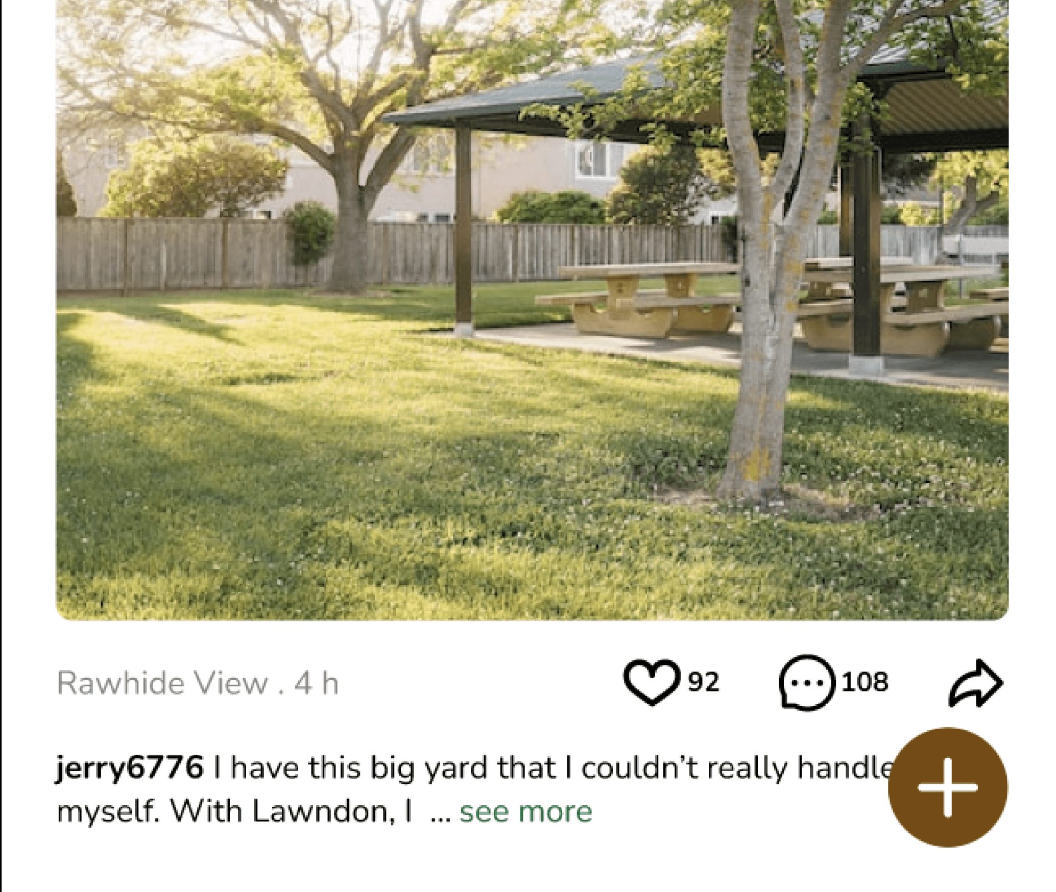
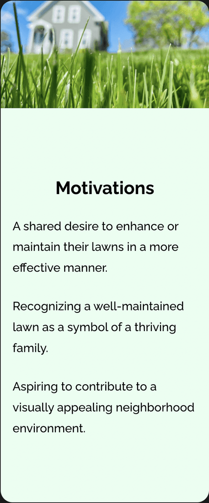
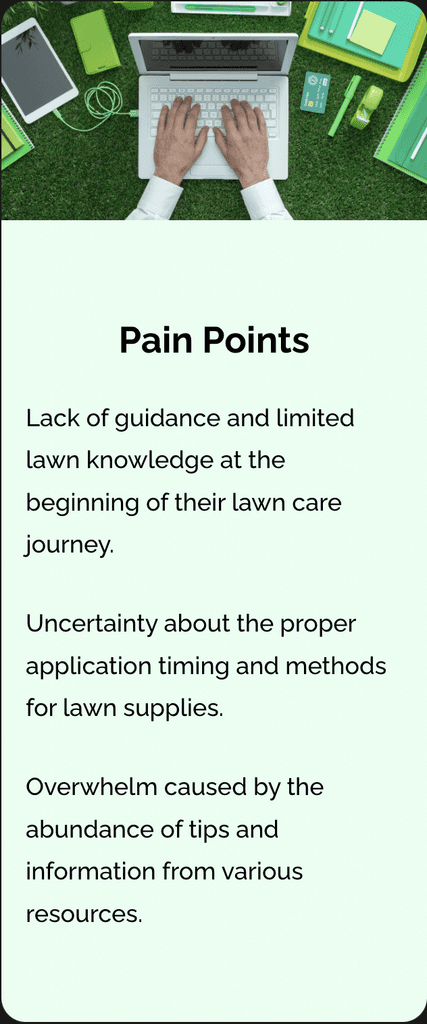
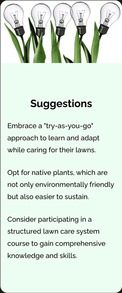
Through interviews with my neighbors, I gained valuable insights into their lawn care experiences. Their shared experiences highlighted common pain points and offered helpful suggestions. I compiled the most frequently mentioned issues and recommendations into a comprehensive and accessible database.
(The Main Insight from the User Interview)
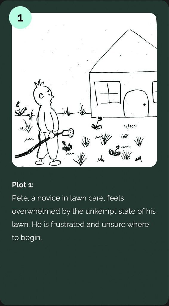
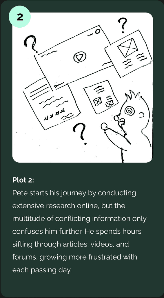
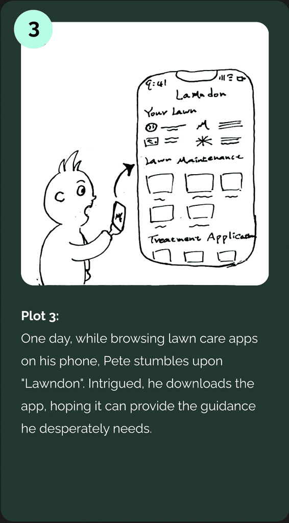
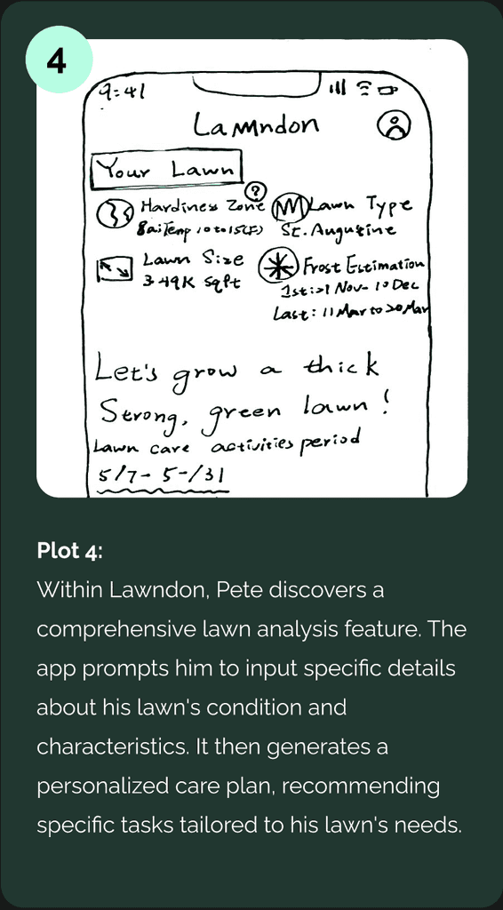
STORYBOARD
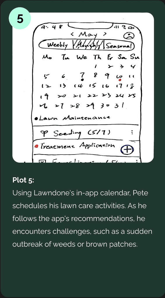
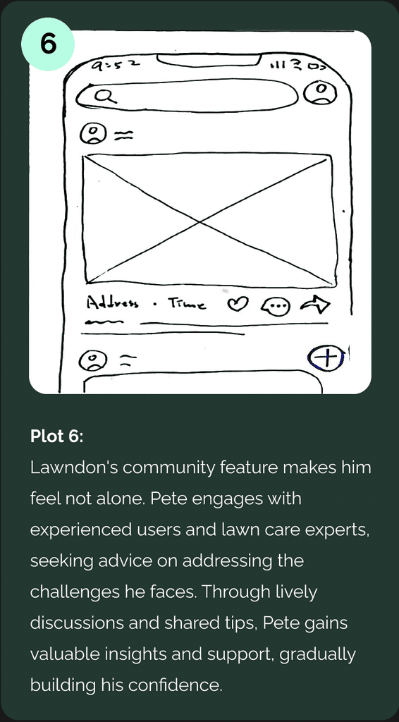
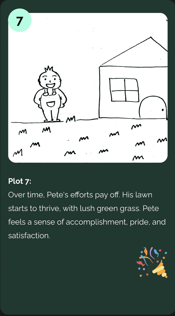
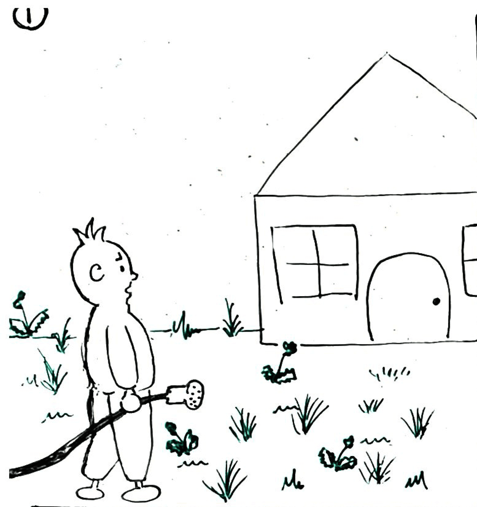
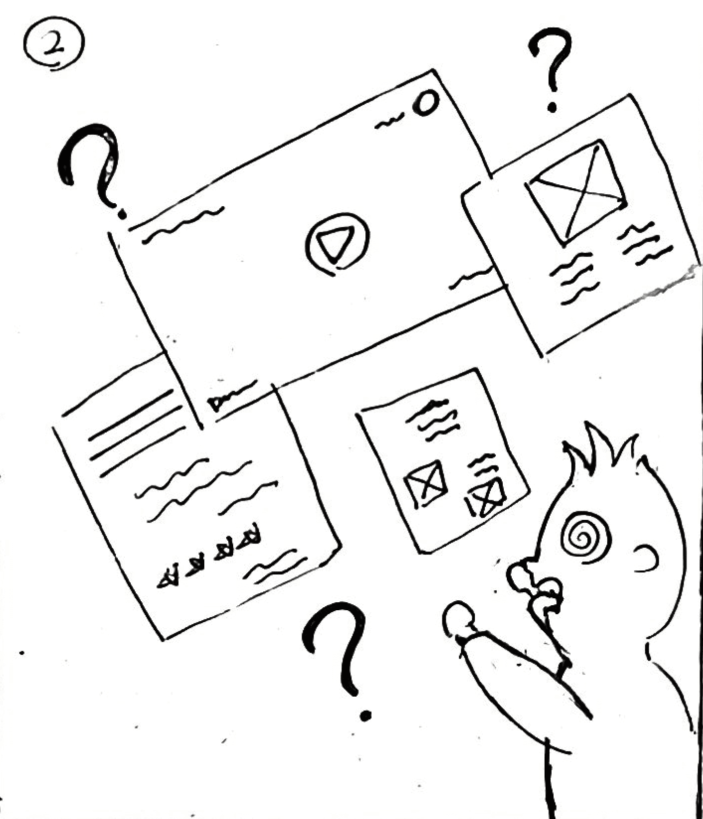
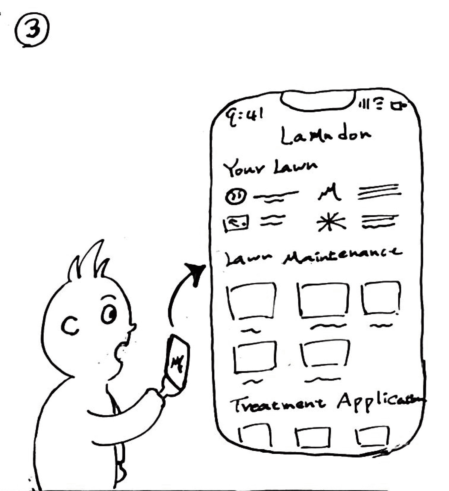
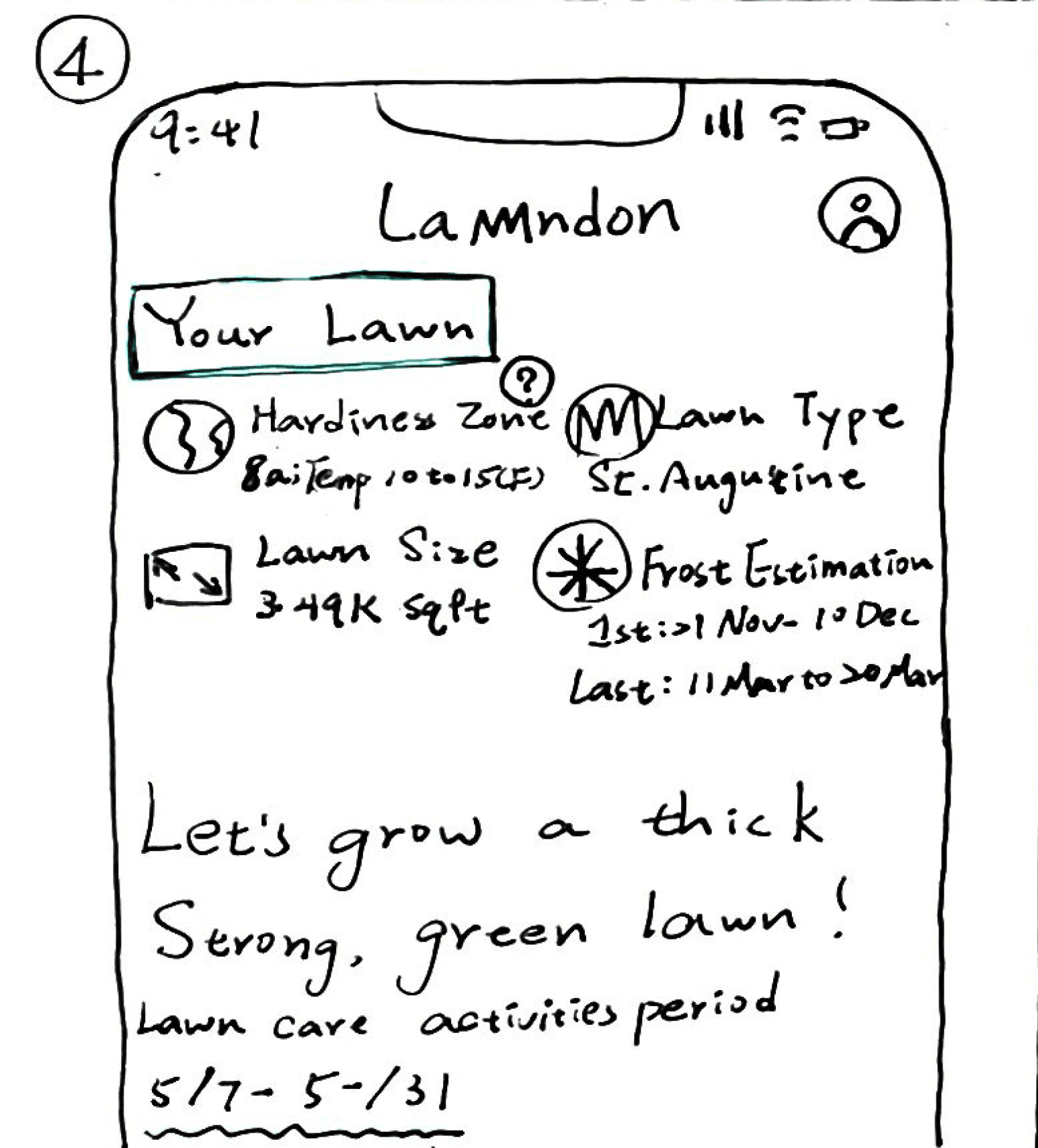
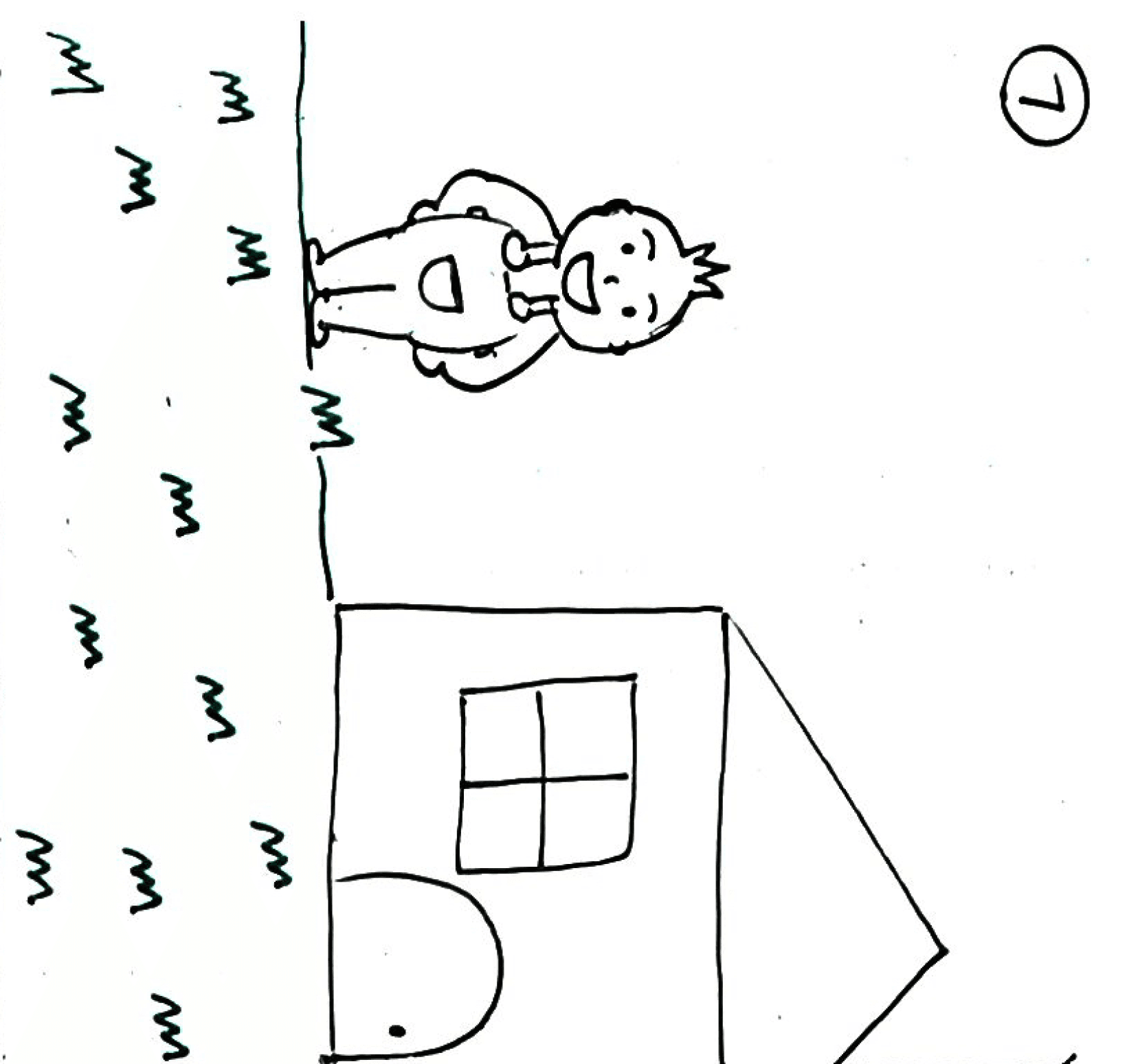
From Overwhelm to Expertise: Pete's Journey of Lawn Care Transformation with Lawndon
From Overwhelm to Expertise: Pete's Journey of Lawn Care Transformation with Lawndon
(The Storyboard)
LOW FIDELITY WIREFRAME
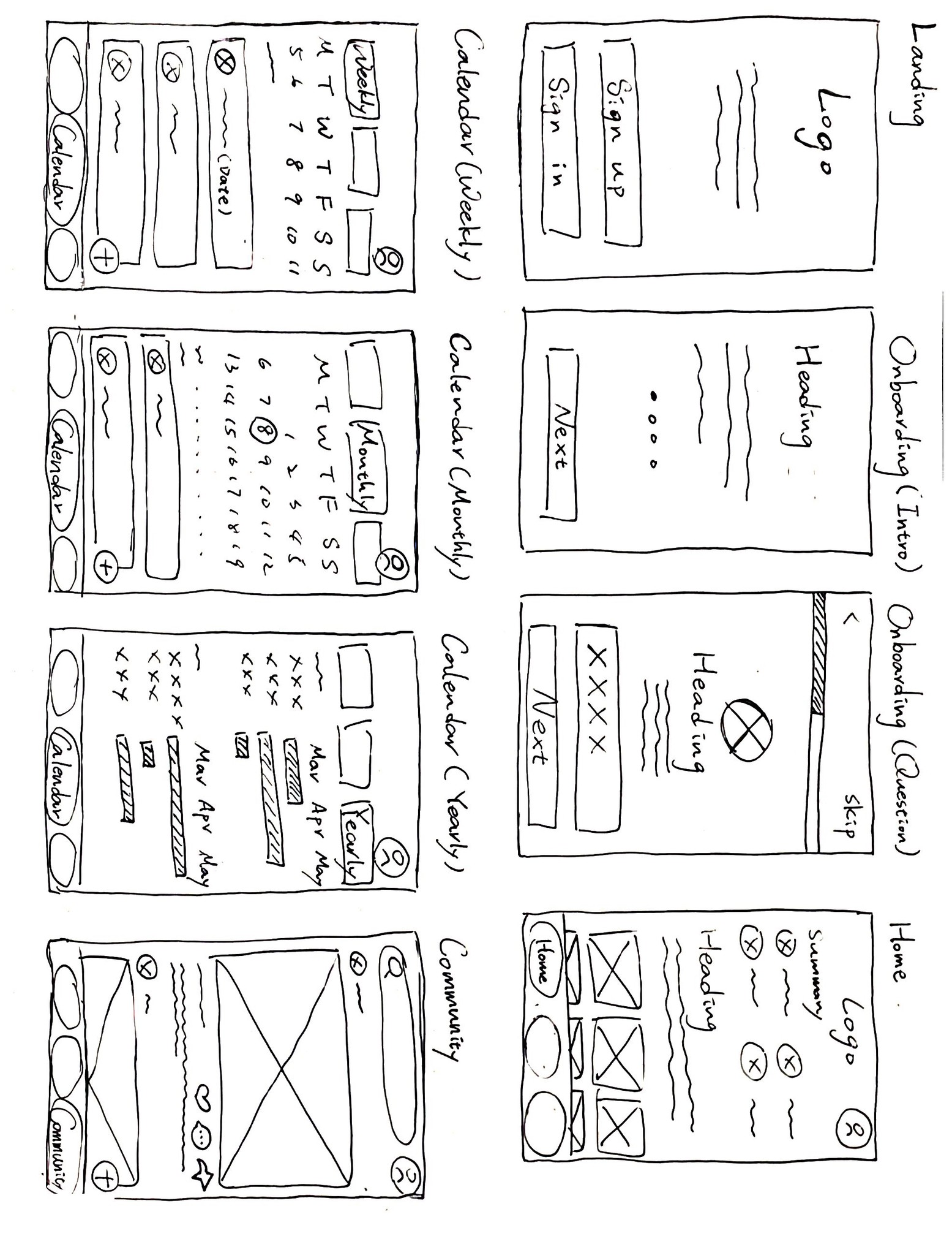
Low-Fidelity Wireframe : Exploring Lawndon App's Key Functionalities
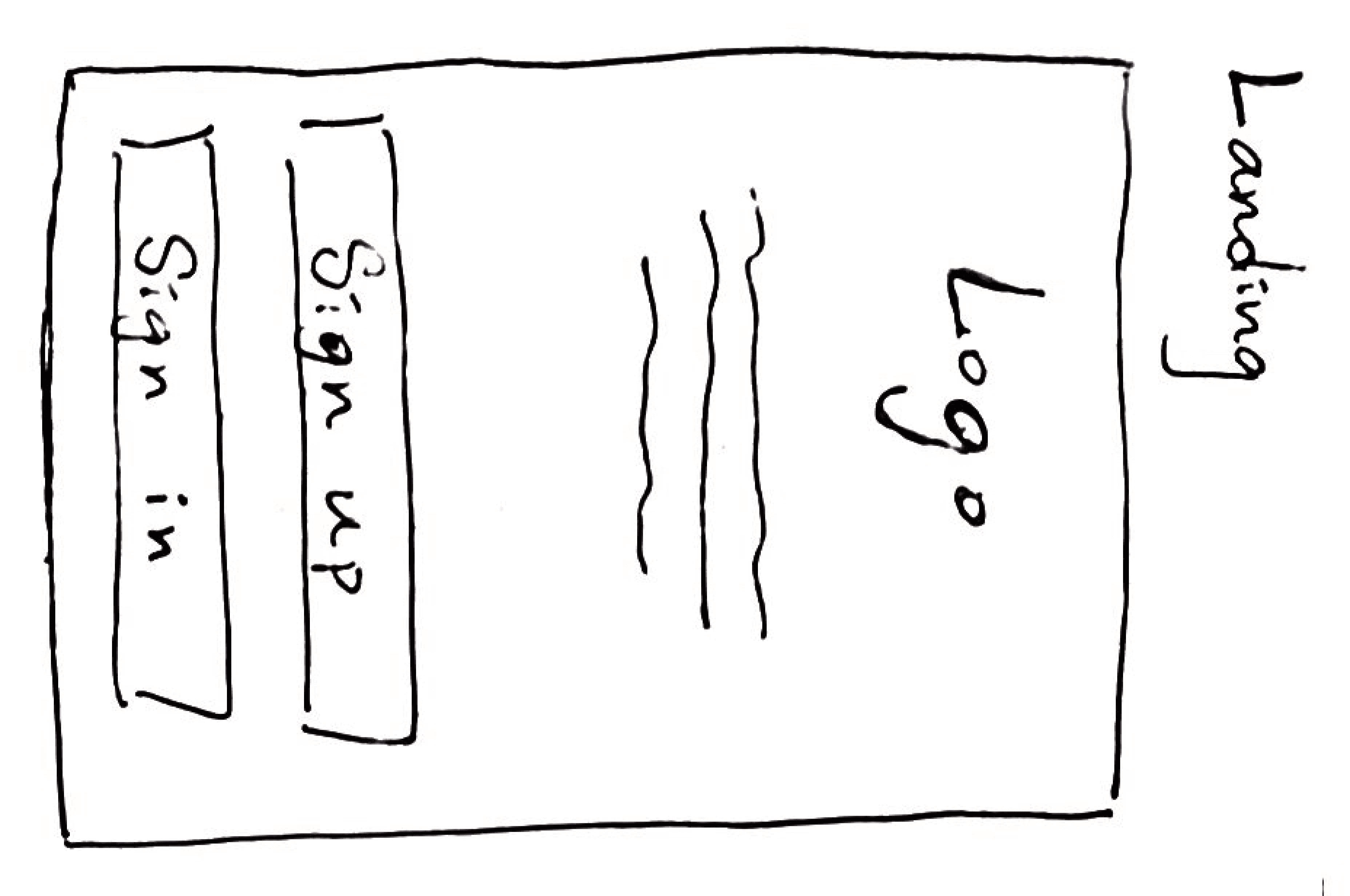
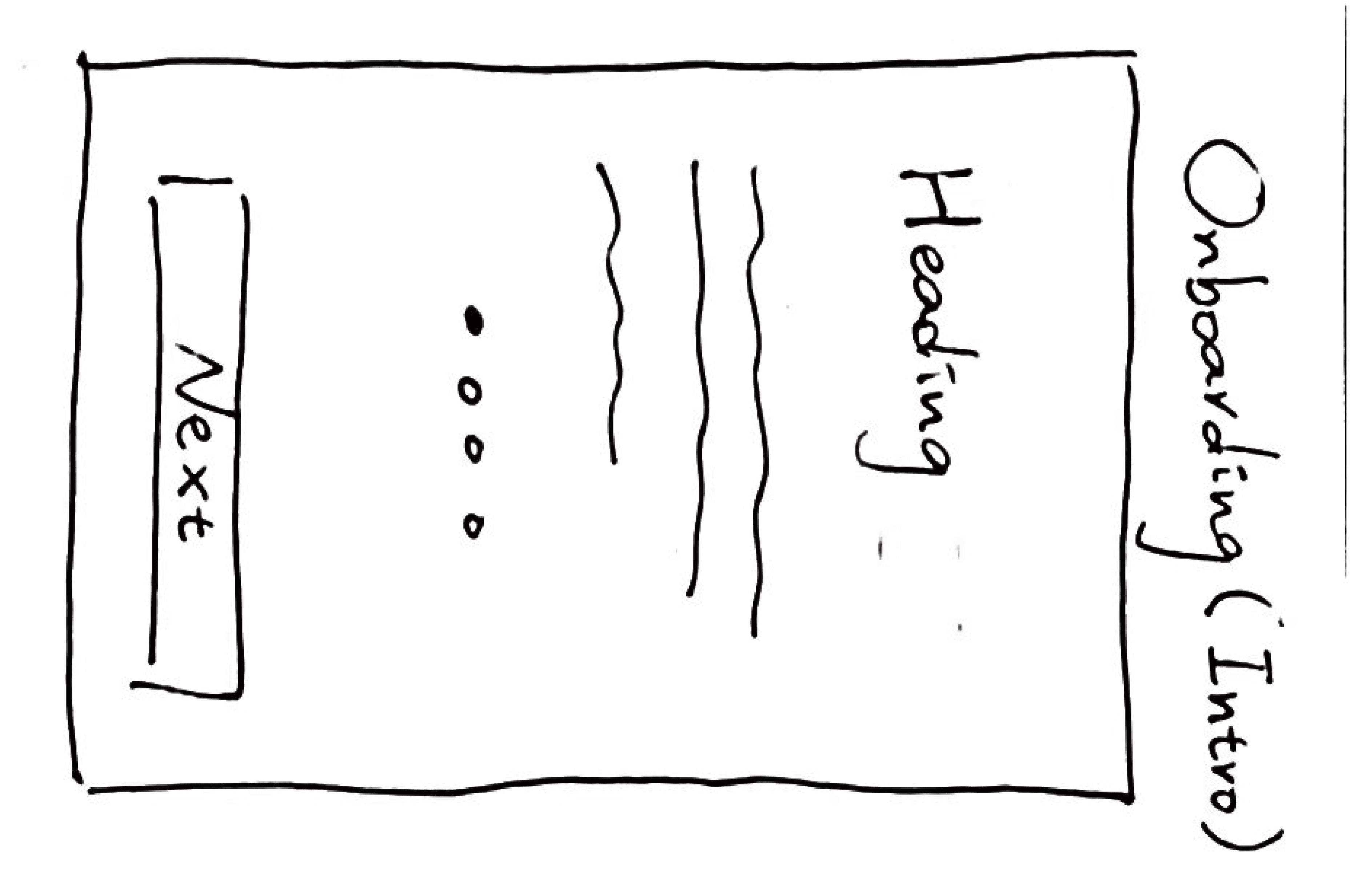
I began sketching these low-fidelity wireframes as a foundation for developing and refining design concepts.
(The Low-Fidelity Wireframe)
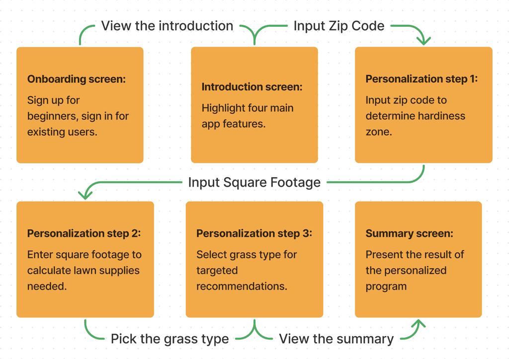
TASK FLOW
Seamlessly Navigating Onboarding, Exploring Main Screens, Editing, and Adding Tasks
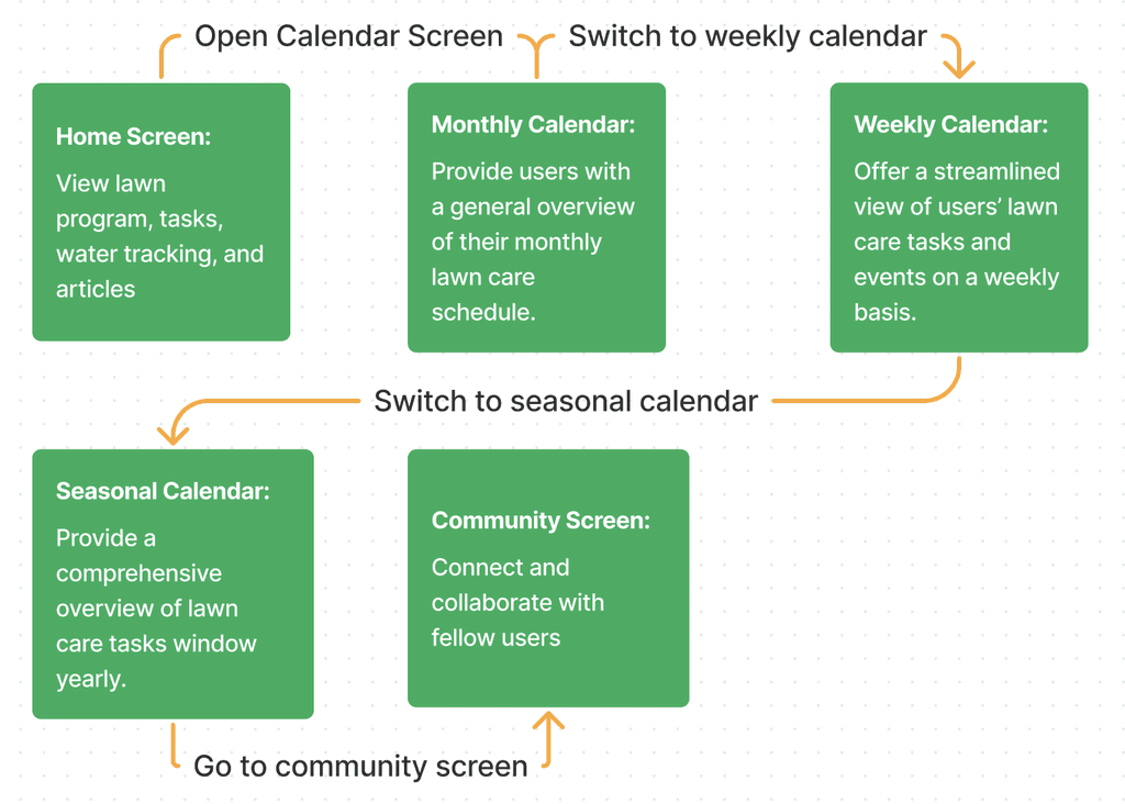
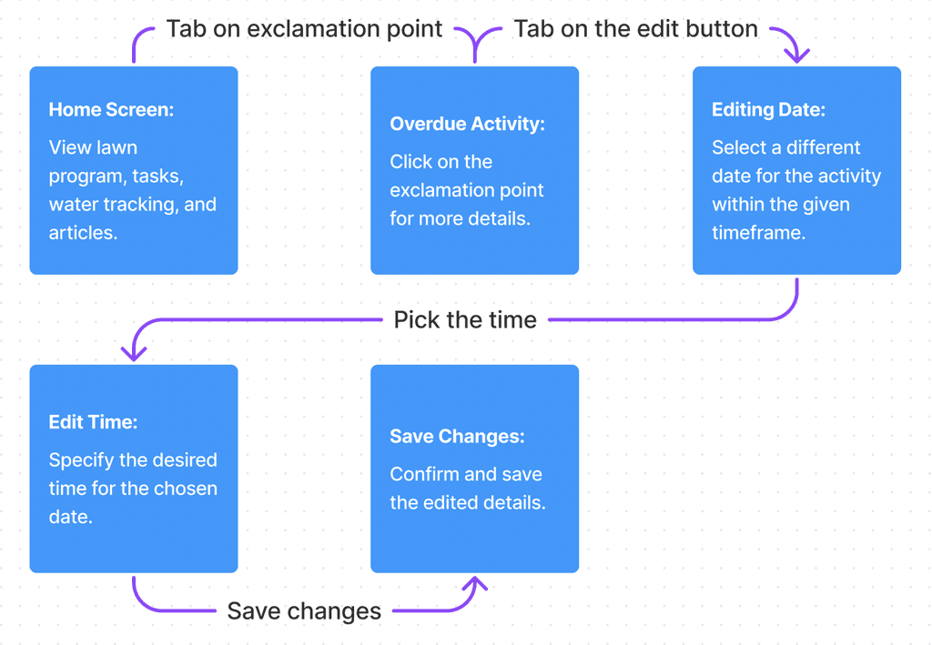
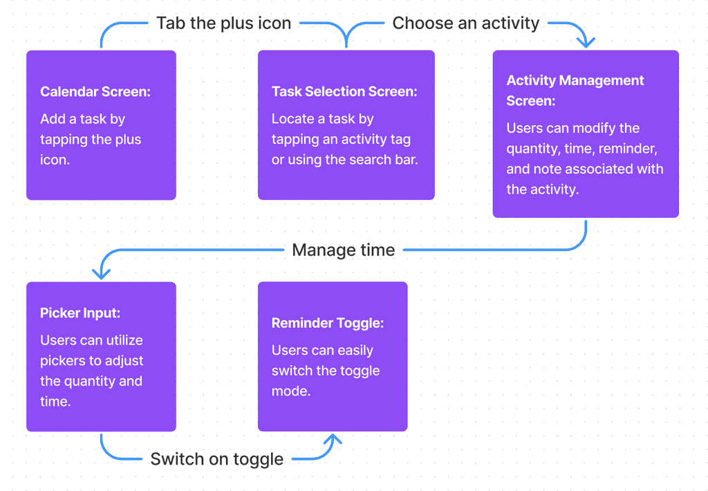
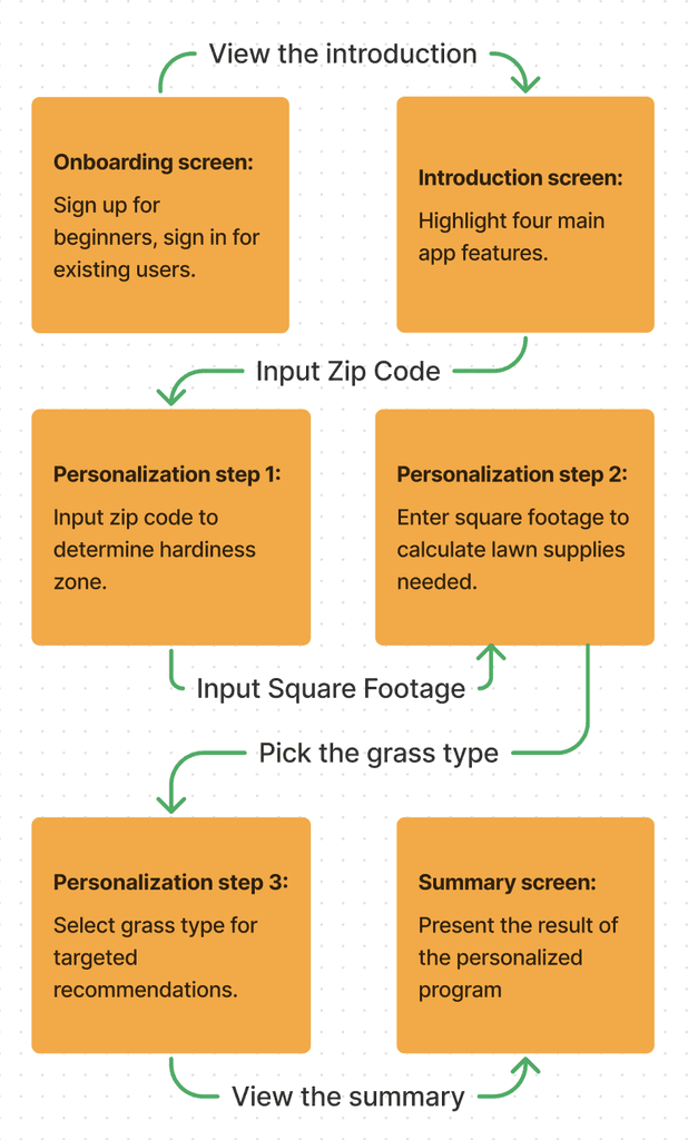
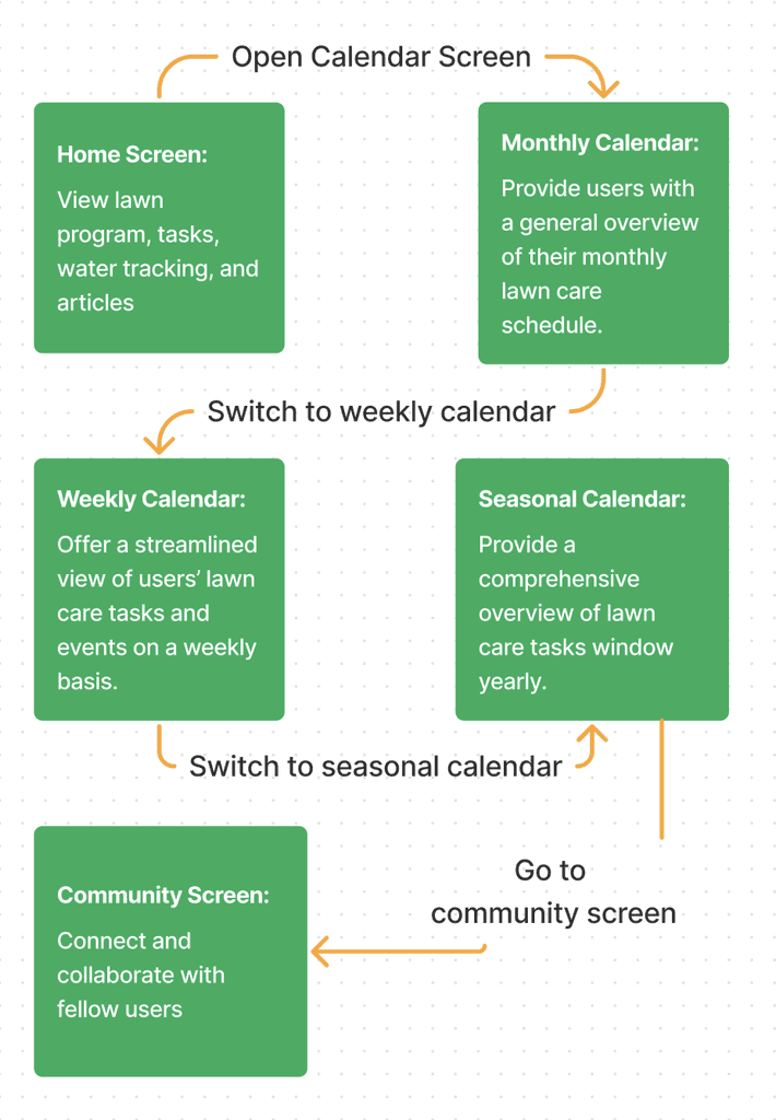
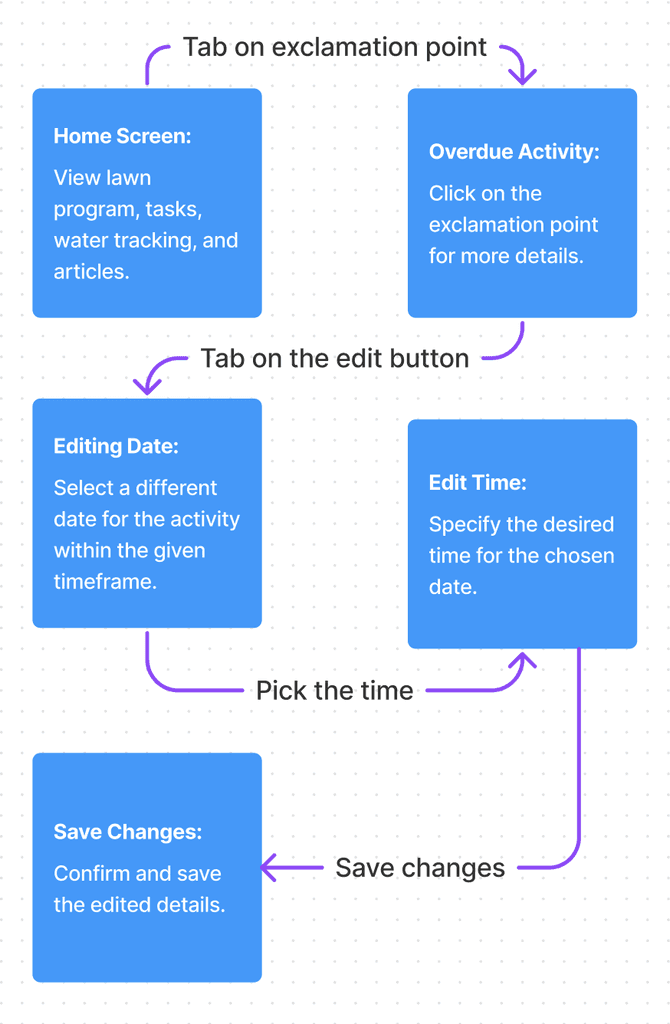
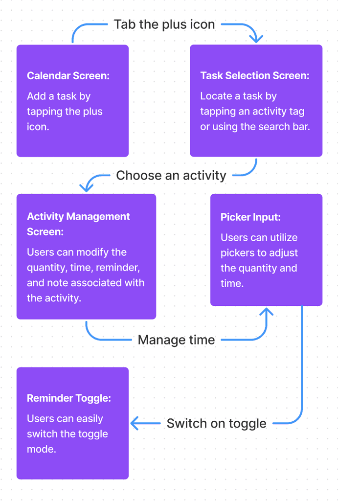
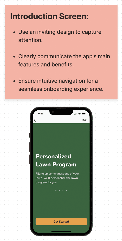
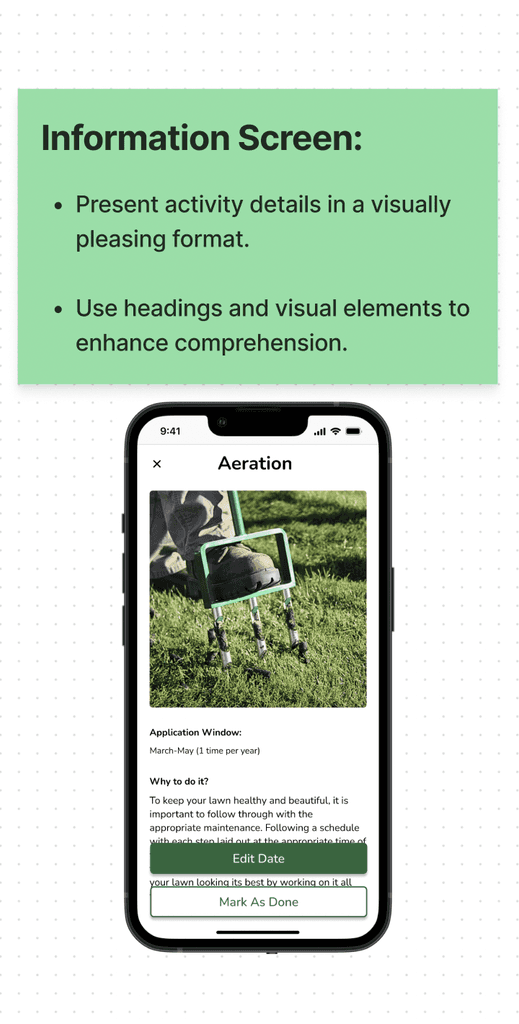
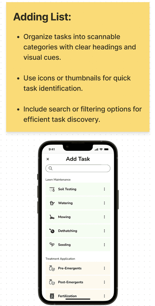
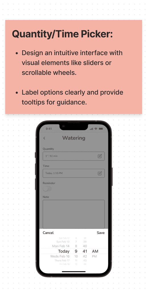
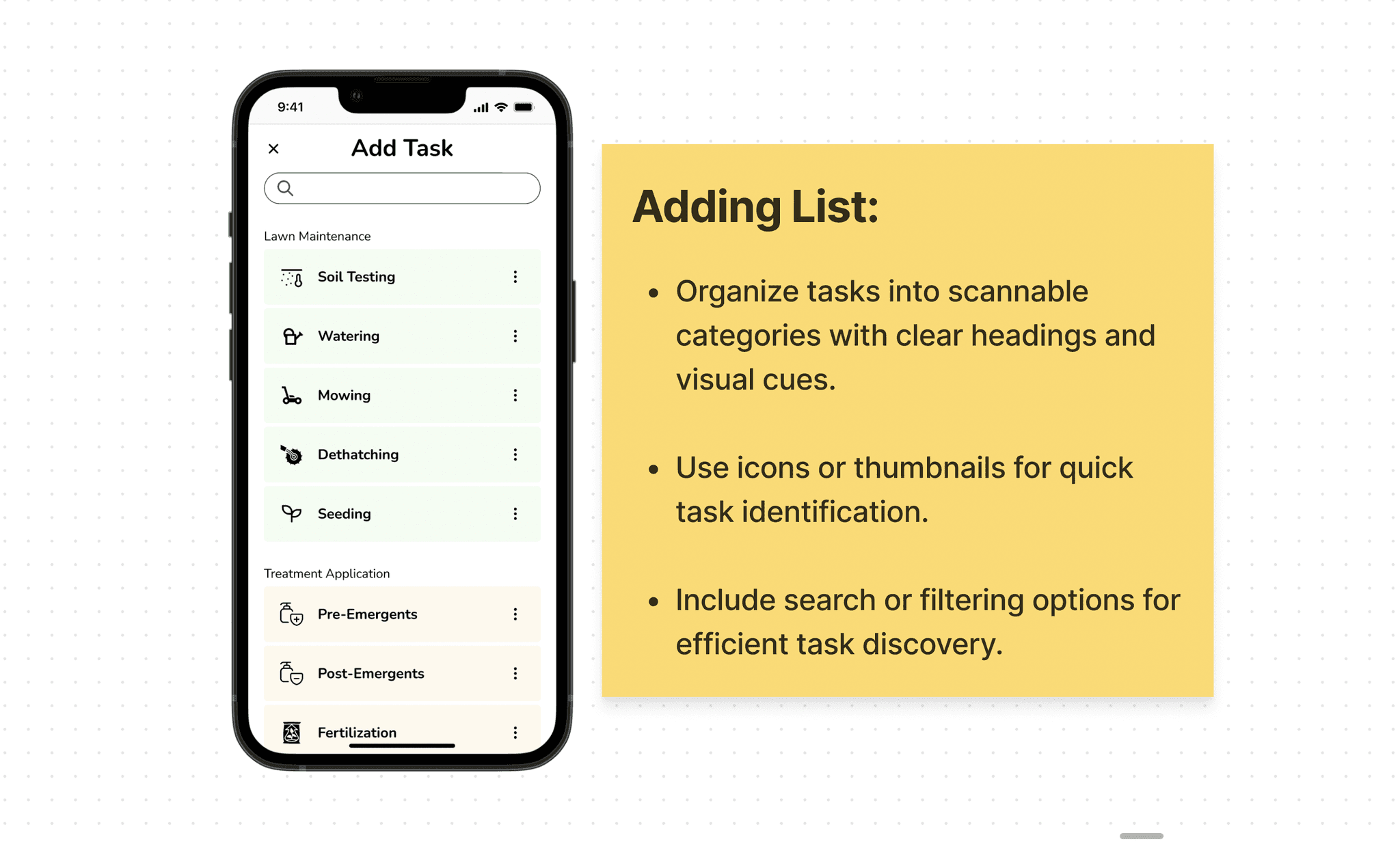
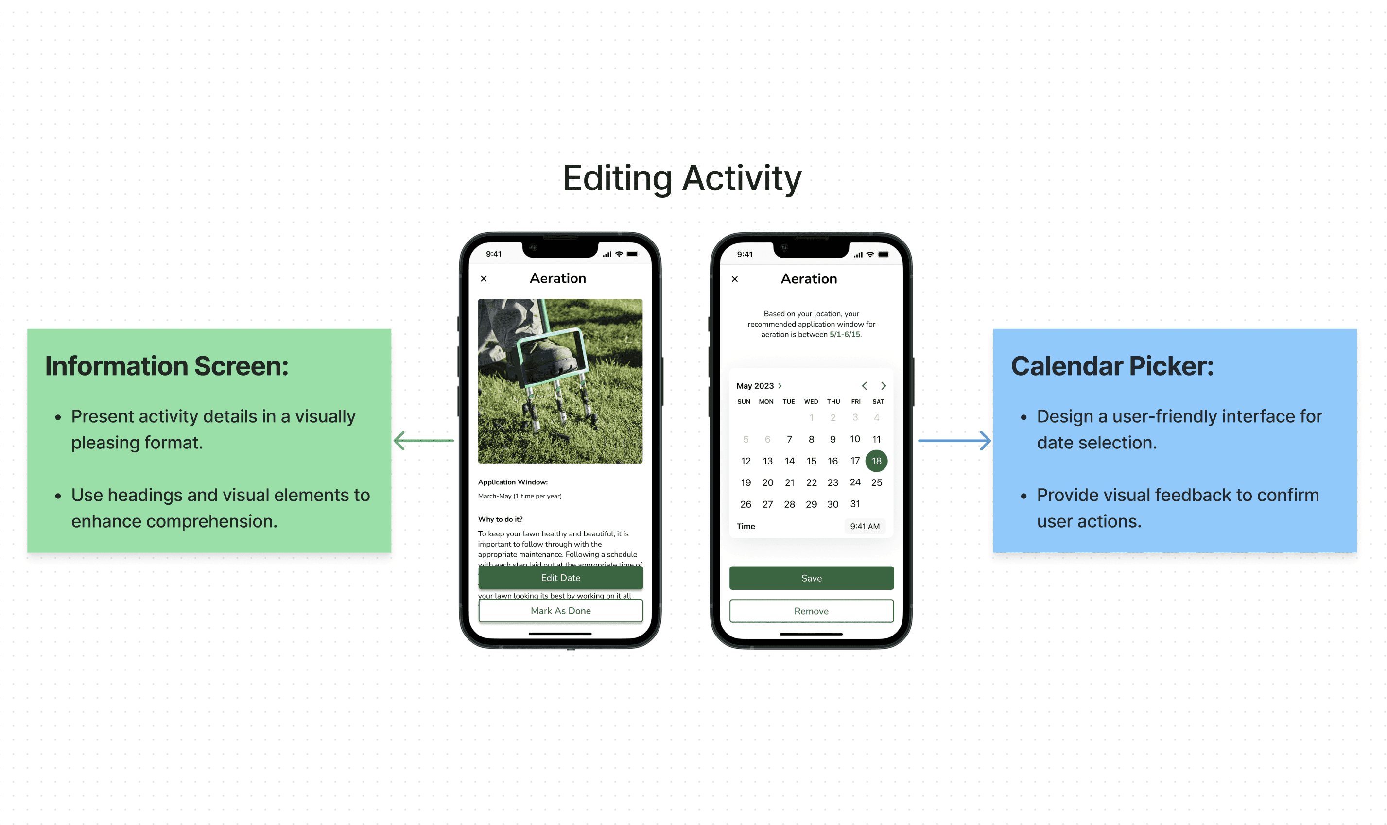
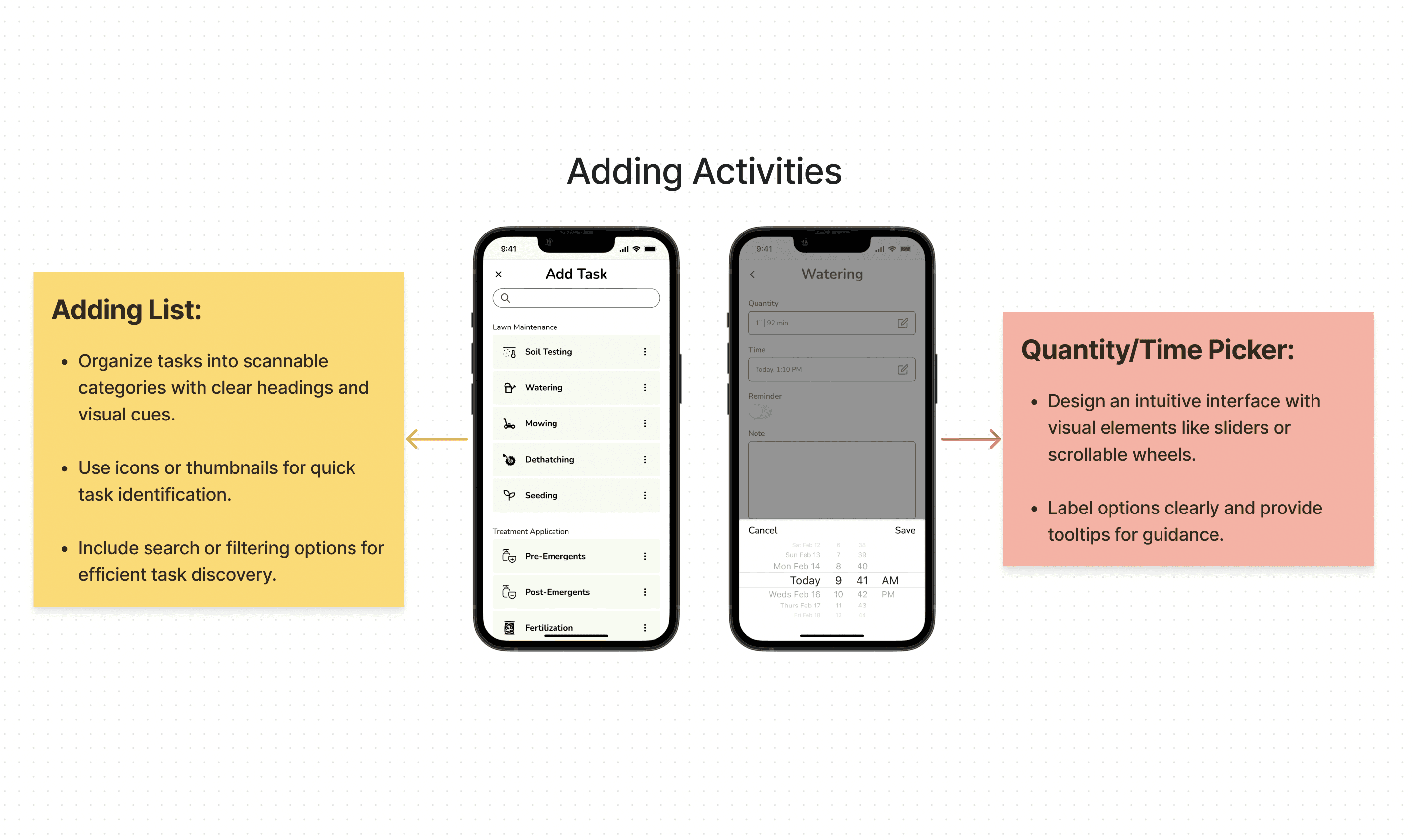
I broke down the essential user flows for four basic task screens to clarify the main features of the APP.
(The Task Flow)
TESTING & IMPROVEMENTS
3 Major Iterations
Guiding newcomers with onboarding screens, prioritizing personalized lawn summaries for a user-centric touch, and optimizing calendar functionality for an intuitive scheduling overview.
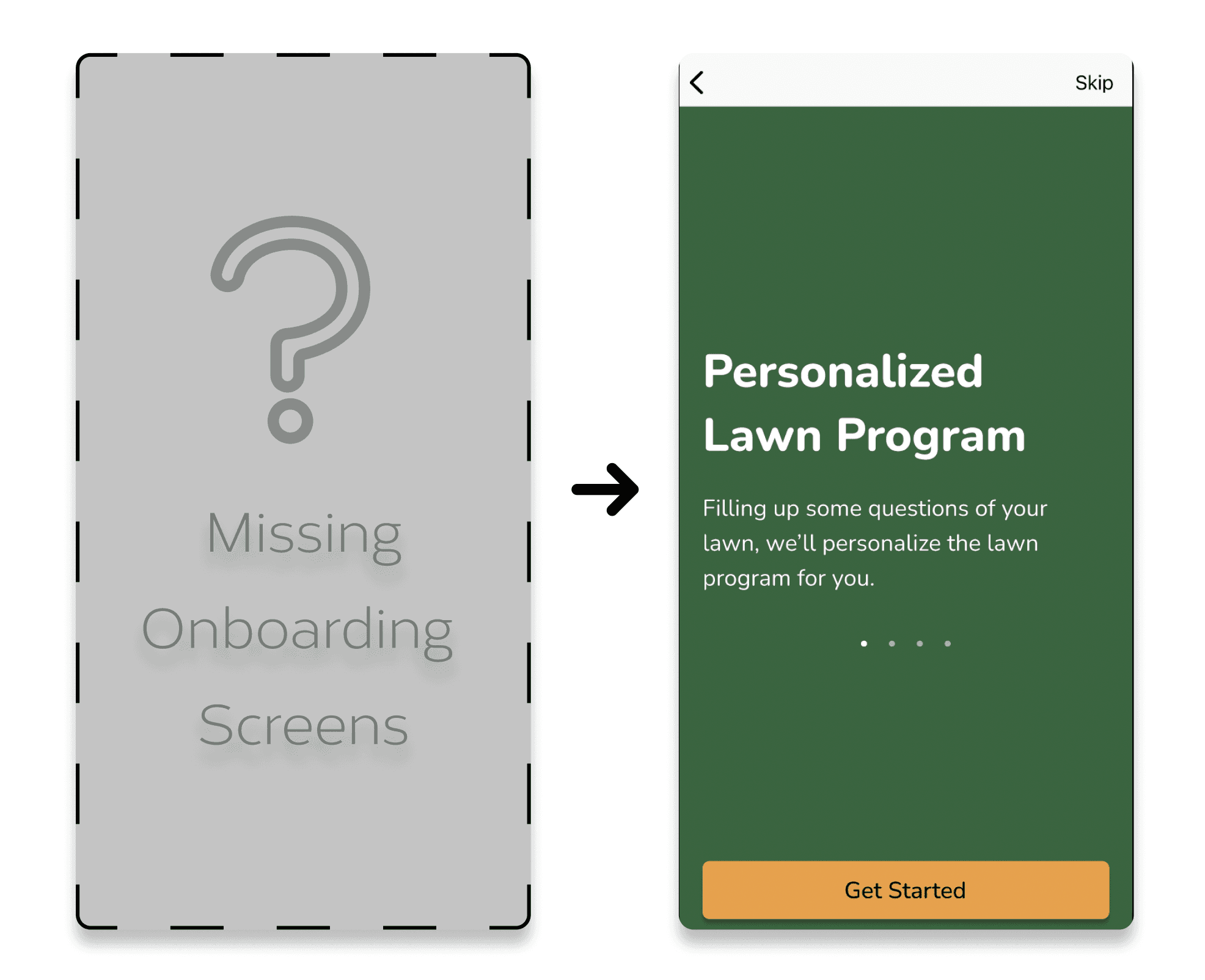
Enhancing User Orientation with Onboarding Screens
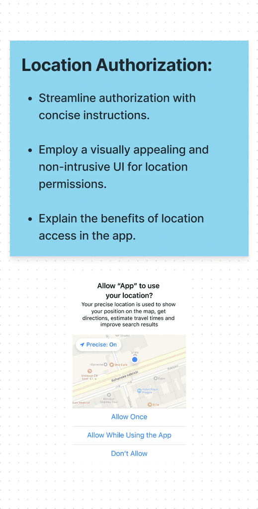
Implementing onboarding screens, especially for new users, is essential for efficiently familiarizing them with the app's basic functions and preventing user confusion or potential app deletion.
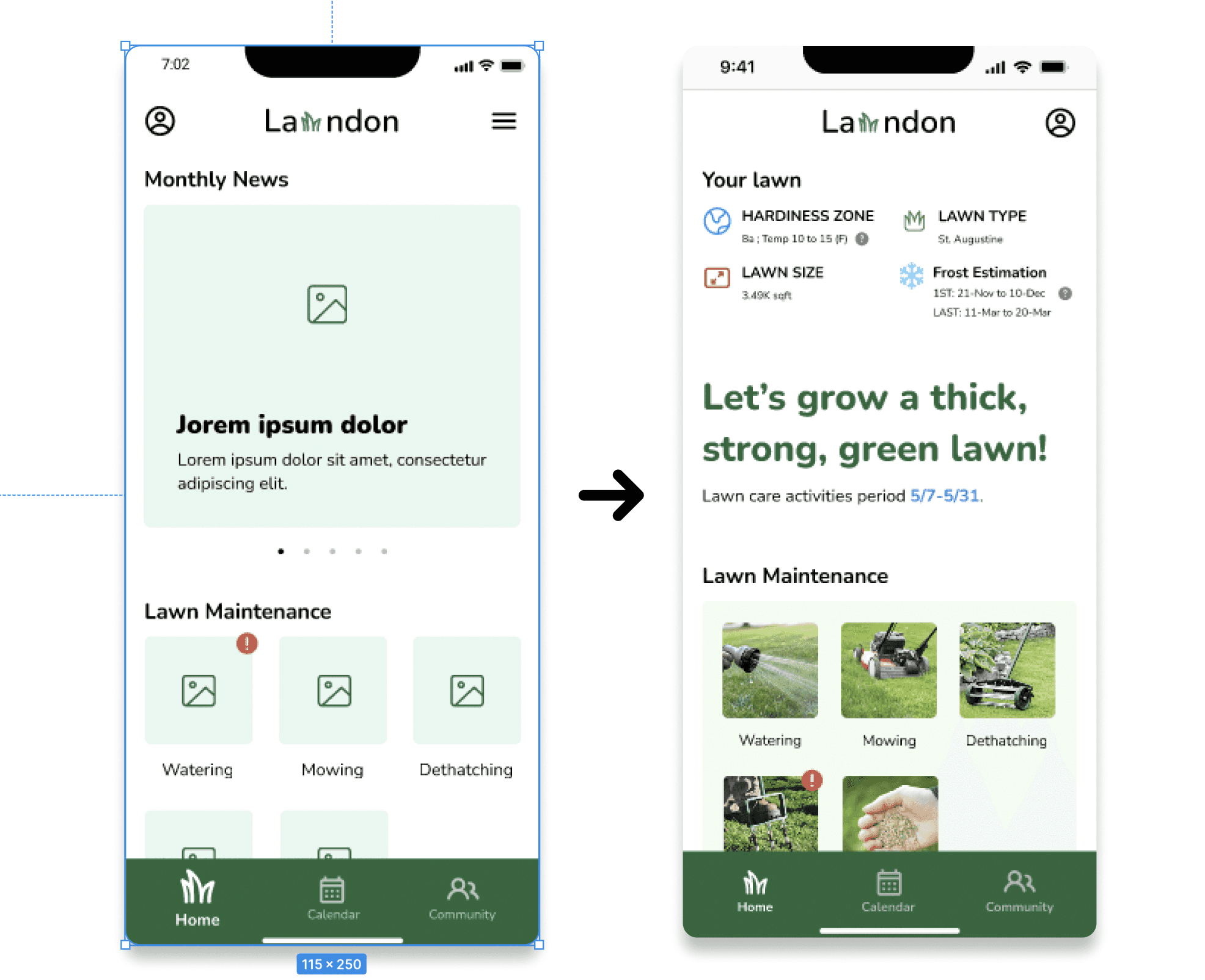
Prioritizing Personal Lawn Summary
I prioritized the personal lawn summary at the top of the home screen, considering it as a user-centered choice over monthly news, ensuring a more engaging and personalized user experience.
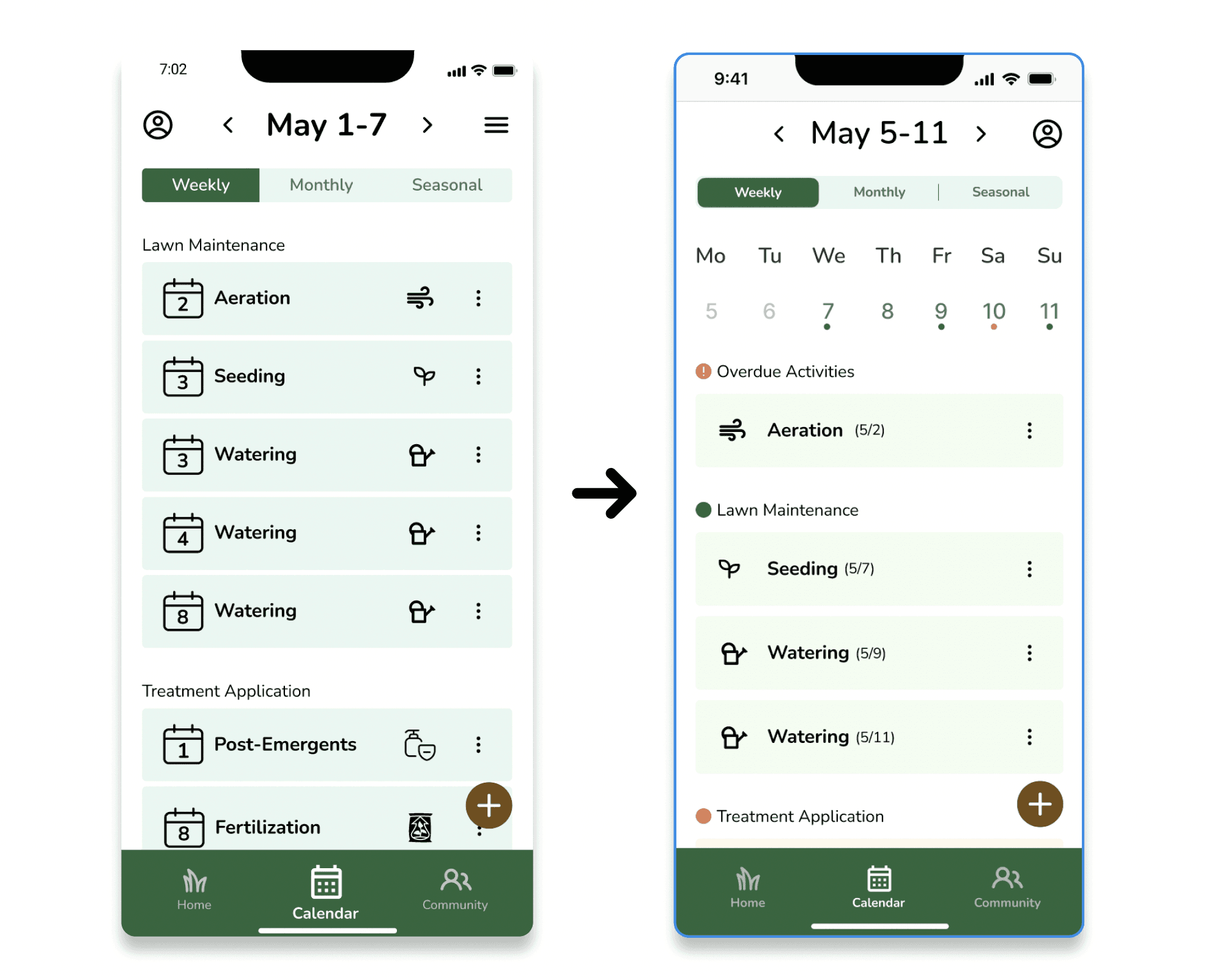
Calendar Overview and Interface Restructuring
I added a weekly calendar for a quick schedule overview and restructured the interface, placing task icons first for improved clarity and usability.
DESIGN DECISION
Embracing Design Thinking On Enhanced Onboarding, Home Screen, and Calendar Features
(The Design Decision)
THE DESIGN
The End-to-End Lawndon Application Design on Figma
(The Prototype of Lawndon APP)
THE CONCLUSION
Reflection and Plans for Continual Improvement
From zero to extraordinary, my journey involved extensive research and immersive interviews with my neighbors. Their wealth of lawn care experiences became the foundation for uncovering common pain points and innovative solutions. I thoroughly analyzed and organized the gathered data, feeling like I was sculpting a gem out of thin air. The in-person interviews brought a new dimension to my research, offering me enjoyment, accuracy, and a genuine connection with people. It was a transformative experience that enriched my project with a profound human touch.
I really liked the simple and clean design of the app, but I think there's so much potential to take it to the next level with a more modern and intuitive approach. It would be fantastic to see a broader range of options for the UI design, going beyond just plain colors, icons, and images. And when it comes to the user experience (UX), I'm personally eager to learn more about iOS design and apply that knowledge to make more thoughtful decisions throughout the design process. I believe these improvements will greatly enhance the overall user satisfaction and engagement with the app.
