


01. Project Overview
Problem
Gridtango recruiters rely on projects to keep candidate information organized and easily reusable.
But the system’s poor usability made their work frustrating. Navigation felt confusing, filters were too complicated, and long lists made it hard to find what they needed. Instead of helping them work more efficiently, the system was slowing them down.
Solutions
I prioritized profile views and add project functionality to help recruiters quickly access data and take actions.
The filter button is placed prominently for easy access and adjustments.
Candidate info is presented in a compact, organized table, allowing recruiters to scan and select the right candidates efficiently.


02. Research & Emphasize
Deep Diving into Users' Needs
Understanding recruiters' daily workflows, pain points, and motivations is key. I started by exploring the system firsthand to identify issues, then researched similar tools to expand my knowledge. Finally, I interviewed target users to understand their specific needs—what features they rely on, what they’d like to remove, and what they wish they had.
Key Insights
Clear Navigation:
Organize system sections clearly so users always know where they are and what they can do.
Simplified Filter
Merge similar functions into one filter, making it easier to find and use.
Effortless Scanning
Keep related info together in a clean, compact layout for quick and easy reading.

03. Ideation
Sketching Mockups
When creating, I prefer sketching ideas by hand. The hand-eye coordination helps clear my thoughts and organize concepts effectively. Though it may slow me down, it lays a strong foundation—my blueprint for design.
Structuring the System
I listed all functionalities and grouped them into categories. This helped me familiarize myself with the system, streamline features, and remove anything unnecessary.


04. Discovery & Design
Discover 01
Home Page Design
Original Design:
The system unnecessarily displays others' projects, causing clutter and confusion. Buttons are scattered throughout the interface, making the functionality hierarchy unclear. Additionally, valuable screen space is wasted instead of being used for essential information.

New Design:
The redesigned homepage is structured into two main sections, creating a more intuitive and user-friendly experience. By clearly separating these two sections, the homepage improves visual hierarchy, reduces cognitive load, and makes navigation more intuitive for users.

Discover 02
Project Filter
Original Design:
The system originally has three separate filtering options: initial filters, drill-down filters, and result list filters. However, users struggle with the fragmented filtering experience, often applying filters in the wrong places and getting inaccurate results. This lack of clarity disrupts the user flow and increases cognitive load, making it harder for users to refine their search effectively.

New Design:
The redesigned filter consolidates the three separate filtering options into a single, unified filter. This eliminates confusion by providing users with one clear and consistent way to refine their search. By simplifying the filtering experience, users can apply filters more intuitively, reducing errors and improving efficiency.


05. Design System
Local Variables
I set up the color palette as local variables in Figma, so I can keep colors consistent across everything—elements, frames, and files. It also makes switching between light and dark mode effortless, saving time and keeping the design flexible.

Component Library
Components are a game-changer for repetitive designs. Instead of updating every instance manually, I can edit the main component, and all variants update instantly. This makes managing multiple versions effortless and keeps the design consistent while saving time.

06. Prototype Usability Test
Usability Interview
Using a prototype, I observed how users navigated tasks, noting where they struggled and how long they took. Through open-ended questions, I uncovered frustrations, dislikes, and areas for improvement. After analyzing feedback and identifying key insights, I refined the design to make the experience smoother and more intuitive.
Guided Project Creation in Three Steps
Creating a project is now a clear, step-by-step process instead of doing everything on one page. This way, users always know where they are and what they need to do next.
At each step, they can go back, exit if needed, or move forward using intuitive primary and secondary buttons—giving them control and flexibility along the way.
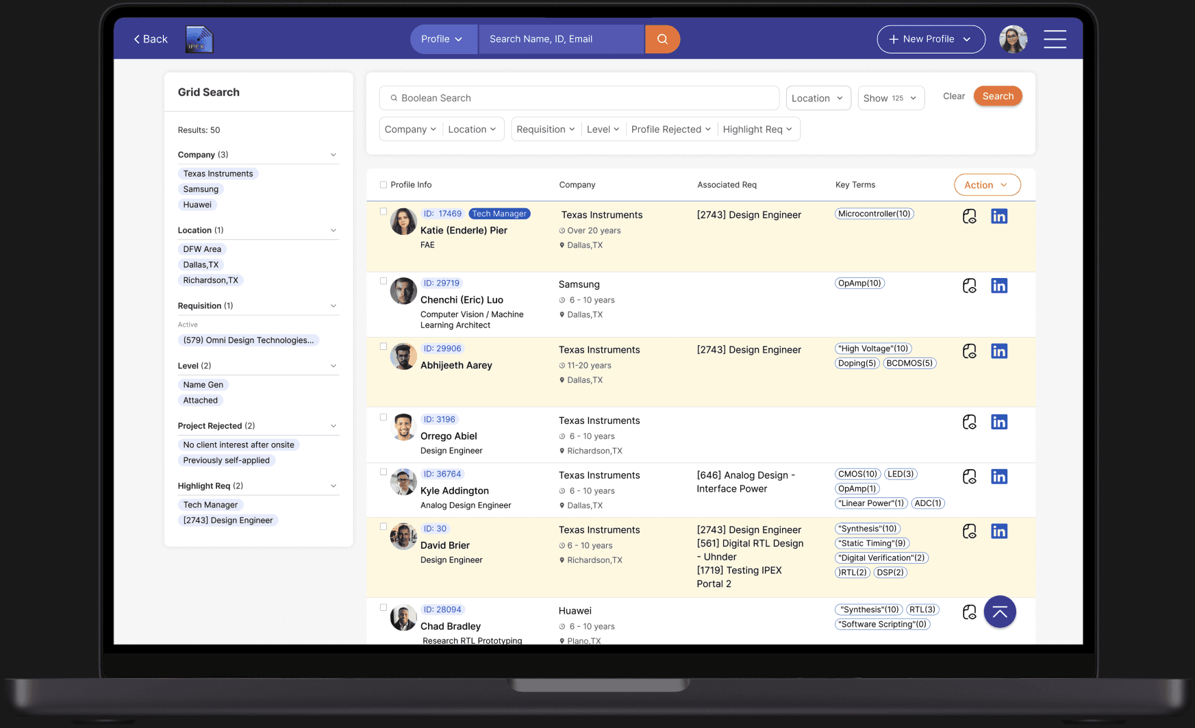
Candidate List View and Features
To improve readability in long lists with multiple columns, I fixed the first column to always display profile information. This way, users can easily keep track of which candidate they’re viewing while scrolling.
For better organization, users can sort profiles, add more columns, and apply filters to narrow down results or create custom filters for more precise searches.
07. Design Handoff
Presentation & Design Document
When handing off a design, I create a presentation that walks through the user flow, explains how key features work, and highlights important considerations for building the system. To streamline communication and minimize back-and-forth questions, I also provide a detailed design document that includes written descriptions, visuals, and videos. Beyond documentation, I stay available to quickly answer developers’ questions, ensuring they have the clarity they need to build an intuitive and well-functioning product.


